Exercise 3: Gallery or site visit

In the last few weeks I have visited three sites that could not be more different in nature or content. Two could be classed as "galleries" while the third describes itself as a museum, but is closer to a cross between a repository and a site-specific installation.

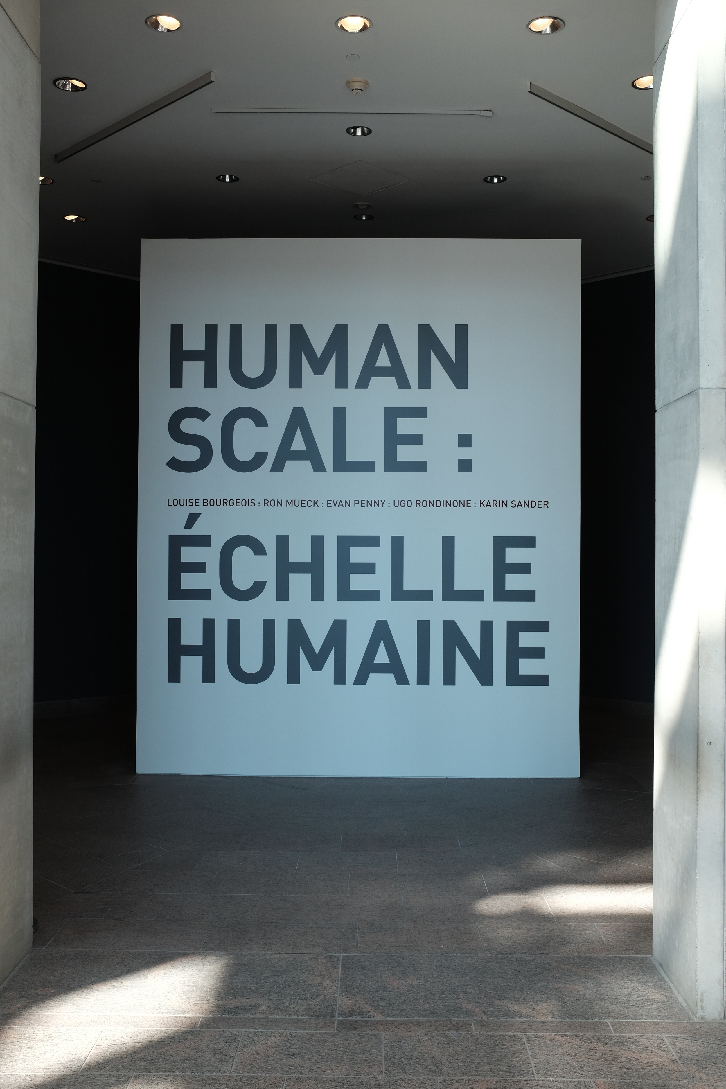
The first visit was to the National Gallery of Canada in Ottawa to see, among other things, an exhibit called "Human Scale." The exhibition is designed

to explore the evolving relationship between the body and sculpture through the work of [...] internationally renowned artists. It reflects upon the persistent question of scale in sculpture, as contemporary artists adapt to new materials, means and technologies for figurative representation. The works on view each vary dramatically in size and proportion, making for a provocative exploration of the physical, psychological and expressive character shaping what it means to be human. (source: Human Scale exhibit web page)

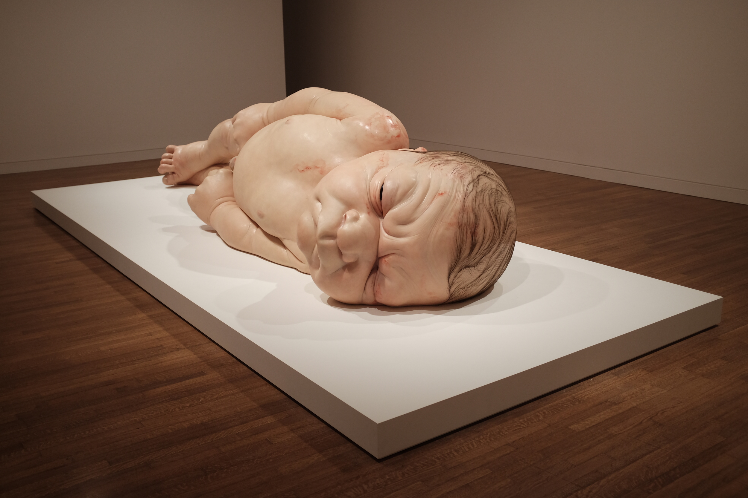
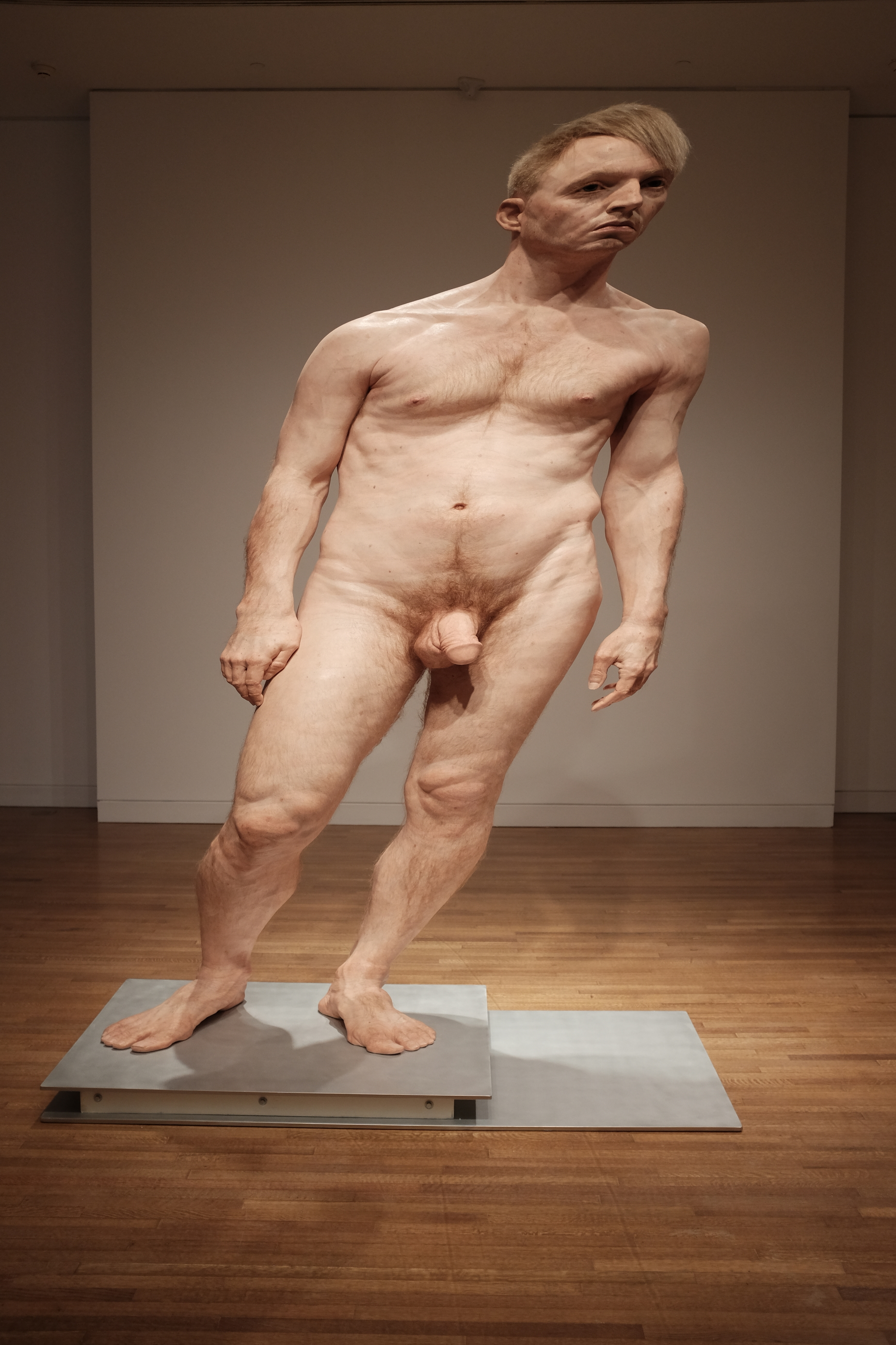
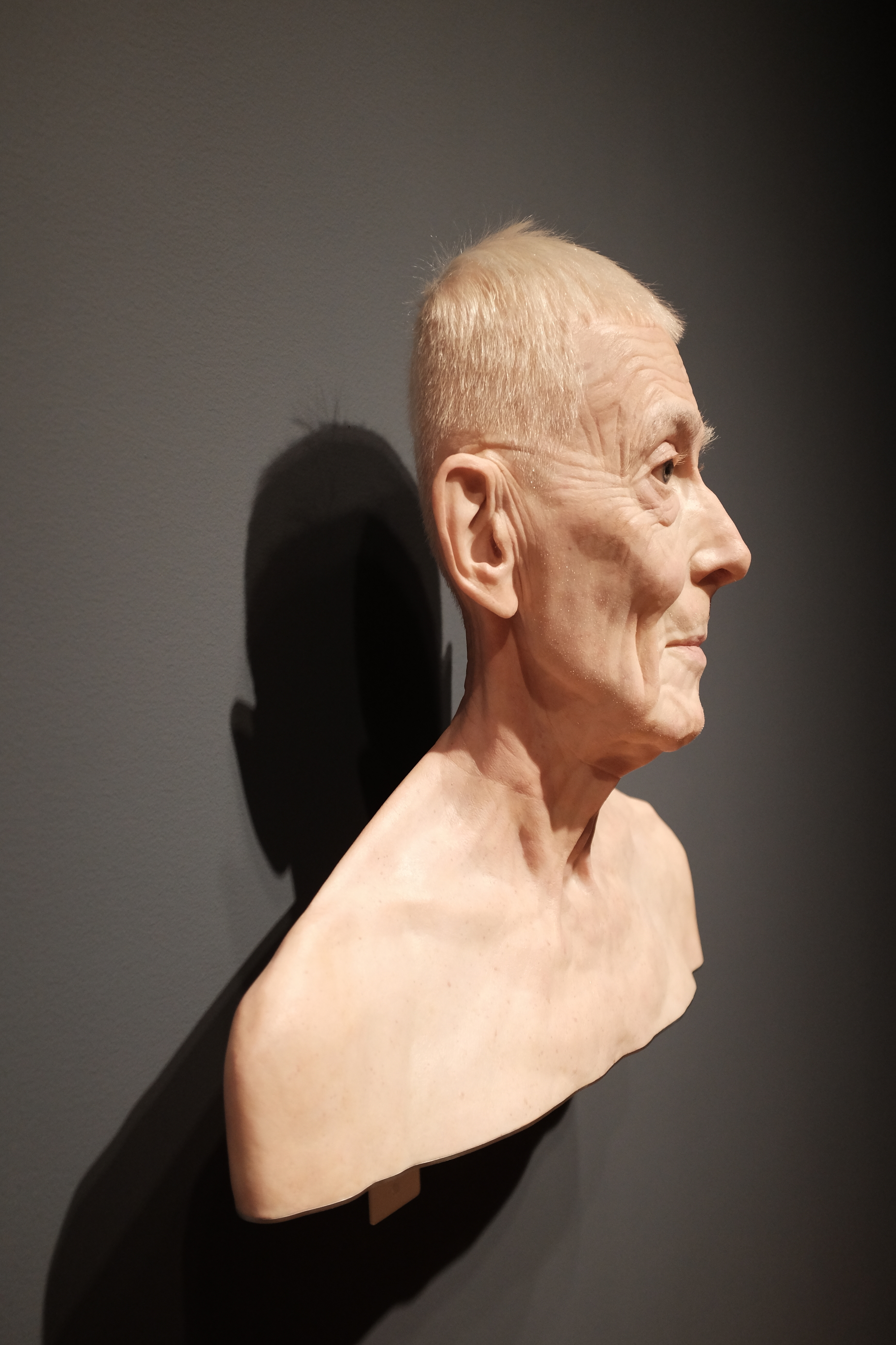
The artists in question are Ron Mueck, Evan Penny, Ugo Rondinone, Karin Sander and the late Louise Bourgeois. Mueck's large-format wood, wire and latex constructions are startlingly realistic—they are often referred to as "hyperrealistic"—and the impression they leave on the viewer is striking. Their scale and accuracy invite us to step up close and examine tiny details in a way that we might not observe a real person. And yet we would not be surprised to feel warmth radiating from the skin, see blood pulsing through the veins and hear breath coming from the nostrils of the oversized newborn portrayed by A Girl. (In fact, a toddler at the exhibit wandered up to the gigantic creature many times her size, pointed and said "baby!"). The sculptures by Evan Penny are also slightly larger than life but it is not their size and accuracy that capture attention, but the way that they have been scaled so that their perspective is slightly "off." When viewed from one angle all seems well; when viewed from a slightly different standpoint the human form has clearly been distorted. The effect is unsettling and shows how much we take for granted in the way we usually view the human figure. And that might be the real benefit of such works: although Mueck's work has been criticized as a "parody" of the body, he and the other artists at this exhibit succeed in making us reconsider the wonder of our own ordinary embodiment.


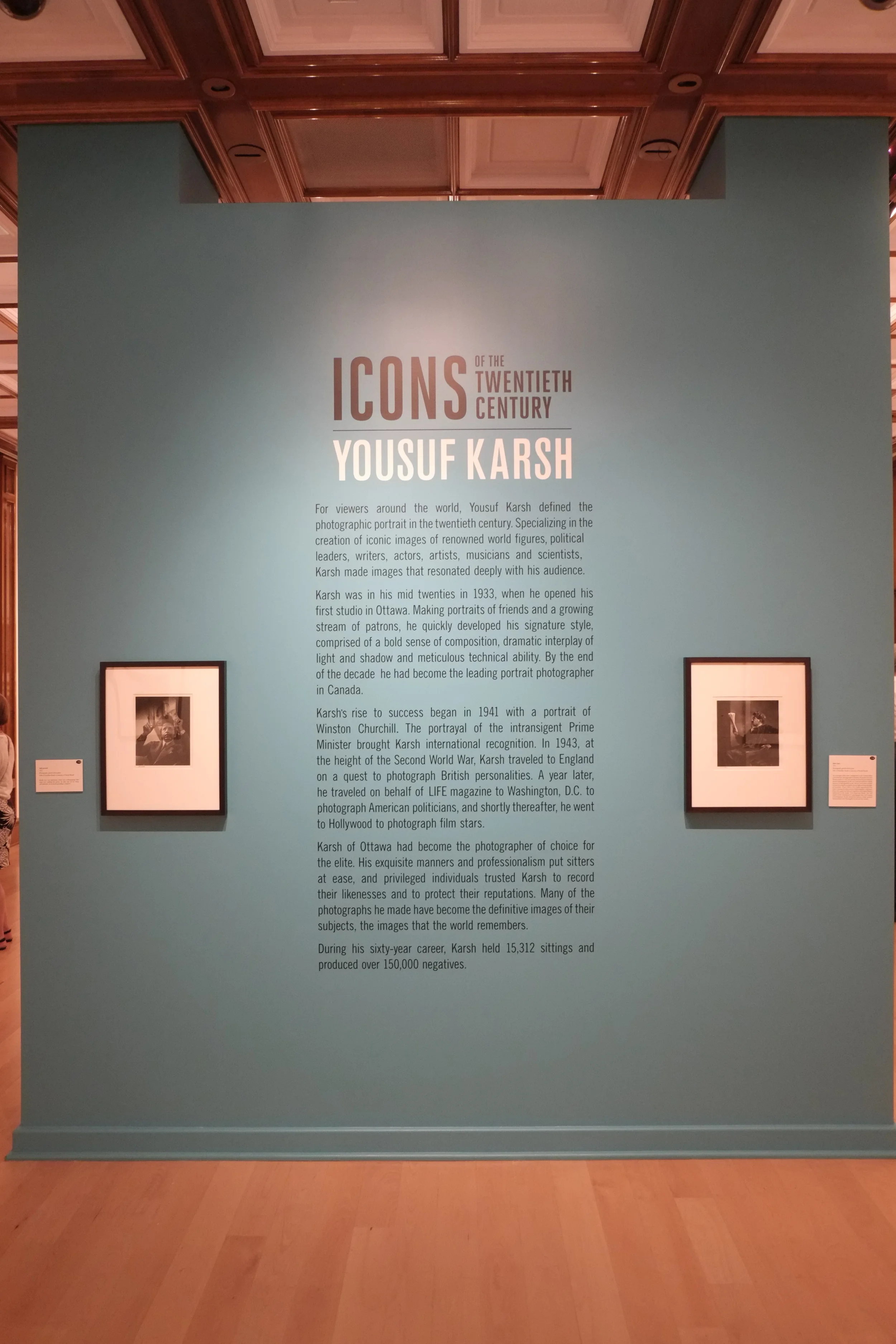
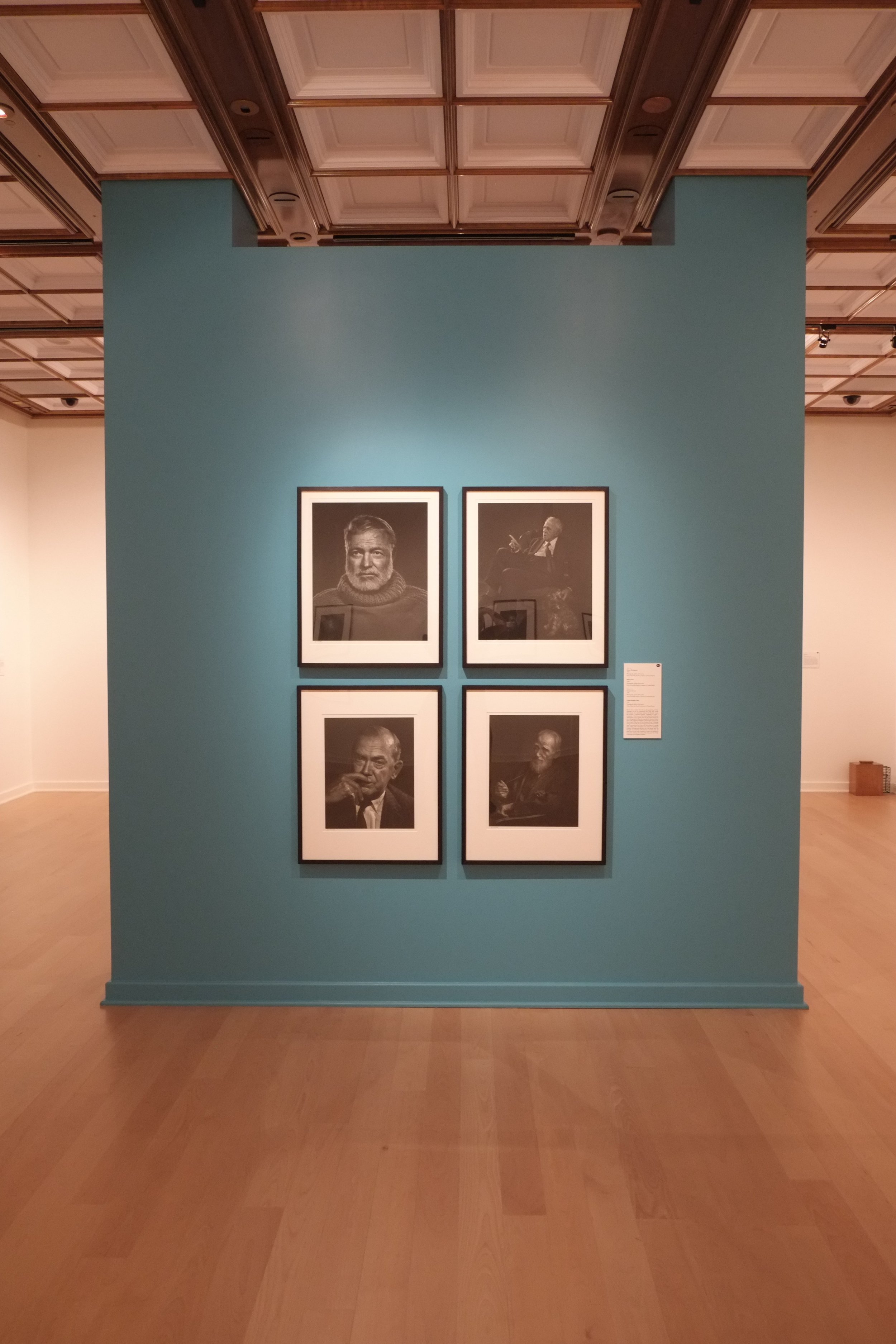
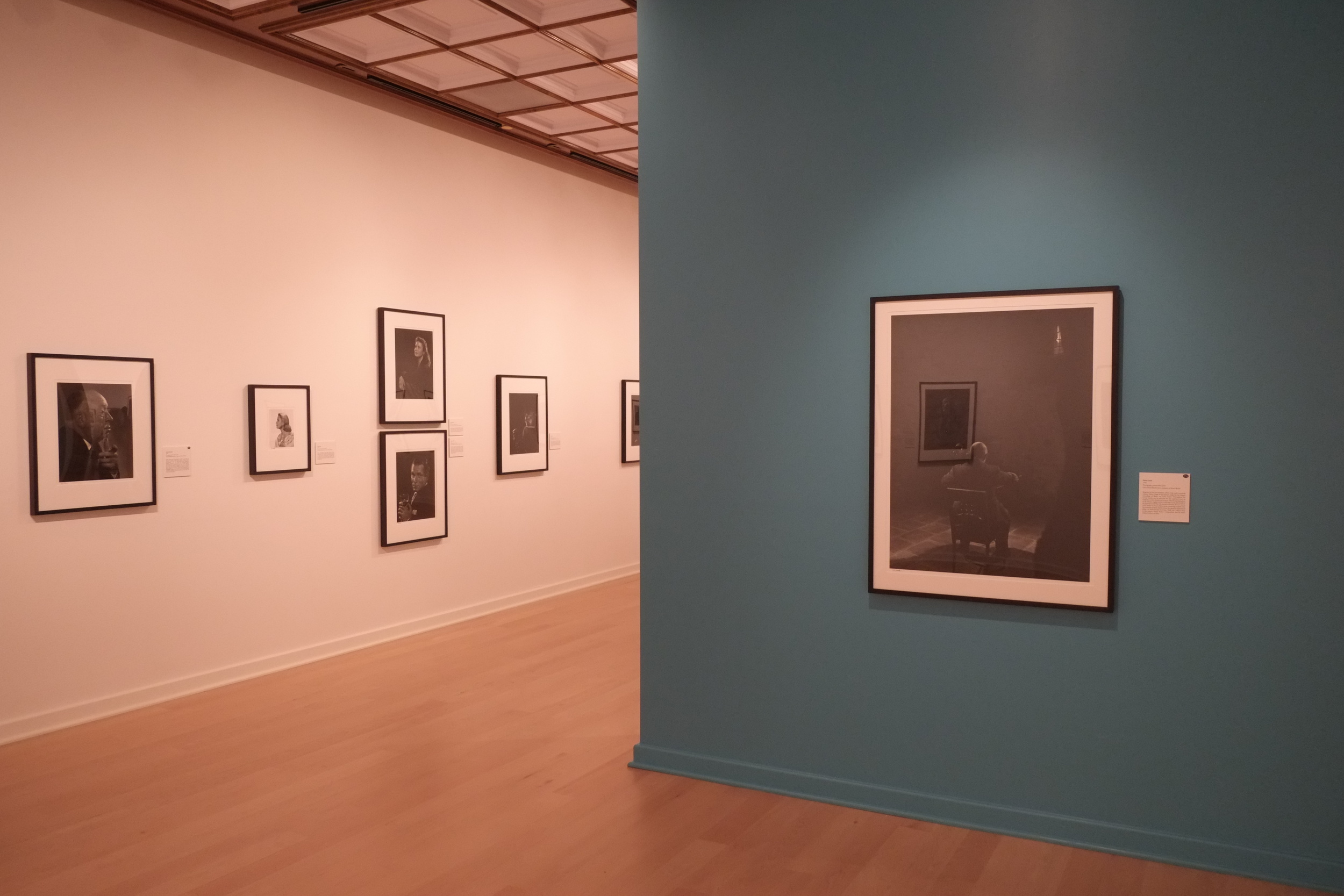
The second visit was to the Bellago Gallery of Fine Art in the Bellagio Hotel, Las Vegas. Gambling is of no real interest to me so I was looking for something else to do during my down time on a recent business trip to the city. I was very pleased to hear that not only was there an art gallery on the Vegas Strip, but that there would be an exhibit of photographs by Yousuf Karsh, the Canadian portrait photographer.  Like most people with an interest in photography, I am very familiar with reproductions of his work in books, but I have not had many opportunities to see his large-format prints in person. The fact that Karsh plied his trade in Ottawa also made for a nice local tie-in for me, so I ordered a ticket to see "Icons of the Twentieth Century."

The gallery is a very small facility comprising just two rooms, well back from the street on the ground floor of the hotel. It's not an easy place to find in a complex the size of The Bellagio. But the size of the gallery is not at all the problem: it's the lighting. It is impossible to view the Karsh photographs properly. There is so much glare from the harsh overhead lights that is impossible to view any of the beautifully-printed images without seeing light flares or the reflections of visitors in the glass covering the images. The images themselves are large, with the very smallest being 11x14" and the more common size being 16x20" or larger. Each contains a character study designed to reveal something of the personality of the sitter and, although the style belongs to another era, the work stands among the best of its kind for its time. On close inspection it is possible to see that they have been printed with great care, with clean highlights, wonderful tonal range and deep, rich blacks. This is what viewers have come to expect of a Karsh image (and pay to see!), but the experience is marred by the distracting lighting and presentation of the work.


The third visit was also in Las Vegas: a night-time tour of the Museum of Neon, more colloquially known as the "Neon Boneyard." The site is the last resting place for many of the famous illuminated signs that lit up the Vegas Strip in the 50s and 60s. Rather than sending the signs to a scrapyard or recycling facility, they are being preserved in the dry Nevada air by a non-profit group keen to celebrate local history and... art.  Although perhaps not site-specific in the strictest sense of the term, the signs flourished in the desert city and have a credible claim to being a distinct local art form. Part of what made (and makes) The Strip the experience that it is, neon was employed in Las Vegas on a scale and with imagination seen in only a handful of places. It is now yesterday's technology, having been largely replaced by cheaper, more reliable and ultimately more flexible video screens.


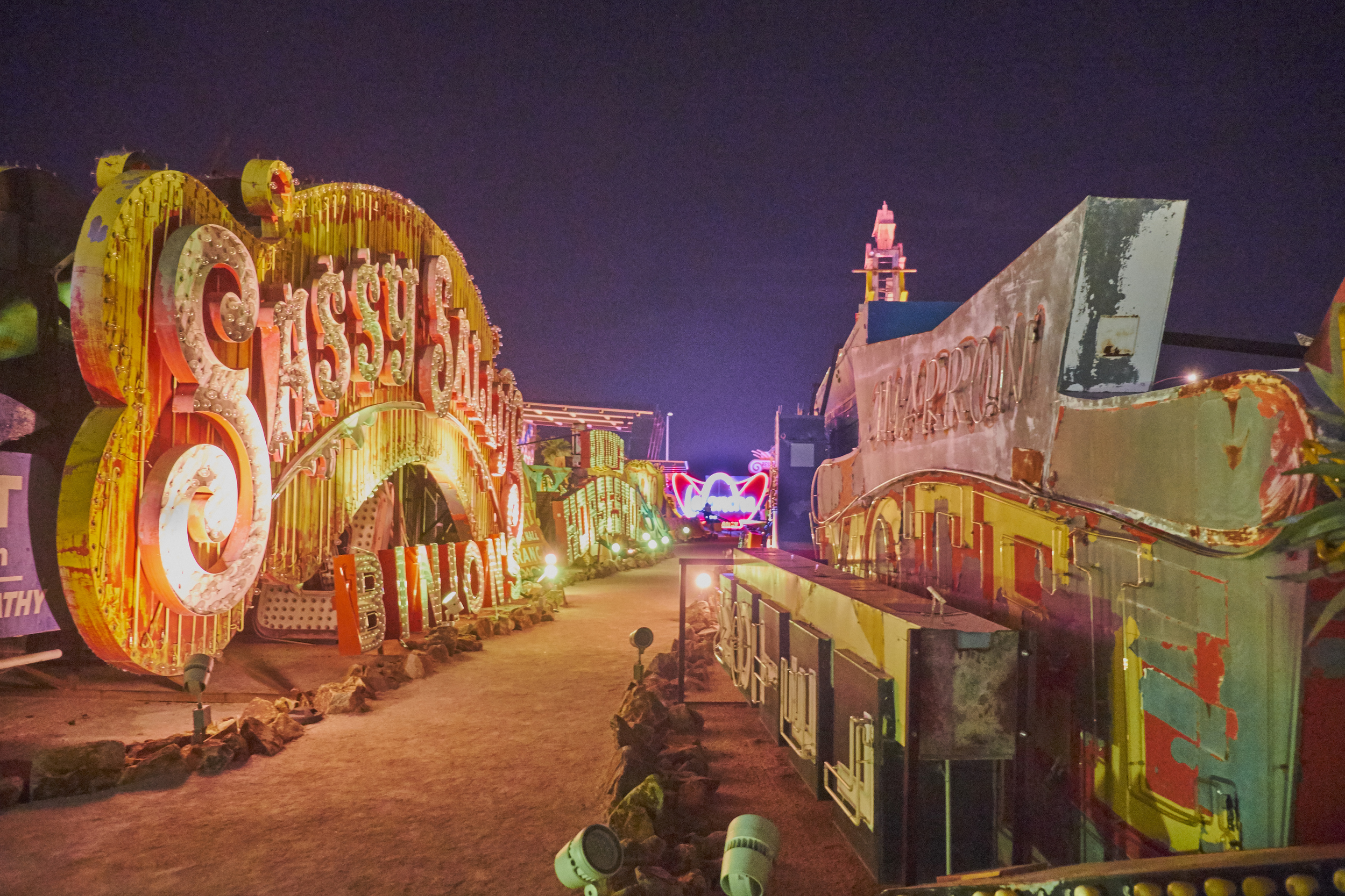
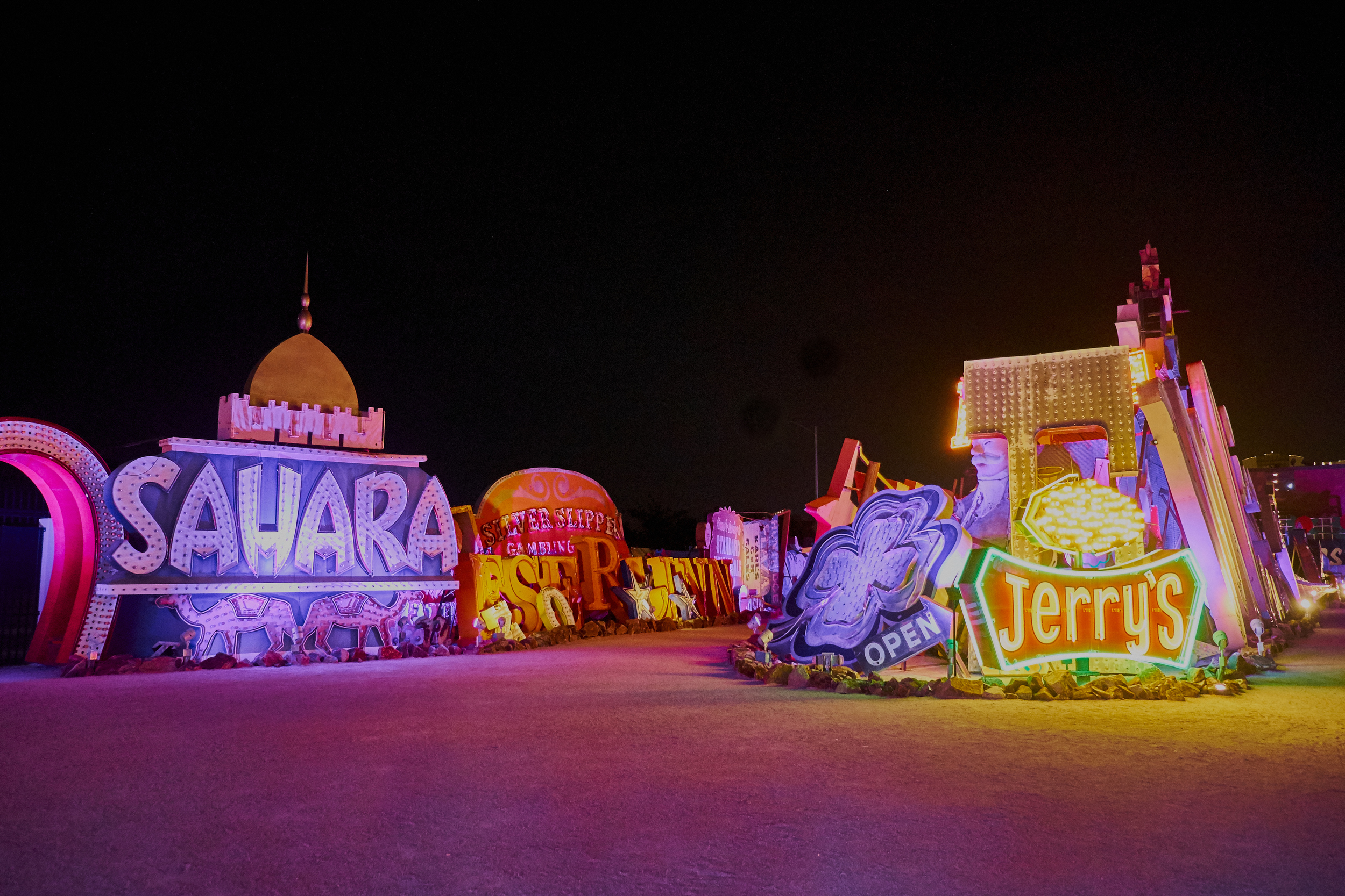
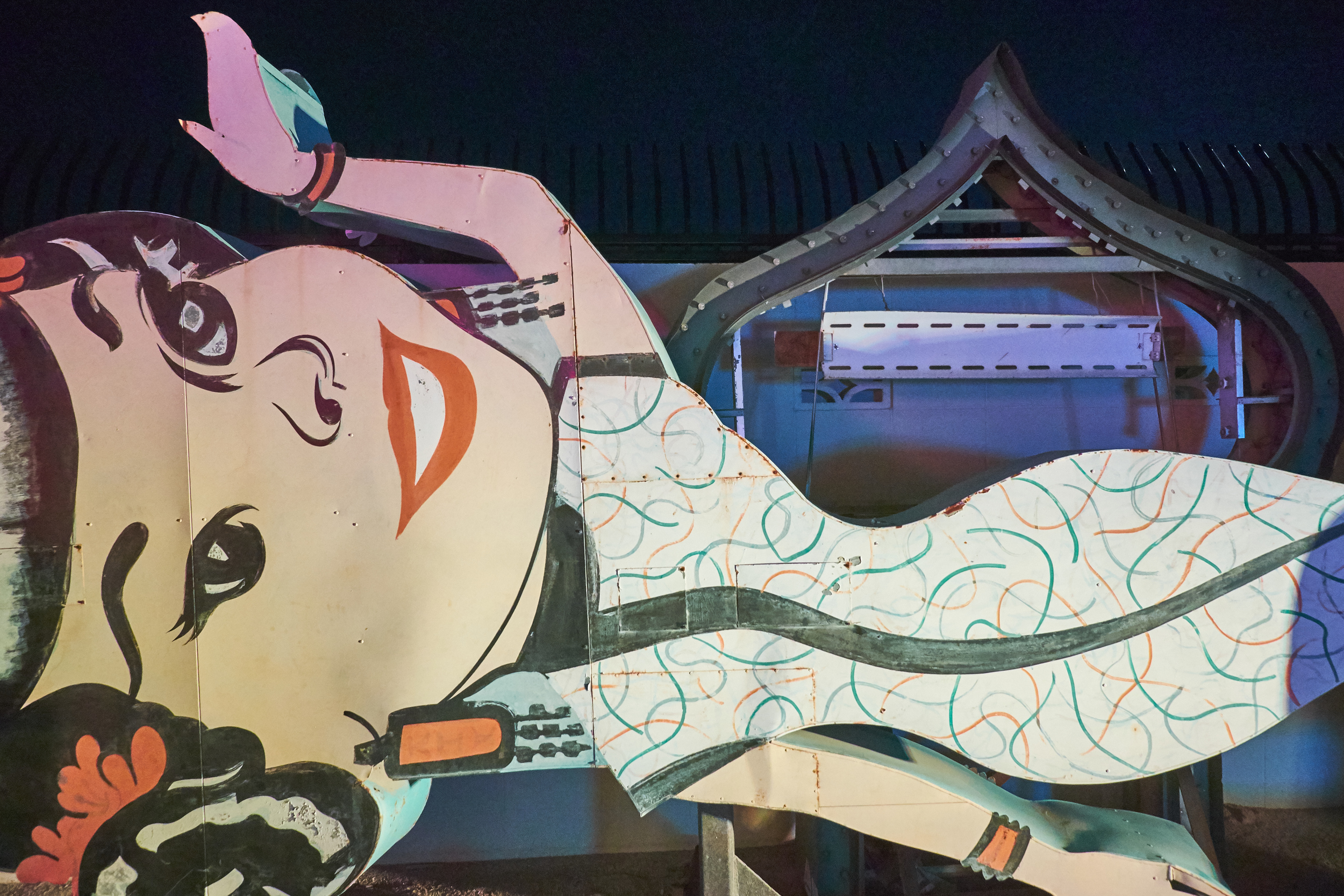
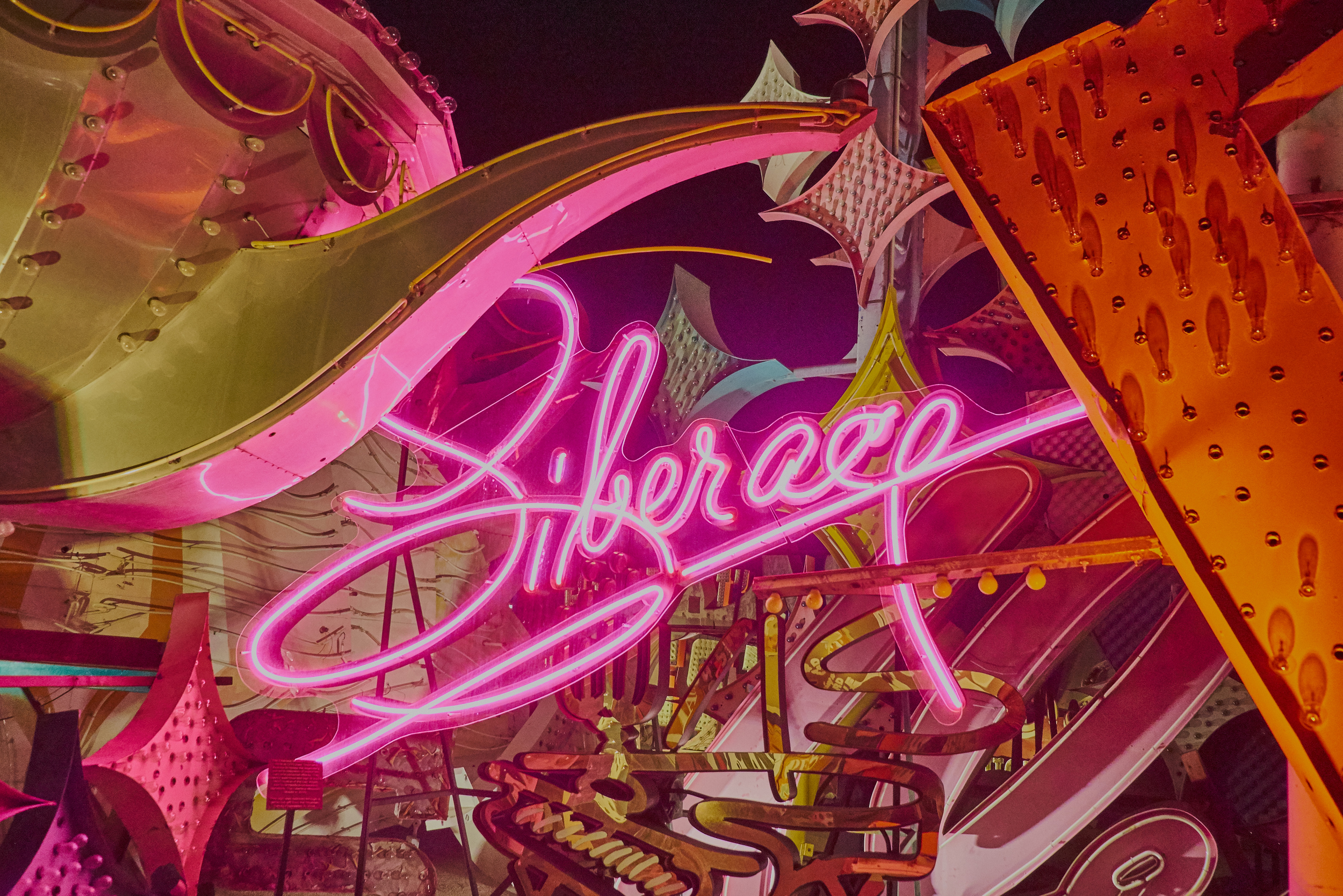
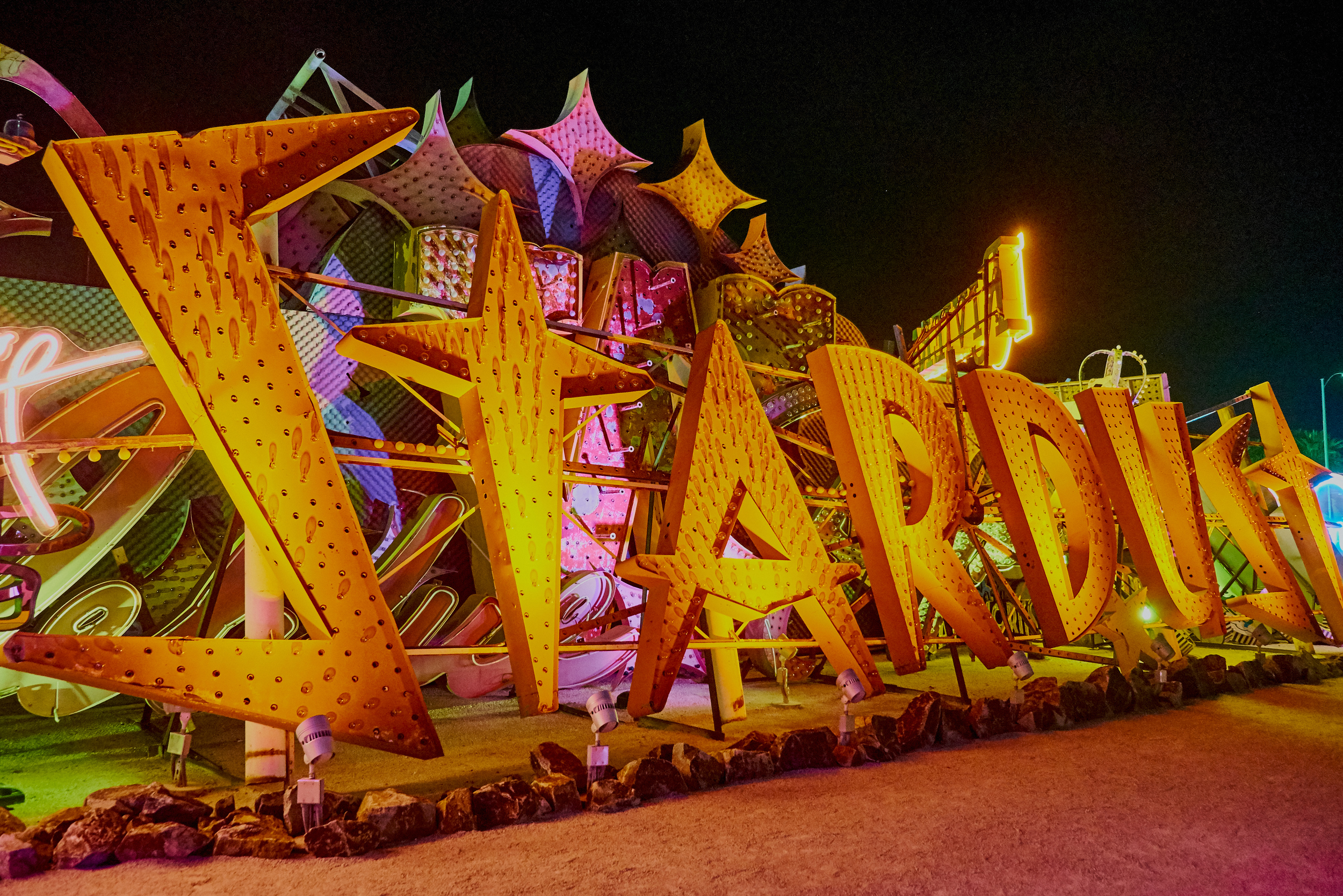
The site itself is a two-acre fenced lot containing a large number of signs that appear to have little order in the way that they have been displayed. Nevertheless, a certain number have been illuminated and turned toward the walkway in a fashion that shows the placement is not entirely random. The signs are constructed of sheet metal and painted in bright colours that supplement or contrast with the neon or incandescent bulbs they hold. Some of the neon signs are "animated," but most contain static lighting displays. All of the signs are intended for commercial advertising, with some simply announcing a service or business and others being more complicated and imaginative in design. The more interesting signs are those that try to convey a sense of style or excitement about the establishment they announce. This is the era of "Mad Men" at its colourful, gaudy best. The museum members had originally planned to restore the signs to their original state wherever possible, but it became clear that this was neither possible (because of costs and availability of materials) nor desirable (visitors to the museum repeatedly said that they liked the patina of age and exposure on the objects). It would be nice for visitors to be left to their own for a few minutes to linger over the design and craftsmanship of the signs, but all visits are guided and kept on a tight schedule. Because the visits are guided, there is also non-stop commentary from the guide.

Exercise 1: Exploring 'place'

‘Place – The First of All Things’, an essay by Tacita Dean and Jeremy Millar (pp.11–26)

The essay provides a conceptual and theoretical introduction to understandings of "place" and begins by walking through some basic definitions before moving looking at how the concept has evolved over the centuries.

Dean and Millar use "place" in a technical sense that goes beyond a simple understanding of location of an object or place in space. In fact, much of their discussion has to do with distinguishing "place" from "space." In their use, "space" has more to do with attributes of physical location or presence, while "place" has overlays of meaning, value and interpretation. Along this line, they go so far as to suggest that "[o]ne might even argue that a landscape ceases to exist if there is no one to look upon it" (p.13). Space might just be there, but place has to have relationship and meaning or order.

The relationship to a viewer or interpreter means that "place" is also touched by time, whether by simply becoming familiar (one way that "space" becomes "place," p.14) or by association with particular events.

There then follows a discussion of how developments in theology, philosophy and science gradually inflated the understanding of "space" and downgraded appreciation of "place." God could not be less than the space He created, so it was posited that a limitless God implied an infinite space. Space, then, became the stage for expanding imaginations and exploration, while place seemed diminished by comparison.

The notion of "place" was never completely eclipsed, however, and came back into its own at least partially because of romanticism. More importantly, "place" still had interpretive power to help people think about human experience and meaning: 

As such, we must recognize not only that there are fundamental differences between place and space, and place and site, its modern replacement, but also that there are many places within place, many regions, each with their own identities, dialects and dialectics.
— Dean and Millar, p.15

And those places have interesting qualities—they can change in meaning over time and can relate to one another through overlap and interpenetration.


Overall, I found this to be a very useful article that helped me to think differently about the importance of "place" in art (and in other ways, too). I have to admit to rolling my eyes in the past when I would read yet another artist statement about "exploring space," but I've gained a new appreciation for the concept.

My only real quibble is that I think Dean and Millar are a little hard on the Enlightenment philosophers who gave greater weight to "space" than to "place"—this was an age of exploding knowledge and exploration in all the sciences, after all.

I will want to think more about a number of the ideas they present. For example:

  • the role of time, meaning and value in defining "place" helps to underline how two or more people can inhabit the same "space" but not necessarily the same "place."
  • a single space could constitute multiple "places" even for the same person, depending upon the interpretative lenses he or she chose to wear.
  • the idea of "thresholds" is very helpful in suggesting how different places can relate to one another without marking hard boundaries between them. There is not necessarily one "place" beyond which is limitless and unknowable space: there can be limitless "places" beyond, all shifting and changing in size and meaning, like soap bubbles running over one another.

All told, a good piece for generating some fresh ideas for me!

Grayson Perry — "Beating the Bounds"

The second of Grayson Perry's Reith Lectures explores the boundaries of art: what sort of things do and do not qualify as contemporary art? 

Perry acknowledges that establishing the limits of art is not easy and that "art" itself has only existed as a self-conscious category for the last few centuries. And although anything can be art (for example, Duchamp's Fountain), art can stop being "art." If this is the case,  there must be boundaries even if these are sometimes emotional in nature rather than intellectual. And we want to know where the bounds lie. As Perry says, "I want to know when to put on my art goggles."

To help us do that, Perry proposes eight tests for art: 

  1. Is it in a gallery or art context?
  2. Is it a boring version of something else? 
  3. Is it made by an artist? 
  4. Photography is problematic: is the subject smiling? Is there any staginess?
  5. The Limited Edition Test: "if something is endless it gives away some of its art quality." 
  6. The Handbag and Hipster Test: who is looking at it? Is there a queue? 
  7. The Rubbish Dump Test: would anyone notice it and pick it up? 
  8. The Computer Art Test: would it cause anyone to pause and think rather than click through? 

No one test is sufficient to establish the "art"label, but Perry sees them forming a Venn diagram "and the bit in the middle is art."

I think that, while we might quibble about one test or another, this is a helpful approach to identifying art. It combines a cluster of judgements that take in the creator, the created object/event, the venue and the audience(s). And although Perry doesn't mention it, it also acknowledges implicitly the role of time: if a piece is "a boring version of something else," enough time must have elapsed for multiple versions to have been created and become boring. The audience/response tests (numbers 6, 7 and 8) also presuppose that an audience has had time to gather and make judgements. Some of those judgements will stand the test of time; others will pass quickly.

As someone with an interest in photography, I'll need to chew on number 4 a bit more. I think this is the weakest of Perry's tests, but it reflects some of the lengthy discussion about the art status of photographic work. Perhaps part of the answer is that a photograph is just as susceptible to Perry's other seven questions as any other piece of work. It would then be up to him to demonstrate why photography doesn't fit his Venn diagram. If a urinal can meet the tests, why not a photograph?

Grayson Perry — "Democracy has bad taste"

I've just listened to the first of Grayson Perry's four Reith Lectures delivered in 2013. From the BBC podcast it sounds as though the lecture was great fun for all involved and Perry made a number of important points while entertaining his audience.

Through the series Perry promises to give his hearers some "tools to understand and appreciate art" from the standpoint of a practitioner rather than a member of academe. He suggests that the art world is often a "closed circle" and believes instead that "anyone can have a career in, or enjoy, the arts."

In this first lecture—"Democracy has bad taste"—Perry raises three questions related to quality in art:

  1. How do we tell if something is good?
  2. Who tells us?
  3. Does it matter?

Some of the biggest challenges arise from conflicting criteria for quality and a perceived tension between popularity and quality. "Quality," then, often breaks down to what Perry suggests has become an "empirical measure of art": the market. And the market's assessment depends on a series of actors who "validate" the quality of art: artists themselves, critics, the media, the public, collectors and dealers. Above them all come the curators who decide which art if of "museum quality."

"Seriousness" can be another measure of the quality of art, but Perry sees a couple of problems with this approach. One is that modern artists have been far too self-conscious about producing "art" and have become captive to complex theory and "international art English" to justify their work. Another problem is that the category of "seriousness" is not helpful when trying to assess some activities, such as participatory art.

Perry ends his lecture by suggesting that perhaps art is good when "enough of the right people think it's good" and that "good taste works within a tribe."

I think that Perry is on to something that helps us to bridge the gap between objective and subjective measures of quality. The decision that something is "good" doesn't just come down to anyone's opinion ("what I like"); it also depends on a gradually settled opinion among several broad groups of people in the art world. Ideally, these different groups will have seen enough art and considered it deeply enough that their opinions will be well-informed. As Perry says in answer to a question after his lecture, "should we expect to understand art right away?"

This also brings us back to the overarching theme for this course: time and place. A settled opinion on quality takes time to develop among particular groups of (hopefully informed) people. But settled opinions can change over time, so what was "museum quality" in one era might not be seen the same way in another.

All told, the lecture was provocative and a lot of fun, so I think I may end up listening to the remaining three in the series. Good stuff!