Read—The art world demystified

A handy little volume full of practical advice from artist, teacher Brainard Carey on how to gain access to curators, gallerists and collectors. The art world looks impenetrable to outsiders but, with guidance from someone who has clearly learned from experience, getting through the door looks doable. And it shouldn't be a spoiler, but a good part of working with those who make up that world comes down to...gasp!...networking and building relationships with other people.


Very glad I read this and I look forward to reading and watching more from the author.

Reference

Carey, B. (2016) The art world demystified: how artists define and achieve their goals. New York: Allworth Press.

Printmaking I

I recently took a short, part-time course during the summer session of the School of the Photographic Arts: Ottawa. I did this for two reasons:

  • To improve my printmaking skills: if a photographic print is to be the output of all or most of the work I produce, I would like to be sure that I am creating prints of high quality. This is all the more important if I am hoping to exhibit or sell printed work at some point. I realise that a lot of what I produce is only ever seen on a screen and that I would like to change this.

  • To help me build my network in the photographic arts community in Canada: one of the clear benefits of studying with the Open College of the Arts is that it can all be done on my schedule without having to relocate. This was particularly important to me because I still had a busy full-time job when I began my studies. And the exposure to UK-based photographers and fellow students has been wonderful. The downside, of course, is that I probably have more connections outside of the country I live and work in than I have within it. It has also been an occasionally isolated road, especially during the last two COVID years. I prefer to work on my own, but even I have my limits.

One of my images I worked on and printed during Printmaking I.

Although Printmaking I only lasted for five three-hour sessions, I found it a real tonic:

  • I learned new techniques and processes to improve the quality of my prints.

  • I was exposed to and impressed by the power of Adobe Photoshop (although I am much more comfortable with Capture One and will continue to use it to edit and print my images. I also own Affinity Photo and will use it to perform any edits that Capture One cannot handle.)

  • I made a connection with SPAO, a small but well-respected school of photography that is the centre of a vibrant community of students and practitioners.

  • I met an excellent instructor and two enthusiastic students who are on their own artistic journeys.

All told, an excellent investment in time and money!

Robert Adams—Beauty in Photography

This is a straightforward little book of essays that is both very accessible and profound. Robert Adams is a well-known photographer of the American West and was an exhibitor in the New Topographics show that influenced the course of contemporary landscape photography.

Speaking about beauty in art has become somewhat taboo, so it was refreshing to read a defence by an established artist. It is also helpful that Adams provides examples from his own work and the works of others to make his points—it is clear that his idea of beauty is neither saccharine nor sentimental. Instead, he sees beauty in those works of art that reveal form, an order or coherence that underlies all things. I was concerned at first that ‘order’ or ‘coherence’ might be construed in an overly rigid, traditional way, but this was not the case: there is plenty of allowance for scope, diversity and ‘newness.’

Some highlights for me:

  • “Landscape pictures can offer us, I think, three verities—geography, autobiography, and metaphor.” (Adams, 1996: 14)

    I think this is a helpful set of categories for thinking about what landscape images offer us: a record of what a location looked like at a given time; an insight into the one who made the image (what is important in his/her mind? what moved them to make this image in this way?); and a chance to think about what the image points to beyond itself, perhaps to more universal categories and stories. I will try to keep this in mind as I look at and make landscape images from here on.

  • “… we would in most respects choose to spend thirty minutes with Edward Hopper’s painting Sunday Morning to thirty minutes on the street that was his subject; with Hopper’s vision we see more.” (Adams, 1996: 16)

    I hadn’t thought about this before, but I suspect that it is true. We could spend time on that street trying to take in all its details, but not see what was true or important about it. At its best, art should enable us to see more. And better.

  • “William Carlos Williams formulated the only resolution that is fully acceptable from an artist’s point of view: ‘No ideas but it in things.’ […] philosophy can forsake too easily the details of experience.” (Adams, 1996: 23)

    I take this as a warning to myself to remember that art consists in the creation of things. Even abstract thought has to come to some kind of expression for it to be art.

  • “If the proper goal of art is, as I now believe it, Beauty, the Beauty that now concerns me is that of Form. […] Why is Form beautiful? Because, I think, it helps us to meet our worst fear, the suspicion that life may be chaos and that therefore our suffering is without meaning.” (Adams, 1996: 24–25)

    This hangs together throughout the book as Adams’ view and, as mentioned above, I was initially worried that this might be cover for a too-positive view of the world. I now see that Adams’ approaches beauty much more broadly and does not shy away from unappealing sights, as his own images of tract housing on once-pristine land show. I suspect that for Adams even sights that are repellent could show beauty of a sort, if they witness to some underlying form or truth. And art shows beauty and form through abstraction and simplification. (Adams, 1996: 25)

  • “For a picture to be beautiful it does not have to be shocking, but it must in some some significant respect be unlike what preceded it (this is why an artist cannot afford to be ignorant of the tradition within his medium). If the dead end of the romantic vision is incoherence, the failure of classicism, which is the outlook I am defending, is the cliché, the ten-thousandth camera club imitation of a picture by Ansel Adams.” (Adams, 1996: 27)

    I think this expresses well the challenge of walking between the temptations of novelty for the sake of novelty and simply walking down the same well-worn path: enough newness to say something fresh and interesting, while remaining part of an ongoing conversation.

  • “An artwork should not appear to have been hard work. I emphasize ‘appear’ because certainly no artwork is easy to make…” (Adams, 1996: 28)

    To my mind, this means that the work should call attention to itself, rather than to its maker.

  • “Is Truth Beauty and vice versa? The answer, as Keats knew, depends on the truth about which we are talking. For a truth to be beautiful, it must be complete, the full and final Truth. And that, in turn, leads me to a definition of Beauty linked unavoidably to belief.” (Adams, 1996: 32)

    This is a trickier statement to unpack and it appears to be tied to Adams’ Christian faith. Where it is useful to a broader audience is the discussion that follows, where Adams distinguishes between the beautiful, the true and the significant. A significant picture can be important but not beautiful, because it does not tell the full or ultimate Truth.

  • “…it is harder in photography than in painting to establish a recognizable style; this leads to desperate efforts to establish a style at any cost and in turn to the creation of technically accomplished but otherwise empty pictures that anger those who must write about them.” (Adams, 1996: 52)

    I am sympathetic to this assertion and I think that what Adams says might be even more true in the era of digital manipulation. I see a lot of ‘overcooked’ landscape images with unnatural colours and angles of view, but that have been shot a hundred times from the same spot. What is the point? Perhaps style is better built through commitment not just to the medium but also to the subject matter.

  • If pictures cannot be understood without knowing details of the artist’s private life, then that is a reason for faulting them; major art, by definition, can stand independent of its maker.” (Adams, 1996: 55)

    Not much to say about this, except that Roland Barthes would agree re: the death of the author. And biography can’t make up for bad work.

  • “Criticism’s job is to clarify art’s mystery without destroying it.” (Adams, 1996: 57)

    I love this. I wish I had written it. It is also part of Adams’ discussion about why critics should only write about pieces that they love: it is easy but not helpful or satisfying to savage pieces that we don’t like. Adams also quotes with approval the following: “All people in this world are made to give evidence or to signify something. Perhaps it can be said as artists that some are made only to show what surface light does to color… Still others may be here only to reveal the possibilities of the color blue.” (Adams, 1996: 60)

  • “…the static visual arts are not well suited to the direct exploration of evil.” (Adams, 1996: 69)

    Adams makes this claim because he believes that a proper portrayal of evil and its consequences requires time, a narrative that is the property of some arts (fiction, theatre, film) but not others (photography). This may well be true; it is hard to think of effective portrayals of evil in still frames that do not require a greater understanding of a backstory.

  • “And I am worried about the amount of time spent by photographers in trying to revive nineteenth-century photographic technology. There are conceivably interesting uses to be made of almost any photographic method, but so many contemporary enthusiasts for old ways seem to place their faith simply in the value of doing the antique thing once more. The results can be momentarily charming, but they are often finally sad, a footnote to history, arcane and a little saccharine.” (Adams, 1996: 82)

    Ouch. This is connected to Adams’ belief that art has to produce the new and not slavishly copy old masters and what they have done. If we do this we become “advocates” of old artists rather than artists ourselves. Something to watch for.

Of course, readers who do not share Adams’ confidence in an underlying order of all things may not find his arguments as convincing. Nevertheless, they may still benefit from listening to a thoughtful discussion from someone who loves art and the world he portrays. I thoroughly enjoyed the book, even in those spots where I was not fully convinced.

Reference

Adams, R. (1996) Beauty in photography: essays in defense of traditional values. (2nd ed) New York, N.Y: Aperture.

Some thoughts on the current news item

1.       I understand why people are frustrated by how long we have been living with the effects of the pandemic. We are all frustrated, each in our own way. My heart goes out particularly to health care workers, teachers, parents of small children, and to others who have had their lives turned upside-down: the elderly, people with disabilities, the chronically ill, and people with anxieties and other mental health difficulties. It has been a long, hard slog and we are not out of the woods yet.

2.       That we are not out of the woods is amply demonstrated by COVID hospitalization and death rates, which continue to climb in a number of provinces.

3.       I am glad that such a high percentage of Canadians have chosen to be vaccinated to protect themselves, their families and their neighbours.

4.       I am also glad that we live in a country where we have the right to protest and make our views known peacefully.

5.       Parliament is not sitting at the moment, so the only people who will be inconvenienced by blocking streets in Ottawa-Gatineau are... ordinary people who live in Ottawa-Gatineau. Not political decision-makers, many of whom will be in their home ridings across the country.

6.       The U.S. has its own mandate in place that requires truckers to be vaccinated before entering that country. Even if Canada was to repeal its own requirement, Canadian truckers would still not be allowed to enter the U.S.

7.       On September 20, 2021 Canada held a federal general election. During the election campaign, federal response to COVID-19 was a major topic. Slightly fewer than 63% of eligible voters cast a ballot, meaning that more than a third of eligible voters did not. The Liberal party was elected as a minority government. The idea of disbanding the government when Canadians have just had their say on the issue is a strange one.

8.       Most of the responsibility for health care lies at the provincial level, not federal. The federal government does, however, have jurisdiction in a number of areas including protecting our borders and over federally-regulated sectors such as transportation. In other words, most of the day-to-day COVID measures that Canadians have faced have been enacted at the provincial and municipal levels, rather than federal.

9.       The proposal that a 'Memorandum of Understanding' could be presented to the Governor General and the Senate to disband the Government is a non-starter. Neither has the authority to do such a thing, even in the unlikely event that they would entertain the idea.

10.   Political demonstrations are routinely co-opted by individuals and groups with a wide range of agendas. The trucker convoy is no different and it is clear that this is already happening. Sorting out one voice from another becomes difficult.

11.   Some of those voices are recommending violence. They may not represent the majority, but they don't have to and people can still get hurt. Or worse.

12.   Those who encourage violence, verbally or financially, are no less guilty than those who commit it.

Theatre of the self

As I looked through the few images that were available to me from the family photographs in my possession, it occurred to me that many of us look for several things in albums: to remember, to show (to ourselves or to others), to look for meaning and clues to our own identity and significance.

This last item—the search for meaning—seems to be particularly important, given the number of people who pay strangers to pick through their DNA samples to help support personal narratives… or to create new ones (“so that’s why I like seafood—I’m 3% Viking!”).

However much we may pretend that we are good postmodern people and have done away with grand narratives, we really want to know where we come from and what our lives “mean.” For some, family albums are a tool for for doing just that: if I can see those who went before me, I can not only spot a familiar jawline or hair colour, but might be able to identify the source of internal traits like personality, psychology or preferences.

For me, this is where the interplay of “nature versus nurture” becomes important. I might be able to recognize cheek bones in a creased photograph of my great-grandparents and their children (including my grandfather as a toddler), but we have lived different lives, with vastly different expectations, in different times, on different continents. There might be something in our shared nature to enlighten me, but it would involve a lot of projection for one photograph to overcome the impacts of nurture.

I was struck by Soomin Ham’s Portraits and Windows portfolio (Soomin Ham, s.d.) which I came across recently in a magazine article (Montrone, 2021). The images, combined black and white photographs of different generations of the artist’s family, portray well the shadowy influences and presences of those who have gone before. They are still held in memory, but their outlines are less distinct with each passing year and generation.

My ancestors, too, stand like a faded negative behind the arc of my own life, from baby, to young graduate, to retired man. It probably means something, but it’s hard to know exactly what—perhaps it means just as much as I want it to.

Can it be that different for anyone else?

References

Montrone, Donatella (2021) ‘Living Memory’ In: Black+White Photography (255) pp.8–16.

Soomin Ham (s.d.) At: https://www.soominham.com (Accessed 23/10/2021).

Family albums and the digital self

In the pre-digital era, the family album was often something precious because it represented a curated record of a family’s history. When having one’s picture taken was still relatively rare, any photograph of a relative had a certain importance and would likely be kept. As more people had access to cameras and photographs, the album was gradually democratized and a greater number of images were kept, although often in a very selective way. One or two members of a family were likely the “keepers” of the album and decide which processed prints would be kept—not so much for aesthetic reasons, but because they showed person(s) X in location Y. These images were memory aids and it has often struck me how similar family albums look within a certain period, partially because of the technology involved (cameras, film, paper, degradation of images over time) but also because of a desire to document similar people, places and things/styles in similar ways. And as transparency films became popular, the family album could be supplemented or replaced by the slide show.

Although the album was a memory aid, I remember noticing that each picture had a story and how the story could evolve at each retelling. Some parts of the narrative would be suggested by the image itself, while other parts of the story would take on a different flavour depending upon the state of the relationships with the people or places depicted. And some images might disappear entirely, removed from the album if they were no longer part of the approved story. Divorce, in particular, had a devastating effect both on families and in the way they were represented in pictures.

Even if the images seemed to fix particular people, times and places, I noticed more than once that memories could be faulty. With each viewing of the album, family members remembered the image itself as well as the event that it depicted. In some cases, the memory of the image became more “real,” to the point where an aunt of mine had to be reminded that she had not been born when a particular picture was taken, despite her “memory” of the event. The retelling became an important part of the oral history around the artefact, and people naturally wanted to be part of the bigger story.

Digital technology—especially the ever-available mobile phone—has changed the way we tell and remember those stories. In fact, we now “consume” images in volume. We can create photographs with such a low incremental cost that we produce hundreds and thousands of them as ephemera with little expectation of them constituting a “family album.” The closest contemporary analogue to an album might be a feed of photographs on a social media site. And it is a strange side-effect of the digital age that, as image-making technology has improved, the quantity of images produced has increased while their quality seems to have declined. We do not value what is most widely available.

I realise as I write this that I rarely sit with my own family to look at our pictures, although this was a common enough activity when I was young—especially when relatives were visiting and there was a need to make family connections, renew memories and show how everyone had changed. I take it for granted that my wider family will see what I post on Facebook and Instagram and do not give much thought to it constituting an “album.” It may be that my experience is unique, but I doubt it.

Given the role that images have played in supporting family and personal narratives for more than a century, I wonder what the decline of the family album means for an understanding of the family and the self. We still care about “where we come from,” but perhaps more of it is based on psychological concepts of the self and “science” (if the numbers of people submitting DNA samples is anything to go by). Genealogical records may also help us to build a family album from administrative data and we are perhaps freer to construct an idea of the self from our interpretation of the nuggets we like (“No wonder I’m the way I am: I’m 3% Viking and I may be descended from the 23rd cousin of King Alfred!”).

Has the digital “family album” left us more adrift in a sea of data that we can read as we will? Does it undermine our ability to place ourselves in a coherent narrative—especially one that we might share with others—or is it just different? I don’t know.

What does “better” mean?

Like many people who enjoy photography, I wonder sometimes if piece of gear X, Y or Z would be better than what I am currently using.

I have been using the Fujinon 18-55mm f/2.8-4.0 zoom lens since I bought my first Fuji in 2013. I have been happy with it and it has spent a lot of time on my cameras, first an X-E1 and now and X-T3. From time to time it has occurred to me that the Fujinon 16-55mm might not only give me a slightly wider angle of view and a constant f/2.8 aperture, but also access to that elusive beast… better image quality.

Of course, “better” means different things in different contexts.

Rather than wonder about it anymore, I decided it was time to rent rather than take the plunge of buying. Vistek Ottawa makes renting easy and a mere CDN$30 let me use the lens for a weekend.

All told, I liked the lens very much but my two conclusions surprised me.

First, using the 16-55mm for two days reminded me why I decided to invest in the Fuji system in the first place: to drastically reduce the weight of the gear I was carrying, especially when travelling. There’s no question that the 16-55 is lovely piece of gear, but my X-T3 felt a bit front-heavy with it and, frankly, I didn’t think I’d want to carry it around all day. And I was losing built-in Image Stabilization (which I really appreciate).

Second, I decided that if I was ever to commit to carrying around heavier equipment I would only do it if it came with a much larger sensor. The kind of sensor you might find in, say, the Fujifilm GFX medium format system.

So, no 16-55mm for me, but an eye open for Fuji’s forthcoming update to the GFX 50s expected for this fall.

In the meantime, here’s an example of what I got up to with that lens on the weekend. It’s a beautiful chunk of glass, but not “better” for my needs and wants.

Fujifilm X-T3 with Fujinon 16-55mm f/2.8 at 16mm

Fujifilm X-T3 with Fujinon 16-55mm f/2.8 at 16mm

Reflecting on the church

It has been a long year since our first COVID Easter, which we observed virtually. And now we have just observed our second. But with the warmer weather coming and vaccination picking up the pace (slowly) in Canada, I dare to hope that 2021 will be a better year for all of us. And perhaps some of us will remember lessons we have learned during this extended time of reflection.

In that spirit, I offer this picture of the church I have attended for 24 years, a fixture in downtown Ottawa since the late 1800s.

Review — Art and Faith: a theology of making

Fujimura, M. and Wright, N. T. (2020) Art and faith: a theology of making. New Haven: Yale University Press.

I enjoyed Makoto Fujimura's meditation on the theology of making and I hope that it will find an audience beyond those who have an interest in "the arts." While many of his stories draw on artistic practice, particularly traditional Japanese schools of ceramics and painting, there is much here that would be encouraging to a wider range of makers and lowercase "c" creators. I found one of Fujimura's distinctions very helpful: the difference between "plumbing theology" that focuses on trying to fix what is wrong in an effort to return to Eden, and a theology of "New Creation" that is oriented in hope toward the future. And the New Creation is not a repudiation or destruction of creation but its completion, as all that is good not only remains but is raised and perfected.

After reading a number of theologians on the arts, it was refreshing to read an artist on theology. Each has their unique challenge, of course: the theologians tend to write as consumers rather than practitioners, and this artist draws on a fairly small theological pool. The work of N.T. Wright gets a lot of play, but after that a lot of the citations go either to T.S. Eliot or C.S. Lewis. Fujimura makes no claim to be writing a survey of Christian thinking on art, but it seems a shame not to allude to the deep riches that exist in the Catholic and Reformed traditions.

But that may also be a strength of the book: it presents a focused, accessible and meaningful case for the importance of making for all people, not just for artists, not just for Christian artists, or even Christians for that matter. It is natural that all those created by a loving Creator should participate in creation by being little creators.

And if the book could have been longer and provided more scope on the sweep of theological thought on art, I think it could also have been shorter: some themes, such as the tears of Christ, were returned to more often than was necessary to recognize the place of suffering in this life and to avoid any triumphalist impulse. It could also have been better fact-checked: for example, "kalos" is not a Hebrew word; the medieval origins of the word "gospel" do not contain the sense of a good "spell"; and no sources are offered for the existence of "tear jars" in antiquity (are there any?). The author is not an academic theologian but he does have access to enough people who are.

I'm glad, though, that a trained, practising and thoughtful artist has taken the time to reflect deeply and faithfully about art, faith and life. I hope that others will follow and that we will all be able to benefit.

Now, let us all go forth and make. ;-)

Review — The Age of Light

Scharer, W. (2019) The age of light. (First Back Bay paperback edition) New York: Back Bay Books/Little, Brown and Company.


I don’t normally publish book reviews, but I might start with this one because of its potential interest to photographers.

I wasn't entirely sure what rating to give The Age of Light because I'm not certain what the book is meant to be. It's offered as a fictionalized biography of someone who lived in the recent past, a risky enough proposition because there are still plenty of people alive who knew Lee Miller. The author concentrates on Miller's romantic and work relationship with Man Ray, which is interesting in itself but already fairly well documented. So more a romance novel than a biography, but I pressed on because I was familiar with both Miller's and Ray's work and looked forward to learning something about their collaboration and world.

The focus on Miller's time in Paris is interspersed with distracting vignettes of her work as a war correspondent across Europe after D-Day. If these brief chapters are meant to show the arc of Miller's development as a photographer, they don't. Rather than explore her many years as an artist with her own studios in Paris and New York, the WWII material seems to be offered up as an explanation for some of Miller's renown and perhaps as a background to her later depression and alcoholism.

Much of the book appears to be an exploration of the photographer's struggle to become independent of men who have used and abused her and to be taken seriously as an artist in her own right. But art is precisely what is missing from this account. There are long descriptions of Paris, night clubs, food, drinking, bohemian parties, sex and arguments, where the author shows that she he has done her research. But there is not much talk about art. We know Miller's new circle is filled with artists and performers because they are all trotted out singly and in groups: Ray, Cocteau, Baker, Éluard, Picasso, Cocteau, Cahun, Bing... everyone gets at least a cameo. What are they creating? What are they trying to say? What drives them? What do they think about art? life? the world? We don't really know.

So how is the reader to understand Miller's desire to be taken seriously as an artist when the author pays scant attention to art or artists? It left a hole in the middle of the book that the period scenes, sex and emotional wrangling didn't fill for me.

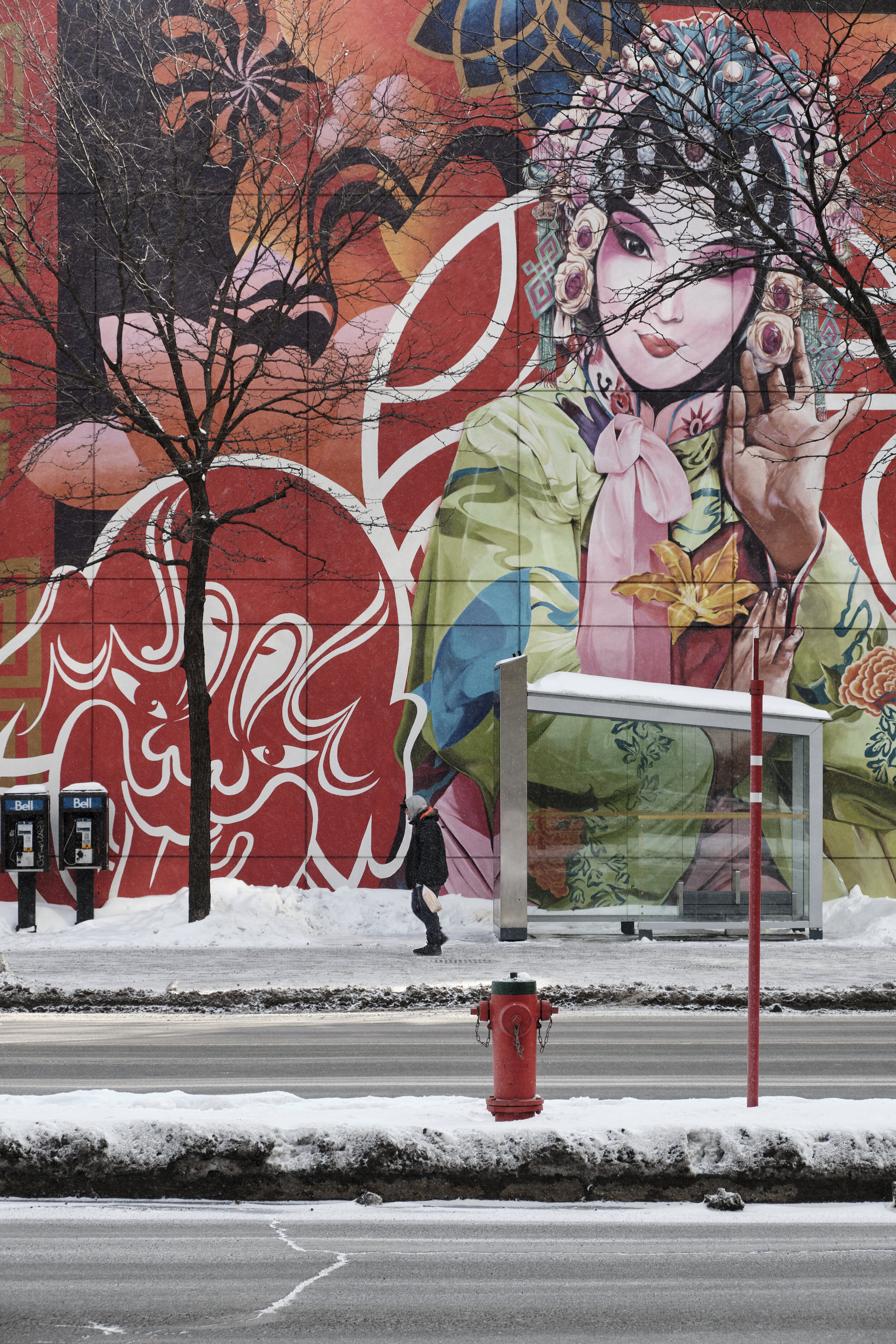
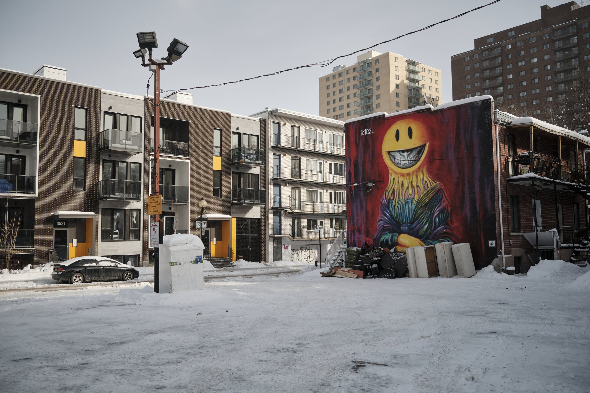
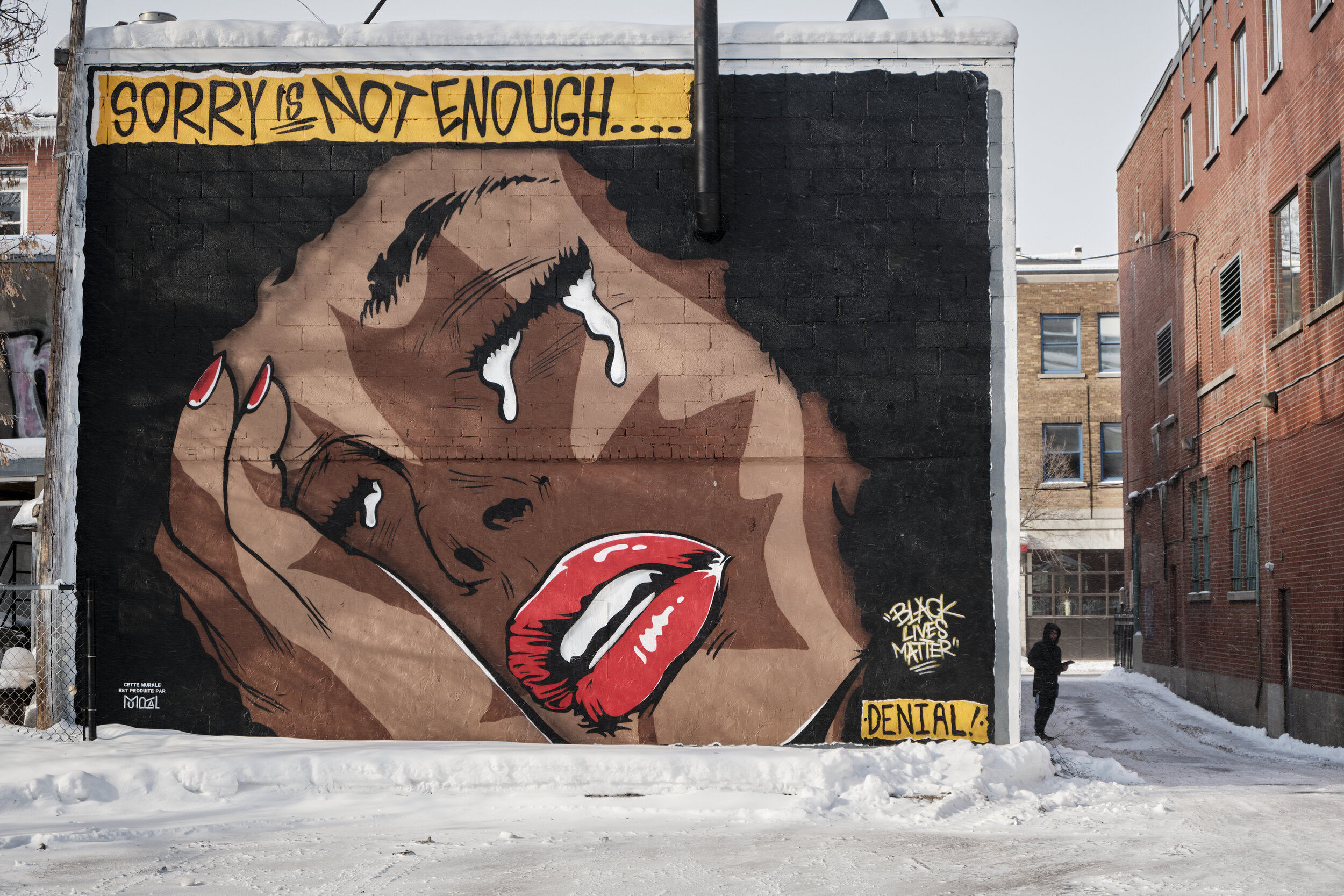
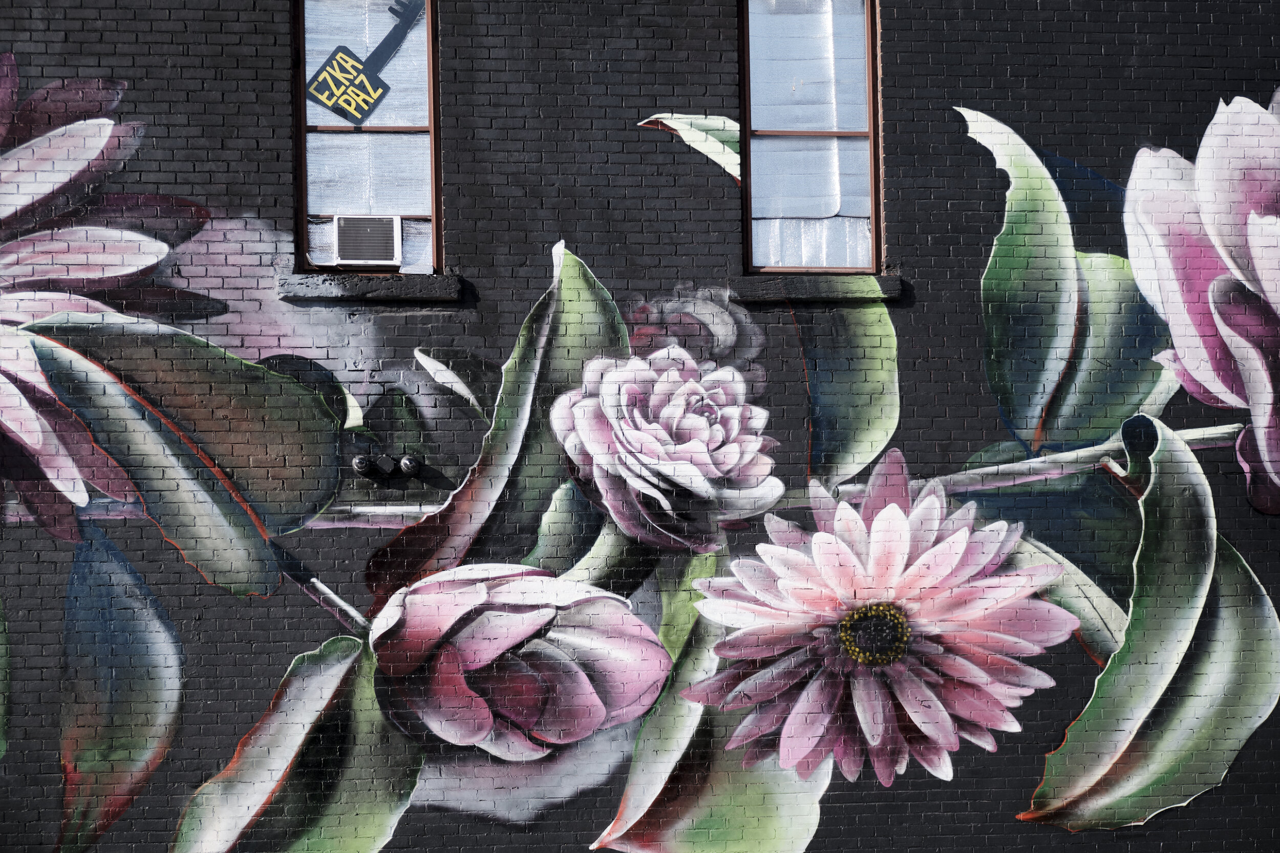
Street art in chilly Montreal

I had the chance to spend a bracing morning recently in Montreal. Well, let’s not lie: “bracing” is far too polite a word for how cold it was. “Frigid” or “bitter” would be more fitting.

Still, a walk on a sunny winter’s day in COVID-time meant that we had the street pretty much to ourselves. It was a treat strolling along Boulevard St-Laurent and taking in some of the street art that is to be found all along the way. It was also another chance to put my new Vallerret photo gloves to the test and they did not disappoint. I’ll likely do a blog post on them once I’ve spent more time with them in different conditions.

The images below were all taken with my Fujifilm X-T3 and 18-55mm zoom, which I find to be a good general purpose lens: a useful variety of focal lengths (mild wide angle to short telephoto), lightweight, with image stabilization.

Alec Soth: Photographic Storytelling

I recently bought Alec Soth’s course on the Magnum Photos website and have been working my way through it. The 19 lessons of uneven length amount to more than five hours of… well, not teaching exactly, but an extended monologue by Soth on his artistic process. It’s less a lecture and more like listening to one side of a conversation. And it works, in this case.

I’ve found it really useful to listen to Soth’s low-key reflections on a wide range of topics related to the creation of his photo projects. Some of these are very well known, like Sleeping by the Mississippi and Niagara, for example, while others have never made it to print. Whatever the case, there is a clear sense of the mind of the photographer at work as he moves from broad concept, to picture-making, to editing his images, to creating a maquette of a book or exhibition, to final product.

I’ve been struck by a number of things along the way:

  • The importance of beginning somewhere, no matter how random it seems. The project can always be refined, but it might begin with something as simple as an observation, a chance comment, a dream or a dart thrown at a map.

  • How desirable it is to have a product in mind, rather than just a collection of images.

  • How useful small working prints are in helping with the culling and sequencing process. I was impressed by how practical this technique is.

  • The need to protect the idea and early stages of a project before showing it to others for input or critique.

  • How important it is to take the final form and appearance into account. An exhibition? What scale and variety of prints? A book? What kind of cover and typeface? What thickness of paper? All of it together is the final work and, while Soth seems a very laid-back individual on camera, he shows a lot of attention to detail in getting exactly the finish and effect he is after.

  • The role of curiosity and serendipity in driving a project forward.

  • The need to let things take their time. Somehow it seems possible to advance a project while not rushing it.

I was wondering if I had made a mistake in buying this series (US$80 on sale) but I found that it grew on me, much the way one of Soth’s projects grows on him. The low-fi blues and roots music also lend a mood to the videos, helping to tie them together and giving the whole thing a contemplative feel. I almost want to say that the music is like a lazy summer day, but that would be an injustice both to the series and to the way Soth works. There is a lot going on under the surface of the river, although it may not all be obvious at first. You have to sit and watch for awhile.

References

Alec Soth: Photographic Storytelling | Magnum Learn (s.d.) At: https://www.magnumphotos.com/learn/course/alec-soth-photographic-storytelling/ (Accessed 19/10/2020).

Soth, A. et al. (2017) Sleeping by the Mississippi. London: Mack.

Soth, A. et al. (2018) Niagara. (s.l.): (s.n.).

Making an effort—Shawville, Québec

A lot of factors have combined to reduce my creative output since mid-March. And they’re the same factors that many people have faced since “COVID-19” entered the global vocabulary: social distancing and isolation, working from home, high workload, significantly reduced opportunity to travel, and a free-floating disquiet connected with a daily diet of bad news on so many fronts.

I have been lacking in motivation.

Still, I have course work to do for my art program and the world continues to spin outside my door. So I made an effort recently to drive to a small town nearby that I had never visited. The town was hosting a printmaking event that involved the creative use of a steamroller on the main street. I haven’t been to a lot of steamroller printmaking sessions, so I went.

And I’m glad I did. It got me out of the house and expanded my mental map of the region I live in.

Ça va bien aller.

A Handful of Dust

On a visit to Toronto, I had the opportunity yesterday to visit an interesting exhibit at the Ryerson Image Centre. Curated by David CampanyA Handful of Dust: From the Cosmic to the Domestic brings together work from a broad range of artists (Man Ray, Marcel Duchamp, Jeff Wall, Walker Evans, Rut Blees Luxemburg, Mona Kuhn and others), all connected thematically with dust. Campany has also published a book of the same name as a catalogue and further exploration of the theme.

The pieces, mostly photographs but with one or two paintings and a couple of video installations, seem to have been selected by Campany as conceptual responses to a photograph by Man Ray (Dust Breeding, 1920) of a piece by Marcel Duchamp. The monochrome photograph looks like it may be an aerial shot of a wasted landscape, but it is hard to get a sense of scale because of the lack of reference points and the uniformity of tone and colour. All the viewer has to go by is line, form and texture. In fact, the photograph depicts a glass plate that had collected a thick layer of dust while lying on the floor of Duchamp’s studio. Viewers are informed that the two artists may not have agreed who was ultimately responsible for the work and later agreed to share credit.

Robert Burley – Implosions of Buildings 65 and 69, Kodak Park, Rochester, NY [#1], October 6, 2007

The selected images are set in two rooms and, apart from a few dust-related quotations painted on the gallery walls, visitors are largely left to derive their own meanings from the display (which I welcomed). The sources of the dust vary—sand, destroyed buildings, human beings—but the overall message is one of human impermanence and mortality: sand covers everything in its path, the built environment doesn’t last forever, humans shed skin and eventually shed their lives.

At the same time, the dust that gathers can both conceal and reveal. It can cover tracks but it can also heighten our ability to see texture and form.

Nick Waplington – from the series Patriarch’s Wardrobe, 2010

I went to the exhibit because I have often appreciated the shows that the Ryerson Image Centre hosts, although I have to admit that I was a bit doubtful because of the subject matter. In the end, I was won over and came away thinking that it amounted to an excellent meditation on aspects of the human condition. The images on display also served to show the power of abstraction and the role of imagination in interpreting  what appears in front of us. In short, the show works.

A side benefit of the visit to the Ryerson Image Centre was a chance to see Extending the Frame: 40 Years of Gallery TPW. The show is a history of the founding and evolution of the Toronto Photographers Workshop (TPW), a group which has worked diligently to advance photography as an art form and has involved such people as Edward Burtynsky, Robert Burley, and the duo of Carole Condé and Karl Beveridge. It was fascinating to see how the dedication of a relatively small number of people has had such an impact on the direction of photography and art more generally in Canada. 

Àbadakone | Continuous Fire | Feu continuel

Àbadakone (Algonquin for “continuous fire”) is the second exhibition “in the National Gallery of Canada’s series of presentations of contemporary international Indigenous art, features works by more than 70 artists identifying with almost 40 Indigenous Nations, ethnicities and tribal affiliations from 16 countries, including Canada.”

According to the National Gallery, “the title Àbadakone was provided by the Elders Language Committee of Kitigan Zibi Anishinabeg. They felt that its connotation of a fire within each artist that continues to burn would be an appropriate title for the second presentation of this ongoing series of exhibitions showcasing Indigenous art from around the world.”

Indigenous art and culture is drawing a lot of attention in Canada and other countries dealing with the history and ongoing impacts of colonization of the “New World” by European powers.

I found the exhibit exciting as it opens up a broad range of discussions that are important not only for Indigenous people, but for anyone who has an interest in place, identity, the construction and evolution of culture, and the importance of narrative for creating and bearing meaning. The introduction at the entry to the exhibit indicates that the broad theme behind its curation is one of “Relatedness, Continuity and Activation.” In brief, this refers to the interconnection of all things, the links across time and generations, and “how an artist animates a space, an object, or an idea through performance, video or viewer engagement.”

(All images taken on my cellphone.)

For me, there were several threads that ran through the exhibit, particularly the challenges of:

  • colonization;

  • industrialization;

  • globalization;

  • environmental degradation;

  • technology;

  • migration; and

  • tradition.

Without taking anything away from the specific issues and questions facing the Indigenous artists who created these works, it seems to me that many of the challenges are also faced by non-Indigenous people. As a result of the challenges I’ve listed above, very few of us can simply take for granted the place where we stand, the identities we have inherited, the histories that have shaped us or the futures that lie before us. In a time of profound uncertainties, it will be important to draw selectively on our knowledge of the past, on our best understanding of our times and on the most promising paths forward. It is fascinating to see that while Postmodernism rejected meta-narratives, we continue to need overarching stories to interpret the past, create meaning in the present and have hope for the future.

Fog-bound in Ottawa

It’s been quite a while since I’ve gone out with my camera with no other purpose than to see what I can see. When I pick up the camera these days, it’s almost always because I am working on an exercise or assignment for my course. An added bonus this time was the chance to meet up with another local photographer—we’ve been connected by social media for a number of years but have just never met IRL. We came close to meeting once, when we were both at the same invitation-only event and didn’t know it.

Yet another reason to push myself out the door—as if I needed another—was to use my new Fujifilm X-T3. I had bought it a couple of weeks back and it was time to press the shutter in earnest. I am still happy with my little X-E1 and it has served me very well, but I wanted to be able to take advantage of the new tech available in the Fuji system.

The weather was uncharacteristically foggy for this time of year, so what a great opportunity to see familiar parts of Ottawa in a less-familiar way.

All images taken with my Fujifilm X-T3 and Fujinon 18-55mm zoom.


Japanese photography at the NGC

Hanran: 20th-Century Japanese Photography” opened recently at the National Gallery of Canada. The exhibit was curated by the Yokohoma Museum of Art and features works by 28 photographers from the early 1930s to the 1990s.

I went to the members’ pre-screening of the exhibit to beat the crowds and so was able to take my time going over the images on display. It was something of an education for me because I have been more familiar with contemporary Japanese photographers (Hiroshi Sugimoto, Nobuyoshi Araki, Daido Moriyama) than those of the previous century. According to the promotional text for Hanran, the works in the exhibit break with the Pictorialism of early Japanese photography and begin with “the avant-garde Shinko Shashin (New Photography) of the 1930s”.

Many of the photographs, both pre- and post-WWII, struck me as being close in subject matter and approach to the images produced in the West at that time. Modernity was in full swing and there is a preoccupation with mechanization, news magazines, fashion and advertising. The photographs produced during the War itself are a departure to much of that, however, and the exhibit devotes a fair bit of space to early propaganda, documentation of the Tokyo it raids and then the horrific aftermath of the atomic bombings of Hiroshima and Nagasaki. It is not until much later that the are-bure-boke (grainy, blurry, out of focus) school of photos start to appear.

And this is more of what I had been hoping to see. For me, much of the exhibit looked a lot like the photography with which Western audiences are familiar. Few of the pictures told me anything new or exposed me to a different way of thinking. If anything, I wondered if much of the photography could be read as a desire in early 20th-century Japan to emulate the West, but this might say more about my ignorance of Japanese history and culture.

All told, I was ready to learn more about the are-bure-boke approach, but that is my problem and not the fault of the curators.

World Press Photo 2019

The World Press Photo 2019 travelling exhibit is currently on show in the Canadian War Museum in Ottawa. I have had the chance to visit the exhibit a few times in previous years, but I found that I saw it with different eyes this year.

Although the specifics of the images change from one year to the next, depending on where the latest trouble spots are in the world, I find that there is a sameness to the images, exhibit after exhibit. Conflict and violence occupy centre stage, as you’d expect from the world’s journalistic businesses—if it bleeds, it leads. The environment is also an area of photojournalistic attention as exploitation of the planet continues at a furious pace (one image of frogs dismembered alive for restaurants illustrates our appetite for destruction particularly well).

There are less shocking, but still dramatic, images every so often from the world of sport and there is the occasional human interest story about people with colourful costumes, interesting diets or religious practices that the media tend to depict as quaint, disturbing or both.

The difference for me this year had to do with the way I looked at the images: how they communicated as a body, rather than one by one.

The first thing I noticed is that there is still an audience for this type of photography. No matter how violent, graphic or disturbing we are fascinated by this type of photojournalism. I suppose that part of this feeds into the idea that we must document the happenings in our world, no matter how terrible they are. Or perhaps it is especially when terrible things happen that we must bear witness to them, although the witness has had little discernible success in keeping similar things from happening—how many times have we said “never again!”? Maybe the best we can hope for is that the perpetrators of this particular outrage might be brought to account, and the victims might receive some degree of recognition or vindication.

The next thing I noticed about the exhibit is that much of the coverage is of things that happen to vulnerable people in or from the developing world. Whether it is migrants to Germany turning to the sex trade just to live, a baby boom among former Colombian guerillas, or the plight of Mayan beekeepers, the collection suggests that bad things are going on among them, far away over there. Sure, Donald Trump shows up—by implication in a caravan of refugees heading to the U.S. border, or leading Emmanuel Macron by the hand—but most of the really bad stuff is happening somewhere else.

After recently reading Roland Barthes’ “Rhetoric of the Image” (Barthes and Sontag, 1989), I was also struck by the power of the caption to “anchor” and constrain the interpretation of an image. The best example of this is the first image one sees when entering the exhibition, which is Brent Stirton‘s picture of an African woman at night, heavily camouflaged and carrying an assault weapon. Is she a guerilla? A jihadist? A government soldier? Is she attacking or is she preparing to defend? Where exactly is she? The image itself could be read in any of a dozen or more ways, but the caption ends the questioning and settles the matter (in a surprising way, for me):

https://www.worldpressphoto.org/collection/photo/2019/37622/1/Brent-Stirton

Petronella Chigumbura (30), a member of an all-female anti-poaching unit called Akashinga, participates in stealth and concealment training in the Phundundu Wildlife Park, Zimbabwe.

I realized how often we simply we accept such captions as Gospel. But what if the caption writer gets it wrong, accidentally or by design? Is the caption a reliable guide? Has the photographer understood all the implications of his or her image, and the complexities of the context? The viewer has no way of knowing (but may accept or reject the authority of caption depending on how ‘reasonable’ or palatable it may sound).

Finally, one of the signs in the museum set me thinking about the role curation plays in an exhibition like this. The sign read, “The stories that matter.” We can take that statement at face value, but the obvious question is: to whom do they matter? Who decides? On what basis? This is certainly not a kick at the organizers of the World Press Photo Contest, but it is a reminder that we never see an unmediated or unselected image. We don’t have to cast aspersions on the motives of the people who choose images to remember that they do indeed have them. And so do we.

Reference

Barthes, R. and Sontag, S. (1989) Selected writings. Fontana.