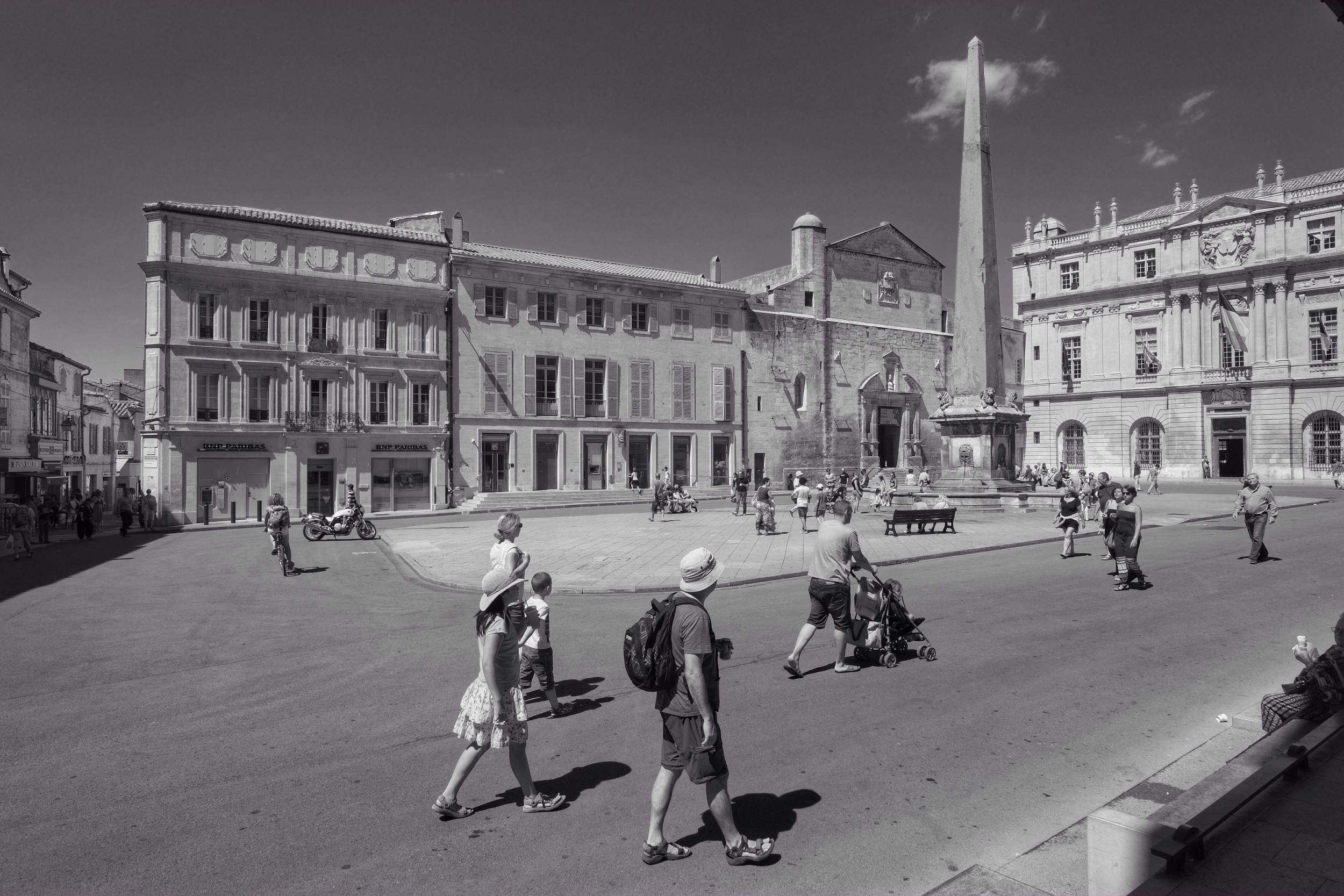
Since ending my career with the Public Service of Canada, part of my 'rewirement' has involved working on an MA in Documentary Photography by distance through the University of South Wales. I will be showing work with other members of my cohort this spring at the Bienal Fotografia do Porto and will wrap up the program in late summer with a degree show in Cardiff or Bristol.
Without going into too much detail, my ongoing interests revolve around the state of institutions in Canada. Over the last 18 months, I have used photography to document aspects of the Bank of Canada, Parliament Hill, and the House of Commons. In future, my artistic explorations of 'institutions' could include bodies such as civil society organizations or churches.
As you'll appreciate, my area of interest has been something of a moving target of late. But this is exactly why I chose it: key institutions are under attack in many places and the damage being visited on them could take years to repair, if indeed it can be repaired. My own view is that I would rather we work to reform imperfect institutions under the rule of law, than to pretend that violence and lawlessness will lead us to freedom. It's hard to grow anything good in scorched earth.
But back to the tasks at hand: photographing, writing, preparing for a show, and thinking about the possibility of a photobook.
A sweep of the Grand Palais, site of Paris Photo 2024
Paris Photo 2024: A Personal Look
NOTE: this post originally appeared on the blog of PhotoED Magazine at Paris Photo 2024
“This is massive.”
That was my first thought as I entered the Grand Palais for the preview of Paris Photo 2024, the night before the fair was to begin officially. And my opinion didn’t change over the four-day run from November 7-10. There is just no way to avoid being overwhelmed by the scale of the show, the quality of work on display, and the talent this event attracts.
Not only is there an enormous amount of work to see and talks to attend under one roof (the Grand Palais itself), but there are also many nearby events and venues where you can buy photobooks and see more work by both the well- and less-known. Only a handful of cities in the world can put on a show like this, and Paris is certainly in the front rank.
You can brush shoulders with Ed Burtynsky and David Company at the Palais, listen to photographic artists like Debi Cornwall and Max Pinckers discuss their new books, and then wander a few minutes away to the Polycopies book sale aboard a barge anchored on the banks of the Seine and ask Todd Hido to sign a copy of his latest for you (I know I did). If that’s not enough, you can venture only slightly further afield to the Offprint photobook salon at Pavillon de l’Arsenal, or hop over to the fringe-y event put on by Réseau LUX and have your portfolio reviewed and see interesting work displayed in a venue that certainly cost less than a booth at the Grand Palais.
Always keeping an eye out for Canadian content, it was good to see ESSE magazine represented at several venues, not only at Paris Photo but also at the Jeu de Paume (where Tina Barney and the late Chantal Akerman had retrospectives).
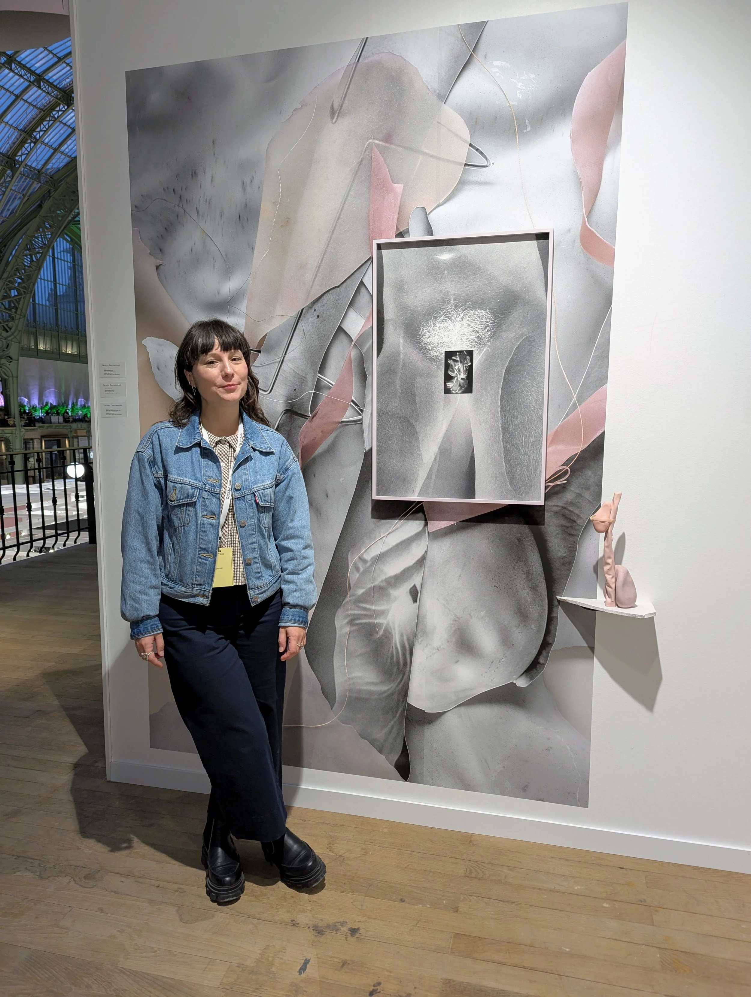
And it was particularly enjoyable to spend some time talking to Montreal-based artist Caroline Mauxion, who was showing work in the booth belonging to Zalucky Contemporary, the Toronto gallery that represents her. Born and raised in France, Caroline completed her MFA at the Université du Québec à Montréal and is now well into her PhD program there. Her ongoing work is an exploration of her own experience of extended orthopedic treatments through a compelling hybrid practice comprising photography, collage, and sculpture.
Caroline describes the work as a way to help her reappropriate her own body, its strengths, and its sexuality. While the act of photographing can sometimes distance, the inclusion of collage recalls the cutting and reshaping of her own body, and the sculptural elements rendered in muted pinks and greys reference bone and ligament, and are themselves formed from metal rods, plastic, and plaster—the basic toolkit of the orthopedic surgeon. Inverted black and white images bring x-rays to mind and flip the shadows of treatment for light and hope. The colour palette and the technique combine to speak of the feminine and the mechanical in a way that invites the viewer to reflect on the body’s vulnerabilities and strengths, and Caroline’s own journey that is still touched by chronic pain. Altogether, a human and thoughtful body of work that draws on a worked—and working—body.
Caroline Mauxion’s work also served to highlight for me a final impression from Paris Photo 2024: little cutting-edge work now relies on ‘straight photography.’ Even documentary, with a clear line of sight back to the origins of the medium, draws today on a rich brew of images, artifacts, physical objects, archival material, and imagined and re-enacted scenes. And that is before we begin to acknowledge the wave of digital imagery and AI-based scenes that towers over us. It was all well-represented in Paris and challenges us to consider again photography’s perpetually loose relationship to ‘the truth,’ alongside a rich new set of tools, techniques, and tales.
Yes, it’s massive. And it’s exciting.
Printmaking I
I recently took a short, part-time course during the summer session of the School of the Photographic Arts: Ottawa. I did this for two reasons:
To improve my printmaking skills: if a photographic print is to be the output of all or most of the work I produce, I would like to be sure that I am creating prints of high quality. This is all the more important if I am hoping to exhibit or sell printed work at some point. I realise that a lot of what I produce is only ever seen on a screen and that I would like to change this.
To help me build my network in the photographic arts community in Canada: one of the clear benefits of studying with the Open College of the Arts is that it can all be done on my schedule without having to relocate. This was particularly important to me because I still had a busy full-time job when I began my studies. And the exposure to UK-based photographers and fellow students has been wonderful. The downside, of course, is that I probably have more connections outside of the country I live and work in than I have within it. It has also been an occasionally isolated road, especially during the last two COVID years. I prefer to work on my own, but even I have my limits.
One of my images I worked on and printed during Printmaking I.
Although Printmaking I only lasted for five three-hour sessions, I found it a real tonic:
I learned new techniques and processes to improve the quality of my prints.
I was exposed to and impressed by the power of Adobe Photoshop (although I am much more comfortable with Capture One and will continue to use it to edit and print my images. I also own Affinity Photo and will use it to perform any edits that Capture One cannot handle.)
I made a connection with SPAO, a small but well-respected school of photography that is the centre of a vibrant community of students and practitioners.
I met an excellent instructor and two enthusiastic students who are on their own artistic journeys.
All told, an excellent investment in time and money!
Robert Adams—Beauty in Photography
This is a straightforward little book of essays that is both very accessible and profound. Robert Adams is a well-known photographer of the American West and was an exhibitor in the New Topographics show that influenced the course of contemporary landscape photography.
Speaking about beauty in art has become somewhat taboo, so it was refreshing to read a defence by an established artist. It is also helpful that Adams provides examples from his own work and the works of others to make his points—it is clear that his idea of beauty is neither saccharine nor sentimental. Instead, he sees beauty in those works of art that reveal form, an order or coherence that underlies all things. I was concerned at first that ‘order’ or ‘coherence’ might be construed in an overly rigid, traditional way, but this was not the case: there is plenty of allowance for scope, diversity and ‘newness.’
Some highlights for me:
“Landscape pictures can offer us, I think, three verities—geography, autobiography, and metaphor.” (Adams, 1996: 14)
I think this is a helpful set of categories for thinking about what landscape images offer us: a record of what a location looked like at a given time; an insight into the one who made the image (what is important in his/her mind? what moved them to make this image in this way?); and a chance to think about what the image points to beyond itself, perhaps to more universal categories and stories. I will try to keep this in mind as I look at and make landscape images from here on.“… we would in most respects choose to spend thirty minutes with Edward Hopper’s painting Sunday Morning to thirty minutes on the street that was his subject; with Hopper’s vision we see more.” (Adams, 1996: 16)
I hadn’t thought about this before, but I suspect that it is true. We could spend time on that street trying to take in all its details, but not see what was true or important about it. At its best, art should enable us to see more. And better.“William Carlos Williams formulated the only resolution that is fully acceptable from an artist’s point of view: ‘No ideas but it in things.’ […] philosophy can forsake too easily the details of experience.” (Adams, 1996: 23)
I take this as a warning to myself to remember that art consists in the creation of things. Even abstract thought has to come to some kind of expression for it to be art.“If the proper goal of art is, as I now believe it, Beauty, the Beauty that now concerns me is that of Form. […] Why is Form beautiful? Because, I think, it helps us to meet our worst fear, the suspicion that life may be chaos and that therefore our suffering is without meaning.” (Adams, 1996: 24–25)
This hangs together throughout the book as Adams’ view and, as mentioned above, I was initially worried that this might be cover for a too-positive view of the world. I now see that Adams’ approaches beauty much more broadly and does not shy away from unappealing sights, as his own images of tract housing on once-pristine land show. I suspect that for Adams even sights that are repellent could show beauty of a sort, if they witness to some underlying form or truth. And art shows beauty and form through abstraction and simplification. (Adams, 1996: 25)“For a picture to be beautiful it does not have to be shocking, but it must in some some significant respect be unlike what preceded it (this is why an artist cannot afford to be ignorant of the tradition within his medium). If the dead end of the romantic vision is incoherence, the failure of classicism, which is the outlook I am defending, is the cliché, the ten-thousandth camera club imitation of a picture by Ansel Adams.” (Adams, 1996: 27)
I think this expresses well the challenge of walking between the temptations of novelty for the sake of novelty and simply walking down the same well-worn path: enough newness to say something fresh and interesting, while remaining part of an ongoing conversation.“An artwork should not appear to have been hard work. I emphasize ‘appear’ because certainly no artwork is easy to make…” (Adams, 1996: 28)
To my mind, this means that the work should call attention to itself, rather than to its maker.“Is Truth Beauty and vice versa? The answer, as Keats knew, depends on the truth about which we are talking. For a truth to be beautiful, it must be complete, the full and final Truth. And that, in turn, leads me to a definition of Beauty linked unavoidably to belief.” (Adams, 1996: 32)
This is a trickier statement to unpack and it appears to be tied to Adams’ Christian faith. Where it is useful to a broader audience is the discussion that follows, where Adams distinguishes between the beautiful, the true and the significant. A significant picture can be important but not beautiful, because it does not tell the full or ultimate Truth.“…it is harder in photography than in painting to establish a recognizable style; this leads to desperate efforts to establish a style at any cost and in turn to the creation of technically accomplished but otherwise empty pictures that anger those who must write about them.” (Adams, 1996: 52)
I am sympathetic to this assertion and I think that what Adams says might be even more true in the era of digital manipulation. I see a lot of ‘overcooked’ landscape images with unnatural colours and angles of view, but that have been shot a hundred times from the same spot. What is the point? Perhaps style is better built through commitment not just to the medium but also to the subject matter.If pictures cannot be understood without knowing details of the artist’s private life, then that is a reason for faulting them; major art, by definition, can stand independent of its maker.” (Adams, 1996: 55)
Not much to say about this, except that Roland Barthes would agree re: the death of the author. And biography can’t make up for bad work.“Criticism’s job is to clarify art’s mystery without destroying it.” (Adams, 1996: 57)
I love this. I wish I had written it. It is also part of Adams’ discussion about why critics should only write about pieces that they love: it is easy but not helpful or satisfying to savage pieces that we don’t like. Adams also quotes with approval the following: “All people in this world are made to give evidence or to signify something. Perhaps it can be said as artists that some are made only to show what surface light does to color… Still others may be here only to reveal the possibilities of the color blue.” (Adams, 1996: 60)“…the static visual arts are not well suited to the direct exploration of evil.” (Adams, 1996: 69)
Adams makes this claim because he believes that a proper portrayal of evil and its consequences requires time, a narrative that is the property of some arts (fiction, theatre, film) but not others (photography). This may well be true; it is hard to think of effective portrayals of evil in still frames that do not require a greater understanding of a backstory.“And I am worried about the amount of time spent by photographers in trying to revive nineteenth-century photographic technology. There are conceivably interesting uses to be made of almost any photographic method, but so many contemporary enthusiasts for old ways seem to place their faith simply in the value of doing the antique thing once more. The results can be momentarily charming, but they are often finally sad, a footnote to history, arcane and a little saccharine.” (Adams, 1996: 82)
Ouch. This is connected to Adams’ belief that art has to produce the new and not slavishly copy old masters and what they have done. If we do this we become “advocates” of old artists rather than artists ourselves. Something to watch for.
Of course, readers who do not share Adams’ confidence in an underlying order of all things may not find his arguments as convincing. Nevertheless, they may still benefit from listening to a thoughtful discussion from someone who loves art and the world he portrays. I thoroughly enjoyed the book, even in those spots where I was not fully convinced.
Reference
Adams, R. (1996) Beauty in photography: essays in defense of traditional values. (2nd ed) New York, N.Y: Aperture.
Review — The Age of Light
Scharer, W. (2019) The age of light. (First Back Bay paperback edition) New York: Back Bay Books/Little, Brown and Company.
I don’t normally publish book reviews, but I might start with this one because of its potential interest to photographers.
I wasn't entirely sure what rating to give The Age of Light because I'm not certain what the book is meant to be. It's offered as a fictionalized biography of someone who lived in the recent past, a risky enough proposition because there are still plenty of people alive who knew Lee Miller. The author concentrates on Miller's romantic and work relationship with Man Ray, which is interesting in itself but already fairly well documented. So more a romance novel than a biography, but I pressed on because I was familiar with both Miller's and Ray's work and looked forward to learning something about their collaboration and world.
The focus on Miller's time in Paris is interspersed with distracting vignettes of her work as a war correspondent across Europe after D-Day. If these brief chapters are meant to show the arc of Miller's development as a photographer, they don't. Rather than explore her many years as an artist with her own studios in Paris and New York, the WWII material seems to be offered up as an explanation for some of Miller's renown and perhaps as a background to her later depression and alcoholism.
Much of the book appears to be an exploration of the photographer's struggle to become independent of men who have used and abused her and to be taken seriously as an artist in her own right. But art is precisely what is missing from this account. There are long descriptions of Paris, night clubs, food, drinking, bohemian parties, sex and arguments, where the author shows that she he has done her research. But there is not much talk about art. We know Miller's new circle is filled with artists and performers because they are all trotted out singly and in groups: Ray, Cocteau, Baker, Éluard, Picasso, Cocteau, Cahun, Bing... everyone gets at least a cameo. What are they creating? What are they trying to say? What drives them? What do they think about art? life? the world? We don't really know.
So how is the reader to understand Miller's desire to be taken seriously as an artist when the author pays scant attention to art or artists? It left a hole in the middle of the book that the period scenes, sex and emotional wrangling didn't fill for me.
Making an effort—Shawville, Québec
A lot of factors have combined to reduce my creative output since mid-March. And they’re the same factors that many people have faced since “COVID-19” entered the global vocabulary: social distancing and isolation, working from home, high workload, significantly reduced opportunity to travel, and a free-floating disquiet connected with a daily diet of bad news on so many fronts.
I have been lacking in motivation.
Still, I have course work to do for my art program and the world continues to spin outside my door. So I made an effort recently to drive to a small town nearby that I had never visited. The town was hosting a printmaking event that involved the creative use of a steamroller on the main street. I haven’t been to a lot of steamroller printmaking sessions, so I went.
And I’m glad I did. It got me out of the house and expanded my mental map of the region I live in.
Ça va bien aller.
Japanese photography at the NGC
“Hanran: 20th-Century Japanese Photography” opened recently at the National Gallery of Canada. The exhibit was curated by the Yokohoma Museum of Art and features works by 28 photographers from the early 1930s to the 1990s.
I went to the members’ pre-screening of the exhibit to beat the crowds and so was able to take my time going over the images on display. It was something of an education for me because I have been more familiar with contemporary Japanese photographers (Hiroshi Sugimoto, Nobuyoshi Araki, Daido Moriyama) than those of the previous century. According to the promotional text for Hanran, the works in the exhibit break with the Pictorialism of early Japanese photography and begin with “the avant-garde Shinko Shashin (New Photography) of the 1930s”.
Many of the photographs, both pre- and post-WWII, struck me as being close in subject matter and approach to the images produced in the West at that time. Modernity was in full swing and there is a preoccupation with mechanization, news magazines, fashion and advertising. The photographs produced during the War itself are a departure to much of that, however, and the exhibit devotes a fair bit of space to early propaganda, documentation of the Tokyo it raids and then the horrific aftermath of the atomic bombings of Hiroshima and Nagasaki. It is not until much later that the are-bure-boke (grainy, blurry, out of focus) school of photos start to appear.
And this is more of what I had been hoping to see. For me, much of the exhibit looked a lot like the photography with which Western audiences are familiar. Few of the pictures told me anything new or exposed me to a different way of thinking. If anything, I wondered if much of the photography could be read as a desire in early 20th-century Japan to emulate the West, but this might say more about my ignorance of Japanese history and culture.
All told, I was ready to learn more about the are-bure-boke approach, but that is my problem and not the fault of the curators.
Vernissage—Anthropocene
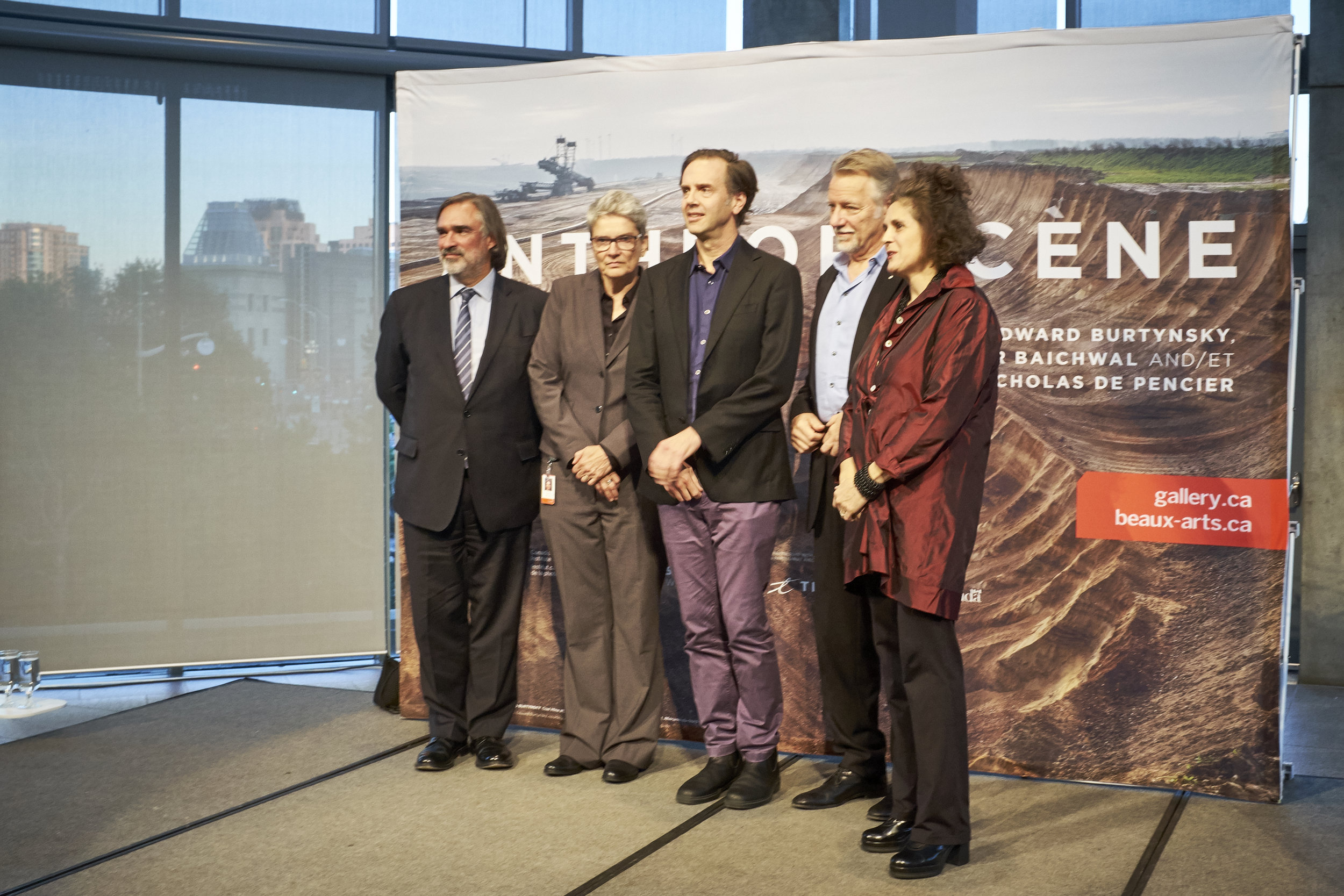
Back in September I was able to attend the pre-opening and vernissage of Anthropocene, the latest collaboration by photographer Edward Burtynsky and filmmakers Jennifer Baichwal and Nicholas de Pencier. The three also collaborated on a previous project, Manufactured Landscapes.
Anthropocene opening at the National Gallery of Canada (NGC), Sept. 26, 2018. From left to right: Marc Mayer, Director of the NGC; Andrea Kunard, Associate Curator, Canadian Photography Institute, NGC; Nicholas de Pencier; Edward Burtynsky; and Jennifer Baichwal.
Anthropocene opened in two complementary versions, one at the National Gallery of Canada in Ottawa and the other at the Art Gallery of Ontario in Toronto. The title of the project is a still-contested term that refers to a new geological era where “…human-kind has caused mass extinctions of plant and animal species, polluted the oceans and altered the atmosphere, among other lasting impacts” (Stromberg, 2013)
The project is a large-scale multimedia production comprising still photography, video, a movie, augmented reality installations and a book. It is in line with Burtynsky’s other work both with and without collaborators: bold, richly layered, large-format photographic prints that make viewers stop to look at things that are worrying.
Anthropocene is very much a project, not only in the sense that it combines the talents of several Canadian artists, but also because it uses art to advance particular ethical and political positions. Although the artists—in words, at least—are careful to lay out information rather than to preach their stance on human impact on the environment, the conclusion of their work could not be clearer. It is possible to imagine a series of images showing the benefits of resource extraction for humanity—or even the utter dependence of our economies on fossil fuels—but that is not what has been done here. Anthropocene is a damning artistic documentation of wholesale exploitation, waste and degradation for the planet and its lifeforms.
I have seen and appreciated Burtynsky’s photographs for a number of years but I find that I am now looking at them differently since reading Stephen Shore’s (2013) brief book. Although I have always appreciated the beauty and content of the images it is only now that I am looking at them as photographs. The images play with framing, scale and geometry in such a way that it is not always clear what you are looking at.
Many of the photographs are printed so large and cover such a vast area that you must look at them twice: once from farther back to take it all in, and then an implied invitation to draw closer to peer at details and to orient yourself in the frame. Sometimes, for example, it is only at nose-distance that tiny blobs of colour reveal themselves to be heavy vehicles in an immense open-pit mine. By being invited into a two-step viewing, I found that my reaction was often to be impressed by beauty at large-scale, and to be shocked by the detail as I moved closer and more fully took in what I was seeing.
A viewer in front of one of the large-scale images from Anthropocene.
In some cases the photographs contain few or no markers of scale or orientation and show a radically flattened perspective: is this scene large or small? am I viewing head-on or from above? As a viewer, I have little choice but to remain in front of the image and puzzle out how I should assess it. Once again, the effort is rewarded by an aha!, but it means that it is almost impossible to skip past Burtynsky’s work in a casual way. It draws you in with its geometric beauty and large physical print, and almost always delivers a punch. For some images, it is necessary to repeat the viewing cycle more than once: distant for a global view, then up close for precise detail.
Anthropocene, like Manufactured Images before it, demands time from its audience to achieve full effect.
Could you use such a set of techniques to manipulate the viewing public into accepting a particular ethical position? Yes, I suppose you could. But living near the National Gallery of Canada in an area that is now regularly visited by ice storms, floods and, most recently, tornadoes, the message of climate change and environmental degradation is not a hard sell. It has the ring of truth.
Burtynsky was Master of Photography at Photo London in May, where I happened to bump into him while I was looking at one of the large prints to be included in Anthropocene. I told him that I always felt conflicted when I looked at his images, because they are so beautifully shot and printed, but their content is so often disturbing. “Good,” he replied. “That’s what you should feel.”
And I do.
Visiting the exhibit was like an object lesson to work through some of Shore’s points about the representation of three-dimensional reality within a two-dimensional frame. I will be spending more time thinking about what impact the factors of scale, perspective and orientation have on my own work and how I can use them to best advantage, to support what it is that I want to say and to help shape the experience for the eventual viewer.
Sunset in Tadoussac
My youngest son recently had a day off school, so we decided to make a long weekend of it in Tadoussac, Quebec on the north shore of the St. Lawrence River. Tadoussac is about 700km from where we live so it made for a lot of driving over the three days.
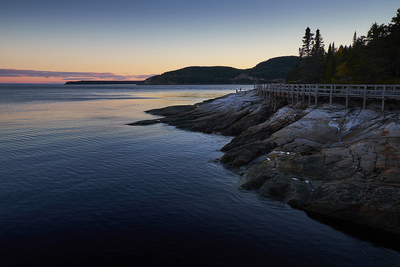
And it was well worth it. Situated at the meeting of the Saguenay and St. Lawrence Rivers, Tadoussac is probably best known as that starting point for whale-watching tours in the St. Lawrence Estuary. The town is touristy but not overly so and the whales (Fin, Minke and Beluga) and seals did not disappoint. The three hours we spent in an open zodiac with fresh air and brilliant sun on a surprisingly smooth river were wonderful. We couldn't have asked for a better late-September afternoon and everything we'd heard about the magnificent marine mammals of the estuary was true.
But the evenings surprised me. The lingering sunsets in Tadoussac's harbour are beautiful and the long stretch of rocky coastline seems tailor-made for landscape photography. (And although I've been casting furtive glances at the new Fujifilm XPro2, my X-E1 continues to deliver results that please me.)
This is just a little of what I saw. I hope you experience some of the enjoyment that I did.
Toronto's Contact Photography Festival
I had the opportunity to visit the Toronto Photography Festival in May and had a write-up published on the WeAreOCA blog of the Open College of the Arts.
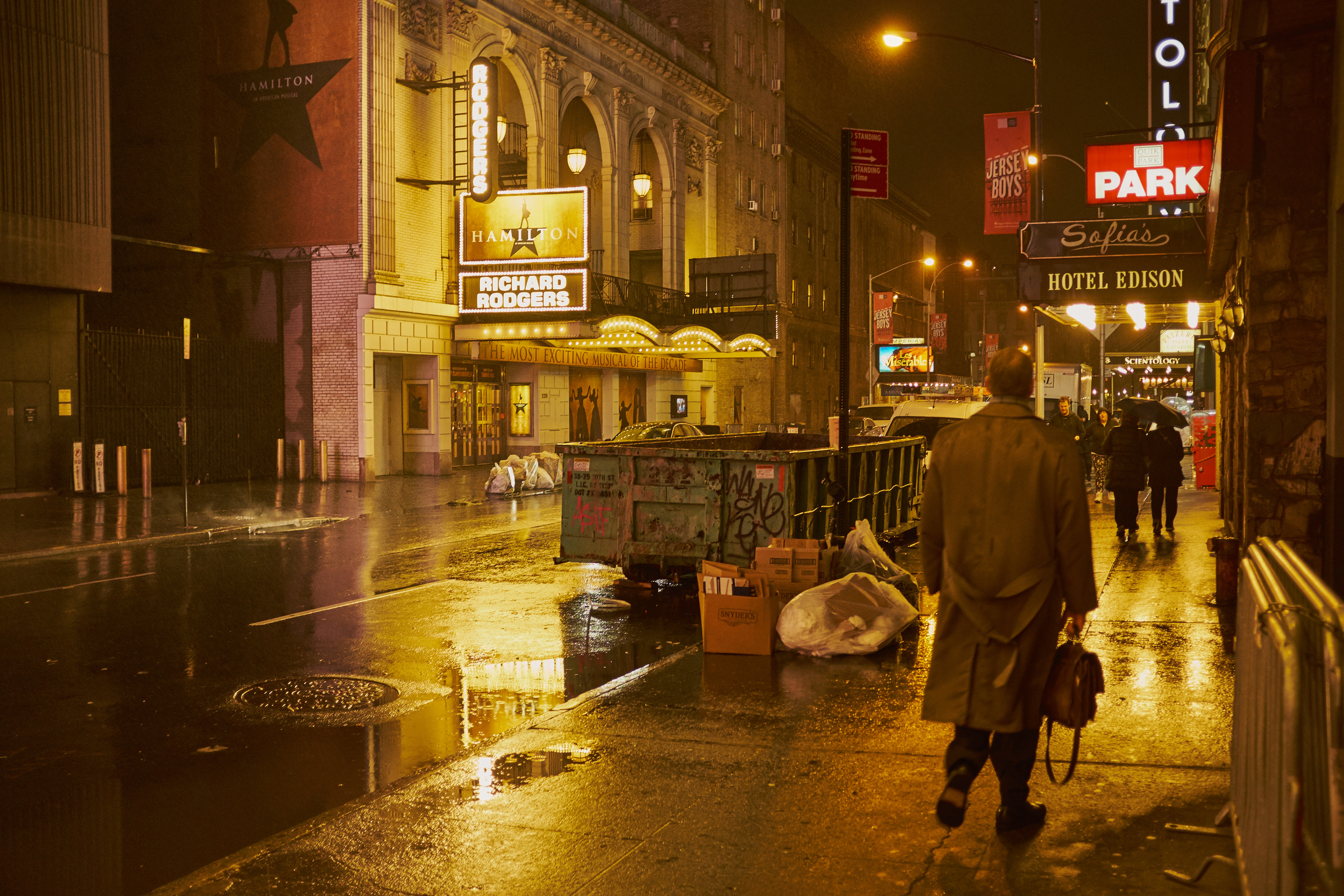
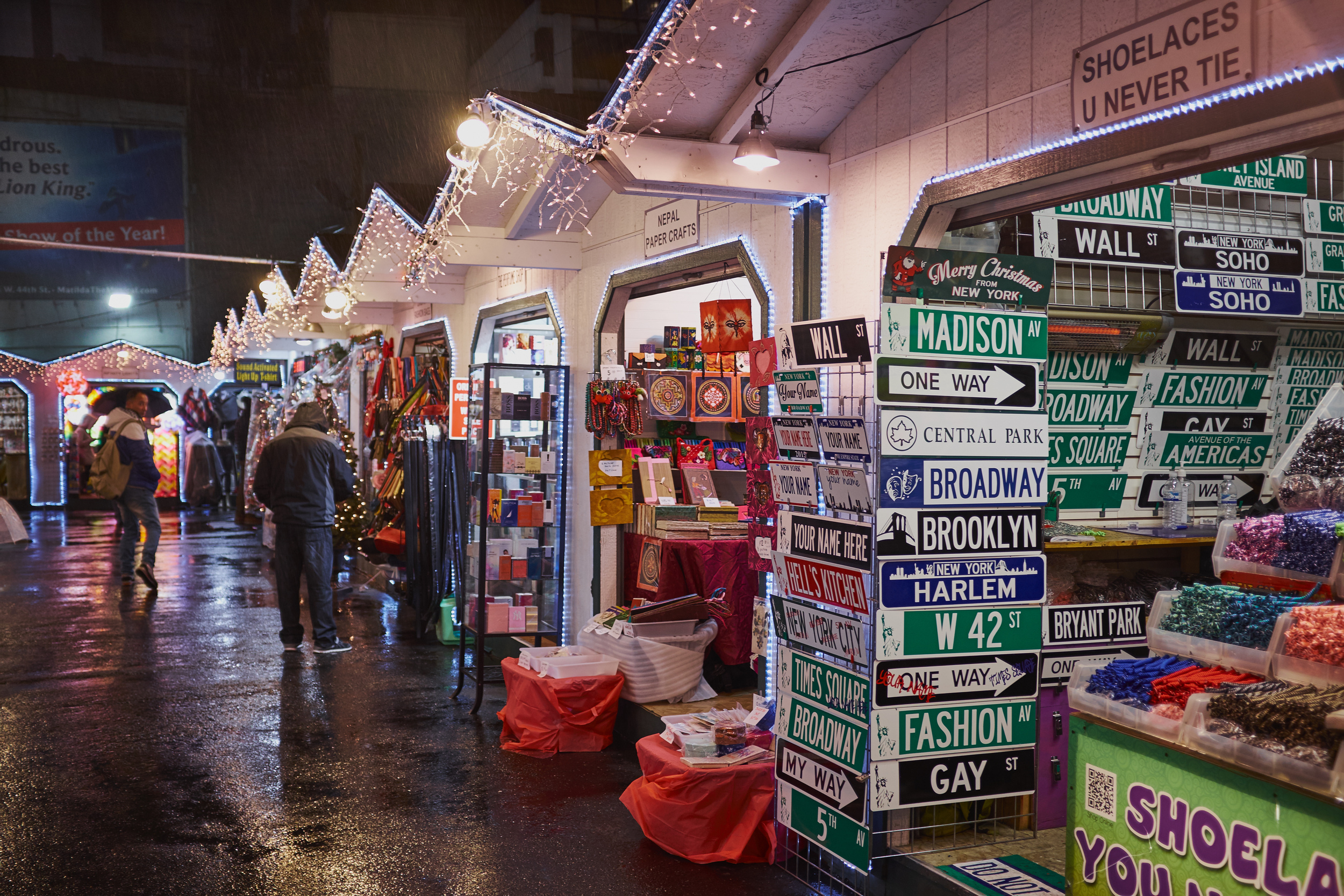
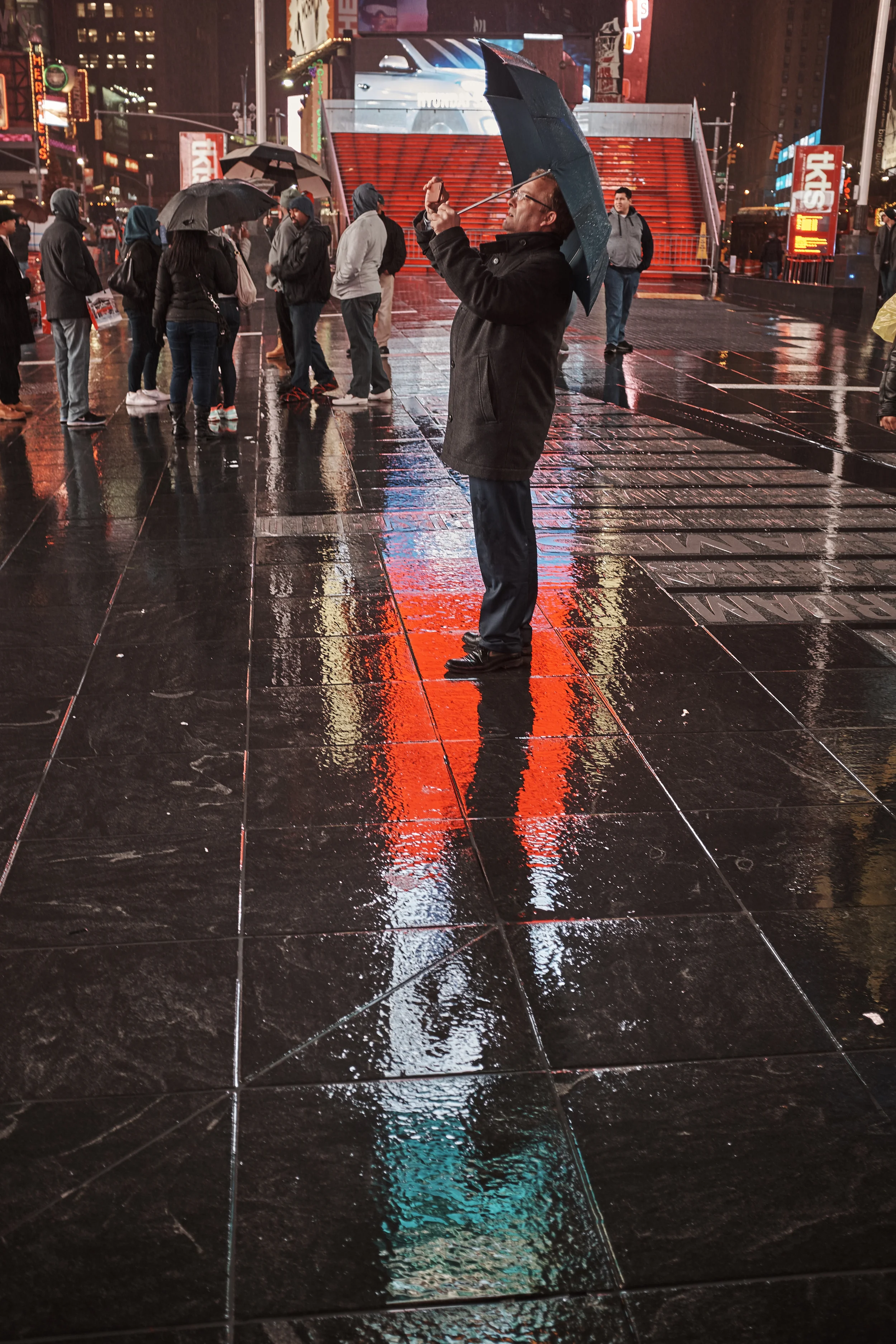
Liquid colour in Manhattan with the X100T
I got the chance recently to spend a couple of days at a conference in NYC. Given that I'd only be there a short time, I decided to take just my Fujifilm X100T rather than pack the whole kit.
In my mind's eye, New York lends itself to black and white photography particularly well but I was concerned that I was falling into a rut. Or perpetuating photographic clichés. Or both. Or... well, whatever it was, I thought it was time to try something new for me. I'd be in meetings all day and it would be getting dark before 5:00 pm, so I'd have to try my hand at night photography. And I decided it was time to add some colour to my NYC shots. On top of that, the weather forecast called for quite a bit of rain. So there it was: night shots in colour in the wet. Challenge accepted!
I debated whether to rig some sort of waterproof cover for the X100T but decided to chance walking around with the camera on a wrist strap, held flat beneath my palm. I'd be ready at a moment's notice and still keep the worst of the rain off the camera body and lens.
To help deal with the wildly different light levels in the city, it was also time to try the Auto ISO setting rather than fiddle constantly with ISO and exposure in the rain. I usually shoot at the lowest ISO I can get away with to help keep the image quality up and have always been worried that the camera would choose sky-high ISOs just to avoid camera shake. This time, I opeted for simplicity: the fixed 23mm lens, Aperture Priority, Auto ISO and wide open at f/2.0. I'd add exposure compensation where necessary.
And I was happy with the results. The X100T didn't get too wet, scenes were well exposed and I had a riot. Easily the most fun I've had in the rain (a decent waterproof jacket is also a big help).
To my mind, it worked. I'd be glad to hear what you think.
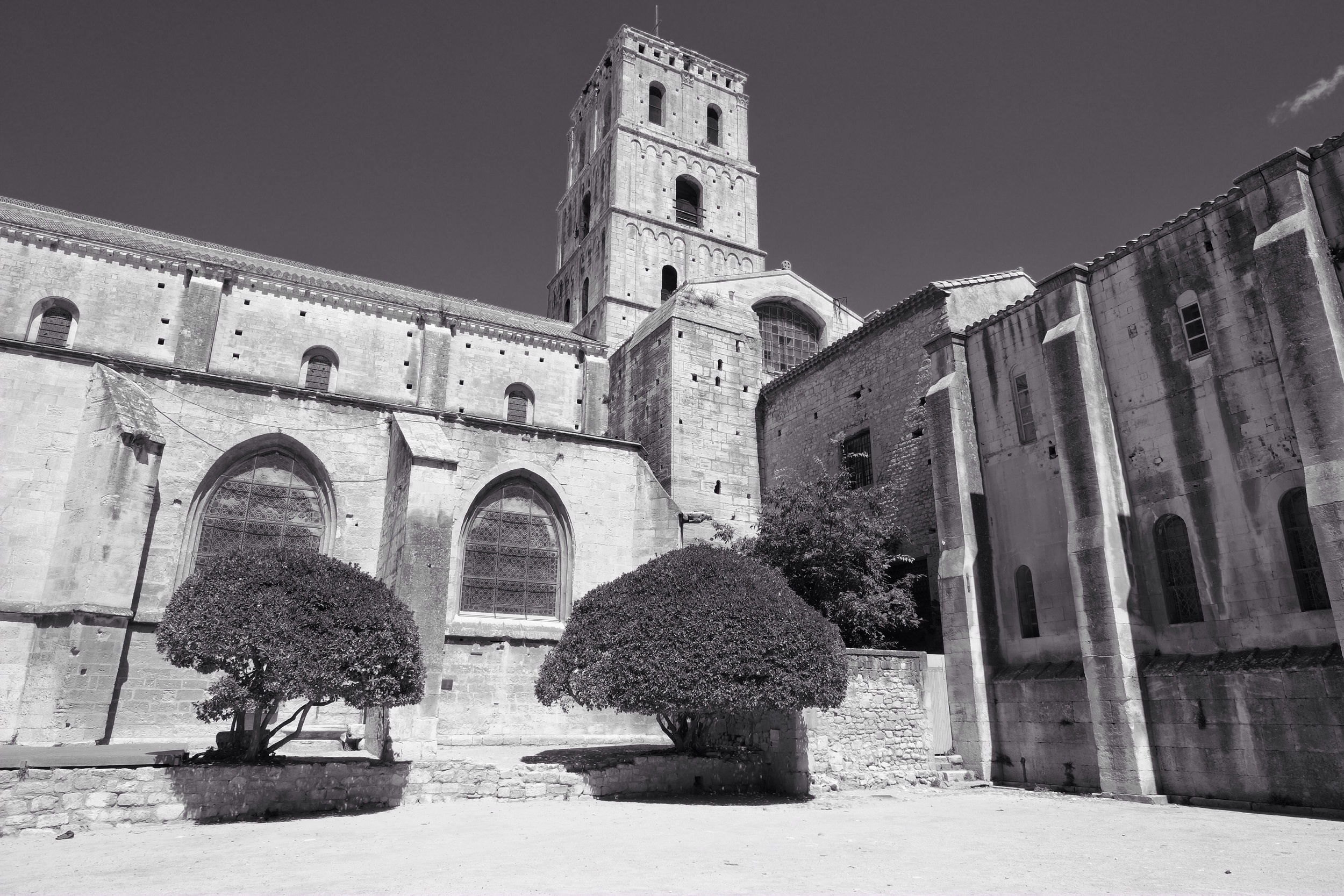
Les Rencontres d'Arles
For me, one of the highlights of our family vacation has been the chance to visit the annual photographic festival in Arles, France. While other gatherings are usually connected to photographic gear and business, Les Rencontres ("meetings" or "encounters" in English) are purely concerned with showing and celebrating photography as art. Founded by Arles-born photographer Lucien Clergue in 1970, the festival has blossomed and now receives some 100,000 visitors each summer.
With just a day to take in the showings that are scattered in different venues around the centre of Old Arles, I didn't manage to visit them all. I did see enough to make me thoroughly glad that we had added the town to our trip.
A few thoughts on the show, offered in no specific order...
First, I was most impressed by the absence of reference to technical details or specific pieces of gear. The point of the exhibitions was very much the artist's vision, not whether a Leica was involved, whether f/5.6 was optimum, whether the shadows were a little muddy, or whether analog / digital is superior. I found this a refreshing approach and a relief from many of the pointless discussions I've seen online. Just vision. Period.
I was also impressed by the importance of story in so many of the showings. In some cases, the story was explicitly connected to the artist's vision and conceived in advance. In other cases, the story seems to have emerged less consciously over time as the artist returned to familiar themes, subjects or approaches. Perhaps "story" is sometimes the cumulative effect of a lifetime's work rather than a pre-conceived plan. In the case of one artist, Zhang Huan, the story he tells is communicated through a sequence of layers of calligraphy on his own face.
It was a pleasure to view images from several periods of Lucien Clergue's own photography and to appreciate how rich a body of work he built through studies of subjects available to him locally: patterns in wet sand, marshlands and nudes on the beach.
David Bailey's retrospective was a treat, starting with 1960's UK fashion, celebrity and family. I enjoyed his larger format portraits and was reminded by many of the shots just how beautiful an effect film grain can produce.
A wonderful exhibit on "Typology, Taxonomy and Seriality" contained images from Richard Avedon, Karl Blossfeldt, August Sander, and Bernd and Hillary Becher (among others). This exhibit was held in the "Espace Van Gogh," the former hospital in Arles where the painter recovered -- and painted -- after cutting off a portion of his ear in 1889. The curated series illustrated over and over the variety (and sometimes beauty) to be found in "like" things: political figures, plant forms, members of early 20th-century German society, 1950s industrial installations, and the hairstyles of Nigerian women.
The W.M. Hunt Collection, however, provided a counterpoint to what I've just said about beauty-in-similarity. Hunt viewed the passion for collecting as foolish and seems to have gone out of his way to prove his point. Over a period of decades he collected large photographs of groups of people at conventions, fairs and events. Frequently panoramic in scope, the combined effect of the dozens of images in three rooms is the loss of the individual. The scenes of large "happenings" are so crushingly repetitive -- groups are sometimes organized into geometric forms by the photographer -- that there is little special about any of the people pictured. All those individuals have indeed been captured in a picture. Captured and assimilated.
The "Trepat Collection" was an interesting demonstration of a collaboration between a wealthy Spanish industrialist and a number of avant garde artists. His success in manufacturing and marketing agricultural machinery allowed him to commission works by the likes of Man Ray, Lazlo Moholy-Nagy, and Walker Evans to help create a distinctive brand for his company.
Other exhibits, such as the impressively large-scale collages by Vik Muniz demonstrated that photographs as artefacts can themselves be reworked to create new images. Others again, such as the work of Mazaccio and Drowilal, undermine celebrity, advertising and sentimentality in our image-soaked society. Denis Rouvre's presentation ("Identity, Intimate Territories") of low-key projected portraits with narration by the subject reminded me that, far from being an issue for the French alone, multiple identities are a fact of life for all of us in a globalized world of migrants.
All in all, a thoroughly enjoyable day and I was only sorry that it couldn't have been longer. It was long enough to inspire me, though, and encourage me to work more carefully on my own photography. Less gear, more story. More vision. More "rencontres"!
All pictures taken with my Fujifilm X-E1 with Fujinon 14mm and 18-55mm lenses. JPEGs tweaked with Snapseed on an iPad.
A walk in Wakefield
Some weeks back my wife and I had the chance to spend a couple of hours walking around Wakefield, a small village on the Gatineau River about 30 or 40 minutes from our place. It was a lazy afternoon so we had no particular plan for our time... and I think the pictures I took reflect that.
Top down. Fujifilm X-E1 with 35mm. ISO 200, 1/3,500 sec at f/1.4.
Cast critters. Fujifilm X-E1 with 35mm. ISO 200, 1/70 sec at f/1.4.
Post pre-modern. Fujifilm X-E1 with 35mm. ISO 400, 1/34 sec at f/1.4.
Wakefield Inn. Fujifilm X-E1 with 14mm. ISO 200, 1/40 sec at f/22.
Wakefield Inn 2. Fujifilm X-E1 with 14mm. ISO 200, 1/110 sec at f/8.
Deck. Chair. Fujifilm X-E1 with 14mm. ISO 200, 1/420 sec at f/2.8.
Cold weather photography with the X-E1
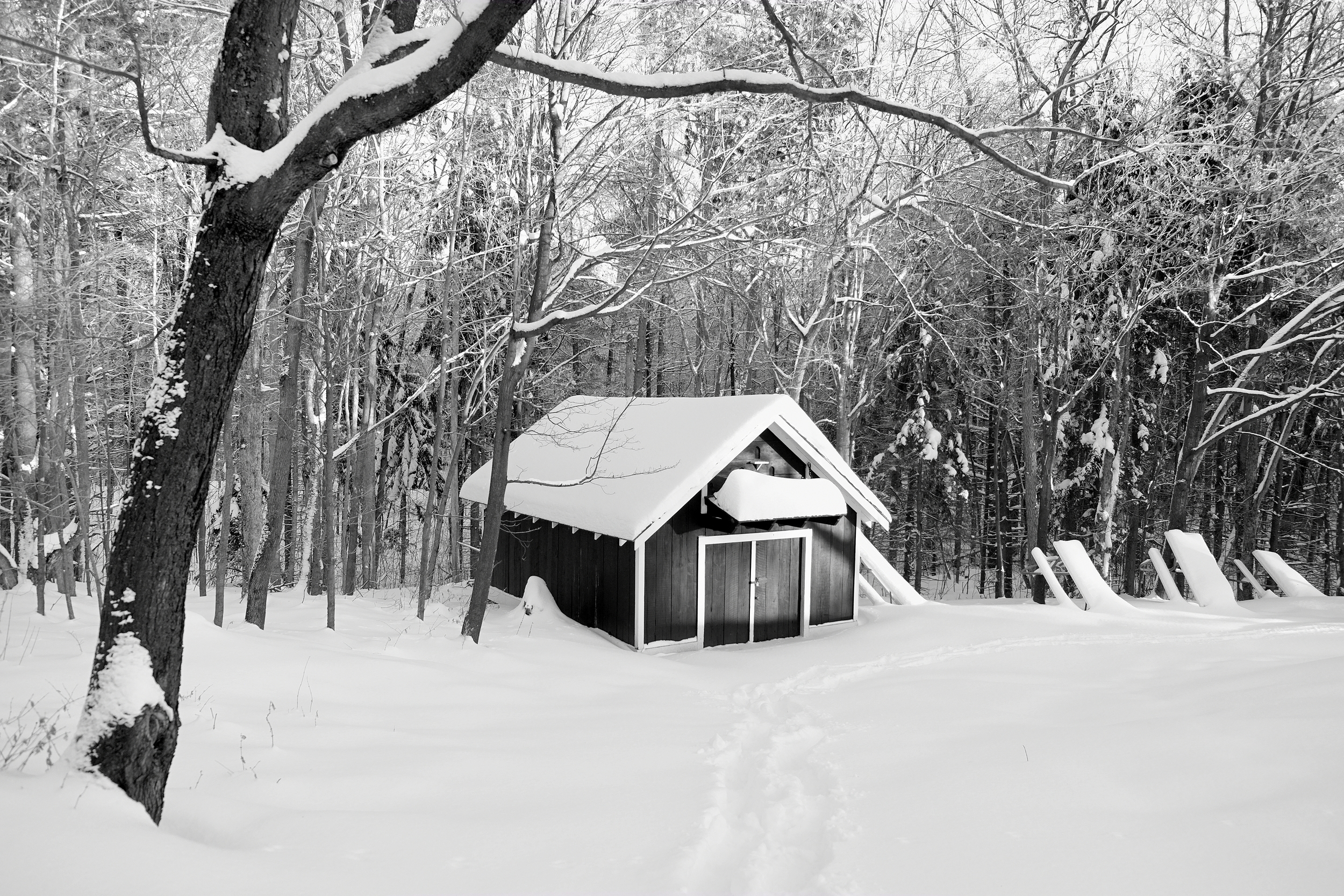
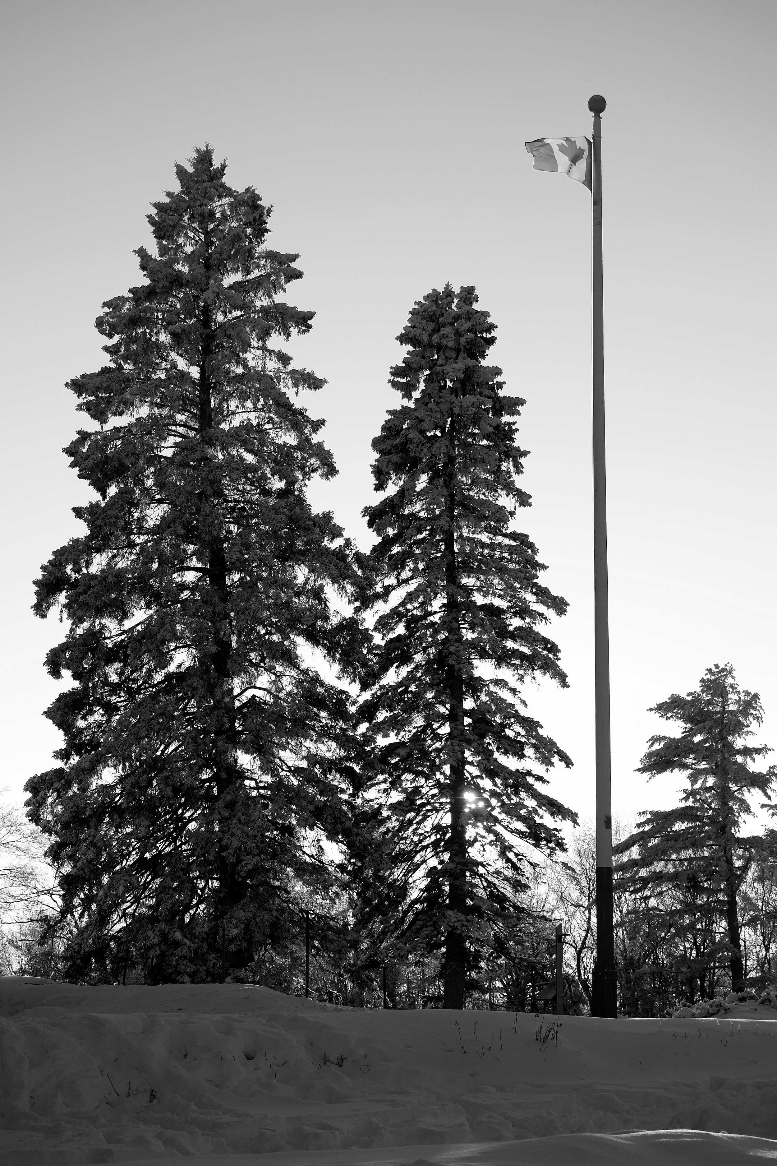
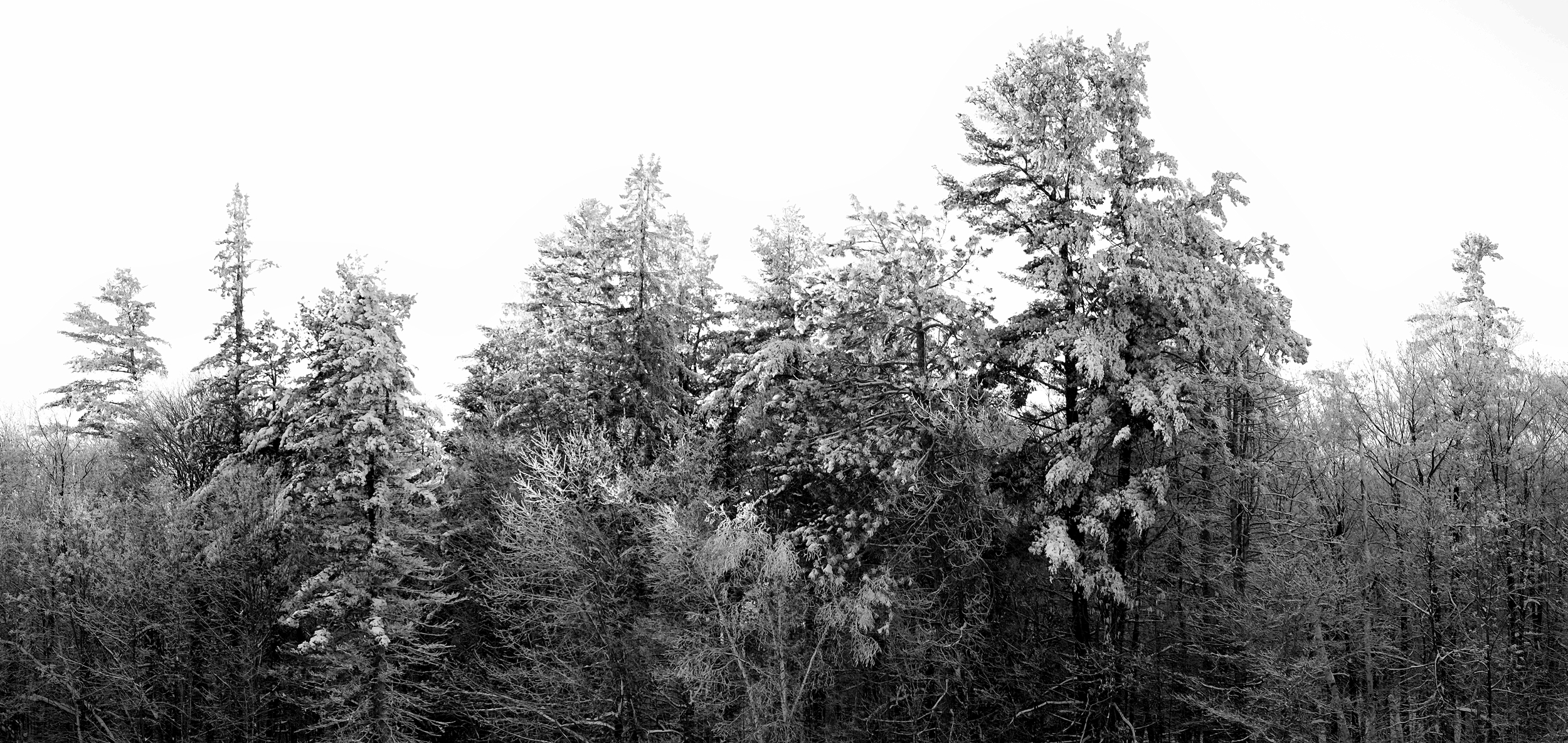
Living in most parts of Canada means that you're either going to have to make friends with cold weather or resign yourself to spending large parts of the year indoors. Unless all your work is done in a studio, the same holds true for Canadian photographers -- and the start of this winter has been unusually cold.
I've had my Fujifilm X-E1 for almost a year and have been interested to see how it performed in the cold. A number of people have raised concerns about the lack of a weather seal on the X-E1, but I can't say that I've found it to be a problem. I never use my cameras unprotected in a downpour and am careful of blowing sand at the beach, so I take the usual precautions -- some sort of cover in the rain and an hour in a sealed plastic bag when coming in from very cold temperatures.
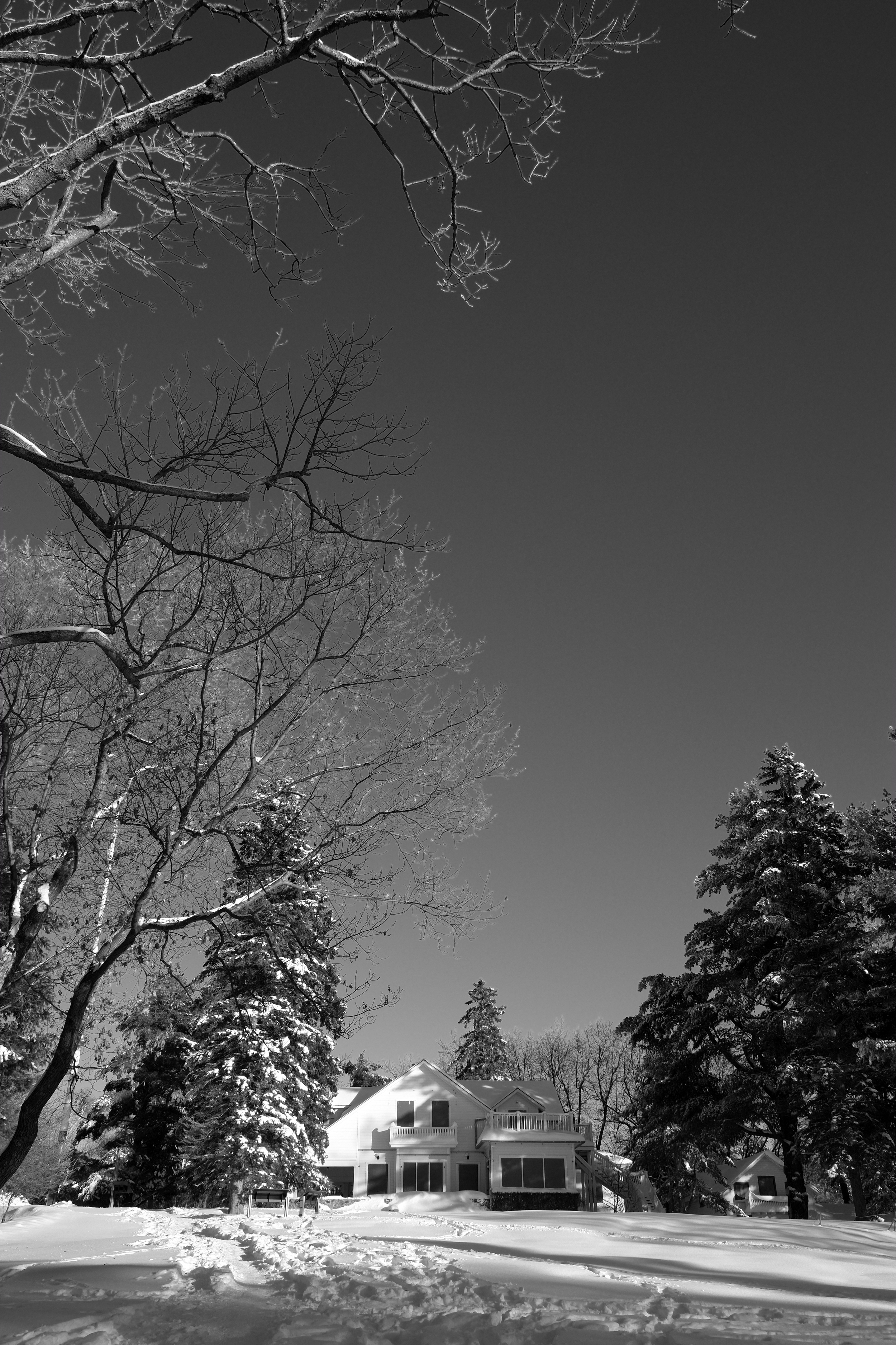
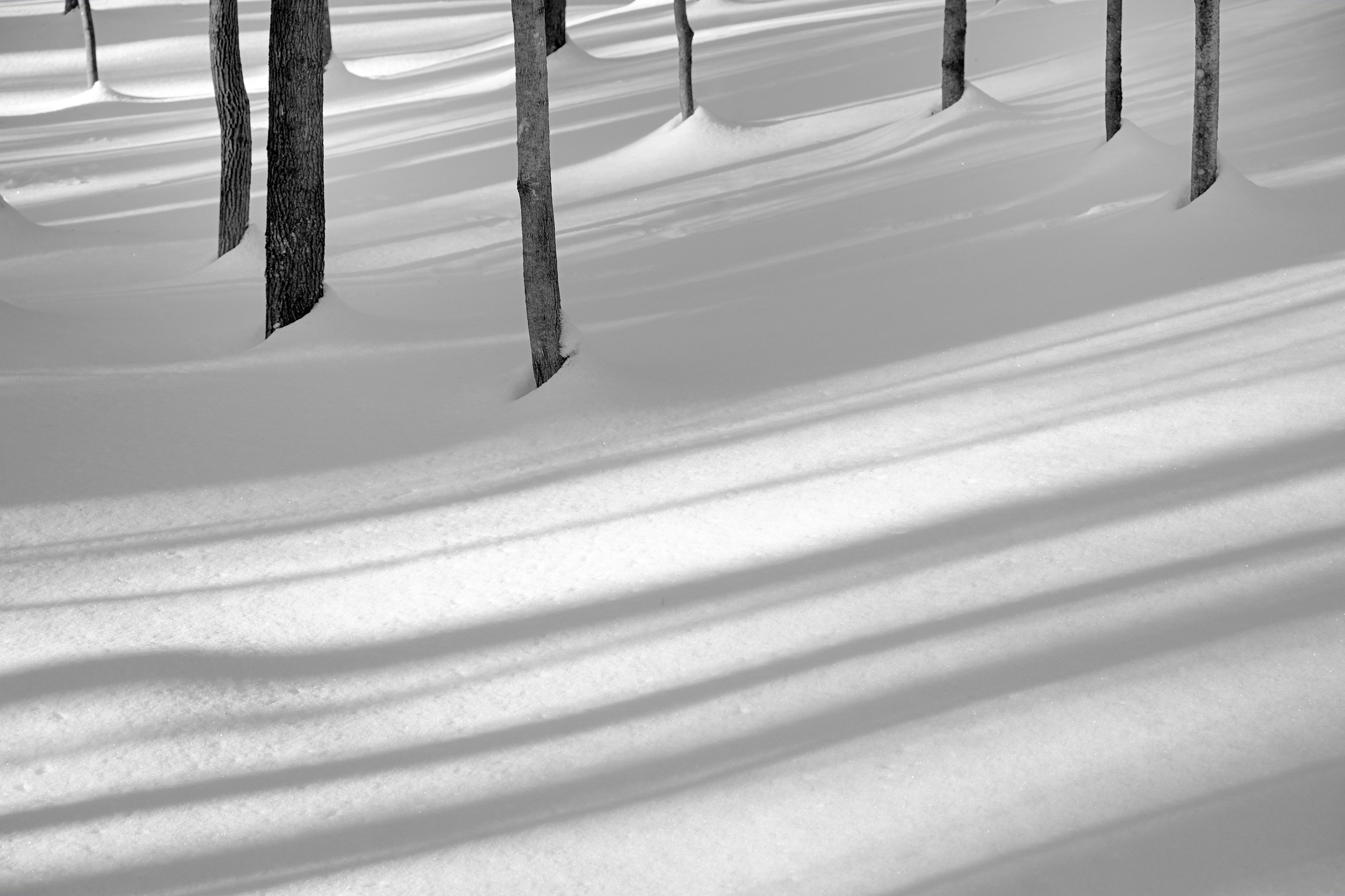
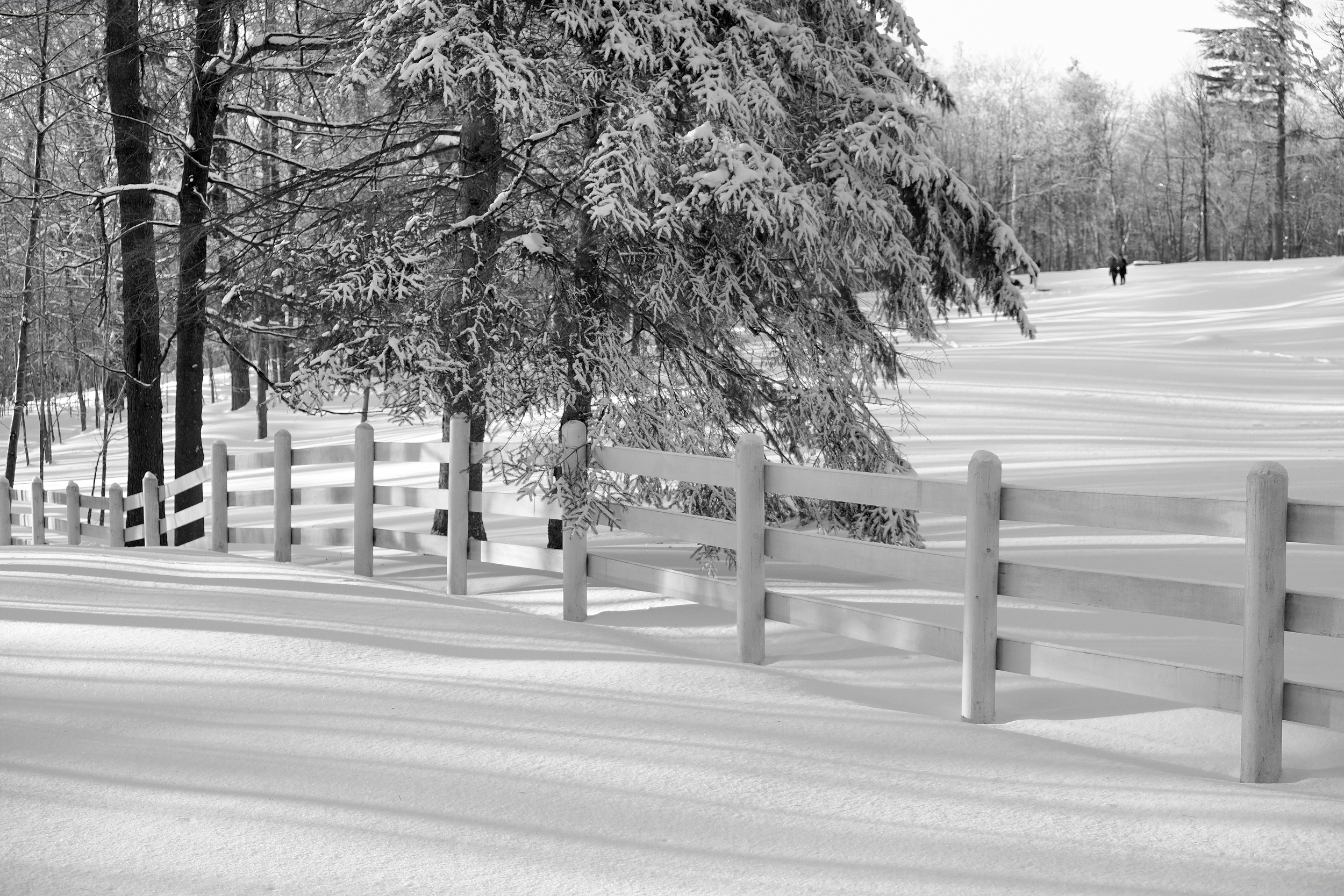
I recently spent an hour and a half taking pictures with the X-E1 and the 18-55mm zoom at the Mackenzie King Estate in Gatineau Park. The estate is an interesting place visually in all seasons and just 15 minutes from where I live, so it is a good option for blowing off the cobwebs. This day, however, the temperature was hovering around -17C with a brisk wind. After 90 minutes, the camera was still working as it should and there appeared to be plenty of battery life left (although I've been fooled before by the X-E1's battery status indicator : it can drop from a "full charge" reading to almost nothing in a matter of minutes. Not helpful.).
I'm happy to report that I didn't end my little cold-weather safari because of the camera, but because the light was fading and my hands were freezing.
As a sidebar, I'd be interested to hear how other photographers keep their hands warm in cold temperatures. I got tired of the mitts-on-mitts-off approach and now use Lowepro gloves. The gloves are a big improvement as they combine a covering for the hands with enough flexibility to adjust camera controls (the raised bumps on the gloves helpfully provide extra grip and tactile feeling on the controls). At the same time, they're still not warm enough for really cold weather over extended sessions outside. Manfrotto used to manufacture an interesting looking pair of gloves, but they seem to have been discontinued. Any other ideas or approaches?
So, it's 2014. Stay warm, keep shooting and have a happy and healthy year!
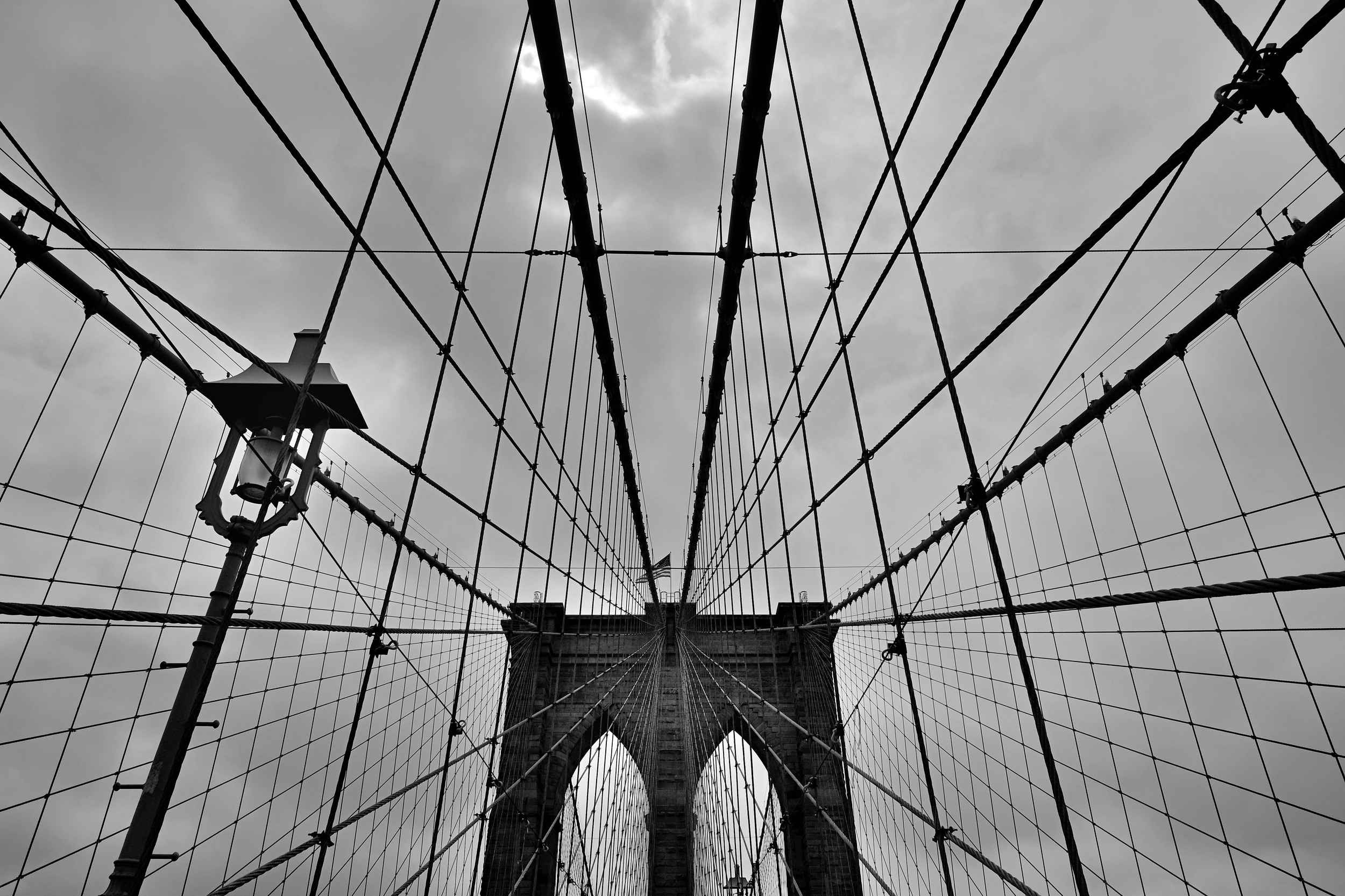
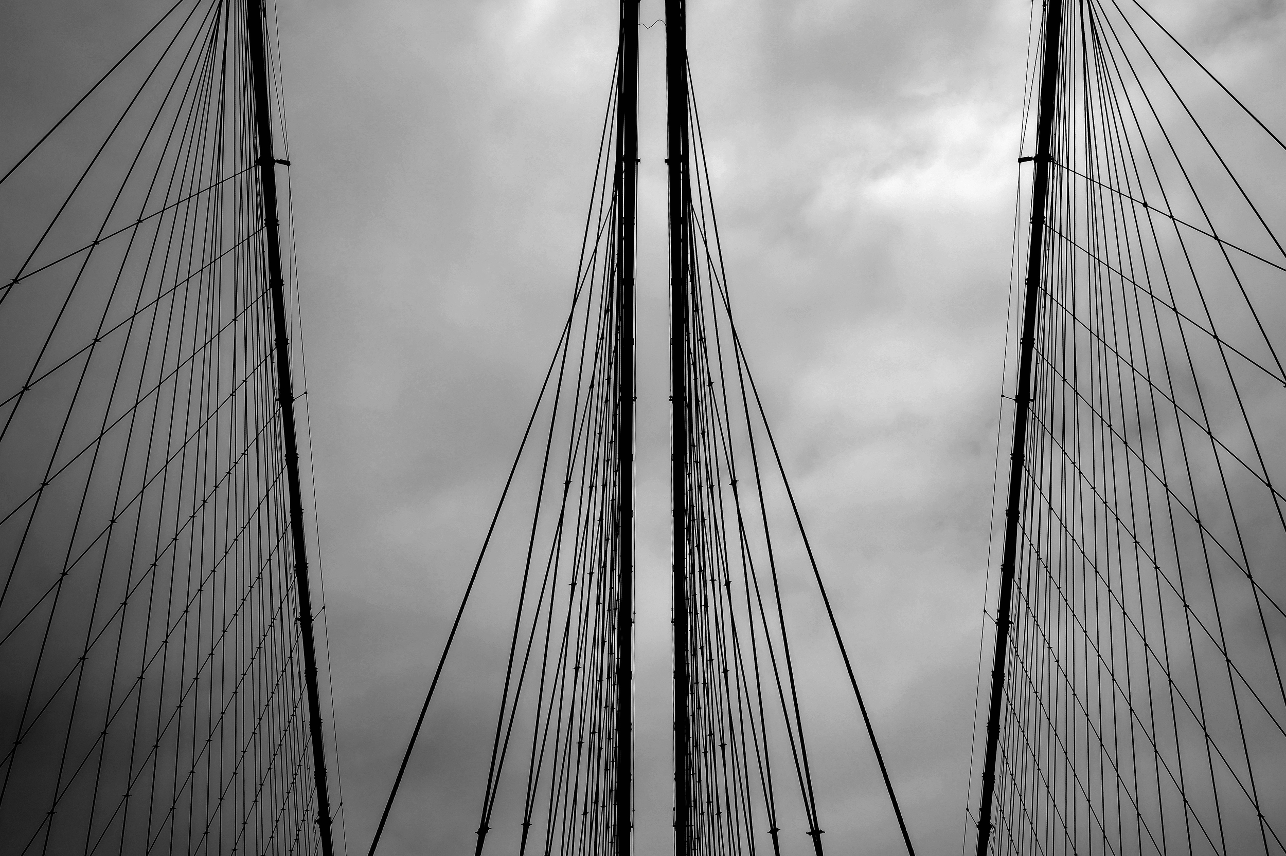
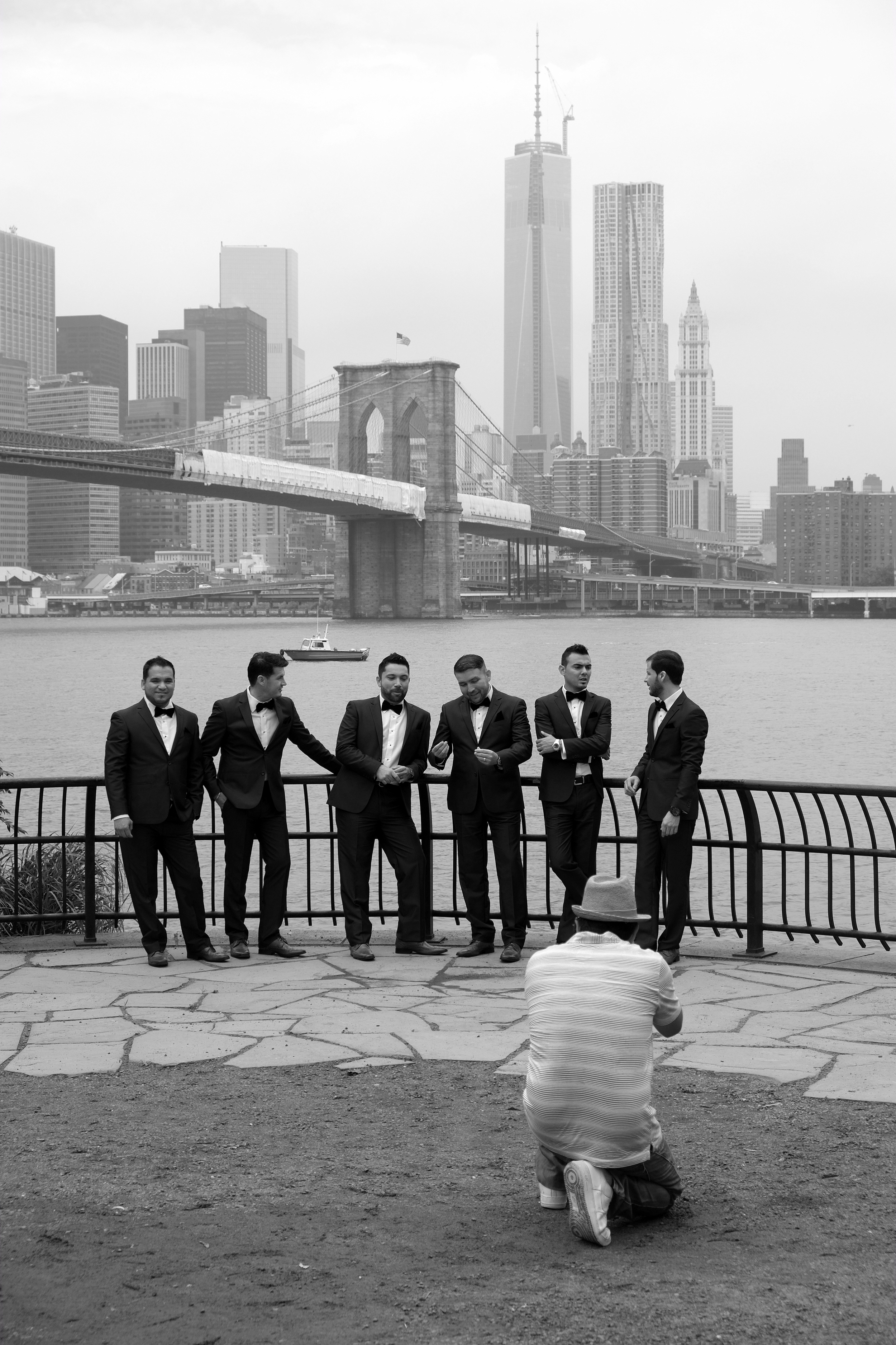
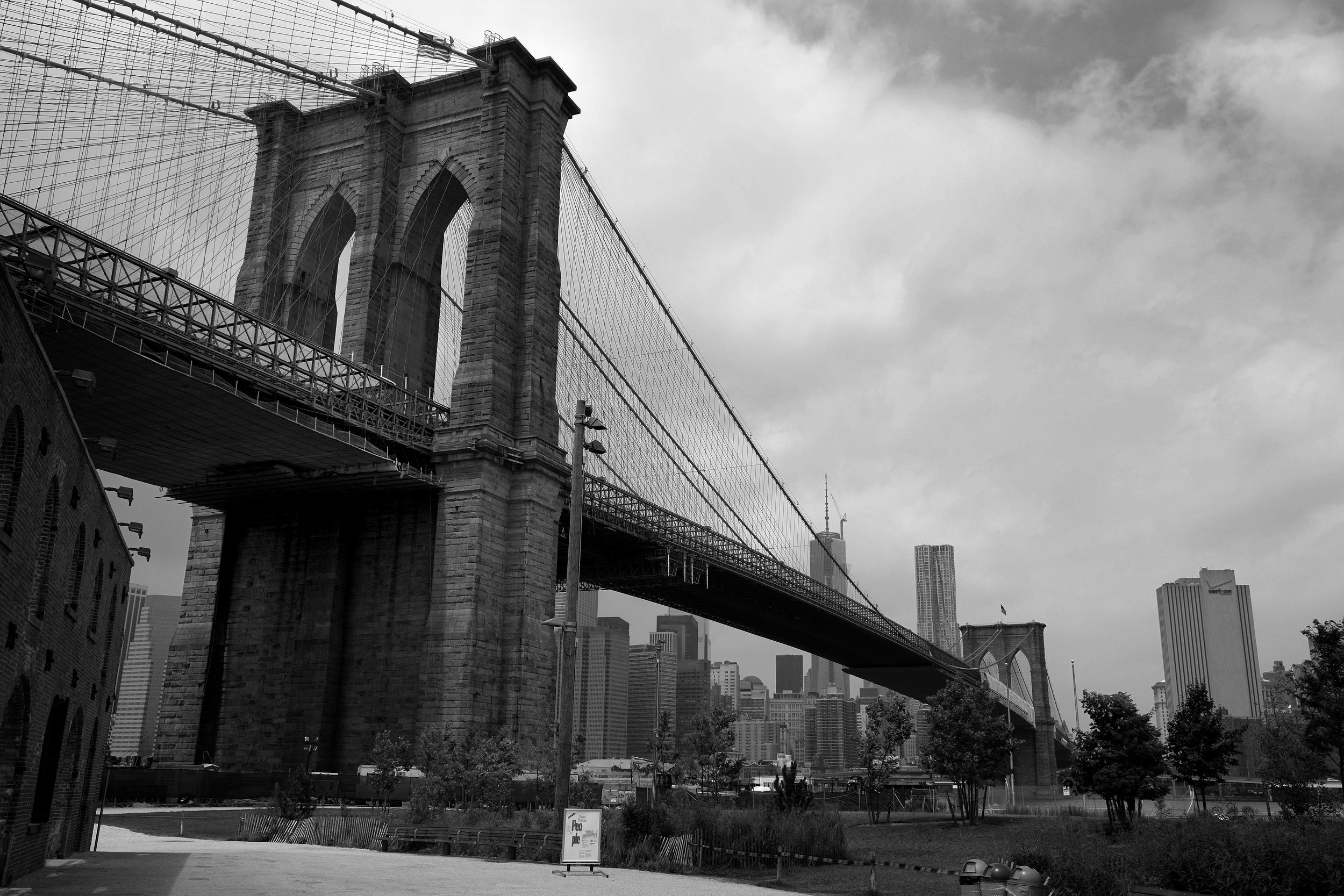
Cliché roundup—the Brooklyn Bridge with my X-E1
I understand that more than 8 million people live in New York City. I understand that NYC is a popular destination for millions more business people and tourists each year. And I also understand that the Brooklyn Bridge has been photographed by every single one of those people, multiple times.
I don't care.
These are the pictures I took of the Brooklyn Bridge with my Fujifilm X-E1 and I like them.
So there. Now it's millions and millions plus one.
