A Handful of Dust

On a visit to Toronto, I had the opportunity yesterday to visit an interesting exhibit at the Ryerson Image Centre. Curated by David CampanyA Handful of Dust: From the Cosmic to the Domestic brings together work from a broad range of artists (Man Ray, Marcel Duchamp, Jeff Wall, Walker Evans, Rut Blees Luxemburg, Mona Kuhn and others), all connected thematically with dust. Campany has also published a book of the same name as a catalogue and further exploration of the theme.

The pieces, mostly photographs but with one or two paintings and a couple of video installations, seem to have been selected by Campany as conceptual responses to a photograph by Man Ray (Dust Breeding, 1920) of a piece by Marcel Duchamp. The monochrome photograph looks like it may be an aerial shot of a wasted landscape, but it is hard to get a sense of scale because of the lack of reference points and the uniformity of tone and colour. All the viewer has to go by is line, form and texture. In fact, the photograph depicts a glass plate that had collected a thick layer of dust while lying on the floor of Duchamp’s studio. Viewers are informed that the two artists may not have agreed who was ultimately responsible for the work and later agreed to share credit.

Robert Burley – Implosions of Buildings 65 and 69, Kodak Park, Rochester, NY [#1], October 6, 2007

The selected images are set in two rooms and, apart from a few dust-related quotations painted on the gallery walls, visitors are largely left to derive their own meanings from the display (which I welcomed). The sources of the dust vary—sand, destroyed buildings, human beings—but the overall message is one of human impermanence and mortality: sand covers everything in its path, the built environment doesn’t last forever, humans shed skin and eventually shed their lives.

At the same time, the dust that gathers can both conceal and reveal. It can cover tracks but it can also heighten our ability to see texture and form.

Nick Waplington – from the series Patriarch’s Wardrobe, 2010

I went to the exhibit because I have often appreciated the shows that the Ryerson Image Centre hosts, although I have to admit that I was a bit doubtful because of the subject matter. In the end, I was won over and came away thinking that it amounted to an excellent meditation on aspects of the human condition. The images on display also served to show the power of abstraction and the role of imagination in interpreting  what appears in front of us. In short, the show works.

A side benefit of the visit to the Ryerson Image Centre was a chance to see Extending the Frame: 40 Years of Gallery TPW. The show is a history of the founding and evolution of the Toronto Photographers Workshop (TPW), a group which has worked diligently to advance photography as an art form and has involved such people as Edward Burtynsky, Robert Burley, and the duo of Carole Condé and Karl Beveridge. It was fascinating to see how the dedication of a relatively small number of people has had such an impact on the direction of photography and art more generally in Canada. 

Vernissage—Anthropocene

Back in September I was able to attend the pre-opening and vernissage of Anthropocene, the latest collaboration by photographer Edward Burtynsky and filmmakers Jennifer Baichwal and Nicholas de Pencier. The three also collaborated on a previous project, Manufactured Landscapes.

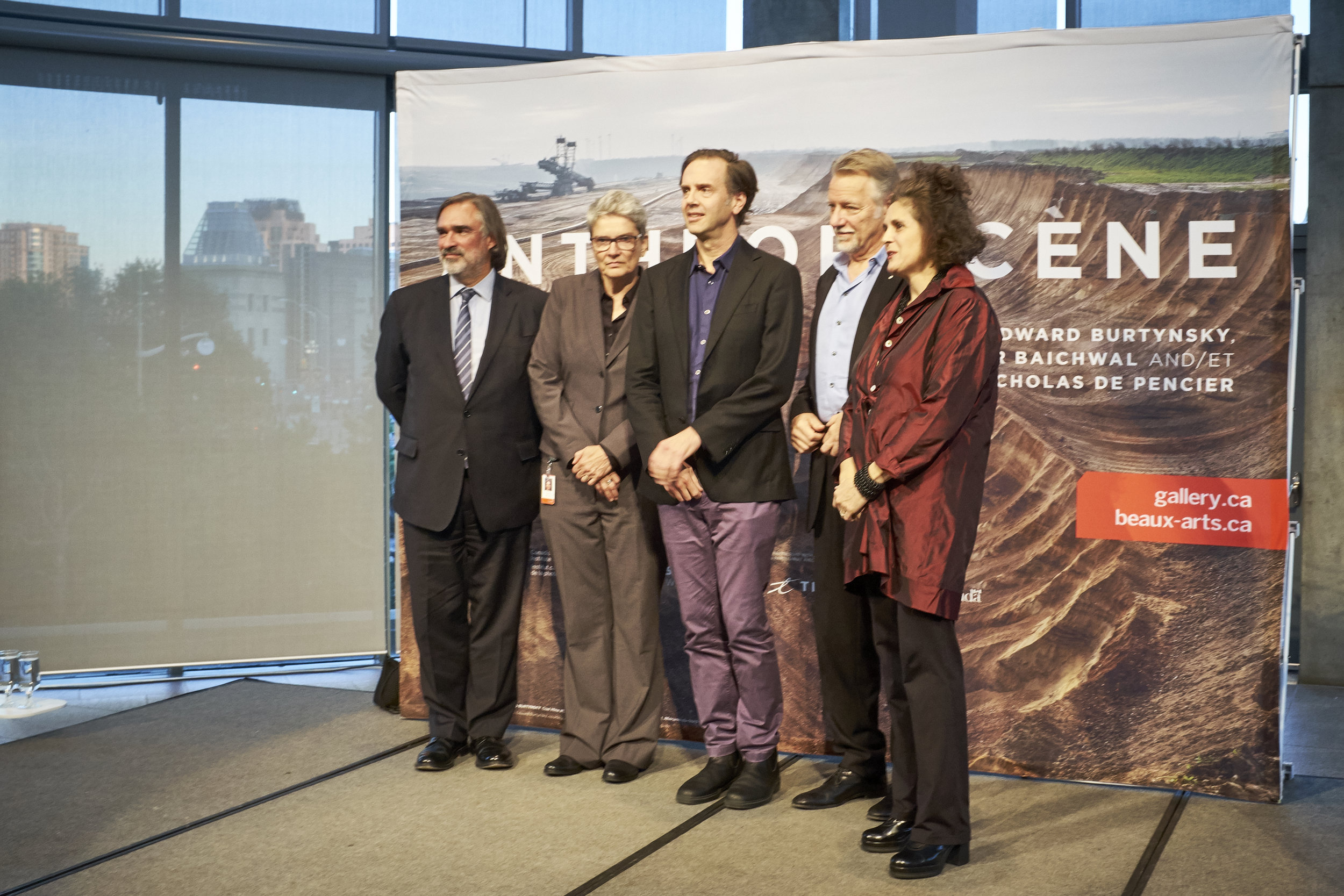
Anthropocene opening at the National Gallery of Canada (NGC), Sept. 26, 2018. From left to right: Marc Mayer, Director of the NGC; Andrea Kunard, Associate Curator, Canadian Photography Institute, NGC; Nicholas de Pencier; Edward Burtynsky; and…

Anthropocene opening at the National Gallery of Canada (NGC), Sept. 26, 2018. From left to right: Marc Mayer, Director of the NGC; Andrea Kunard, Associate Curator, Canadian Photography Institute, NGC; Nicholas de Pencier; Edward Burtynsky; and Jennifer Baichwal.

Anthropocene opened in two complementary versions, one at the National Gallery of Canada in Ottawa and the other at the Art Gallery of Ontario in Toronto. The title of the project is a still-contested term that refers to a new geological era where “…human-kind has caused mass extinctions of plant and animal species, polluted the oceans and altered the atmosphere, among other lasting impacts” (Stromberg, 2013)

The project is a large-scale multimedia production comprising still photography, video, a movie, augmented reality installations and a book. It is in line with Burtynsky’s other work both with and without collaborators: bold, richly layered, large-format photographic prints that make viewers stop to look at things that are worrying.

Anthropocene is very much a project, not only in the sense that it combines the talents of several Canadian artists, but also because it uses art to advance particular ethical and political positions. Although the artists—in words, at least—are careful to lay out information rather than to preach their stance on human impact on the environment, the conclusion of their work could not be clearer. It is possible to imagine a series of images showing the benefits of resource extraction for humanity—or even the utter dependence of our economies on fossil fuels—but that is not what has been done here. Anthropocene is a damning artistic documentation of wholesale exploitation, waste and degradation for the planet and its lifeforms.

I have seen and appreciated Burtynsky’s photographs for a number of years but I find that I am now looking at them differently since reading Stephen Shore’s (2013) brief book. Although I have always appreciated the beauty and content of the images it is only now that I am looking at them as photographs. The images play with framing, scale and geometry in such a way that it is not always clear what you are looking at.

Many of the photographs are printed so large and cover such a vast area that you must look at them twice: once from farther back to take it all in, and then an implied invitation to draw closer to peer at details and to orient yourself in the frame. Sometimes, for example, it is only at nose-distance that tiny blobs of colour reveal themselves to be heavy vehicles in an immense open-pit mine. By being invited into a two-step viewing, I found that my reaction was often to be impressed by beauty at large-scale, and to be shocked by the detail as I moved closer and more fully took in what I was seeing.

A viewer in front of one of the large-scale images from Anthropocene.

A viewer in front of one of the large-scale images from Anthropocene.

In some cases the photographs contain few or no markers of scale or orientation and show a radically flattened perspective: is this scene large or small? am I viewing head-on or from above? As a viewer, I have little choice but to remain in front of the image and puzzle out how I should assess it. Once again, the effort is rewarded by an aha!, but it means that it is almost impossible to skip past Burtynsky’s work in a casual way. It draws you in with its geometric beauty and large physical print, and almost always delivers a punch. For some images, it is necessary to repeat the viewing cycle more than once: distant for a global view, then up close for precise detail.

Anthropocene, like Manufactured Images before it, demands time from its audience to achieve full effect.

Could you use such a set of techniques to manipulate the viewing public into accepting a particular ethical position? Yes, I suppose you could. But living near the National Gallery of Canada in an area that is now regularly visited by ice stormsfloods and, most recently, tornadoes, the message of climate change and environmental degradation is not a hard sell. It has the ring of truth.

Burtynsky was Master of Photography at Photo London in May, where I happened to bump into him while I was looking at one of the large prints to be included in Anthropocene. I told him that I always felt conflicted when I looked at his images, because they are so beautifully shot and printed, but their content is so often disturbing. “Good,” he replied. “That’s what you should feel.”

And I do.

Visiting the exhibit was like an object lesson to work through some of Shore’s points about the representation of three-dimensional reality within a two-dimensional frame. I will be spending more time thinking about what impact the factors of scale, perspective and orientation have on my own work and how I can use them to best advantage, to support what it is that I want to say and to help shape the experience for the eventual viewer.