Read—The art world demystified

A handy little volume full of practical advice from artist, teacher Brainard Carey on how to gain access to curators, gallerists and collectors. The art world looks impenetrable to outsiders but, with guidance from someone who has clearly learned from experience, getting through the door looks doable. And it shouldn't be a spoiler, but a good part of working with those who make up that world comes down to...gasp!...networking and building relationships with other people.

Very glad I read this and I look forward to reading and watching more from the author.

Reference

Carey, B. (2016) The art world demystified: how artists define and achieve their goals. New York: Allworth Press.

Printmaking I

I recently took a short, part-time course during the summer session of the School of the Photographic Arts: Ottawa. I did this for two reasons:

  • To improve my printmaking skills: if a photographic print is to be the output of all or most of the work I produce, I would like to be sure that I am creating prints of high quality. This is all the more important if I am hoping to exhibit or sell printed work at some point. I realise that a lot of what I produce is only ever seen on a screen and that I would like to change this.

  • To help me build my network in the photographic arts community in Canada: one of the clear benefits of studying with the Open College of the Arts is that it can all be done on my schedule without having to relocate. This was particularly important to me because I still had a busy full-time job when I began my studies. And the exposure to UK-based photographers and fellow students has been wonderful. The downside, of course, is that I probably have more connections outside of the country I live and work in than I have within it. It has also been an occasionally isolated road, especially during the last two COVID years. I prefer to work on my own, but even I have my limits.

One of my images I worked on and printed during Printmaking I.

Although Printmaking I only lasted for five three-hour sessions, I found it a real tonic:

  • I learned new techniques and processes to improve the quality of my prints.

  • I was exposed to and impressed by the power of Adobe Photoshop (although I am much more comfortable with Capture One and will continue to use it to edit and print my images. I also own Affinity Photo and will use it to perform any edits that Capture One cannot handle.)

  • I made a connection with SPAO, a small but well-respected school of photography that is the centre of a vibrant community of students and practitioners.

  • I met an excellent instructor and two enthusiastic students who are on their own artistic journeys.

All told, an excellent investment in time and money!

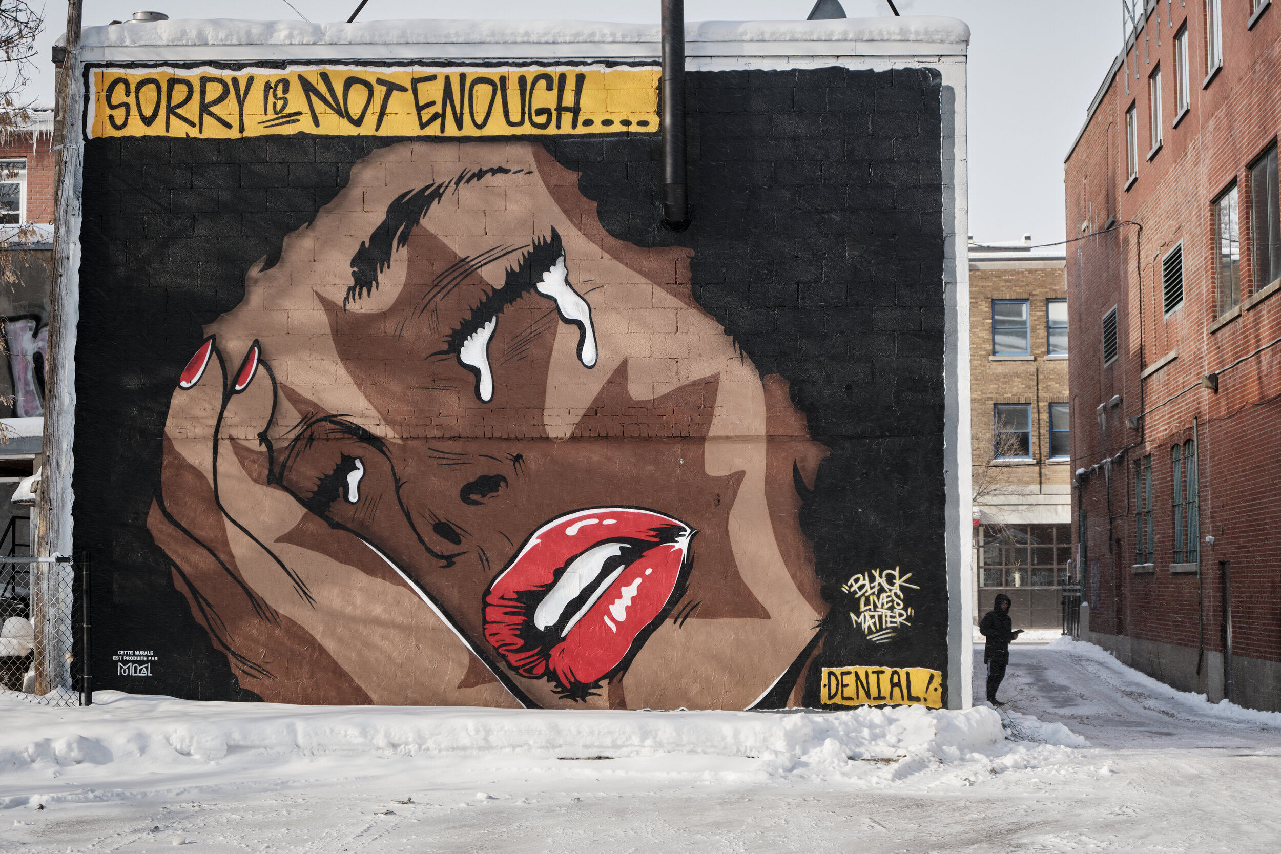
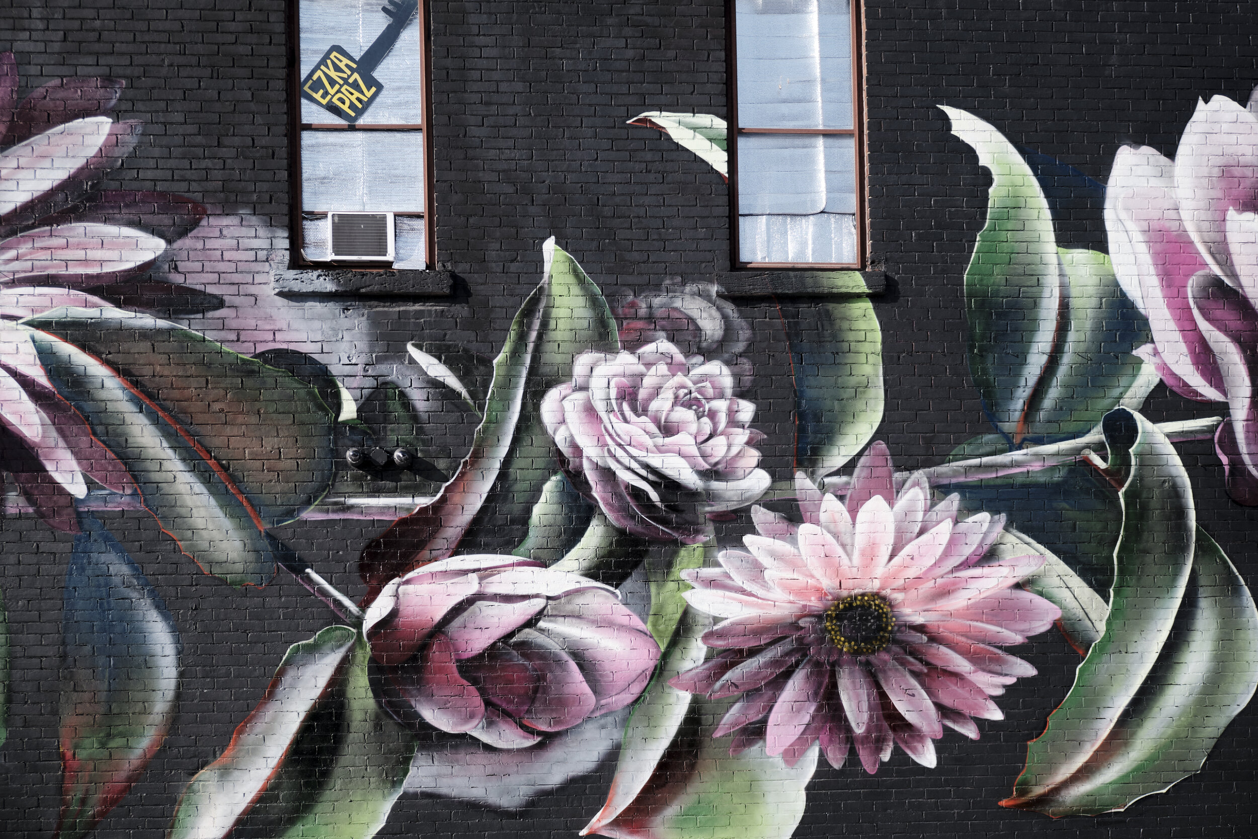
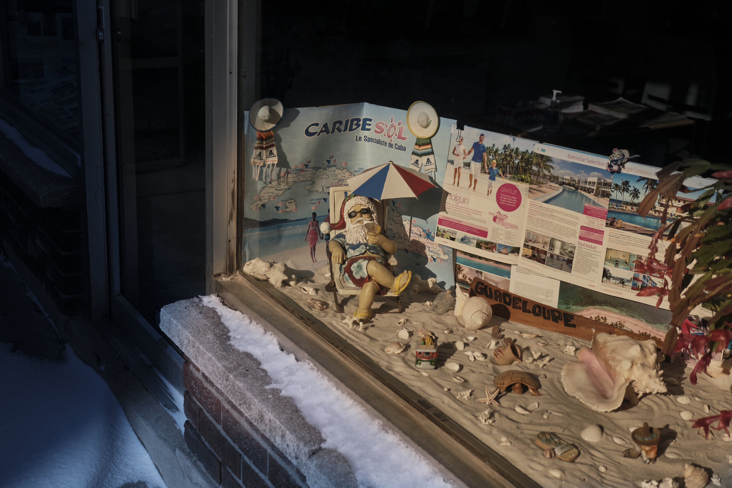
Street art in chilly Montreal

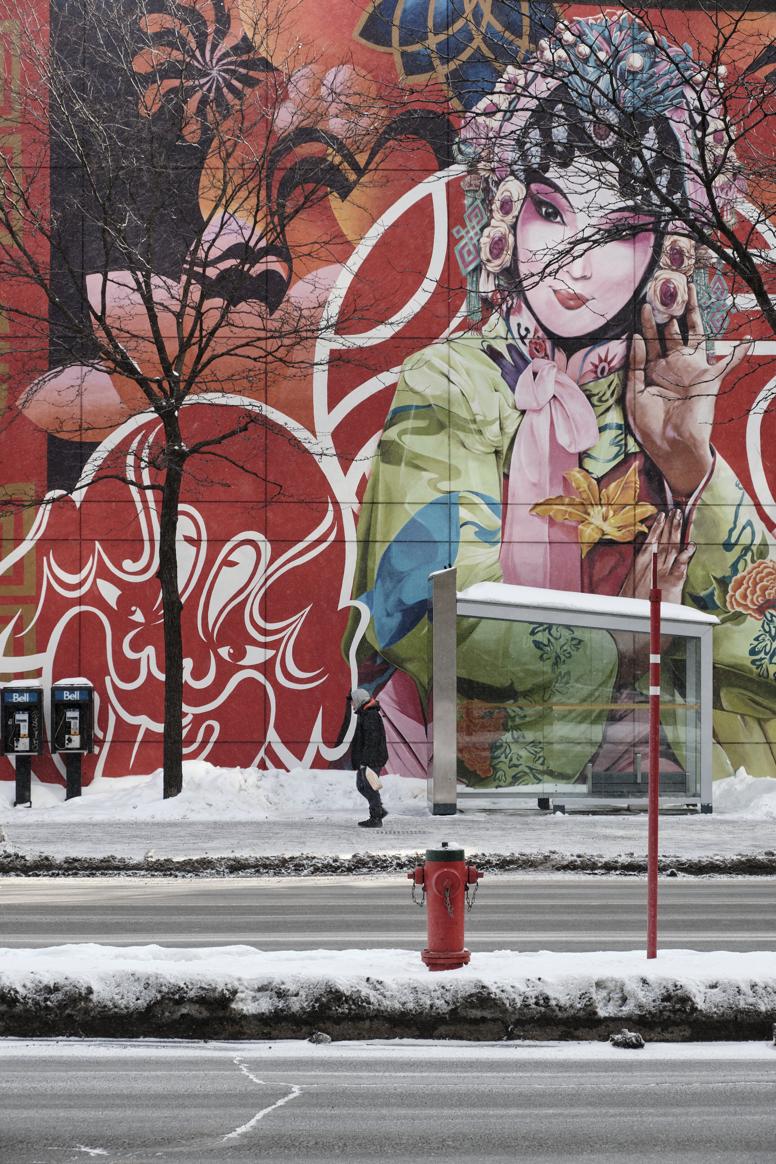
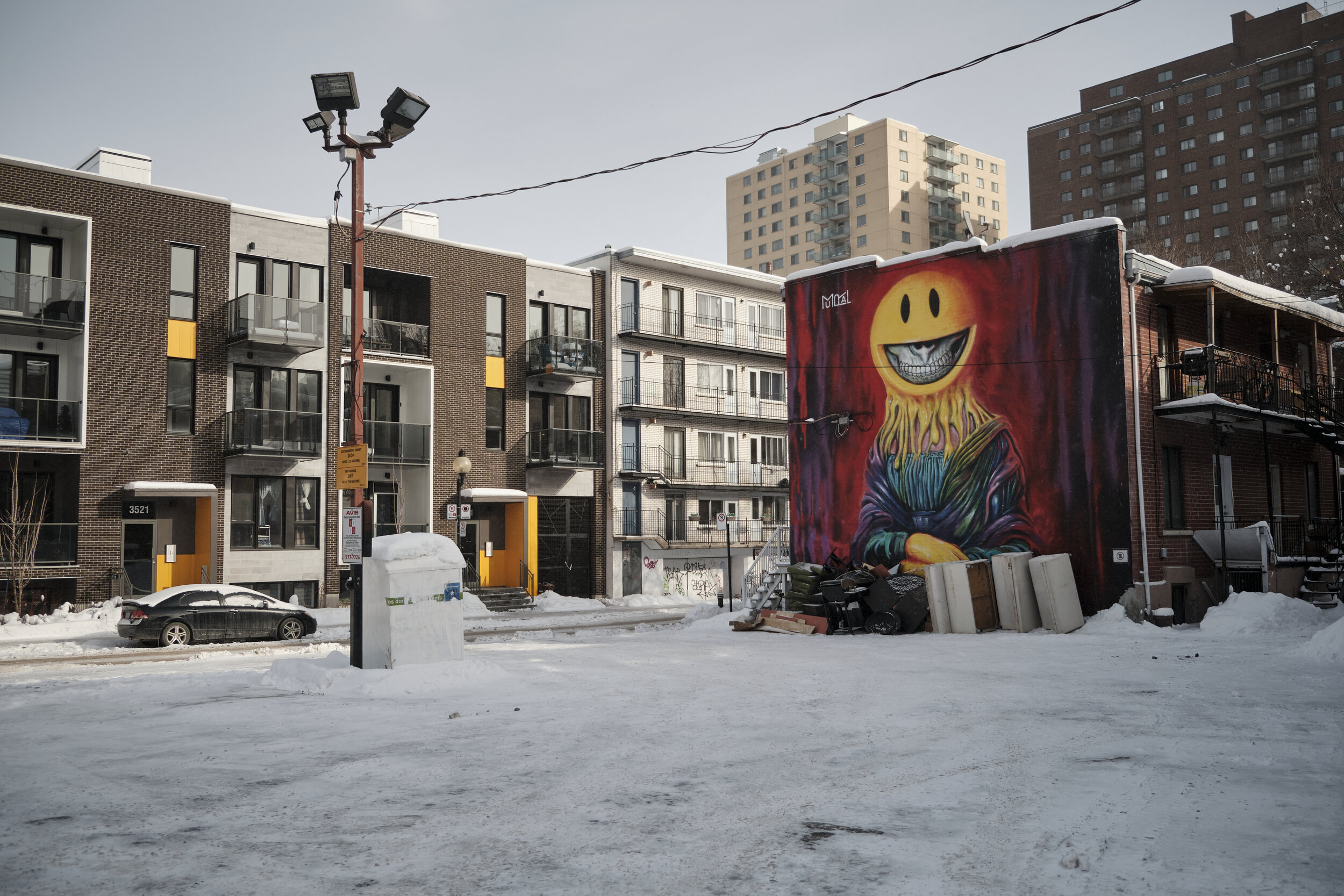
I had the chance to spend a bracing morning recently in Montreal. Well, let’s not lie: “bracing” is far too polite a word for how cold it was. “Frigid” or “bitter” would be more fitting.

Still, a walk on a sunny winter’s day in COVID-time meant that we had the street pretty much to ourselves. It was a treat strolling along Boulevard St-Laurent and taking in some of the street art that is to be found all along the way. It was also another chance to put my new Vallerret photo gloves to the test and they did not disappoint. I’ll likely do a blog post on them once I’ve spent more time with them in different conditions.

The images below were all taken with my Fujifilm X-T3 and 18-55mm zoom, which I find to be a good general purpose lens: a useful variety of focal lengths (mild wide angle to short telephoto), lightweight, with image stabilization.

A Handful of Dust

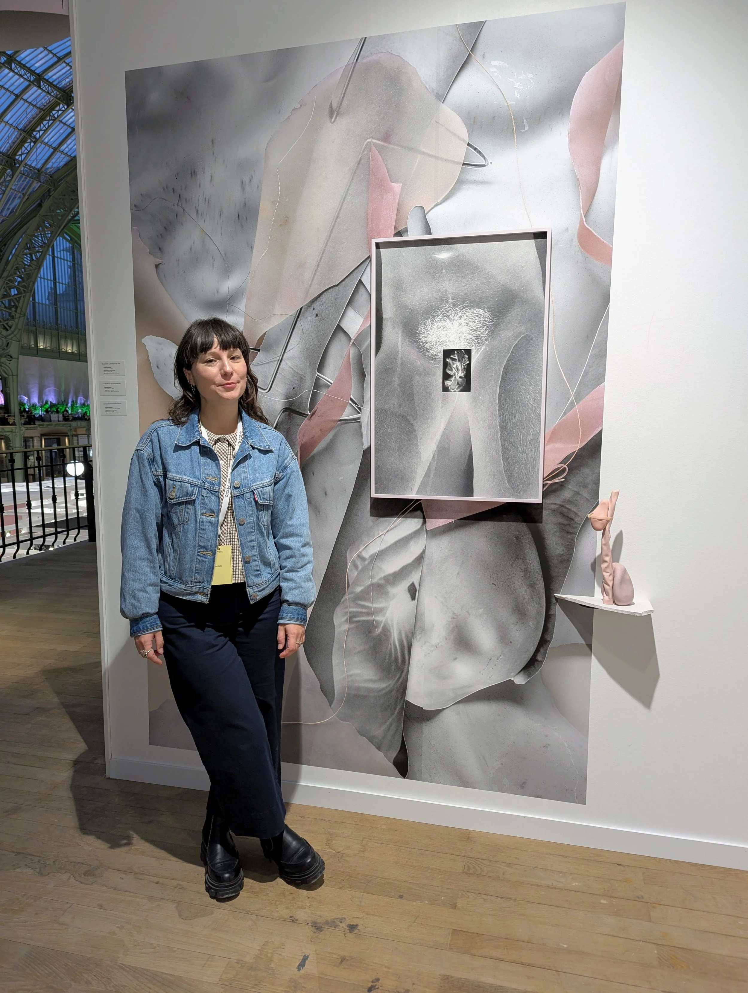
On a visit to Toronto, I had the opportunity yesterday to visit an interesting exhibit at the Ryerson Image Centre. Curated by David CampanyA Handful of Dust: From the Cosmic to the Domestic brings together work from a broad range of artists (Man Ray, Marcel Duchamp, Jeff Wall, Walker Evans, Rut Blees Luxemburg, Mona Kuhn and others), all connected thematically with dust. Campany has also published a book of the same name as a catalogue and further exploration of the theme.

The pieces, mostly photographs but with one or two paintings and a couple of video installations, seem to have been selected by Campany as conceptual responses to a photograph by Man Ray (Dust Breeding, 1920) of a piece by Marcel Duchamp. The monochrome photograph looks like it may be an aerial shot of a wasted landscape, but it is hard to get a sense of scale because of the lack of reference points and the uniformity of tone and colour. All the viewer has to go by is line, form and texture. In fact, the photograph depicts a glass plate that had collected a thick layer of dust while lying on the floor of Duchamp’s studio. Viewers are informed that the two artists may not have agreed who was ultimately responsible for the work and later agreed to share credit.

Robert Burley – Implosions of Buildings 65 and 69, Kodak Park, Rochester, NY [#1], October 6, 2007

The selected images are set in two rooms and, apart from a few dust-related quotations painted on the gallery walls, visitors are largely left to derive their own meanings from the display (which I welcomed). The sources of the dust vary—sand, destroyed buildings, human beings—but the overall message is one of human impermanence and mortality: sand covers everything in its path, the built environment doesn’t last forever, humans shed skin and eventually shed their lives.

At the same time, the dust that gathers can both conceal and reveal. It can cover tracks but it can also heighten our ability to see texture and form.

Nick Waplington – from the series Patriarch’s Wardrobe, 2010

I went to the exhibit because I have often appreciated the shows that the Ryerson Image Centre hosts, although I have to admit that I was a bit doubtful because of the subject matter. In the end, I was won over and came away thinking that it amounted to an excellent meditation on aspects of the human condition. The images on display also served to show the power of abstraction and the role of imagination in interpreting  what appears in front of us. In short, the show works.

A side benefit of the visit to the Ryerson Image Centre was a chance to see Extending the Frame: 40 Years of Gallery TPW. The show is a history of the founding and evolution of the Toronto Photographers Workshop (TPW), a group which has worked diligently to advance photography as an art form and has involved such people as Edward Burtynsky, Robert Burley, and the duo of Carole Condé and Karl Beveridge. It was fascinating to see how the dedication of a relatively small number of people has had such an impact on the direction of photography and art more generally in Canada. 

Àbadakone | Continuous Fire | Feu continuel

Àbadakone (Algonquin for “continuous fire”) is the second exhibition “in the National Gallery of Canada’s series of presentations of contemporary international Indigenous art, features works by more than 70 artists identifying with almost 40 Indigenous Nations, ethnicities and tribal affiliations from 16 countries, including Canada.”

According to the National Gallery, “the title Àbadakone was provided by the Elders Language Committee of Kitigan Zibi Anishinabeg. They felt that its connotation of a fire within each artist that continues to burn would be an appropriate title for the second presentation of this ongoing series of exhibitions showcasing Indigenous art from around the world.”

Indigenous art and culture is drawing a lot of attention in Canada and other countries dealing with the history and ongoing impacts of colonization of the “New World” by European powers.

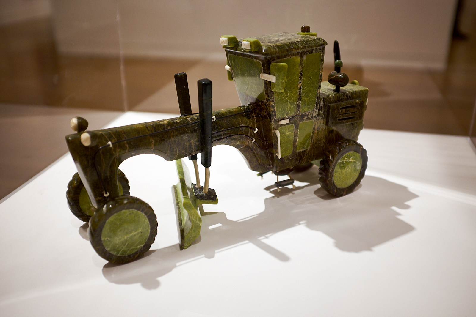
I found the exhibit exciting as it opens up a broad range of discussions that are important not only for Indigenous people, but for anyone who has an interest in place, identity, the construction and evolution of culture, and the importance of narrative for creating and bearing meaning. The introduction at the entry to the exhibit indicates that the broad theme behind its curation is one of “Relatedness, Continuity and Activation.” In brief, this refers to the interconnection of all things, the links across time and generations, and “how an artist animates a space, an object, or an idea through performance, video or viewer engagement.”

(All images taken on my cellphone.)

For me, there were several threads that ran through the exhibit, particularly the challenges of:

  • colonization;

  • industrialization;

  • globalization;

  • environmental degradation;

  • technology;

  • migration; and

  • tradition.

Without taking anything away from the specific issues and questions facing the Indigenous artists who created these works, it seems to me that many of the challenges are also faced by non-Indigenous people. As a result of the challenges I’ve listed above, very few of us can simply take for granted the place where we stand, the identities we have inherited, the histories that have shaped us or the futures that lie before us. In a time of profound uncertainties, it will be important to draw selectively on our knowledge of the past, on our best understanding of our times and on the most promising paths forward. It is fascinating to see that while Postmodernism rejected meta-narratives, we continue to need overarching stories to interpret the past, create meaning in the present and have hope for the future.

Surface Tension

A little poem inspired by Henri Cartier-Bresson’s famous image, Behind the Gare St. Lazare, 1932.

Surface Tension

Defying gravity, hanging between earth and eighteen-percent sky
A blurry cartoon man looks and leaps and never lands
The take-off hurried
but so graceful that it leaves just a ripple witness and hat firmly fixed.
A shadow hangs below—his, if experience can be trusted and photographs don’t lie— ever threatening to connect the reflected with the reflection.
A “Do Not Walk” silhouette sign in greyscale where
fiery flashing red should be.

The sensible figure observes, comforting the fence behind,
a watcher, not a risker.
Will he have no brave story of his own
but settle for singing another man’s song?

The gravity-defier will never settle
Content to hover and fly, tantalizing a puddle
He has learned through the years the science of water and the art of birds
Born in steam-time, he embraces weightless the world of wonders
Rare-earth magnetic heels repelling the mirror planet below him

The station
Stationary
Surface tension.

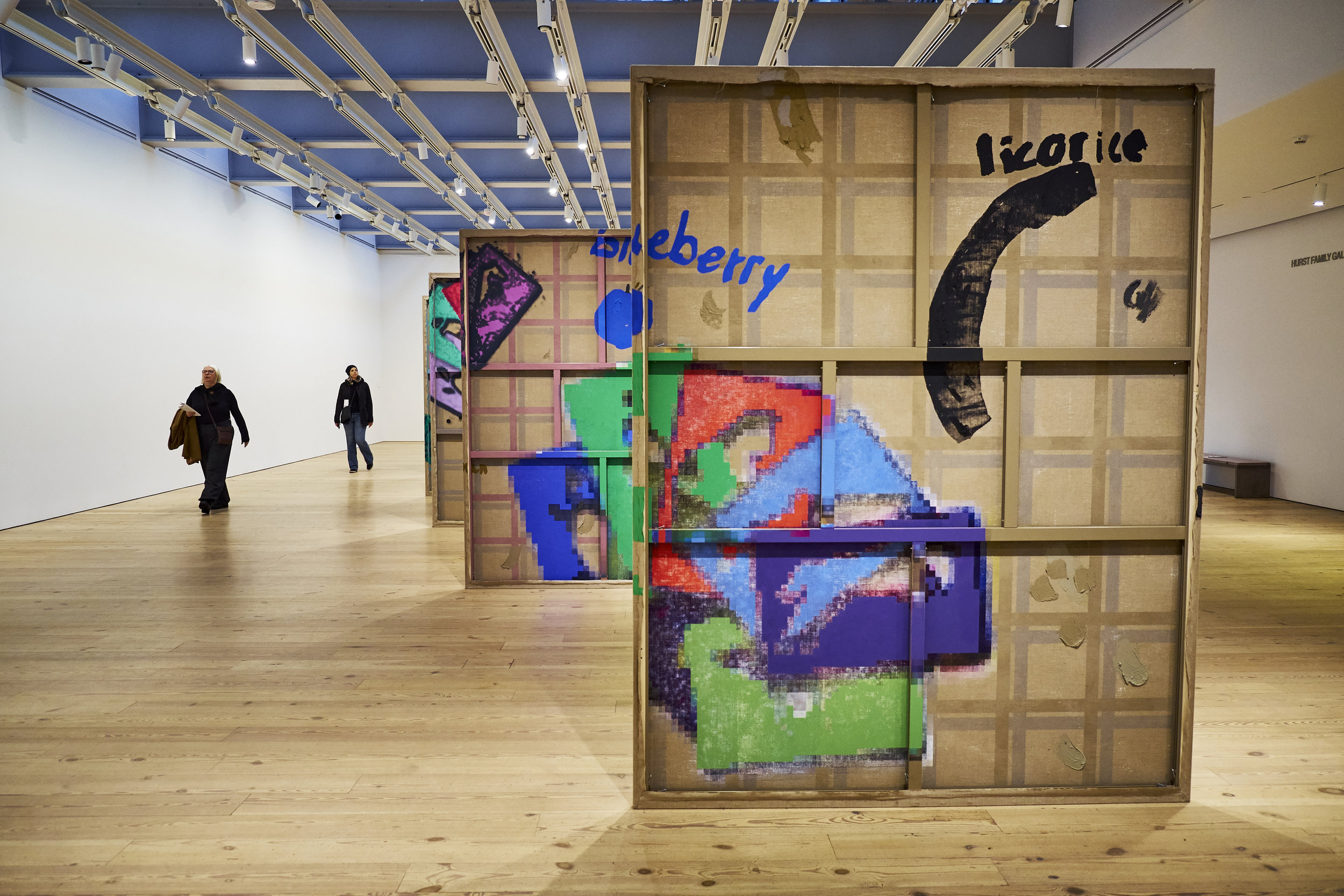
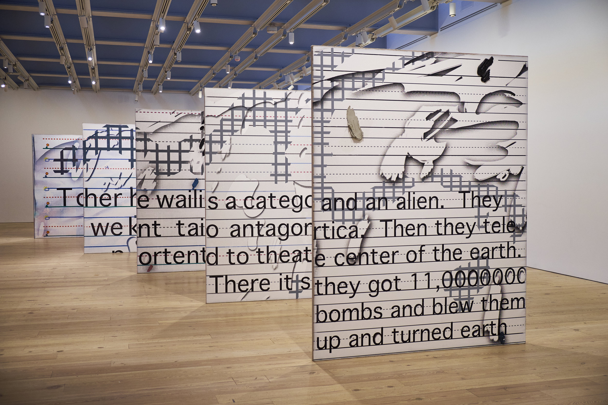
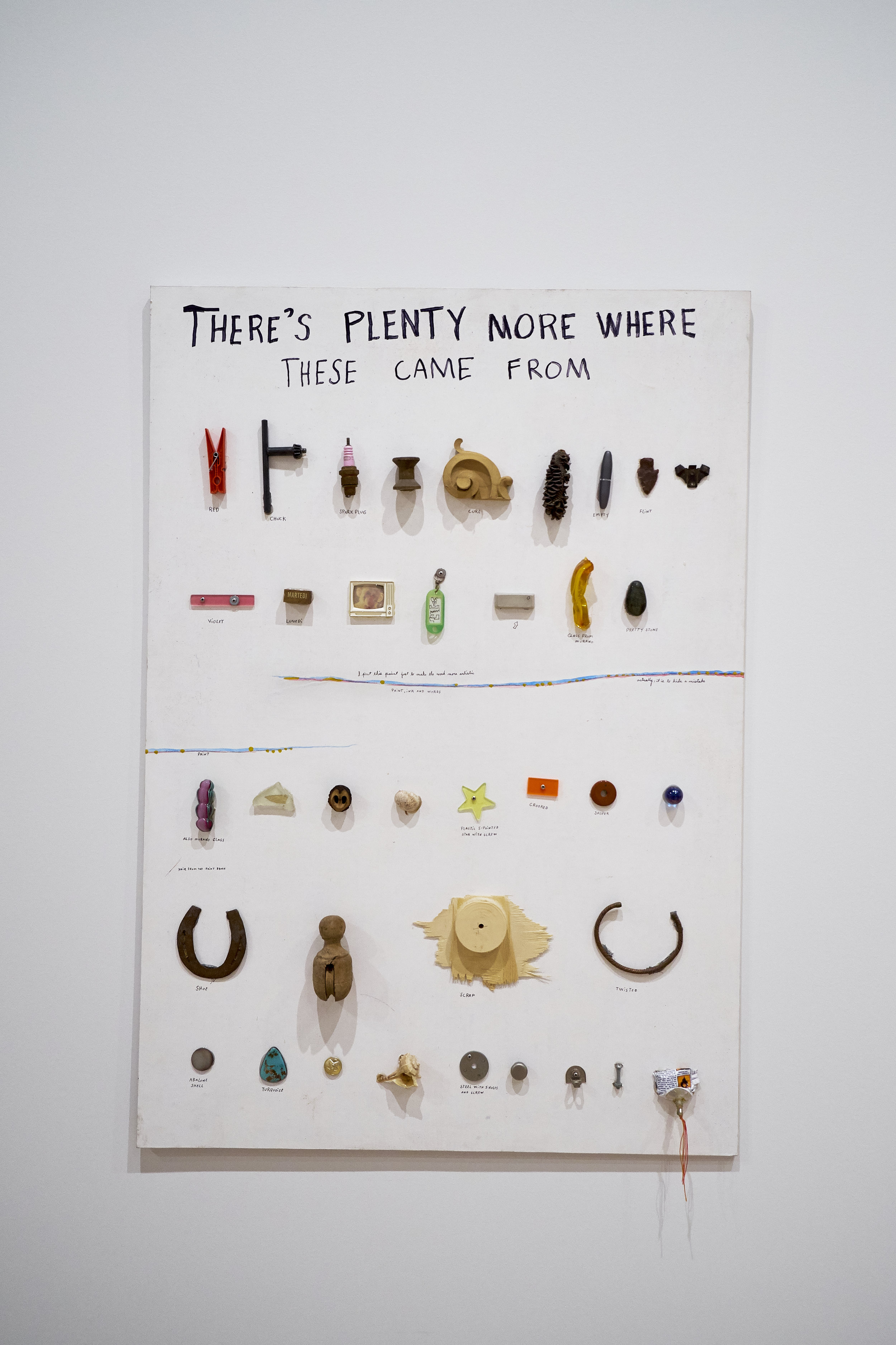
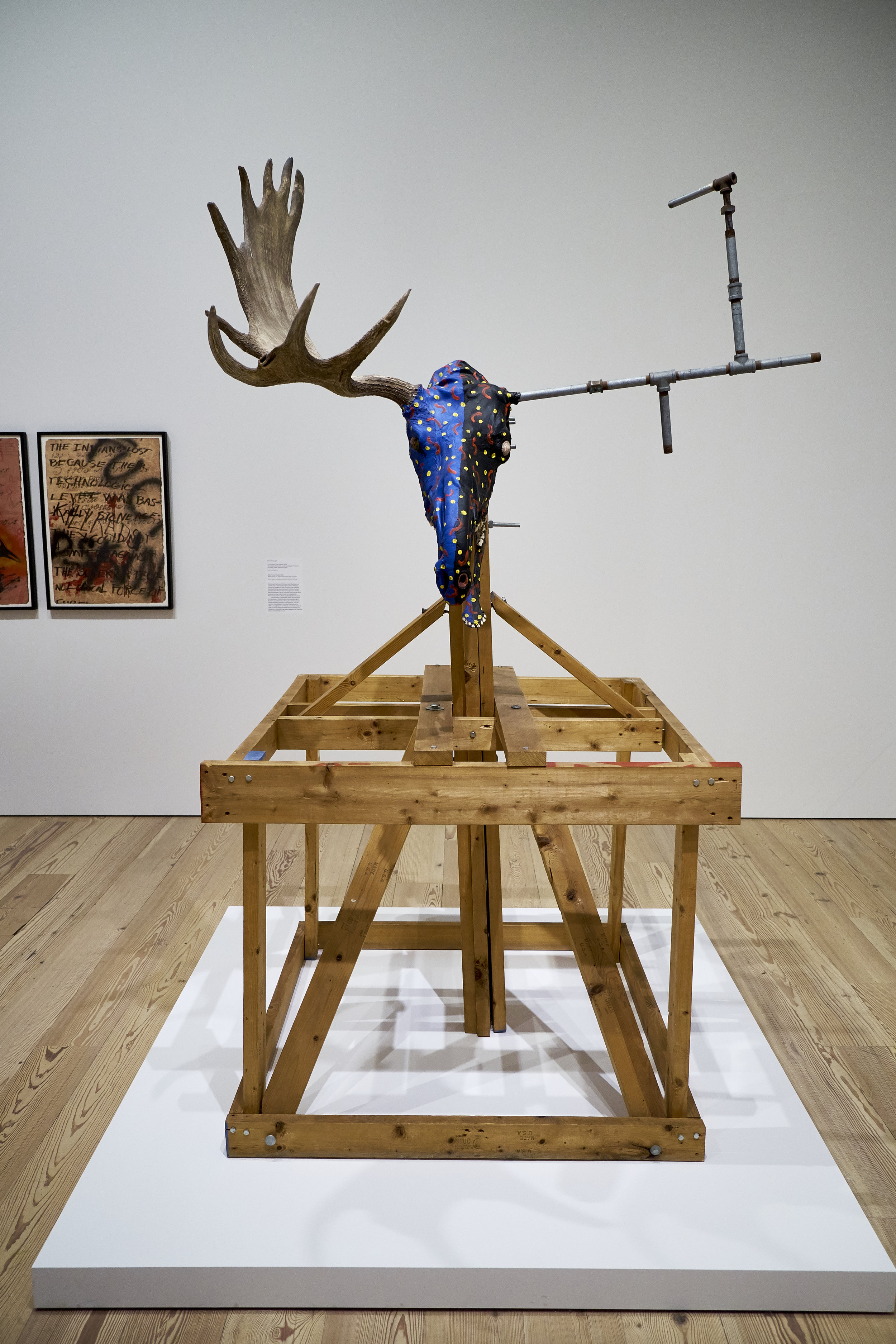
A Trip to the Whitney

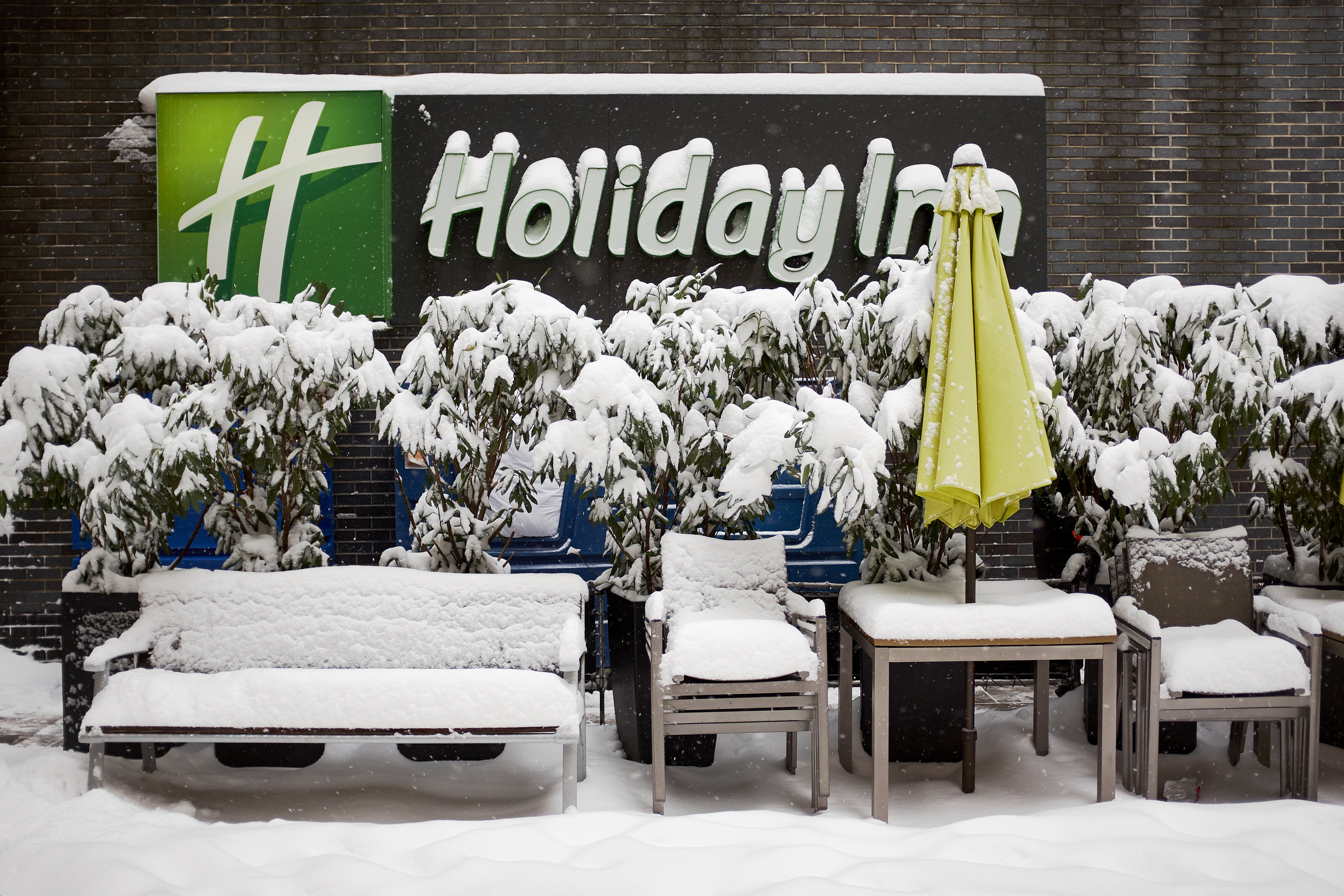
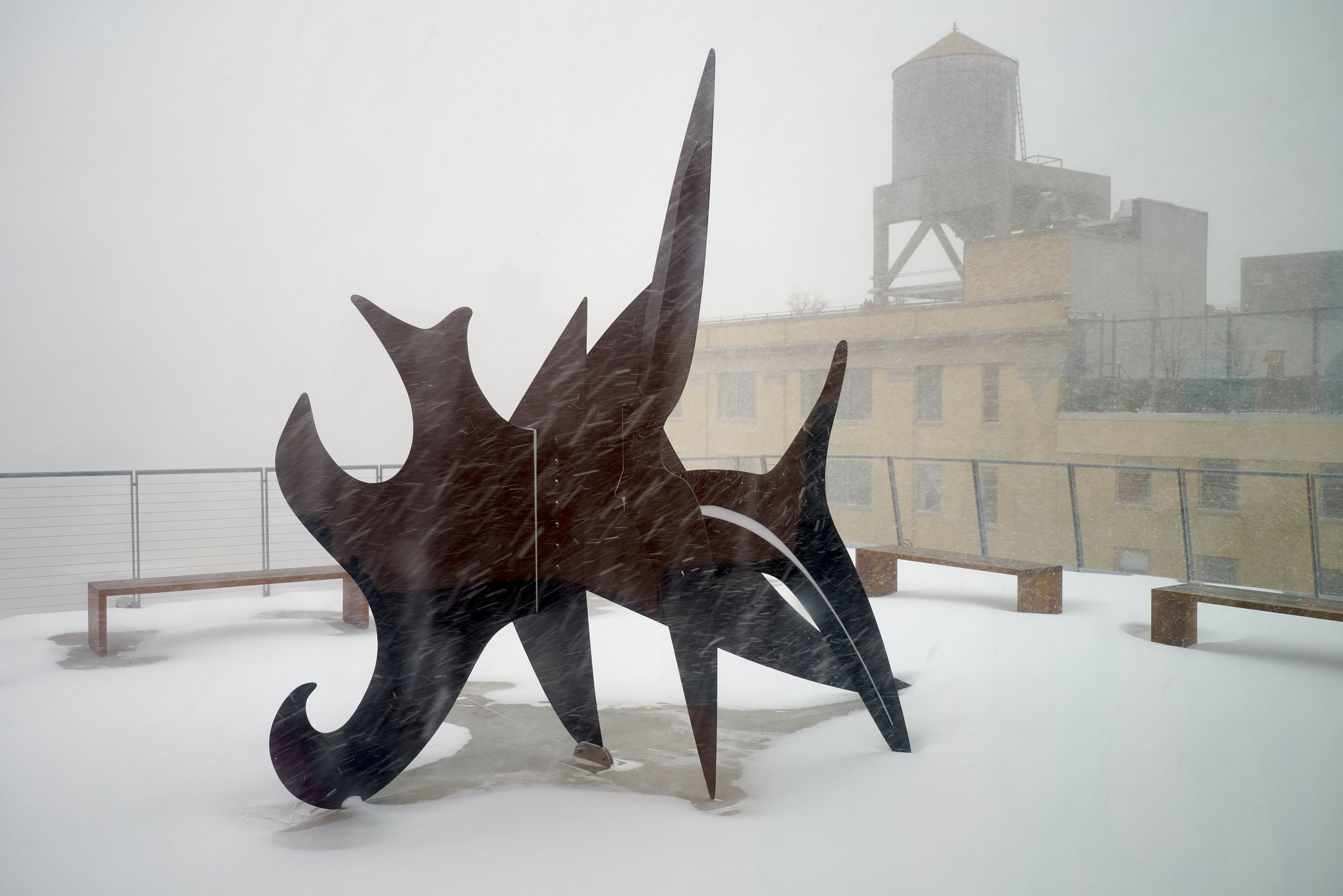
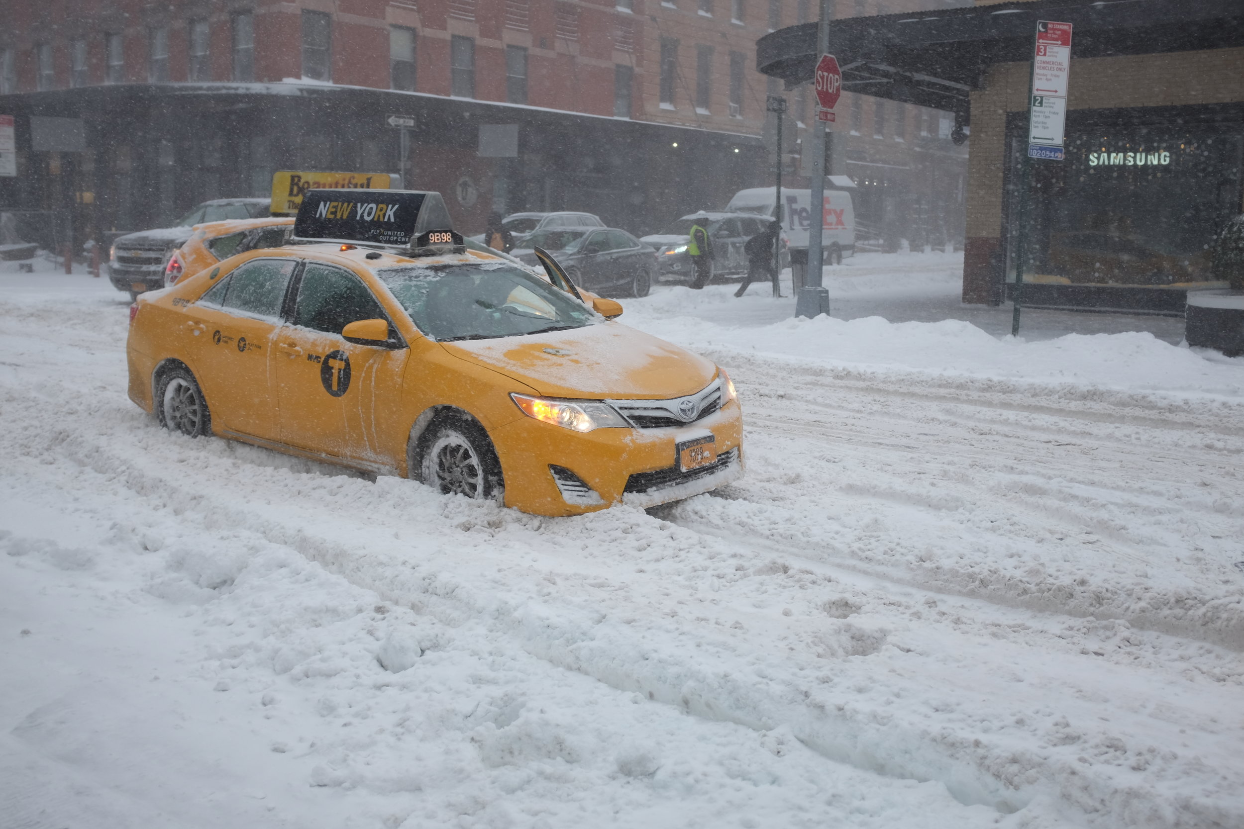
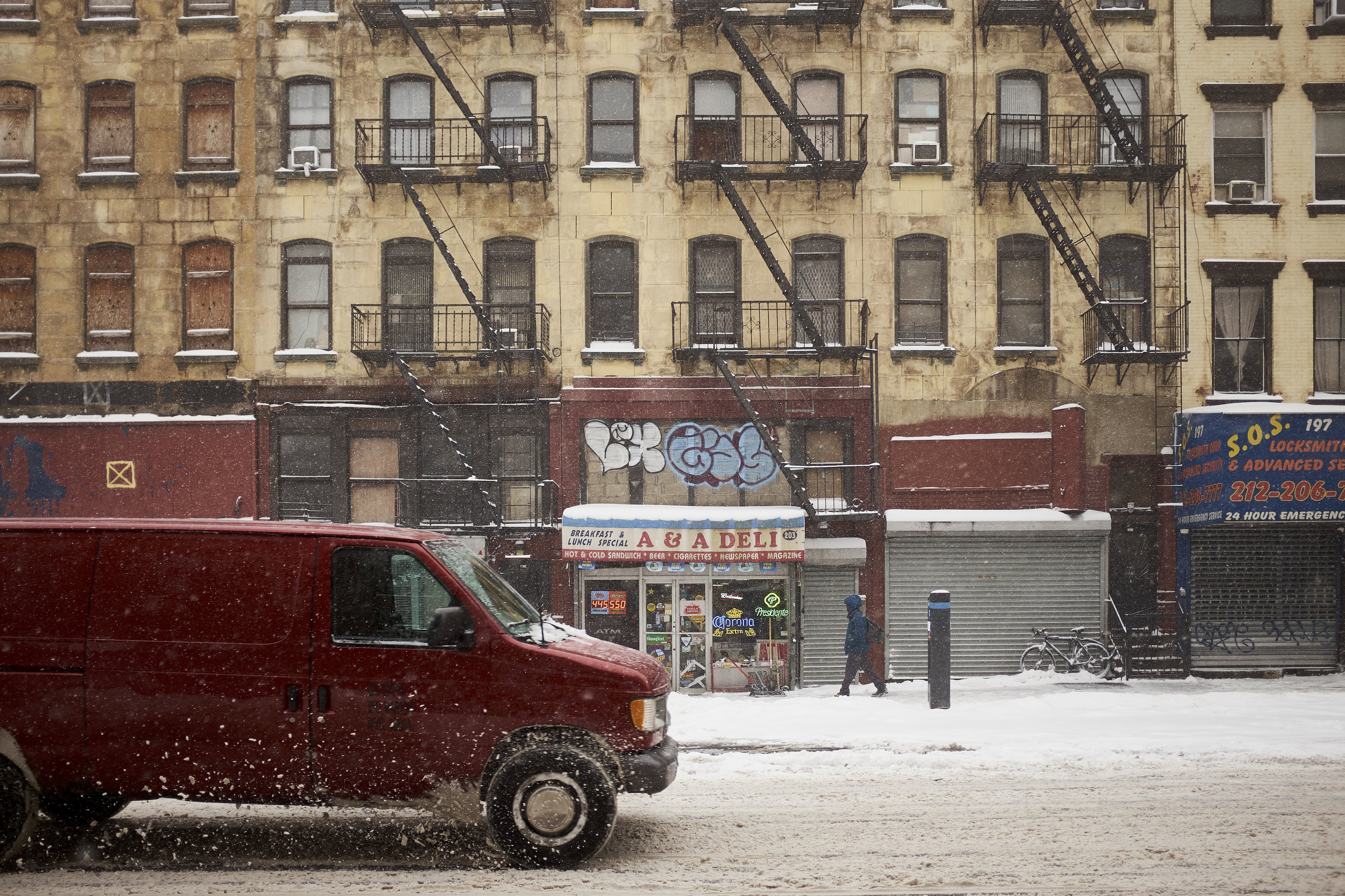
My family and I took a quick break in New York City in the first week of 2018 and arrived just in time for a major snowstorm, after driving through hours of snow squalls on our way from Ottawa. (And we didn’t know it then, but we would also drive the eight hours home through yet more snow squalls.)


We had never visited the Whitney Museum of American Art so it provided an ideal activity for a day when the weather was miserable. The collection is housed over several floors in a new building with plenty of space for taking in the work, especially for larger-scale pieces in the ‘mid-career’ survey of work by Laura Owens (born Ohio, 1970). Owens’ work can appear deceptively simple but I found it helpful to view all of her exhibit before making too many judgements. Her paintings and installations do indeed contain simple elements, but they are often layered with text and texture, digitally-manipulated photographs and even other paintings to create more complex and sometimes humorous work.

I left this exhibit with a sense of quiet enjoyment of light, and life and colour.


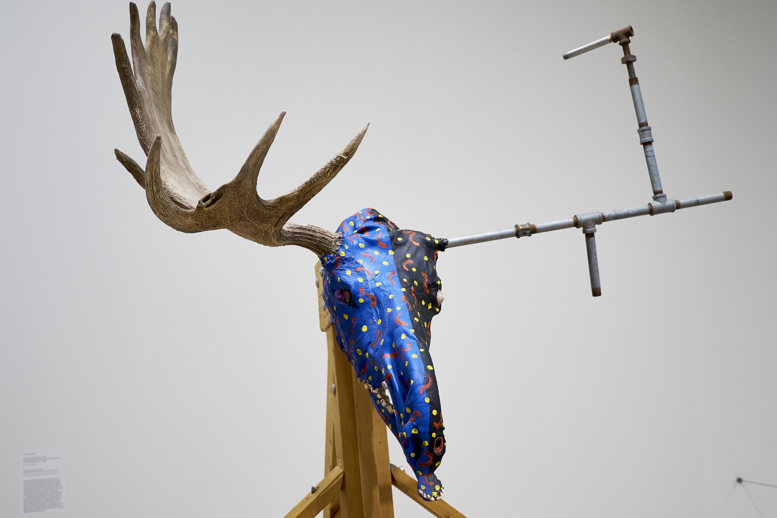
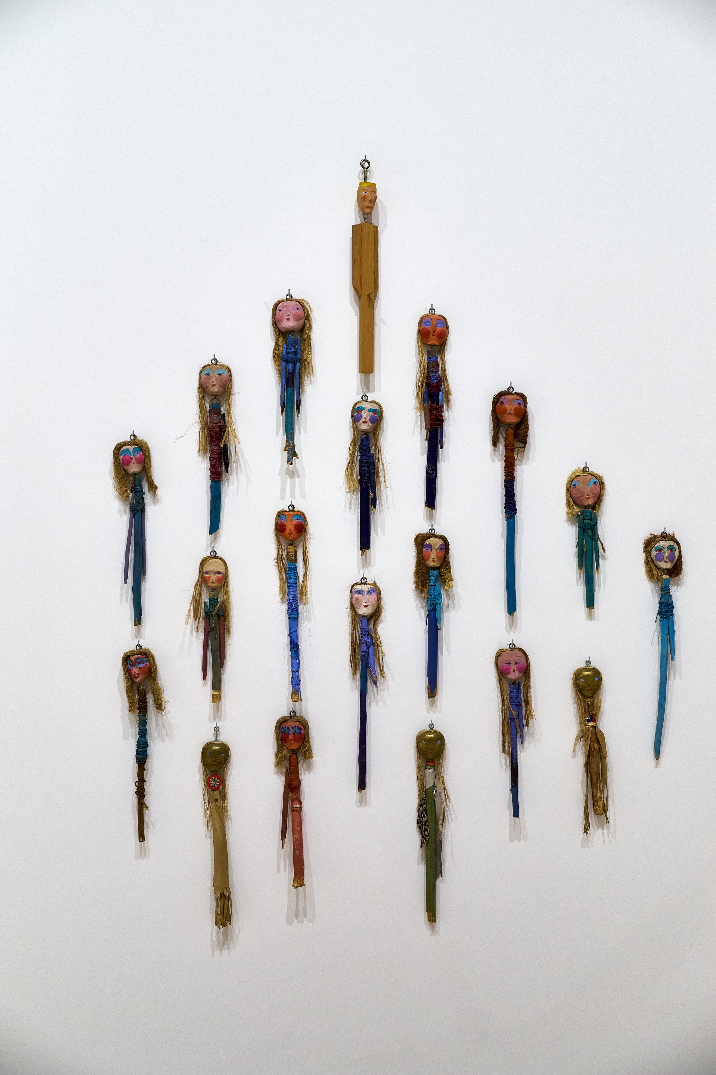
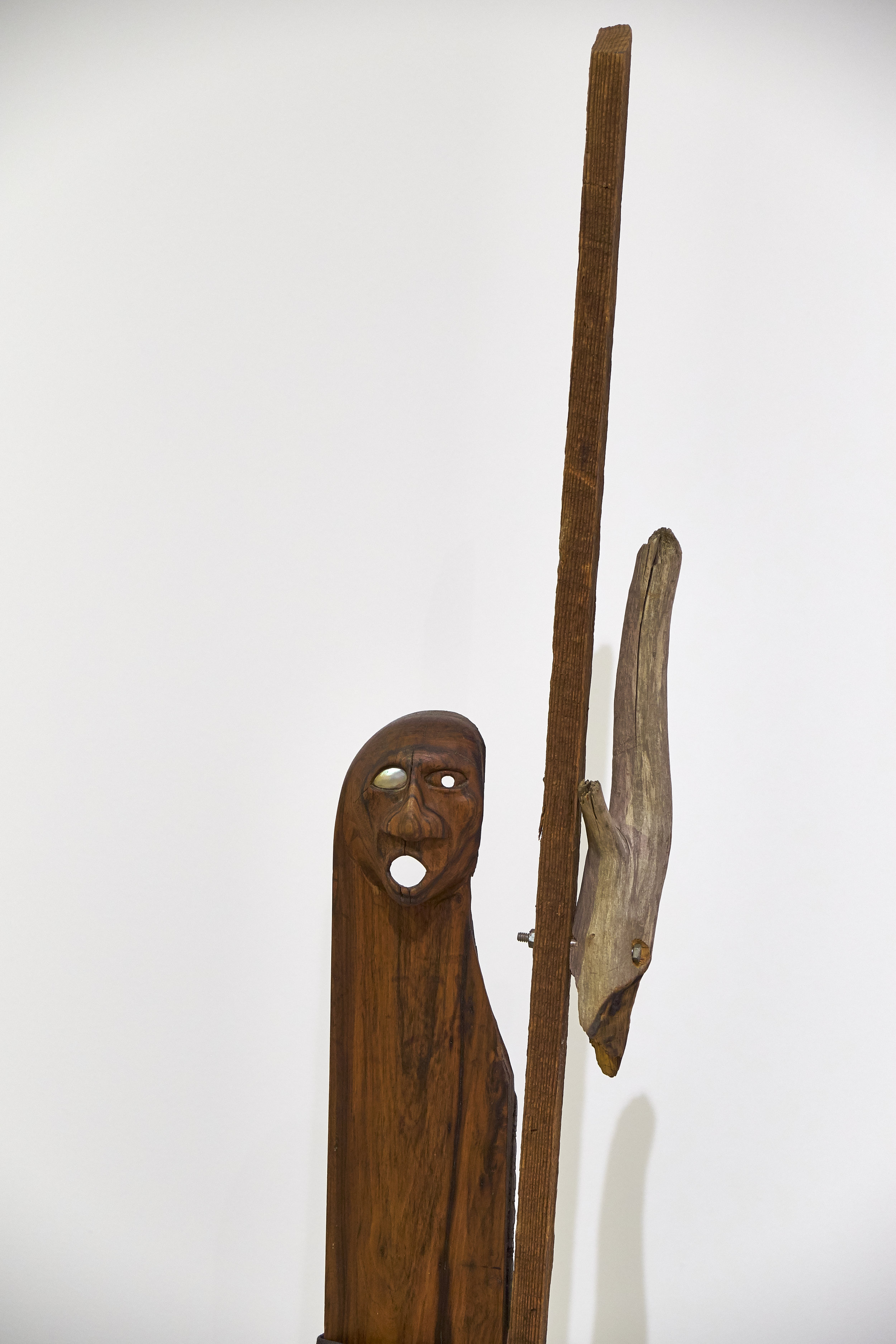
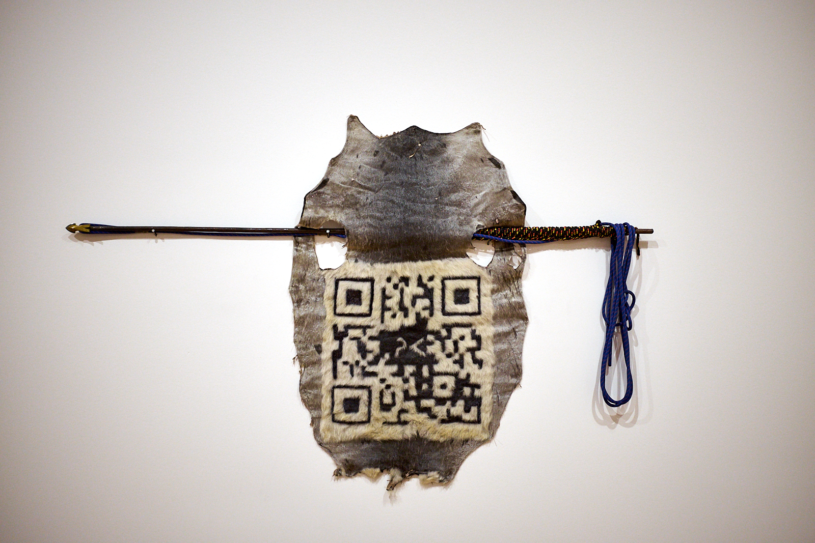
If Owens’ work showed flashes of humour, “Jimmie Durham: At the Center of the World” contained a strong mix of humour, satire and the absurd. Durham (born USA, 1940) worked as a political organizer for the American Indian Movement in the 1970s and his commitments are present throughout his work. He consistently draws attention to the impacts of the colonisation of the USA but probably manages to do it without alienating the people who most need to hear his message. To my mind, Durham use of humour and satire to communicate serious messages make him a trickster of sorts (although some contend that his claims to be Cherokee are false and that he is taking the trickster role too far). Cherokee or not, he draws on found objects to create works that draw on traditions of North American Indigenous art but clearly show their postmodernist and technological origins.

Three exhibits at the National Gallery of Canada: land and landscape

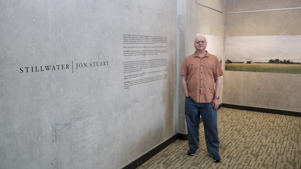
On November 5 I visited three new photography exhibits at the National Gallery of Canada in Ottawa. In one way or another, all three were tied to the Canadian landscape whether in the past or currently.

For Canadians who were old enough to read books in 1976, the exhibit Between Friends is a reminder of a book of the same name published as a gift from Canada to the U.S. on the occasion of that country’s bicentennial. For this exhibit, photographer Andreas Rutkauskas revisited many of the locations along the 8,891 km border between the two countries. While much of the geography has not changed, the exhibit contains reminders that crossing the border has become more difficult and formal in recent years because of the rise of protectionism and isolationism in the U.S., and the new geopolitical reality throughout the world. The pictures are subtle and often beautiful and the boundary they point to can seem an artificial and arbitrary one. Why should the living situation of people leaving a couple of hundred metres apart be so different?

A similar theme is evoked in Frontera, a drone’s-eye view of the U.S.’s southern border with Mexico. These pictures, however, do not contain the open spaces and lightly-patrolled woodlands seen in Between Friends. The Mexican border is lined by a steel scar that runs across the landscape for many hundreds of miles through inhospitable wild places, sometimes broken by poor settlements on one side and wealthier communities on the other. More often, though, it is difficult—if not impossible—to tell which side of the frontier is which: the land is the same and it is a political negotiation that has traced a line through it. Looking at many of the pictures by Mexicans Pablo López Luz and Alejandro Cartagena, Canadians Mark Ruwedel and Geoffrey James, Swiss Adrien Missika, American Kirsten Luce and German Daniel Schwarz, it is easy to imagine that one day the land will absorb the border and all human traces will be forgotten.

The third exhibit, Gold and Silver: Images and Illusions of the Gold Rush, provides a photographic record of the stampede for California and Yukon gold in the late 19th century. While we cannot help but wonder at the bravery and greed that drove men and women to seek their fortunes in unforgiving locations, it is impossible to miss the impact on the environment that was the result of unchecked exploitation. Many of the worst cases—deforestation, slag heaps and diverted watercourses—are still there to be seen. The collection is a fascinating set of posters, daguerrotypes and tiny, vintage contact prints but, while image-making technology has moved on, it seems our care for the land has not evolved at the same pace.

Start creating, like a thief

A quick plug for Steal Like an Artist: 10 Things Nobody Told You About Being Creative by Austin Kleon.

I bought this book on someone's recommendation, without giving it much thought. It was so small and cartoonish when it arrived, however, that I assumed I had made a mistake. As it turned out, I enjoyed it. I found it simple but not simplistic. If your goal is to create, the brief lessons in the book could help you to jump-start your creative juices and get moving on actually making something. Or you could find a longer book that you will never finish and be happy to have an excuse not to make a start.

51H1Sfu+oPL._SX258_BO1,204,203,200_.jpg

The Louvre: from Mona to Marianne

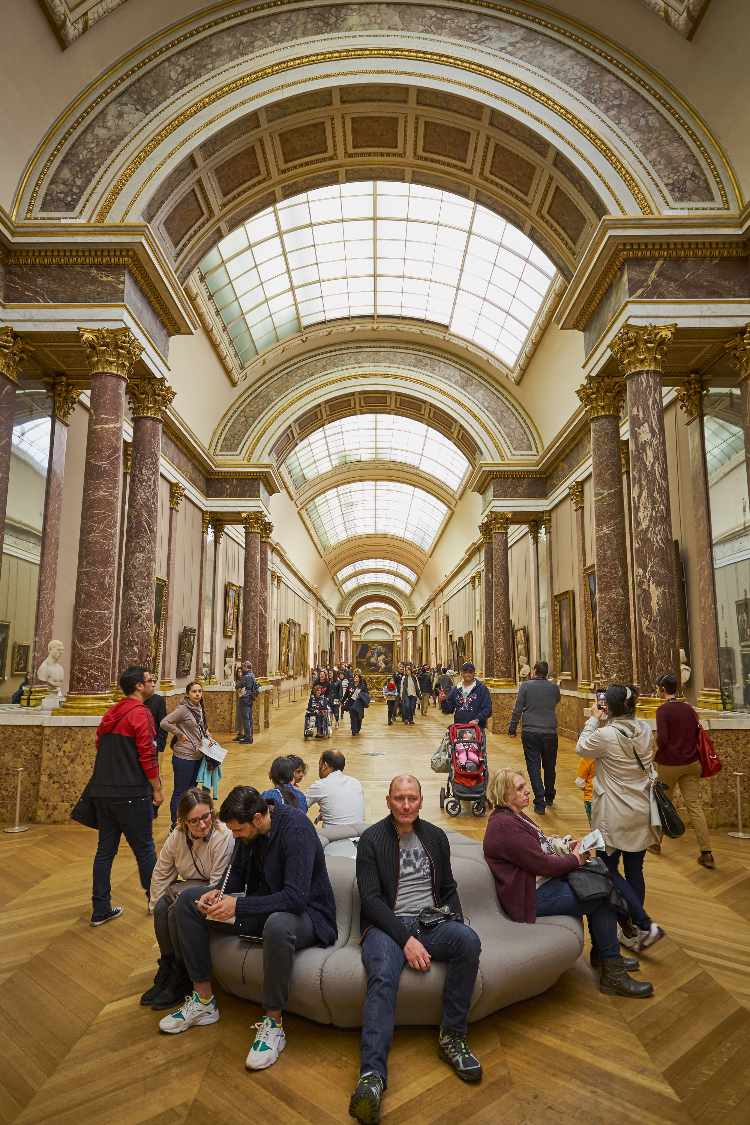
What could I say about the Musée du Louvre that hasn't been said often and better by others? The scale of the collection is staggering and it is impossible to take everything in in a single visit. I soon found myself trying to move through rooms too quickly, aware of how much more there was to see. After a short while I realized that I was doing the gallery a disservice by rushing and decided to slow down again. Better to see fewer things well than to consume the art of the centuries like fast food. For the remainder of the four hours of my visit I wandered at a comfortable pace.

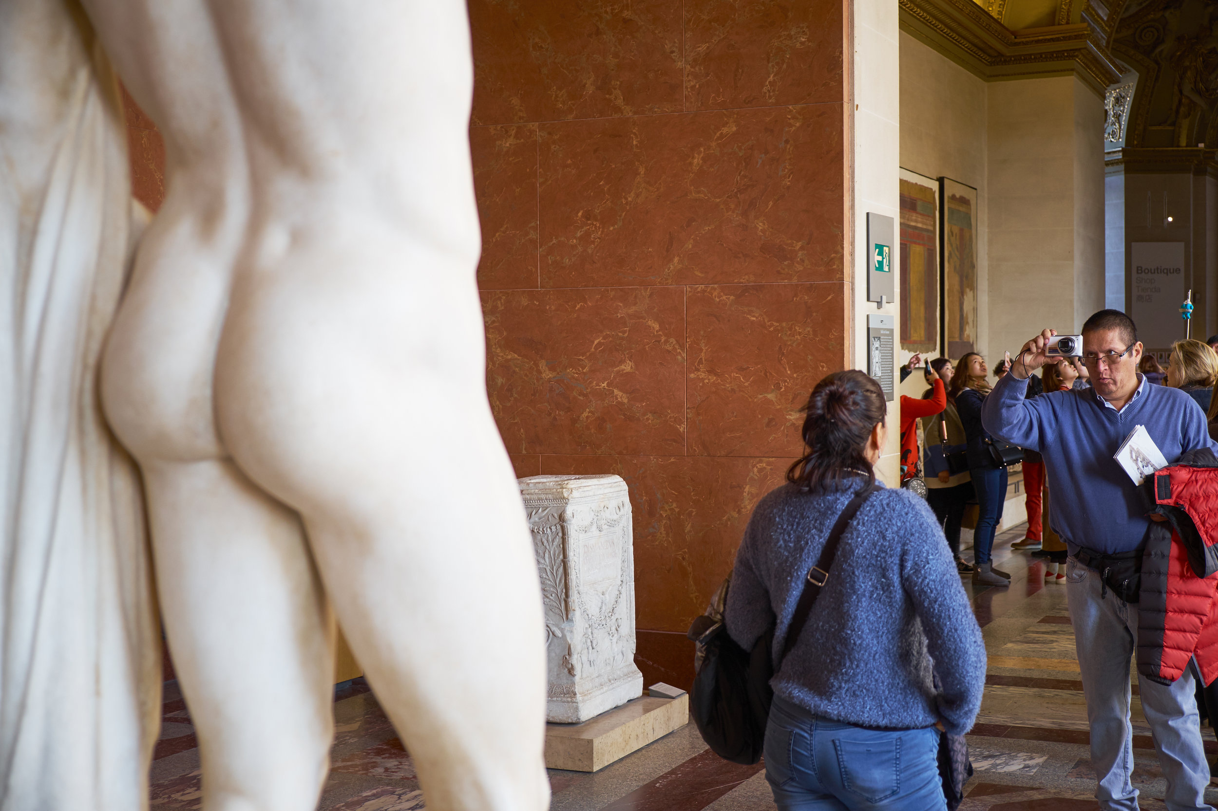
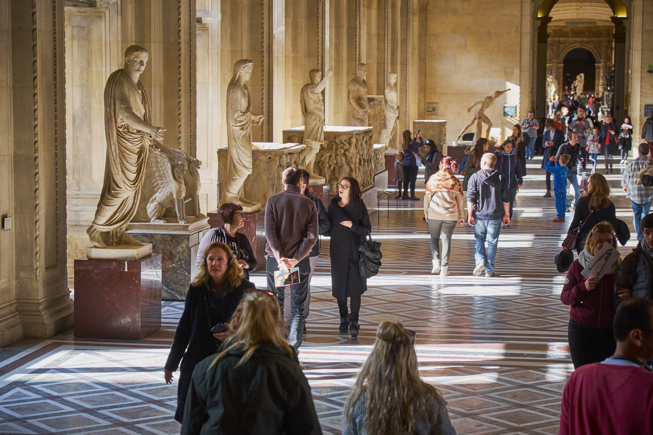
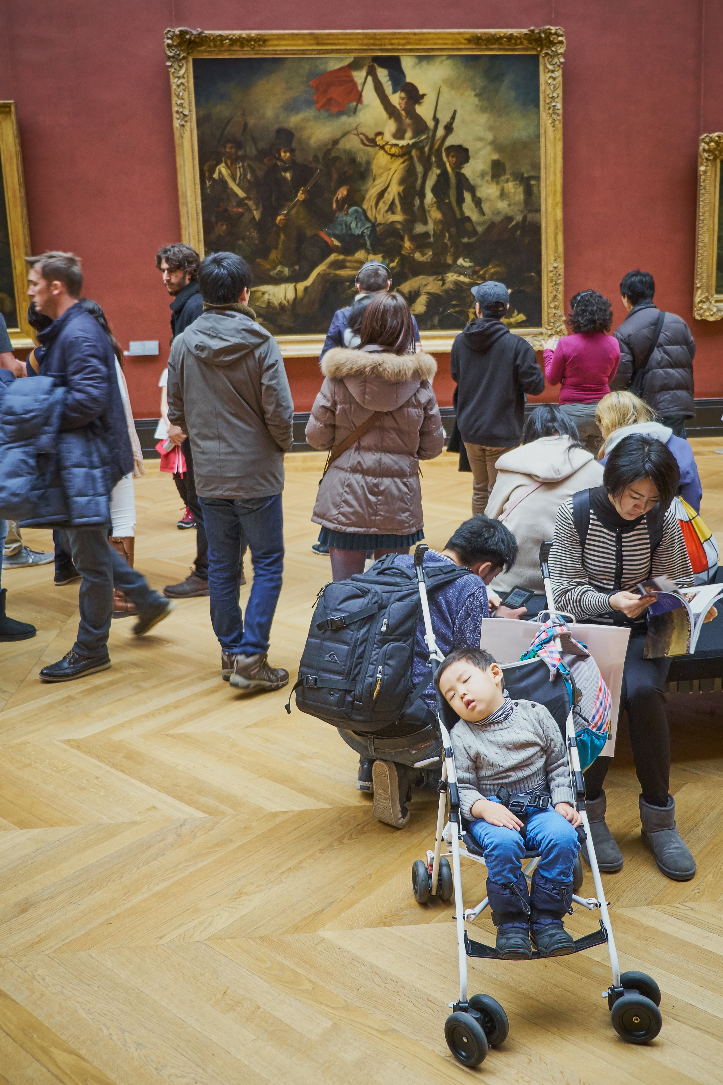
And I found that not all the sights were on the gallery walls: I also found it fascinating to keep an eye on my fellow visitors who were there in their thousands. You can learn a lot about human nature from the way people act in crowds—some of it touching, some of it puzzling, some of it comical.

I would have to place people's behaviour around the Mona Lisa in the 'puzzling' category. By the time I had followed the signs to the gallery where da Vinci's famous piece hangs behind protective glass, it was obvious that I was going to visit a celebrity. Few works in the museum have their own signposts so that you can find them from several galleries away. I could have waited my turn in the long line to see the painting from a couple of metres away, but it seemed to me that the crowd itself had become the story. I could not believe how many people, having queued up to see the painting, immediately turned their backs on it so that they could take a selfie.

I understand that people want to document their experiences, but many of them spent no time at all contemplating one of the world’s most famous pieces of art. They were oblivious to the object in front of them, which seemed to have little or no significance of its own. Instead the work was there to validate their importance or experience. It didn't point to anything grander, more beautiful, nobler, more challenging or universal than… me.

So, a short series of images of guys and galleries at the museum, starting with Mona and ending with Marianne ... and a tired fellow visitor.