Project 3, Exercise 3: Viewpoint

Image 1: ©Derek Trillo, The Cheshire Plain from Beeston Castle, 2008

  • The high, oblique perspective gives a sense of the spatial relationship of objects on the ground to one another.
  • We also get a sense of the relative size of the objects and we are able to guess at scale, using the trees as a guide.
  • The slanting light gives some idea of texture, from the rough trees and gullies to the relative smoothness of the mowed fields and plowed earth. The shadows also give a relative indication of the time of day—we know the picture was taken during the day (bright) but not at noon when the sun would be directly overhead (smaller or no shadows).
  • We can also surmise that the image was made in early spring: the fields have been plowed for sowing and the grass is very green, but the leaves on the trees are not very advanced.
  • If we were at ground level our view would be blocked by trees, hedges and walls. This high perspective allows us to see over and beyond these obstacles.
  • We cannot see the horizon, however, so it is hard to relate this viewpoint to anything beyond the tight frame of the image.
  • A map would give us a representation of the area from directly above, but we would not have as much information about the ground features or about their texture.
  • Many of the same comments could be made about earlier versions of Google Maps, but more recent iterations give us a richer range of options for viewing.

Image 2 by OCA student, Peter Mansell

  • This picture allows us to see the horizon and shows us a developed urban area that stretches on for some miles.
  • The image shows us a region that appears to contain both commercial / industrial facilities as well as residential areas (the apartments and lower buildings in the middle and longer distance).
  • Although a black and white picture, the trees are covered in foliage and suggest summer.
  • Other than a partial sign on a roof ('P.A. FINLA'), there are few identifying features in the image (the canal?) and little indication where this town might be.

Image 3: © John Davies, Agecroft Power Station, Salford, 1983

  • The black and white photograph is taken from a high angle and shows four cooling stacks from a power station set in a broader landscape. Metal pylons hold the high tension wires that carry electricity away from the station.
  • Behind the cooling stacks it is possible to make out a large building with a high chimney. In the foreground sit some cars in the middle of what looks like scrub land and rubbish at the end of a canal. In the middle distance a game is underway on a football pitch.
  • The foreground is made up of lines of trees, broken up by the lane that the cars have used for access. There appears to be a split-rail fence just behind the trees.
  • The sky is dark and overcast, and it is not possible to tell if the clouds are natural or if they are the smoke/steam produced by the cooling towers. Perhaps the clouds are a mix of both.
  • All told, it is a bleak scene even though the towers are impressive in the way they dominate the landscape and stand against the sky. The bleakness comes from the brute figure of the power station squatting in the middle of what was likely agricultural land.
  • Taking the shot from a relatively high angle allows the photographer to show more of the surrounding area, thereby providing greater local context for the image. Moving to a lower angle or moving closer to the power station would have made the cooling towers even more dominant, but would have blocked much of the view and reduced the amount of visual information for the viewer.
  • Being able to see the players on the football pitch gives the viewer an immediate sense of scale. The figures are dwarfed by the landscape and by the massive size of the cooling towers. It does not take much imagination to see how the humans are dominated in what should be a natural setting by the industrial installation beside and above them.

Image 4: © Bernd & Hilla Becher, Water Towers, 1980

  • Although not technically part of the exercise, the series of images by Bernd and Hilla Becher are very interesting to me because I first saw them in a show at the Rencontres Arles Photographie 2014.
  • The show was called 'The Walther Collection: Typology, Taxonomy and Seriality' and dealt specifically with the issue of how series of similar images invite comparison. Just as the course materials suggest, I found that I did indeed "look far more closely when looking for differences than [I] would do at a single image."
  • Along with work by the Bechers, there were series of images by Karl Blossfeldt (plants), J.D. 'Okhai Ojeikere (hairstyles of African women), Richard Avedon (portraits of Washington elites), Martina Bacigalupo (trimmed remnants from a portrait studio), Ai Weiwei (the dropping of an urn), and Zhang Huan (a face being progressively covered in Chinese characters), Eadweard Muybridge (successive frames of a woman walking) and others.
  • I spent much longer looking at this exhibit than I thought I would, absorbed in examining the clues suggested by the smallest of differences from one frame to the next.
Project 2, Exercise 3: The image as document

Why do you think that photographs are such a significant part of our lives? Write down how you feel about photos – or videos – from your family’s past.

  • Photographs are tangible artifacts that promise to preserve memories intact and changeless across time. Faces and places are of particular importance to us, so anything that can channel their likenesses to us is meaningful. We can preserve other kinds of keepsakes like letters or personal possessions, but they don't seem to have quite the same power. Perhaps this is because relate to people is more important than relating to inanimate objects, and to relate to a person most often means reading his or her face where we look for recognition, what is familiar and loved, and characteristic expressions and signs of mood.
  • I look at pictures and videos of my family's past to remember how people and things were. Sometimes they help me to recall a particular, mood or feeling, but it is hard to view them without adding on a layer of everything that has happened since the time the picture was taken. I also find that I feel differently about pictures taken of family members that I know than those that I have never known. Pictures of family members from generations that went before me are interesting in a curious (are those eyes like mine?) or historical (so that's where and how our family lived) way, but they do not have the same personal appeal—they both are and are not part of my story.

Will this archiving be affected by the digital revolution?

  • Digital photography has many advantages over film-based photography, but one of its downsides is the fact that I print so few images now. I realize that none of my children has probably had the experience of poring over a family album because there isn't one. There are now thousands more images in the house but they are not as easily available and we are not likely to sit looking at them together. (Although we did happen to do this recently and it occurred to me how much I missed looking at family pictures together, even those taken just a few years ago.)
  • Looking at screen-based imagery is not the same as looking at a photographic print: we are used to digital images being transitory and are more likely to browse rather than contemplate them. If we need to research or consume images, digital is much faster. If we want to take time over a picture there is no substitute for a print you can hold in your hand. I wouldn't call one approach better than the other—it is more a question of being appropriate to the task.

Project 4, Exercise 3: Visual conventions for time and place

Frame-by-frame storytelling

The best example of this type of storytelling is the classic cartoon strip that has been in use for over 100 years and is still employed in graphic novels. It is understood that time passes from one frame to the next and, in some case, place also changes (as can be seen from changes in the illustrated background in each frame).

Boys Will Be Boys, created in 1909 by Harry Grant Dart.

Unbroken chain of narrative

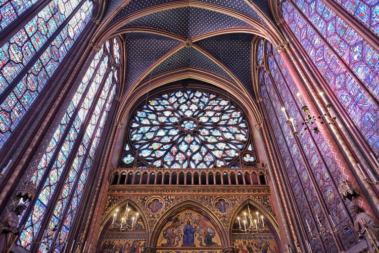
Before the frame-by-frame approach demonstrated above, some historical narratives were related in an unbroken visual story that was read sequentially. In many cases, the story was told only in images while others included text. The Sainte-Chapelle stained glass windows below show the narrative of the Old and New Testaments without words, while in the Bayeux Tapestry key elements of the narrative are described in Latin text.

Sainte-Chapelle, Paris

Sainte-Chapelle, Paris

A detail from the Bayeux Tapestry showing Latin narrative

Motion or speed lines

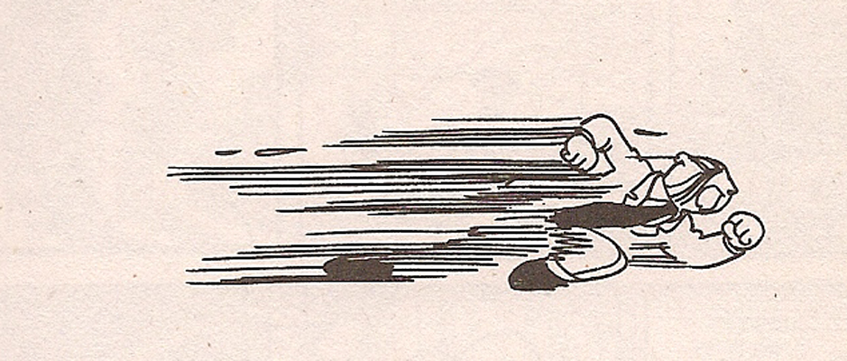
Commonly seen in cartoons, "motion lines" or "speed lines" clearly indicate direction and speed of a moving object. The more rapid the implied motion, the longer and more severe the lines which can be reinforced by blurring or elongating the moving figure. The cartoon here reminded me of a well-known photograph by Jacques-Henri Lartigue that distorts movement because of the technical characteristics of the shutter in the camera he used. I suspect that a number of the conventions we use to show motion did not exist before the invention of the camera, because the unaided human eye would simply not seen movement this way. (No doubt someone has already written about this at length...).

Use of speech bubbles

Portrayal of clocks, calendars, hour glasses

Maps

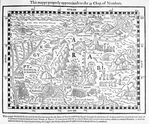
By themselves, maps generally provide a visual representation of a particular place. When coupled with lines or other interpretive overlays they can also indicate movement or other changes over time.

A map showing the journey of the Israelites out of Egypt and into Canaan, facsimile of an image from the Geneva Bible of 1560 (engraving)

A map showing the journey of the Israelites out of Egypt and into Canaan, facsimile of an image from the Geneva Bible of 1560 (engraving)

Map of Toronto subway system. Toronto Transit Commission.

Map of Toronto subway system. Toronto Transit Commission.

Changing light and/or season for passage of time

We are so attuned to the change of seasons—and even the changes of the hours of the day—that we sometimes take for granted how we constantly read the quality of light associated with a particular hour, or the colours connected with a particular month or season. But we read them all the time and they have great interpretive and emotional weight for us.

Illustration showing the changing of seasons on a single tree from www.planet-science.com

Illustration showing the changing of seasons on a single tree from www.planet-science.com

Subject or background movement

Even without the leading lines described above, we associate blurring of an image with movement. And we instantly make judgements about which planes are moving relative to others based on what appears to be sharp and what appears blurred. For example, when the foreground is sharp and the background is blurred—especially when a frame appears in the image—we generally assume that we are on a moving platform or in a vehicle.

Train Window - Green Pine{车窗-青松]. Zhang Xiaogang 张晓刚2010

Train Window - Green Pine{车窗-青松]. Zhang Xiaogang 张晓刚2010

Stages of life, aging

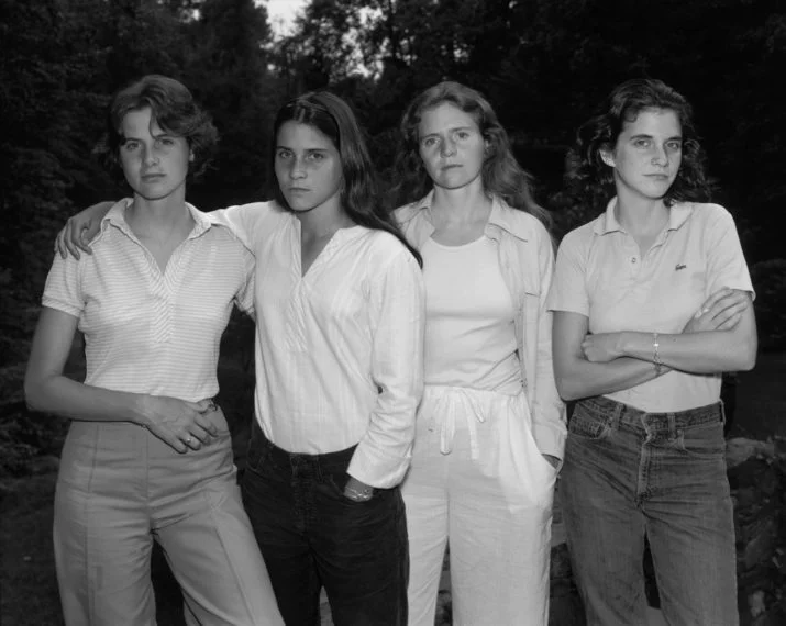
We take for granted that all living things age, die and decay. When we see a series of images that show people or other living things at different stages of life we are able to set them in chronological order without too much effort. The annual images Nicholas Nixon has made of four sisters since 1975 (two of which appear below) is an example of this: we know which picture was taken first and which later.

The Brown Sisters, 1975. Nicholas Nixon.

The Brown Sisters, 1975. Nicholas Nixon.

The Brown Sisters, 2012. Nicholas Nixon.

The Brown Sisters, 2012. Nicholas Nixon.

Signposts, place names

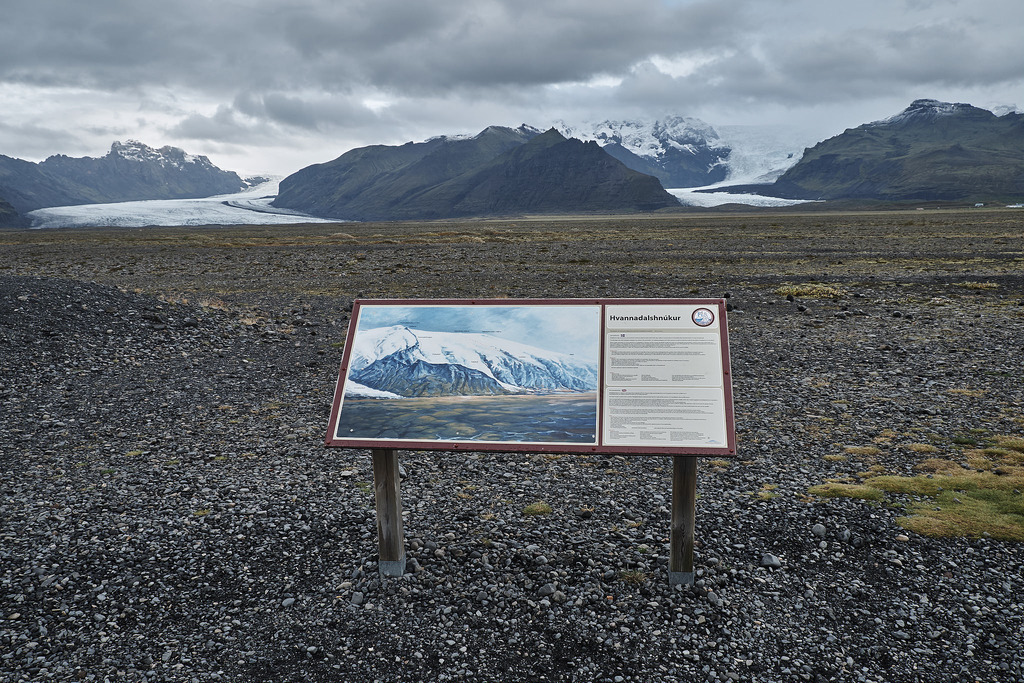
Although perhaps a bit obvious and maybe overlooked, the simplest way to designate a place is to put a sign on it. Our built environment is so full of signs that we might be overwhelmed by them, or register only those that stand out, as in the street scene in Las Vegas. The image below, taken in Iceland, has only one sign but it is intended to give information and a framework for understanding the geology of the place in front of the viewer.

Fremont East District, Las Vegas. 2016.

Fremont East District, Las Vegas. 2016.

Hvannadalshnjúkur, Iceland. 2015.

Hvannadalshnjúkur, Iceland. 2015.

Reflection

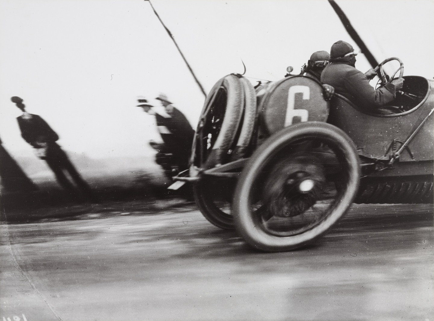
I've found that image-making as a whole has gone through important changes, but I think that some of the most significant changes may be related to the technology we have available to us, Those technological conventions have then been carried over into the visual arts. For example, the cartoon above that shows motion lines reminded me of a well-known photograph by Jacques-Henri Lartigue that distorts the shape of a car wheel because of the technical characteristics of the shutter in the camera he used. I suspect that a number of the conventions we use to show motion did not exist before the invention of the camera, because the unaided human eye would simply not seen movement this way. (No doubt someone has already written about this at length...). In the same way, I wonder if the use of frame-by-frame narration was connected with the invention of animation techniques.

Grand Prix of the Automobile Club of France, Course at Dieppe, 1912. Jacques-Henri Lartigue.

Grand Prix of the Automobile Club of France, Course at Dieppe, 1912. Jacques-Henri Lartigue.

In terms of researching this piece, I have to admit that I found it frustrating at times. It wasn't so much the process itself—starting with initial search terms, reviewing the results, refining and combining search terms to get more useful and illustrative results—it had more to do with copyright limitations on images on particular websites and/or the limitations of search engines on the websites of major galleries and image collections. In general, it is far easier to use a powerful search engine like Google that is much more configurable and fast, although the fact that it pulls up everything can be a downside: whose image is this? Can I use it for study purposes? Is this a good representation? Is the information about the image accurate?

Project 2, Exercise 3: Film posters

Sing Street poster, 2016.

I have chosen to discuss the poster for the 2016 film Sing Street because it is a relatively recent movie and because of the stylized artwork.

The film is a coming-of-age story set in Dublin of the 1980s. The protagonist has a crush on a young woman and decides that being in a band is the best way to get her attention. As a result, a lot of the movie is taken up with those two themes: the development of the relationship and the influence of the popular music of the time.

The poster captures both themes well. The two main characters dominate the artwork and their fashion sense and hairstyles recall the 1980s. They are clearly young—both from the way they are dressed and the pinkness of their skin and lips. The lead is playing a guitar and singing, although the young woman is looking off somewhere else—the future? perhaps she has ambitions—and is dressed much like Madonna in the 1985 film, Desperately Seeking Susan.

Madonna in a production still image from Desperately Seeking Susan, 1985. Orion Pictures.

Madonna in a production still image from Desperately Seeking Susan, 1985. Orion Pictures.

The image is not straight photography but has been posterized, with reduced tones, heightened contrast and saturated colours. In this way it references the look, colour palette and blocks of colour of the music imagery of the same period, as can be seen in the picture of The Cure, below. The type and typefaces are simple and bold, and are also in keeping with poster art from the 1980s.

The Cure

The Cure

Taken as a whole, the different elements of this poster for Sing Street combine to make an effective visual communication. They telegraph the major themes of the movie while evoking the spirit of the period in which it is set.


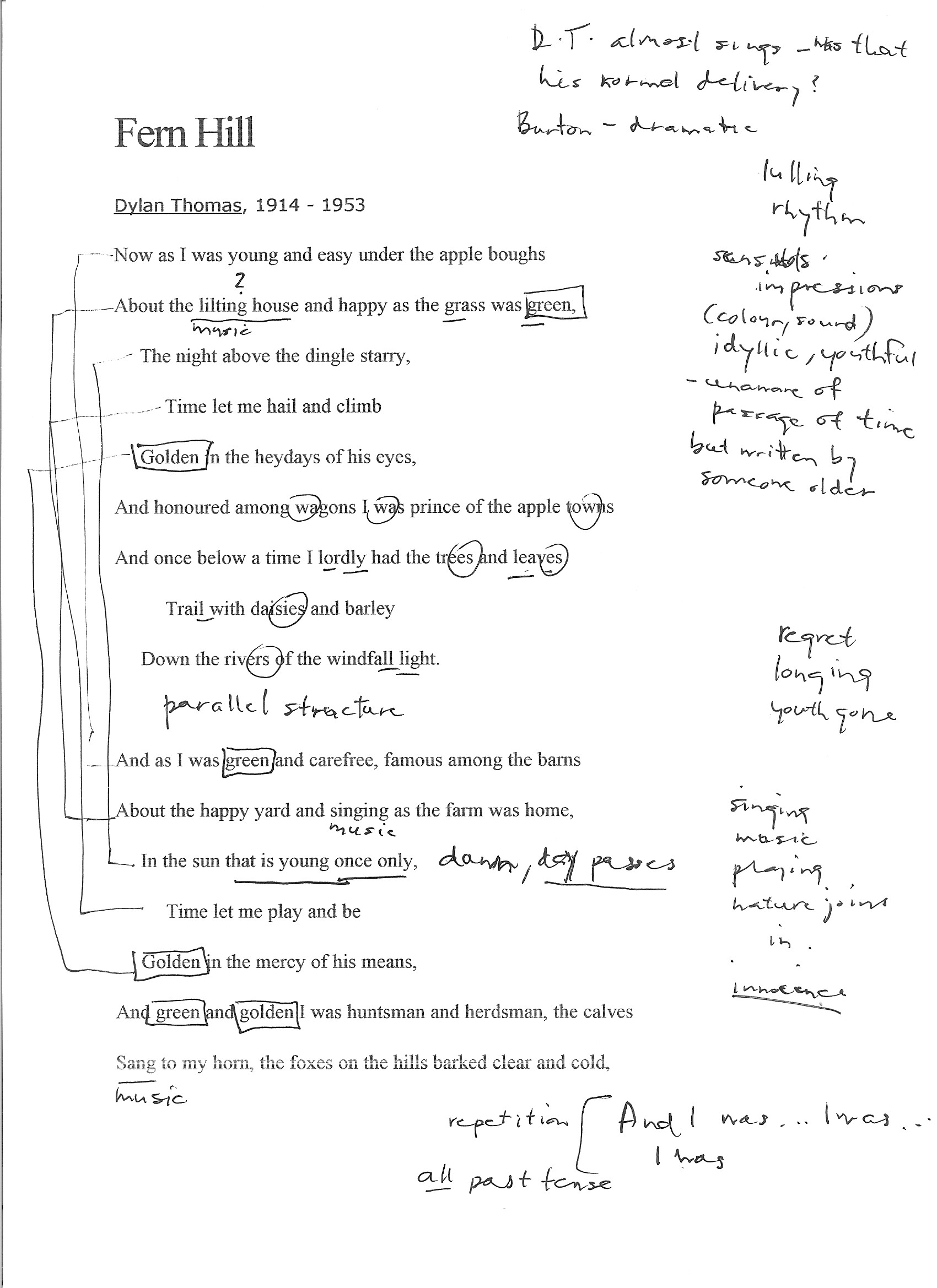
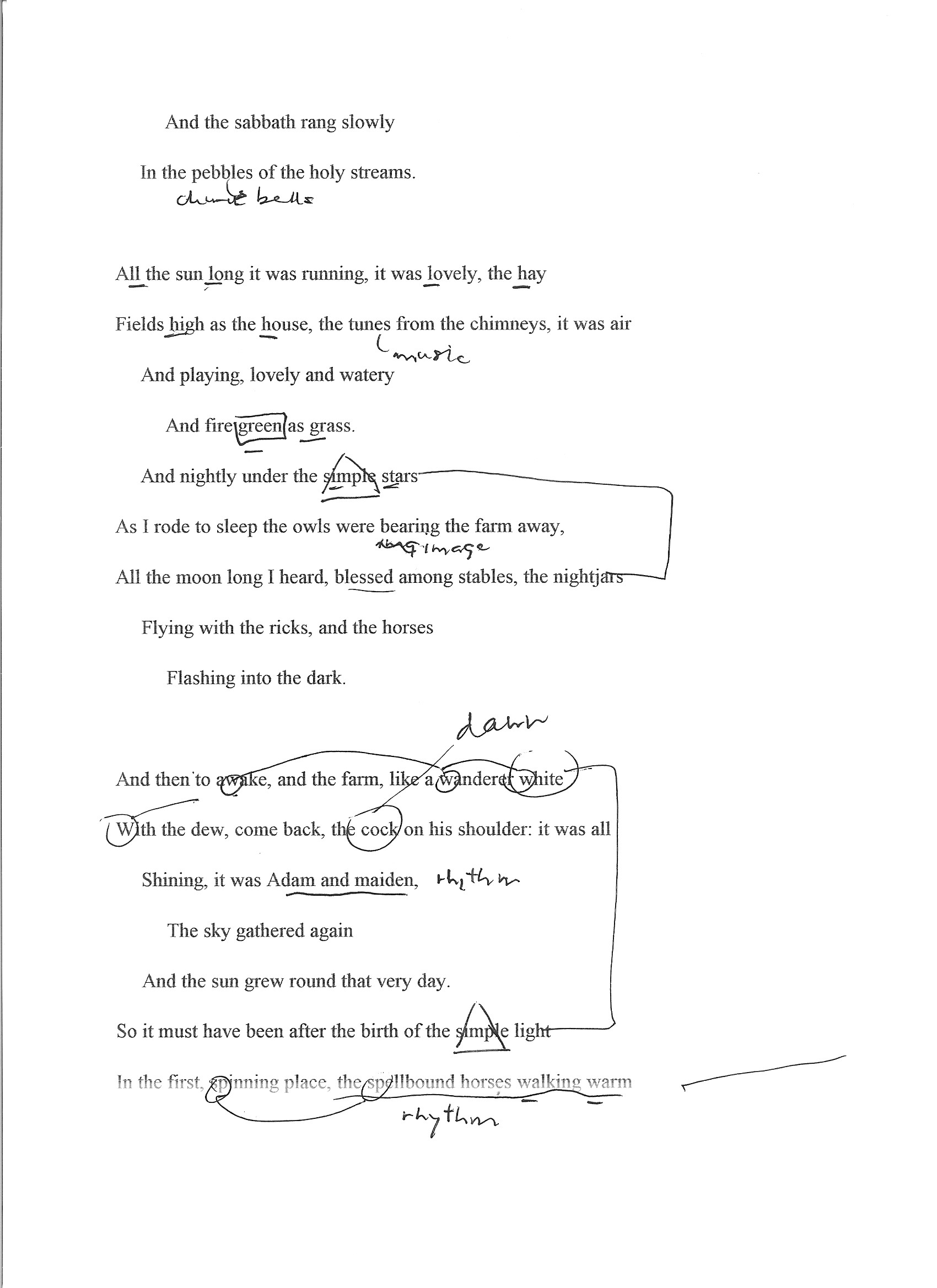
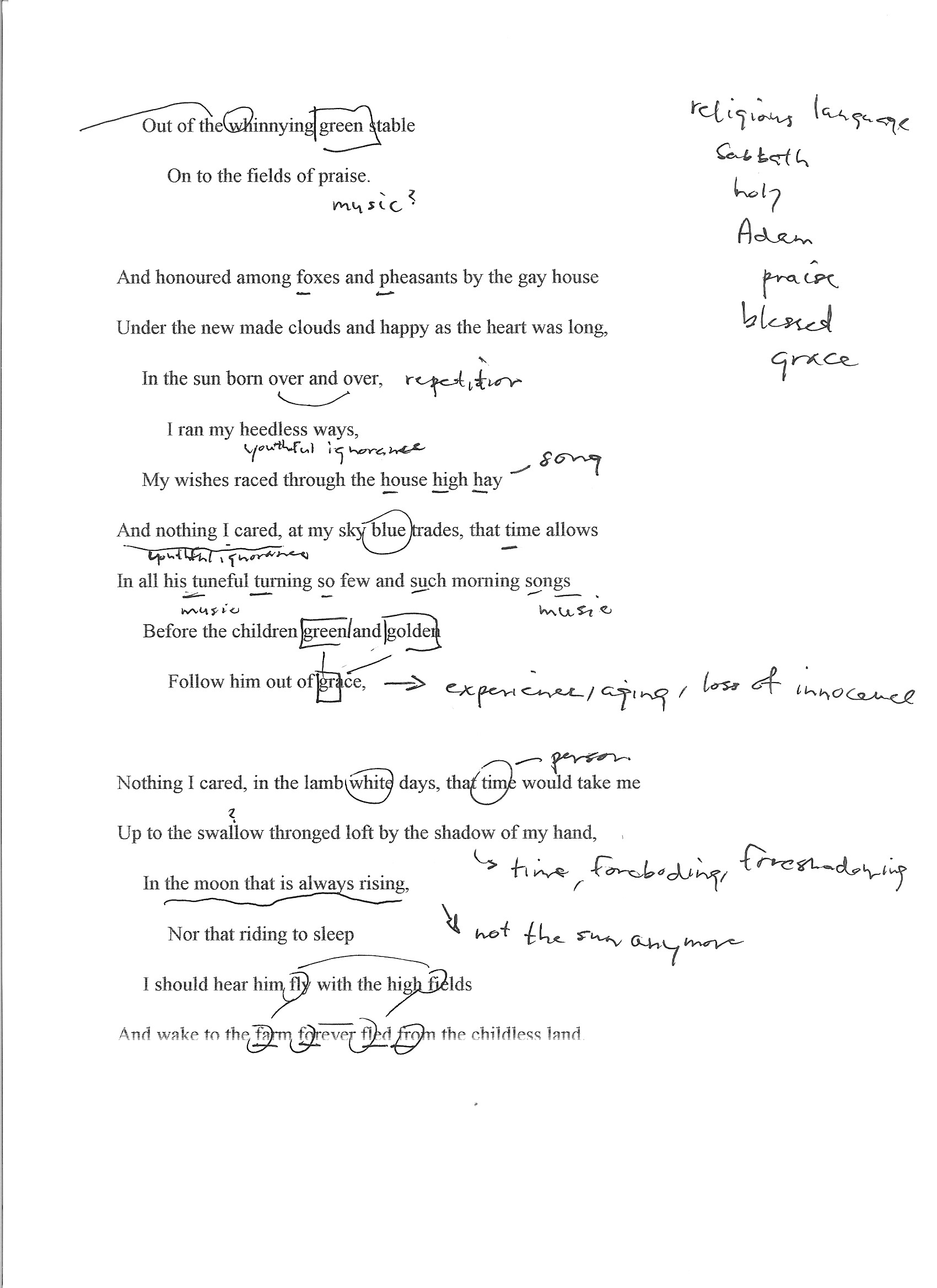
Project 3, Exercise 3: a close reading of Fern Hill

Fern Hill (1945) is a poem by Dylan Thomas, first published in the October, 1945, Horizon magazine, with its first book publication as the last poem in Deaths and Entrances. [source: Wikipedia, accessed 24 October 2016]

  • What’s the mood of the poem? How does it make you feel?

The mood of the poem seems wistful to me. Although the bulk of the text conjures up beautiful images of a blessed childhood, the way it is written in the past tense—"And I was... And as I was...I was...I was..."—leaves the clear sense that the time of youth is now gone. The piling up of sensory images, the use of colour and sound, made me feel a certain rose-coloured nostalgia. At the same time, there was a creeping awareness that although the subject has all summer to play, the poem was written by someone older who understands that childhood does not last forever ("In the sun that is young once only").

  • What poetic devices does Thomas use and what effect do they have on the poem?

Thomas makes little or no use of rhyme in this poem, but he makes powerful use of several other devices:

Rhythm — "the spellbound horses walking warm" — For much of the poem, the gentle rhythm carries the reader along like the boy enjoying the summer. The sharp break in rhythm in the last line is a rude awakening to the demands of time.

Repetition—"green," "golden," "And I was...I was..." — The use of repetition serves to heighten the effect of memory: particularly sharp impressions from the past that linger with us and trigger other memories.

Alliteration — "And wake to the farm forever fled from the childless land," "My wishes raced through the house high hay" — The alliteration briefly speeds up the rhythm of the poem and help to make us think of play or breathless speed.

Assonance — "Trail with daisies and barley" — This line may have two examples of assonance: the long "a" linking "trail" with "daisies," and the long "e" sound shared by "daisies" and "barley." They act like a kind of internal rhyme in a single line and help to move the rhythm along.

Consonance — "Shining, it was Adam and maiden" — The repetition of the "m" and "d" sounds is pleasing and helps to make the text flow by, just as time is flowing by in a carefree way.

Onomatopoeia — "Out of the whinnying green stable" — This device helps us to hear the sound in a way that goes beyond mere description: it helps us to share the experience of the boy in the poem.

Personification — "Time let me play and be / Golden in the mercy of his means" and other examples — I think that this particular use of personification helps us to feel the poet's bitterness more fully: it can be hard enough to accept aging and death as an inevitable part of life, but it seems even worse to think that there might be an intelligent figure behind it.

Simile — "and the farm, like a wanderer white / With the dew..." — The simile compels us to use our imagination to make meaning. We are not reading a news report: we have to engage with the text in a more deliberate way, with a different kind of thinking and appropriation.

Metaphor — "I was prince of the apple towns" — The boy was not a prince, but we can remember what it is like to be a child and think that we might be for a moment.

  • How do the poetic devices help evoke the themes of time and place? Can you identify any other theme running through this poem?

Thomas evokes time (references to age, time of day, movement of the sun, seasons and other natural references, and use of verb tense) and place (descriptions of the farm and its natural surroundings) in fairly direct ways. Perhaps more important is the way he uses poetic devices to move beyond mundane descriptions and invite the reader to experience the time and place through the senses—the sights (frequent repetition of "green" and "golden"), sounds ("About the happy yard and singing as the farm was home"), and emotions ("About the lilting house and happy as the grass was green") of a blissful childhood.

Time and place are the backdrop where Thomas explores the universal themes of youth, its inevitable loss and mortality. At the beginning of the poem he can write that "Time let me hail and climb / Golden in the heydays of his eyes," but by its end he knows that "Time held me green and dying". The personification of Time and its possession of youth is powerful.

  • What is the poem is saying about time and place (and any other theme you’ve identified)?

The poem is saying that time and place are... for a time and place. The sun and moon, the seasons of nature continue their courses but the individual human does not. We may experience them for a spell and naively believe that we are like them, but we are not: Time masters us. Youth, though enjoyable, passes for us all.

  • What lines or images stay with you? What do they remind you of or how do they make you feel?

The repetition of "apples" coupled with "green" and "golden" have stayed with me—they do an excellent job of conjuring up the sense of mid- or late summer. It's not hard to imagine being a boy again, playing in the warm sun on a holiday that goes on forever. It's very appealing.

  • What’s the rhythm like? Is it choppy or is it flowing and smooth? How does the rhythm impact on the poem?

The poem has a lulling rhythm, peaceful and unhurried. At times, it seems almost playful as in the line "My wishes raced through the house high hay," which sounds like it could be a child's song or the kind of wordplay that a child would enjoy. The rhythmic pattern supports well the idyllic imagery that the poet builds into a portrait of a carefree youth. The very last line of the poem shatters the reverie with a new rhythm that falls like a series of blows: "Though I sang in my chains like the sea." Childhood is over.

  • Is the ‘speaker’ important? What are his views? Are they apparent or inferred?

By inference, the speaker is a young boy ("I was prince of the apple towns") raised in the countryside. We never learn his identity, but this is ultimately not very important: the poem addresses universal themes of innocence and its loss, life and death. His views become quite apparent but the reader learns them through accumulated inferences. Thomas could have said plainly, "I had no idea that childhood and its pleasures come to an end, but they did and it is a shock to face mortality." Instead, he draws the reader through an experience of youth that seems never-ending and makes them feel the loss of its passing away.

  • Are there any lines you don’t get? Can you hazard a guess as to what they mean or allude to?

No, there were not. I had to read some of the lines out loud more than once to make sure I had the right rhythm, and found that helped me to understand the phrasing. I had to check the meanings of a couple of words ("dingle," "nightjars") but I did not find the poem difficult.

Exercise 3: Gallery or site visit

In the last few weeks I have visited three sites that could not be more different in nature or content. Two could be classed as "galleries" while the third describes itself as a museum, but is closer to a cross between a repository and a site-specific installation.

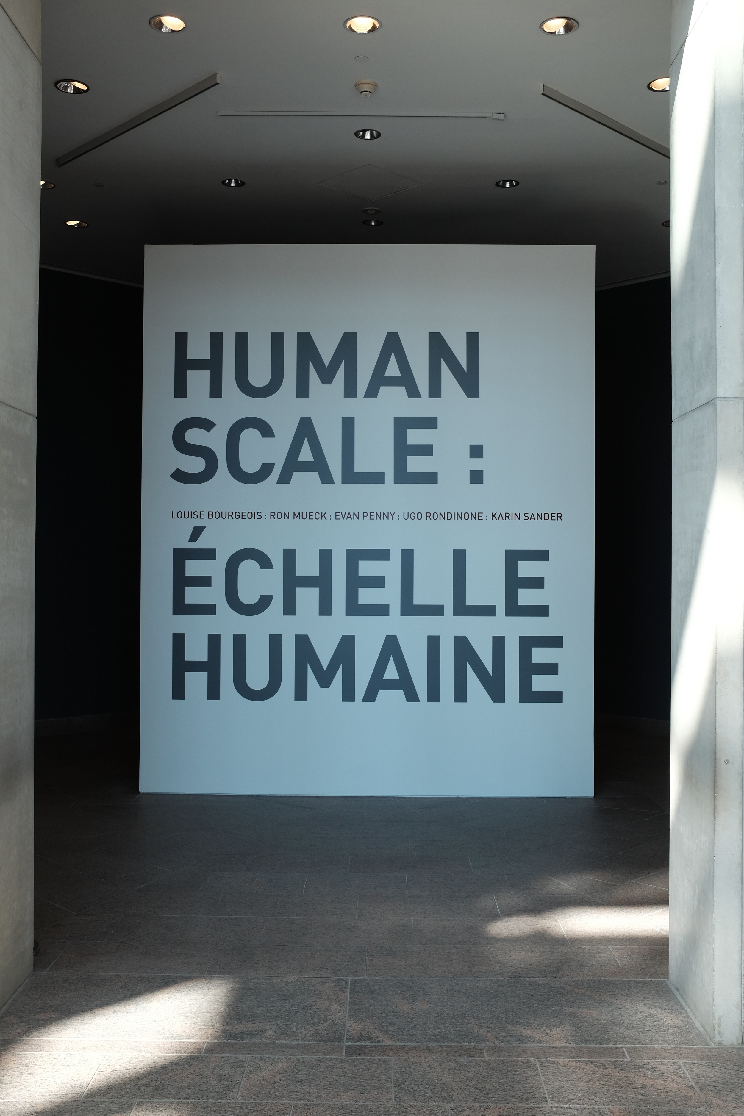
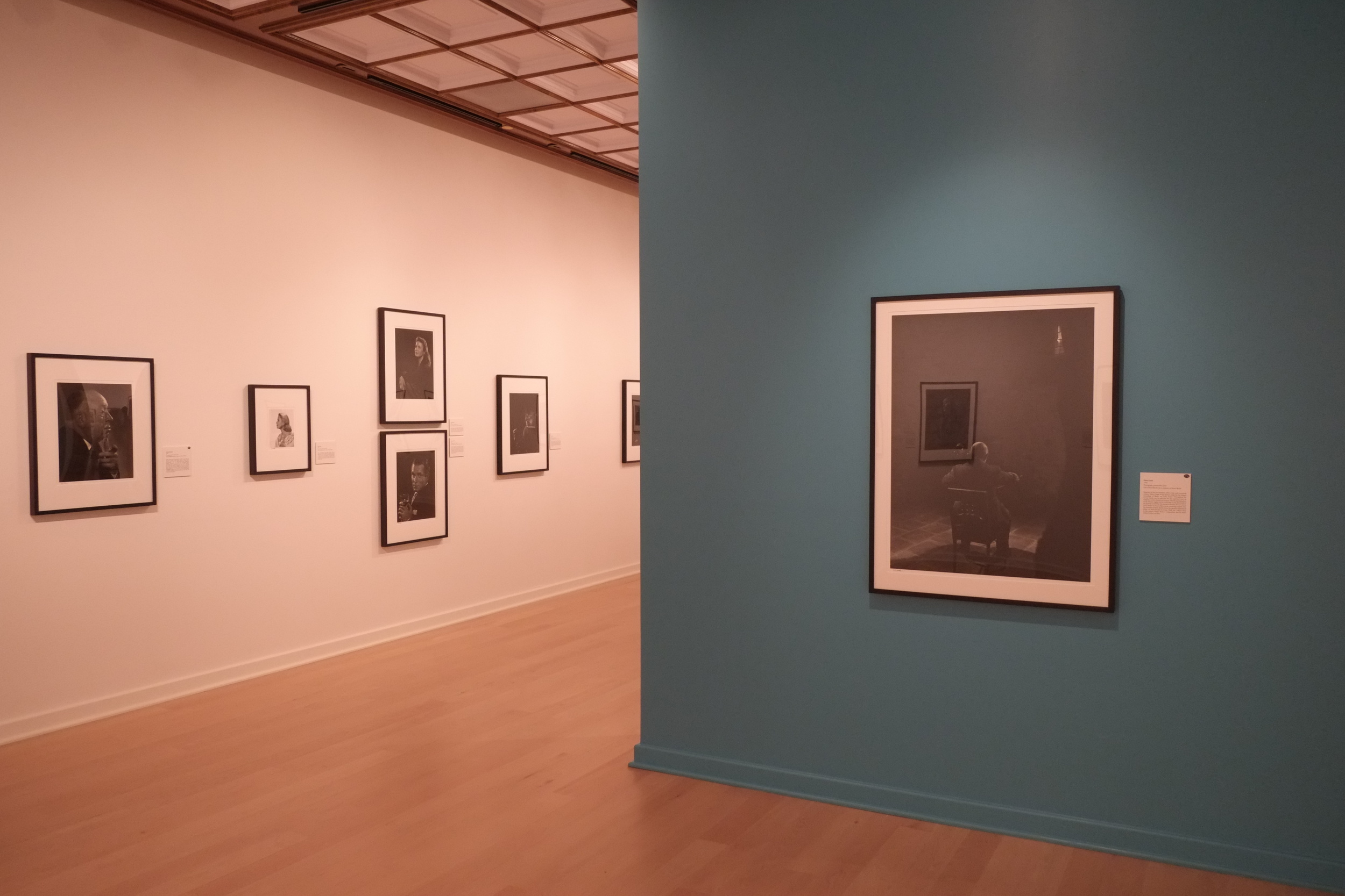
The first visit was to the National Gallery of Canada in Ottawa to see, among other things, an exhibit called "Human Scale." The exhibition is designed

to explore the evolving relationship between the body and sculpture through the work of [...] internationally renowned artists. It reflects upon the persistent question of scale in sculpture, as contemporary artists adapt to new materials, means and technologies for figurative representation. The works on view each vary dramatically in size and proportion, making for a provocative exploration of the physical, psychological and expressive character shaping what it means to be human. (source: Human Scale exhibit web page)

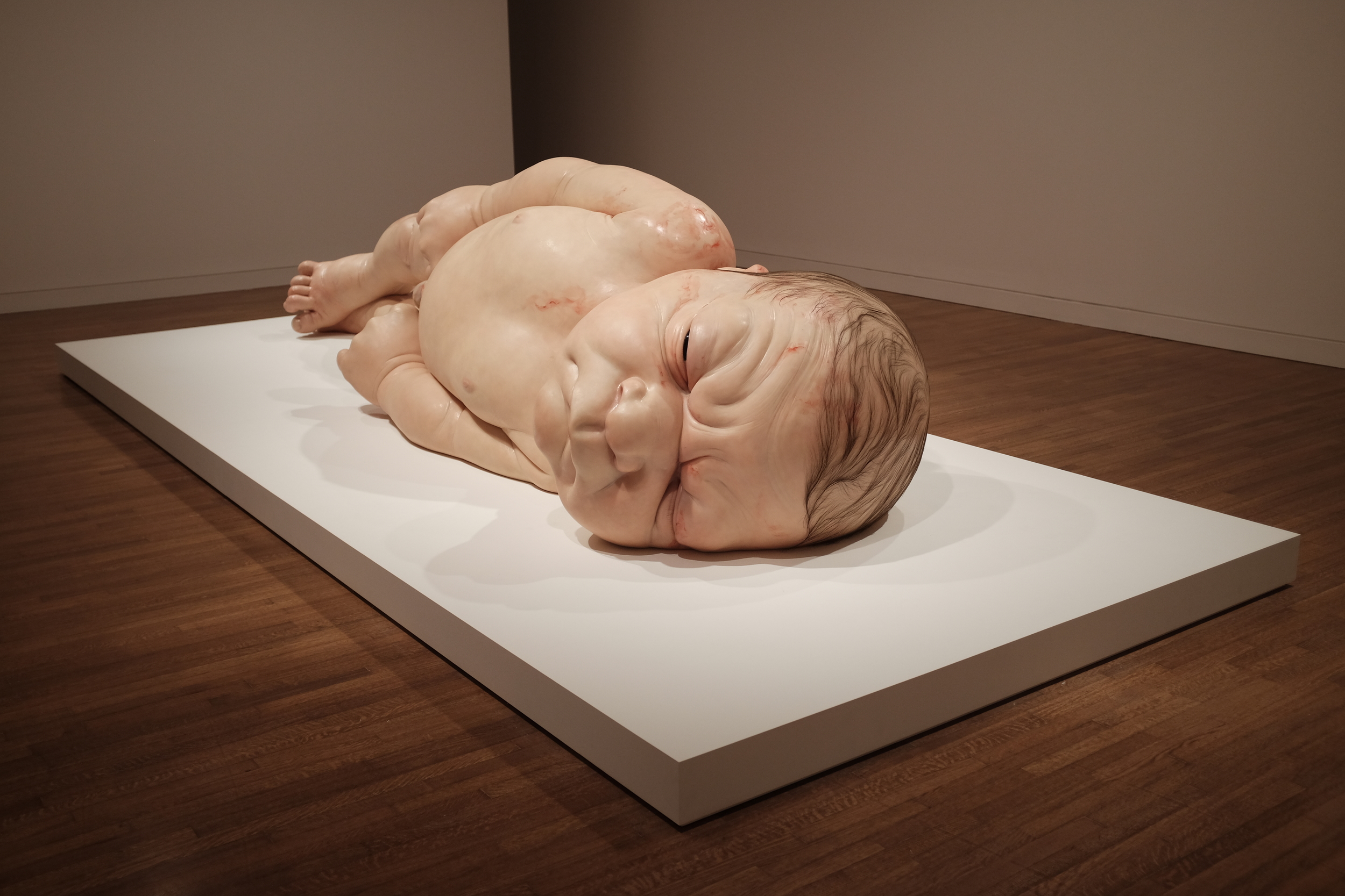
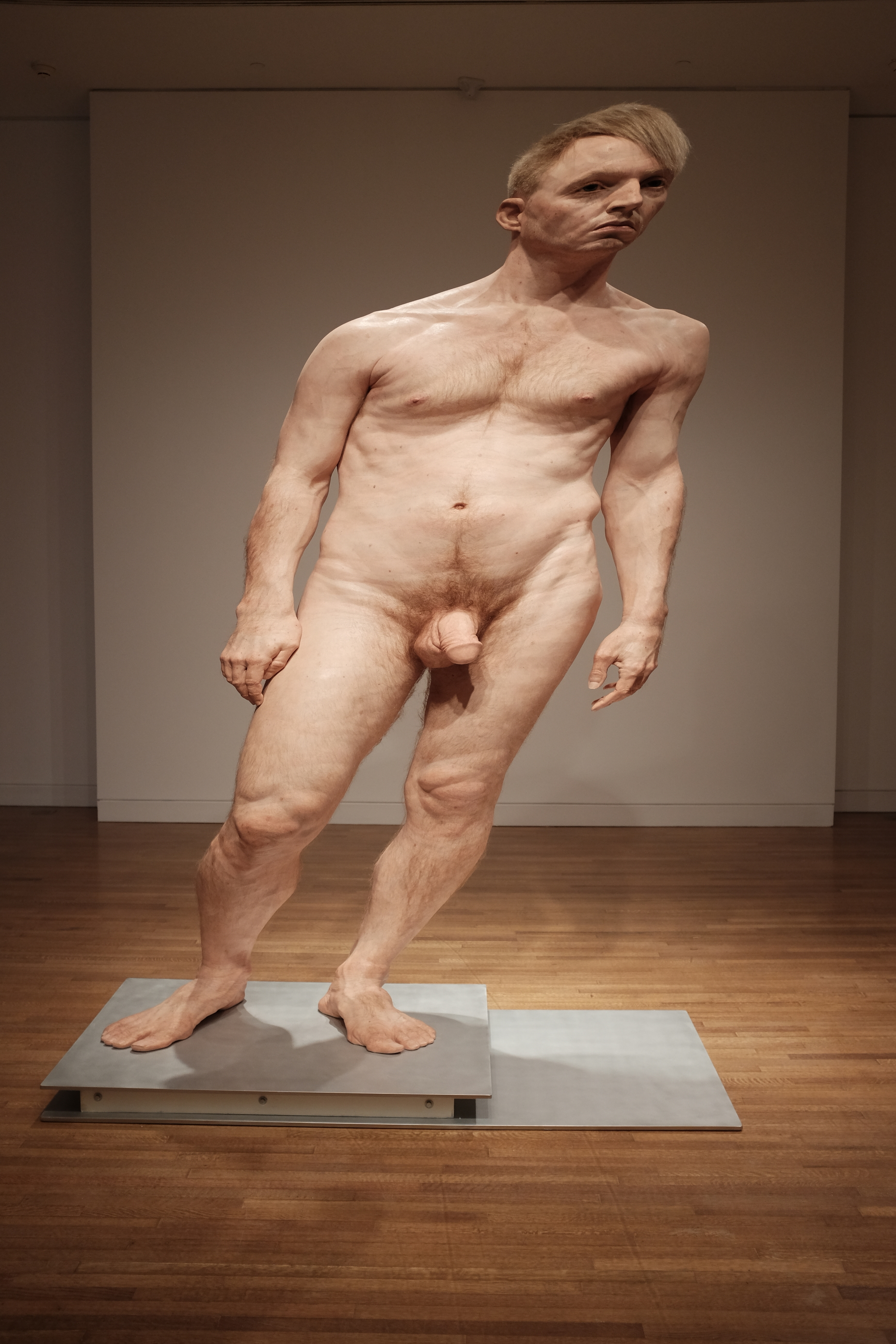
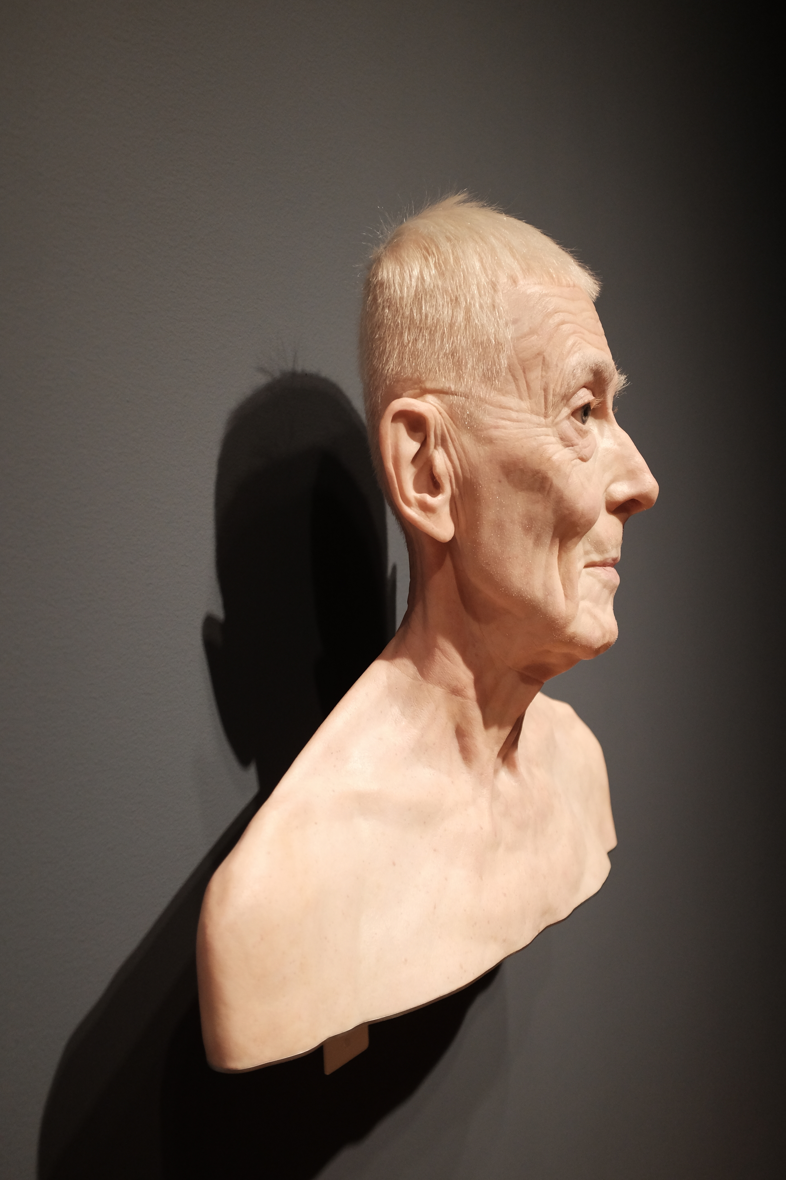
The artists in question are Ron Mueck, Evan Penny, Ugo Rondinone, Karin Sander and the late Louise Bourgeois. Mueck's large-format wood, wire and latex constructions are startlingly realistic—they are often referred to as "hyperrealistic"—and the impression they leave on the viewer is striking. Their scale and accuracy invite us to step up close and examine tiny details in a way that we might not observe a real person. And yet we would not be surprised to feel warmth radiating from the skin, see blood pulsing through the veins and hear breath coming from the nostrils of the oversized newborn portrayed by A Girl. (In fact, a toddler at the exhibit wandered up to the gigantic creature many times her size, pointed and said "baby!"). The sculptures by Evan Penny are also slightly larger than life but it is not their size and accuracy that capture attention, but the way that they have been scaled so that their perspective is slightly "off." When viewed from one angle all seems well; when viewed from a slightly different standpoint the human form has clearly been distorted. The effect is unsettling and shows how much we take for granted in the way we usually view the human figure. And that might be the real benefit of such works: although Mueck's work has been criticized as a "parody" of the body, he and the other artists at this exhibit succeed in making us reconsider the wonder of our own ordinary embodiment.


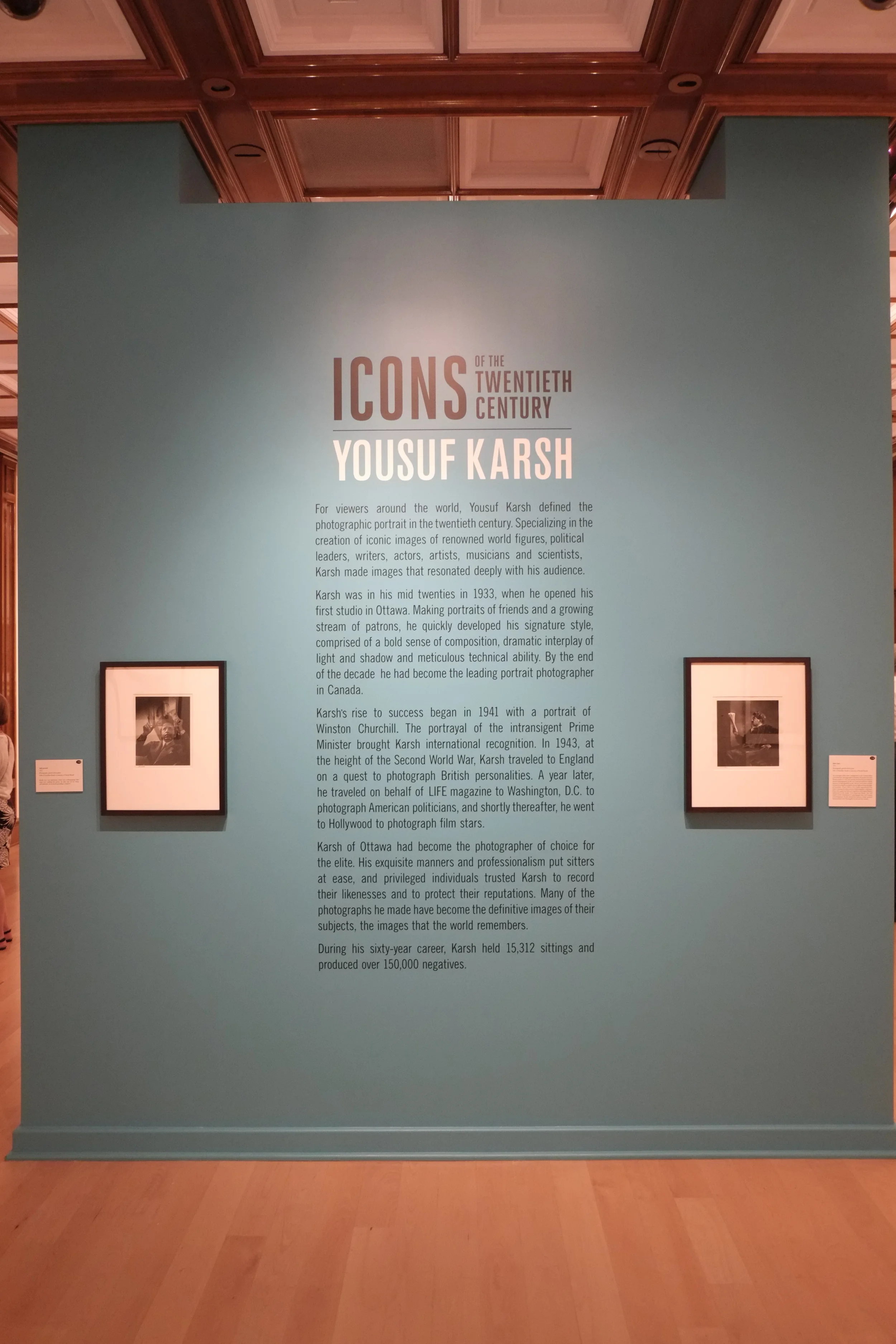
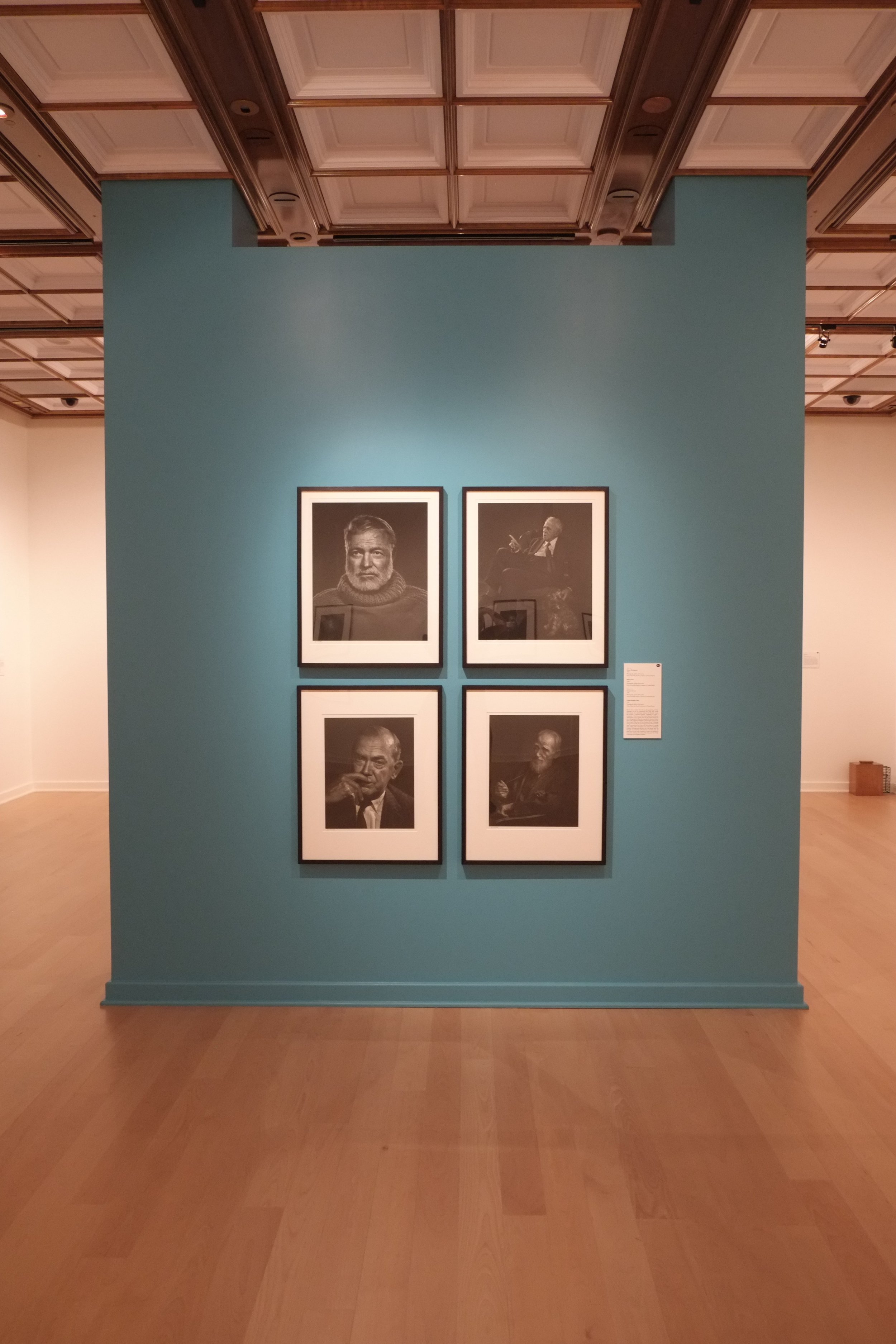
The second visit was to the Bellago Gallery of Fine Art in the Bellagio Hotel, Las Vegas. Gambling is of no real interest to me so I was looking for something else to do during my down time on a recent business trip to the city. I was very pleased to hear that not only was there an art gallery on the Vegas Strip, but that there would be an exhibit of photographs by Yousuf Karsh, the Canadian portrait photographer.  Like most people with an interest in photography, I am very familiar with reproductions of his work in books, but I have not had many opportunities to see his large-format prints in person. The fact that Karsh plied his trade in Ottawa also made for a nice local tie-in for me, so I ordered a ticket to see "Icons of the Twentieth Century."

The gallery is a very small facility comprising just two rooms, well back from the street on the ground floor of the hotel. It's not an easy place to find in a complex the size of The Bellagio. But the size of the gallery is not at all the problem: it's the lighting. It is impossible to view the Karsh photographs properly. There is so much glare from the harsh overhead lights that is impossible to view any of the beautifully-printed images without seeing light flares or the reflections of visitors in the glass covering the images. The images themselves are large, with the very smallest being 11x14" and the more common size being 16x20" or larger. Each contains a character study designed to reveal something of the personality of the sitter and, although the style belongs to another era, the work stands among the best of its kind for its time. On close inspection it is possible to see that they have been printed with great care, with clean highlights, wonderful tonal range and deep, rich blacks. This is what viewers have come to expect of a Karsh image (and pay to see!), but the experience is marred by the distracting lighting and presentation of the work.


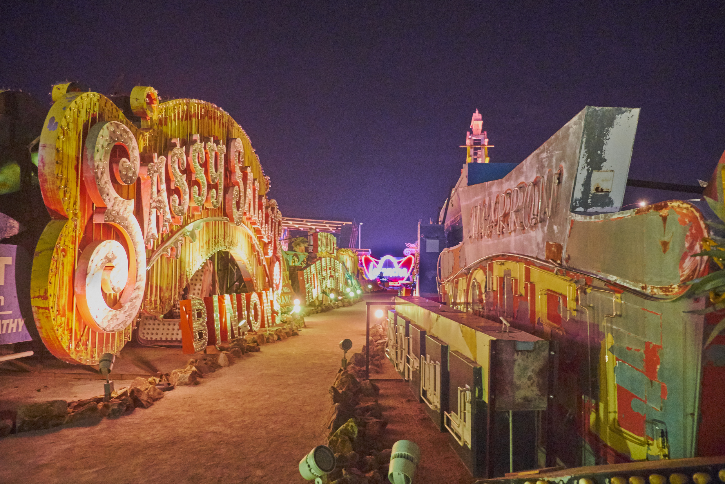
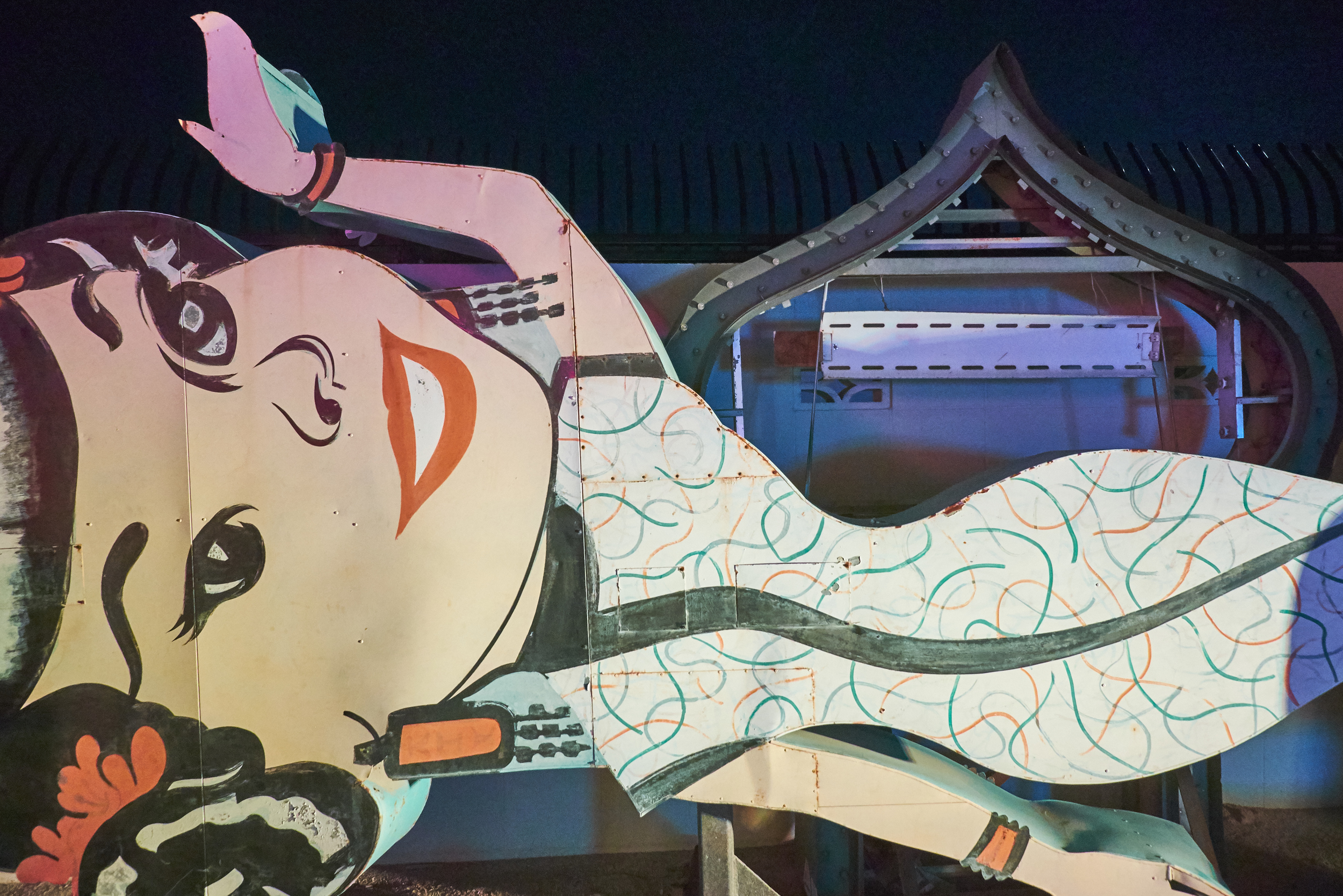
The third visit was also in Las Vegas: a night-time tour of the Museum of Neon, more colloquially known as the "Neon Boneyard." The site is the last resting place for many of the famous illuminated signs that lit up the Vegas Strip in the 50s and 60s. Rather than sending the signs to a scrapyard or recycling facility, they are being preserved in the dry Nevada air by a non-profit group keen to celebrate local history and... art.  Although perhaps not site-specific in the strictest sense of the term, the signs flourished in the desert city and have a credible claim to being a distinct local art form. Part of what made (and makes) The Strip the experience that it is, neon was employed in Las Vegas on a scale and with imagination seen in only a handful of places. It is now yesterday's technology, having been largely replaced by cheaper, more reliable and ultimately more flexible video screens.


The site itself is a two-acre fenced lot containing a large number of signs that appear to have little order in the way that they have been displayed. Nevertheless, a certain number have been illuminated and turned toward the walkway in a fashion that shows the placement is not entirely random. The signs are constructed of sheet metal and painted in bright colours that supplement or contrast with the neon or incandescent bulbs they hold. Some of the neon signs are "animated," but most contain static lighting displays. All of the signs are intended for commercial advertising, with some simply announcing a service or business and others being more complicated and imaginative in design. The more interesting signs are those that try to convey a sense of style or excitement about the establishment they announce. This is the era of "Mad Men" at its colourful, gaudy best. The museum members had originally planned to restore the signs to their original state wherever possible, but it became clear that this was neither possible (because of costs and availability of materials) nor desirable (visitors to the museum repeatedly said that they liked the patina of age and exposure on the objects). It would be nice for visitors to be left to their own for a few minutes to linger over the design and craftsmanship of the signs, but all visits are guided and kept on a tight schedule. Because the visits are guided, there is also non-stop commentary from the guide.

Exercise 3: Reading about art

This was a relatively straightforward exercise. The passage to be read from Art History: The Basics was quite short, but the discussion on the definition of "art" was engaging and the examples were helpful. Although I'm sure the writers won't leave the issue unresolved, they ask a question that probably goes through the minds of many people: has the definition of "art" been stretched to the point where it is meaningless? And their brief comments about the roles of culture, history and language point out that the understanding of art has evolved and will continue to do so.

I had never heard of the material "jesmonite" before, so I had to look it up. I now know that it is "a composite material used in fine arts, crafts, and construction. It consists of a gypsum-based material in an acrylic resin" (Wikipedia).

The short excerpt was enough to convince me that the book is probably one I should order for reading and reference.