Gallery visit: Musée des arts décoratifs

During my February trip to Paris I visited the Musée des arts décoratifs to take in an exhibition entitled L’esprit du Bauhaus. Having had the chance to visit the site of the Bauhaus in Dessau, Germany a number of years ago, I wanted to learn more about this fascinating school and the impact of its brief history (1919–1933).

I was most struck by the scope of the vision of founder Walter Gropius and his ability to draw others to participate in it, either as students or as teachers. Comprising a number of “schools” of artistic and design pursuits—cabinetmaking, textiles, metalwork, typography and photography, for example—Gropius used his own disciple of architecture as a unifying theme to draw the various threads of the programs together. There may not have been a single aesthetic, but there was a shared commitment to reunite design and manufacturing which had grown apart rapidly as industrialization took greater and greater hold on the Western world. This commitment could be seen in the way that students began their studies in foundational courses examining materials and colour theory and in the Bauhaus motto, "Art into Industry." The school did not disdain manufacturing; it aimed to give new life to mass production for the modern world.

The second half of the exhibit comprised more recent works by artists and designers who had been invited to create original works inspired by the ethos of the Bauhaus. I found this portion of the visit somewhat disappointing because it seemed to me that most participants had honoured the 'art' portion of the brief but had neglected the 'into industry' aspect: they had missed L'esprit du Bauhaus. Many of the pieces were visually interesting, but it was hard to imagine them being useful objects in the home or workplace.

Gallery visit: Musée du Louvre

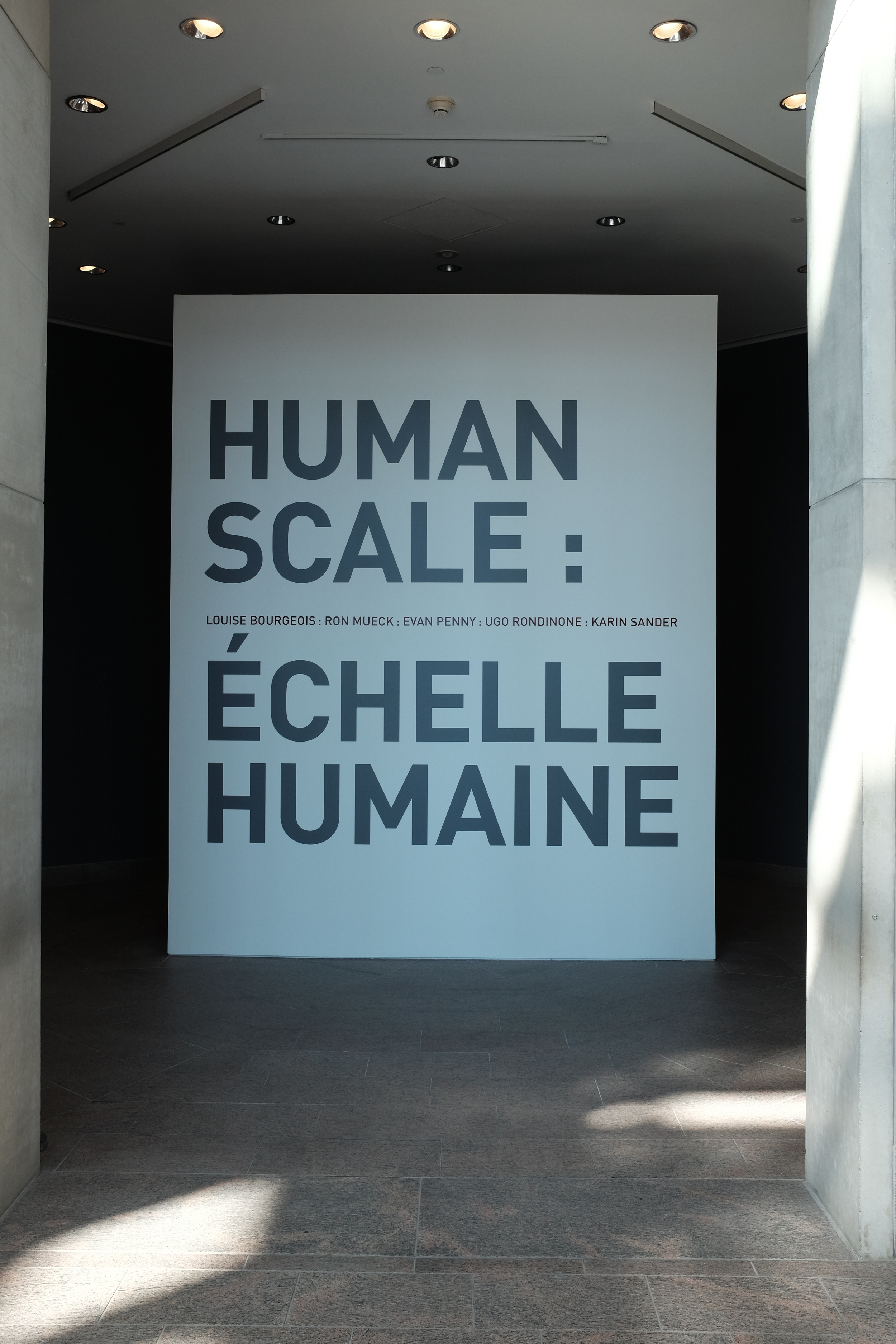
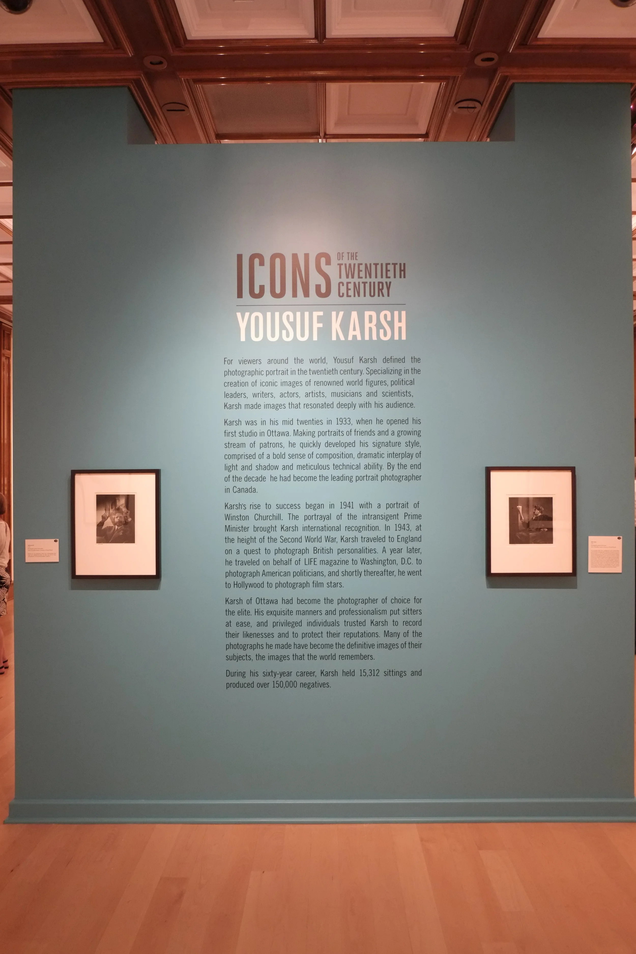
During a recent visit to Paris I made a point of visiting a number of galleries and museums and will write them up as I have time over the days to come. It would probably have been better to document my thinking at the time, but I was in "holiday mode" and not ready to spend hours writing. Nevertheless, I did reflect on my experiences and made notes that I will draw from.

The first gallery I visited was the Musée du Louvre, something I have wanted to do for years. I was overwhelmed by the sheer scale of the museum and it is difficult to know where to start describing the visit. From outside it is easy to think that the collection is housed only in the older building that surround the central square, not realizing how extensive the complex is and how much of it lies underground. It is massive and would take several visits to even pretend to have covered all the exhibition space at a rapid pace. I tried to see as much as I could but I became aware that I wasn’t giving many of the works their due because of a desire to keep moving. I was also surprised at the number of visitors in February: if this is what the crowds are like during the off season, I can not imagine what it must be like when all the tourists arrive in the spring and summer. I quickly realized that I was “consuming” art rather than viewing a collection properly. After four hours, my feet decided that I had seen enough for this trip.

I was particularly taken with the portraits painted by Jacques-Louis David. I have seen a number of David’s paintings before, both on TV/video and in person at the Palais de Versailles. Many have qualities that appeal to me: technical skill, a clear story and sometimes a hint of humour or pathos. It seems to me that there is something very human about his paintings, although I know that sounds silly: all paintings are produced by humans. Somehow, though, there is a connection with the viewer that I don't necessarily sense in other painters of the period. I’ll need to think more about this, because I’m aware that I'm not expressing myself well.

I was also fascinated by the Fayum funeral masks in the Louvre's collection: these were striking because of the quality of the work and its state of repair. How much restoration has been performed on these pieces? The portraits and masks seemed representative enough that one could believe they were good likenesses of the deceased. But were they or were they idealized representations, perhaps built on some notion of the ideal or divine man or woman? Whatever the case, these were clearly meant for people of some means and it seems apparent that people millennia ago were as interested in honouring memory and leaving a good visual representation of themselves and their loved ones.

The Mona Lisa and the selfie: from contemplating the other to fixating on one’s self. By the time I had followed the signs to the gallery where this piece is hung behind a protective glass, it was obvious that I was going to visit a celebrity. Few works in the museum have their own signposts so that you can find them from several galleries away. I could have waited my turn in the long line to see the painting from a couple of metres away, but it seemed to me that the crowd itself had become the story. Many visitors, having queued up to see the painting, turned their backs on it as soon as they were in front of it so that they could take a selfie. I understand that people want to document their experiences, but many of them spent no time at all contemplating one of the world’s most famous pieces of art. They were oblivious to the object in front of them, which had little or no significance of its own. Instead it was there to validate their importance or experience. It didn't point to anything grander, more beautiful, nobler, more challenging or universal than… me.

Can a large museum be too much of a good thing, or does it require a different kind of strategy to be useful?

Exercise 3: Gallery or site visit

In the last few weeks I have visited three sites that could not be more different in nature or content. Two could be classed as "galleries" while the third describes itself as a museum, but is closer to a cross between a repository and a site-specific installation.

The first visit was to the National Gallery of Canada in Ottawa to see, among other things, an exhibit called "Human Scale." The exhibition is designed

to explore the evolving relationship between the body and sculpture through the work of [...] internationally renowned artists. It reflects upon the persistent question of scale in sculpture, as contemporary artists adapt to new materials, means and technologies for figurative representation. The works on view each vary dramatically in size and proportion, making for a provocative exploration of the physical, psychological and expressive character shaping what it means to be human. (source: Human Scale exhibit web page)

The artists in question are Ron Mueck, Evan Penny, Ugo Rondinone, Karin Sander and the late Louise Bourgeois. Mueck's large-format wood, wire and latex constructions are startlingly realistic—they are often referred to as "hyperrealistic"—and the impression they leave on the viewer is striking. Their scale and accuracy invite us to step up close and examine tiny details in a way that we might not observe a real person. And yet we would not be surprised to feel warmth radiating from the skin, see blood pulsing through the veins and hear breath coming from the nostrils of the oversized newborn portrayed by A Girl. (In fact, a toddler at the exhibit wandered up to the gigantic creature many times her size, pointed and said "baby!"). The sculptures by Evan Penny are also slightly larger than life but it is not their size and accuracy that capture attention, but the way that they have been scaled so that their perspective is slightly "off." When viewed from one angle all seems well; when viewed from a slightly different standpoint the human form has clearly been distorted. The effect is unsettling and shows how much we take for granted in the way we usually view the human figure. And that might be the real benefit of such works: although Mueck's work has been criticized as a "parody" of the body, he and the other artists at this exhibit succeed in making us reconsider the wonder of our own ordinary embodiment.


The second visit was to the Bellago Gallery of Fine Art in the Bellagio Hotel, Las Vegas. Gambling is of no real interest to me so I was looking for something else to do during my down time on a recent business trip to the city. I was very pleased to hear that not only was there an art gallery on the Vegas Strip, but that there would be an exhibit of photographs by Yousuf Karsh, the Canadian portrait photographer.  Like most people with an interest in photography, I am very familiar with reproductions of his work in books, but I have not had many opportunities to see his large-format prints in person. The fact that Karsh plied his trade in Ottawa also made for a nice local tie-in for me, so I ordered a ticket to see "Icons of the Twentieth Century."

The gallery is a very small facility comprising just two rooms, well back from the street on the ground floor of the hotel. It's not an easy place to find in a complex the size of The Bellagio. But the size of the gallery is not at all the problem: it's the lighting. It is impossible to view the Karsh photographs properly. There is so much glare from the harsh overhead lights that is impossible to view any of the beautifully-printed images without seeing light flares or the reflections of visitors in the glass covering the images. The images themselves are large, with the very smallest being 11x14" and the more common size being 16x20" or larger. Each contains a character study designed to reveal something of the personality of the sitter and, although the style belongs to another era, the work stands among the best of its kind for its time. On close inspection it is possible to see that they have been printed with great care, with clean highlights, wonderful tonal range and deep, rich blacks. This is what viewers have come to expect of a Karsh image (and pay to see!), but the experience is marred by the distracting lighting and presentation of the work.


The third visit was also in Las Vegas: a night-time tour of the Museum of Neon, more colloquially known as the "Neon Boneyard." The site is the last resting place for many of the famous illuminated signs that lit up the Vegas Strip in the 50s and 60s. Rather than sending the signs to a scrapyard or recycling facility, they are being preserved in the dry Nevada air by a non-profit group keen to celebrate local history and... art.  Although perhaps not site-specific in the strictest sense of the term, the signs flourished in the desert city and have a credible claim to being a distinct local art form. Part of what made (and makes) The Strip the experience that it is, neon was employed in Las Vegas on a scale and with imagination seen in only a handful of places. It is now yesterday's technology, having been largely replaced by cheaper, more reliable and ultimately more flexible video screens.


The site itself is a two-acre fenced lot containing a large number of signs that appear to have little order in the way that they have been displayed. Nevertheless, a certain number have been illuminated and turned toward the walkway in a fashion that shows the placement is not entirely random. The signs are constructed of sheet metal and painted in bright colours that supplement or contrast with the neon or incandescent bulbs they hold. Some of the neon signs are "animated," but most contain static lighting displays. All of the signs are intended for commercial advertising, with some simply announcing a service or business and others being more complicated and imaginative in design. The more interesting signs are those that try to convey a sense of style or excitement about the establishment they announce. This is the era of "Mad Men" at its colourful, gaudy best. The museum members had originally planned to restore the signs to their original state wherever possible, but it became clear that this was neither possible (because of costs and availability of materials) nor desirable (visitors to the museum repeatedly said that they liked the patina of age and exposure on the objects). It would be nice for visitors to be left to their own for a few minutes to linger over the design and craftsmanship of the signs, but all visits are guided and kept on a tight schedule. Because the visits are guided, there is also non-stop commentary from the guide.