Gallery visit: Musée des arts décoratifs

During my February trip to Paris I visited the Musée des arts décoratifs to take in an exhibition entitled L’esprit du Bauhaus. Having had the chance to visit the site of the Bauhaus in Dessau, Germany a number of years ago, I wanted to learn more about this fascinating school and the impact of its brief history (1919–1933).

I was most struck by the scope of the vision of founder Walter Gropius and his ability to draw others to participate in it, either as students or as teachers. Comprising a number of “schools” of artistic and design pursuits—cabinetmaking, textiles, metalwork, typography and photography, for example—Gropius used his own disciple of architecture as a unifying theme to draw the various threads of the programs together. There may not have been a single aesthetic, but there was a shared commitment to reunite design and manufacturing which had grown apart rapidly as industrialization took greater and greater hold on the Western world. This commitment could be seen in the way that students began their studies in foundational courses examining materials and colour theory and in the Bauhaus motto, "Art into Industry." The school did not disdain manufacturing; it aimed to give new life to mass production for the modern world.

The second half of the exhibit comprised more recent works by artists and designers who had been invited to create original works inspired by the ethos of the Bauhaus. I found this portion of the visit somewhat disappointing because it seemed to me that most participants had honoured the 'art' portion of the brief but had neglected the 'into industry' aspect: they had missed L'esprit du Bauhaus. Many of the pieces were visually interesting, but it was hard to imagine them being useful objects in the home or workplace.

Project 4, Exercise 4: Cutting Edge

The third dimension

Many, if not all, of the examples of what is "cutting edge" in visual communications are directly linked to the digital revolution. In one sense, this has been somewhat limiting because it implied that the "edge" was largely limited to those forms of visual communication that could be digitized for two-dimensional printing and/or viewing on a monitor. With the advent of 3D printing, however, more digitized visual communications will have the added benefit of depth as well as shape.

More and more artists are now working in the area of 3D printing of their art, making it possible to transmit exact copies of their work anywhere in the world and to scale the work to a client's desired dimensions. Examples of 3D sculpture and wearables (with the potential to create scripted or spontaneous visual 'communications') can be seen on many sites across the Web. Here are just a few examples:

Intelligent typefaces

One of the more interesting items I found during my search was the self-adjusting typeface called Futuracha. Inspired by art deco design, its intelligent properties can be seen in a video for a fund-raising campaign. Each letter in the typeface automatically adjusts to the preceding and following letters to create beautiful ligatures and typographic designs.

A sample of text in the Futuracha typeface showing self-adjusting ligatures and letter combinations.

A sample of text in the Futuracha typeface showing self-adjusting ligatures and letter combinations.

Could it be that typefaces will self-adjust not only to graphical form within words, but to the content of the words themselves? In other words, intelligent text would not only enhance the appearance of words visually but perhaps help to communicating the meaning of a passage?

Visual representation of data

Now that virtually every phenomenon can be recorded and digitized directly or indirectly, we are swimming in rapidly-expanding seas of data. Many of these datasets are so large that is impossible to find meaning within them quickly or effectively. And the democratization of data—in the sense that data are created by and about  a much wider section of the population and affect our lives—means that more of us need help to understand what all this information means. New techniques of visual representation are being developed to make sense of data and to tease out the "stories" they can tell.

"Data visualization" is becoming a specialized field of trained individuals who can interpret the work of quantitative analysts and make it accessible to a broader audience in a way that is both accurate and aesthetically appealing. "Infographics" tell a static and relatively simple data story in graphic form, while more detailed visualizations are often dynamic and designed to allow the end user to monitor evolving data and make decisions.

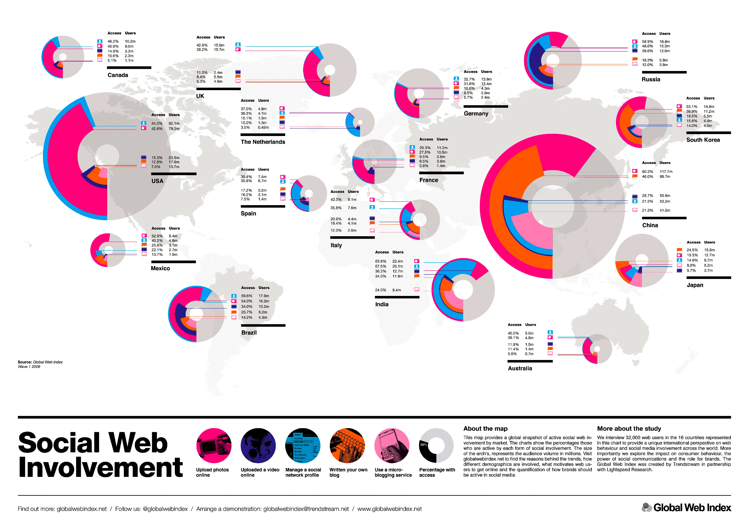
An infographic describing social web involvement. www.globalwebindex.net

An infographic describing social web involvement. www.globalwebindex.net

A dynamic visualization providing sales information. www.lintao-dashboards.com

A dynamic visualization providing sales information. www.lintao-dashboards.com

The Histography website is a particularly powerful example of visualization of a huge dataset, showing the span of human history as a timeline drawn from every entry on Wikipedia

The next step beyond data visualization allows viewers not only to view data representations passively, but to actively manipulate data in graphical form. A visual interface makes it possible for non-specialists to conduct complex mathematical and statistical computations while exploring large datasets and creating models with them as images.

Data exploration and modelling example. SAS Visual Analytics.

Data exploration and modelling example. SAS Visual Analytics.

Virtual reality

Virtual reality (VR)—an immersive, computer-generated 3D environment—is not new in itself, having been around since the middle of the 20th century. What is cutting-edge, however, is how the necessary equipment to create and experience VR is now within the reach of people outside of laboratories and production studios. It is possible to buy purpose-built VR headsets for hundreds of dollars, but it is also possible to adapt an iPhone or similar device to experience VR. Most VR content has been designed for gaming, but there is nothing to prevent developers from opening up a broader world of travel and art at relatively low cost and easy distribution.

The Zeiss VR One, a virtual reality headset with a slide-out tray for the iPhone 6 (Photo: Will Shanklin/Gizmag.com).

The Zeiss VR One, a virtual reality headset with a slide-out tray for the iPhone 6 (Photo: Will Shanklin/Gizmag.com).

Reflection

Looking at this collection of new forms of visual communication, some are admittedly more cutting-edge than others. What makes them of interest to me, however, is the way that they open up new possibilities and often to a broader range of people. Whether it is making it possible for ordinary people to understand and ask questions of enormous amounts of data, allowing us to have the sensation of travelling beyond our own time and place, or helping us to communicate more powerfully, each of these innovations can extend our reach as individuals and as a society. They give us new tools to persuade, to inform, to develop and expand identity, to interact and, where necessary, to call into question facts or narratives.

Project 4, Exercise 3: Visual conventions for time and place

Frame-by-frame storytelling

The best example of this type of storytelling is the classic cartoon strip that has been in use for over 100 years and is still employed in graphic novels. It is understood that time passes from one frame to the next and, in some case, place also changes (as can be seen from changes in the illustrated background in each frame).

Boys Will Be Boys, created in 1909 by Harry Grant Dart.

Unbroken chain of narrative

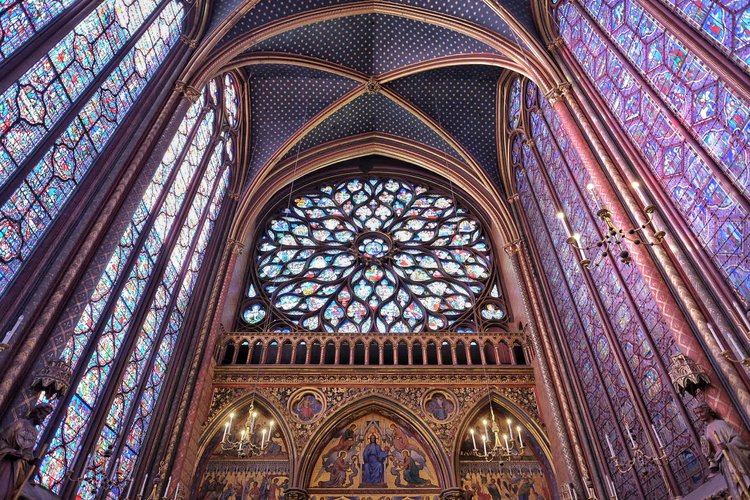
Before the frame-by-frame approach demonstrated above, some historical narratives were related in an unbroken visual story that was read sequentially. In many cases, the story was told only in images while others included text. The Sainte-Chapelle stained glass windows below show the narrative of the Old and New Testaments without words, while in the Bayeux Tapestry key elements of the narrative are described in Latin text.

Sainte-Chapelle, Paris

Sainte-Chapelle, Paris

A detail from the Bayeux Tapestry showing Latin narrative

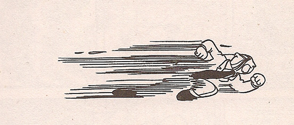
Motion or speed lines

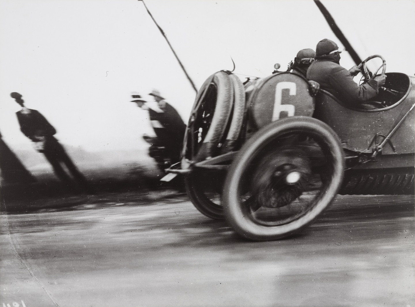
Commonly seen in cartoons, "motion lines" or "speed lines" clearly indicate direction and speed of a moving object. The more rapid the implied motion, the longer and more severe the lines which can be reinforced by blurring or elongating the moving figure. The cartoon here reminded me of a well-known photograph by Jacques-Henri Lartigue that distorts movement because of the technical characteristics of the shutter in the camera he used. I suspect that a number of the conventions we use to show motion did not exist before the invention of the camera, because the unaided human eye would simply not seen movement this way. (No doubt someone has already written about this at length...).

Use of speech bubbles

Portrayal of clocks, calendars, hour glasses

Maps

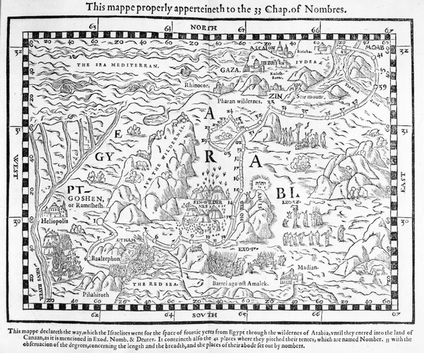
By themselves, maps generally provide a visual representation of a particular place. When coupled with lines or other interpretive overlays they can also indicate movement or other changes over time.

A map showing the journey of the Israelites out of Egypt and into Canaan, facsimile of an image from the Geneva Bible of 1560 (engraving)

A map showing the journey of the Israelites out of Egypt and into Canaan, facsimile of an image from the Geneva Bible of 1560 (engraving)
Map of Toronto subway system. Toronto Transit Commission.

Map of Toronto subway system. Toronto Transit Commission.

Changing light and/or season for passage of time

We are so attuned to the change of seasons—and even the changes of the hours of the day—that we sometimes take for granted how we constantly read the quality of light associated with a particular hour, or the colours connected with a particular month or season. But we read them all the time and they have great interpretive and emotional weight for us.

Illustration showing the changing of seasons on a single tree from www.planet-science.com

Illustration showing the changing of seasons on a single tree from www.planet-science.com

Subject or background movement

Even without the leading lines described above, we associate blurring of an image with movement. And we instantly make judgements about which planes are moving relative to others based on what appears to be sharp and what appears blurred. For example, when the foreground is sharp and the background is blurred—especially when a frame appears in the image—we generally assume that we are on a moving platform or in a vehicle.

Train Window - Green Pine{车窗-青松]. Zhang Xiaogang 张晓刚2010

Train Window - Green Pine{车窗-青松]. Zhang Xiaogang 张晓刚2010

Stages of life, aging

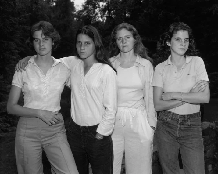
We take for granted that all living things age, die and decay. When we see a series of images that show people or other living things at different stages of life we are able to set them in chronological order without too much effort. The annual images Nicholas Nixon has made of four sisters since 1975 (two of which appear below) is an example of this: we know which picture was taken first and which later.

The Brown Sisters, 1975. Nicholas Nixon.

The Brown Sisters, 1975. Nicholas Nixon.

The Brown Sisters, 2012. Nicholas Nixon.

The Brown Sisters, 2012. Nicholas Nixon.

Signposts, place names

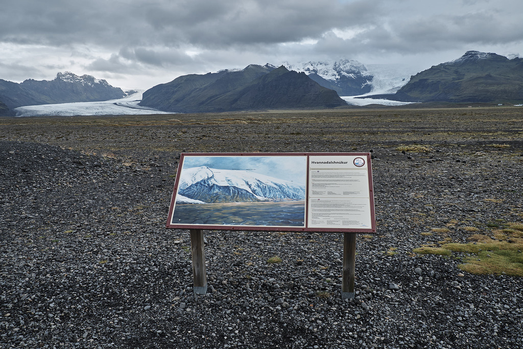
Although perhaps a bit obvious and maybe overlooked, the simplest way to designate a place is to put a sign on it. Our built environment is so full of signs that we might be overwhelmed by them, or register only those that stand out, as in the street scene in Las Vegas. The image below, taken in Iceland, has only one sign but it is intended to give information and a framework for understanding the geology of the place in front of the viewer.

Fremont East District, Las Vegas. 2016.

Fremont East District, Las Vegas. 2016.

Hvannadalshnjúkur, Iceland. 2015.

Hvannadalshnjúkur, Iceland. 2015.

Reflection

I've found that image-making as a whole has gone through important changes, but I think that some of the most significant changes may be related to the technology we have available to us, Those technological conventions have then been carried over into the visual arts. For example, the cartoon above that shows motion lines reminded me of a well-known photograph by Jacques-Henri Lartigue that distorts the shape of a car wheel because of the technical characteristics of the shutter in the camera he used. I suspect that a number of the conventions we use to show motion did not exist before the invention of the camera, because the unaided human eye would simply not seen movement this way. (No doubt someone has already written about this at length...). In the same way, I wonder if the use of frame-by-frame narration was connected with the invention of animation techniques.

Grand Prix of the Automobile Club of France, Course at Dieppe, 1912. Jacques-Henri Lartigue.

Grand Prix of the Automobile Club of France, Course at Dieppe, 1912. Jacques-Henri Lartigue.

In terms of researching this piece, I have to admit that I found it frustrating at times. It wasn't so much the process itself—starting with initial search terms, reviewing the results, refining and combining search terms to get more useful and illustrative results—it had more to do with copyright limitations on images on particular websites and/or the limitations of search engines on the websites of major galleries and image collections. In general, it is far easier to use a powerful search engine like Google that is much more configurable and fast, although the fact that it pulls up everything can be a downside: whose image is this? Can I use it for study purposes? Is this a good representation? Is the information about the image accurate?

Project 4, Exercise 2: Knitting patterns

An initial mind map on knitting

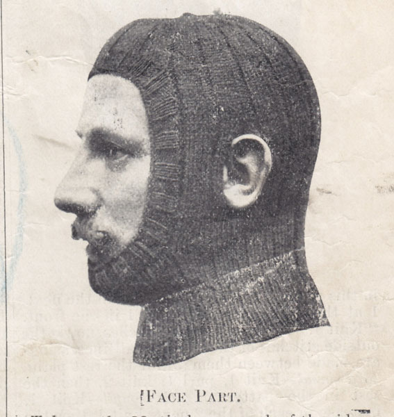
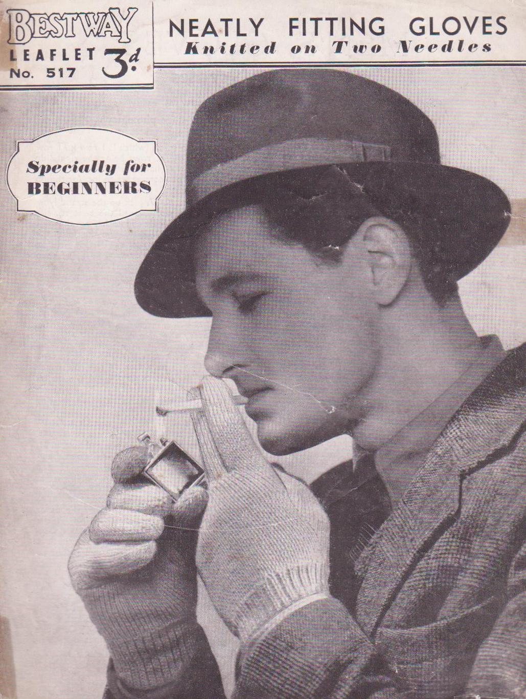
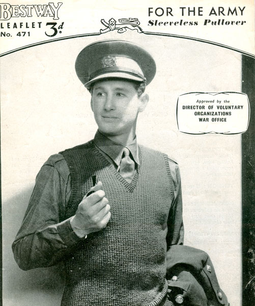
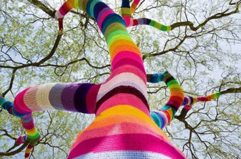
Examples of knitting and knitwear

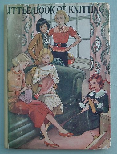
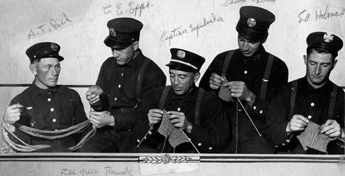
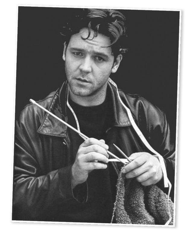
Many of the historical images I found online (and this is only a representative sample) followed a fairly stereotypical pattern: while both women and men wore knitwear, it was largely made by women, often in groups or in cozy domestic settings. I did manage to find some historical images of men knitting, but there are far fewer of them and they often go out of their way to show men knitting in ways that underline their masculinity (as in the group of men in uniform, above).

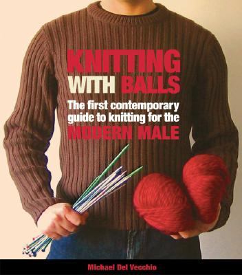
It is easier to find contemporary images of men knitting, but a significant number still show the men in ways that otherwise confirm their masculinity (men in uniform, sports figures or actors with a rough edge). It is sometimes hard to tell if these men really knit, or if the image is meant to be ironic.

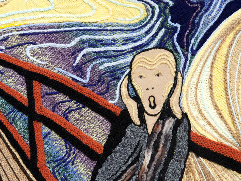
Another important difference between historical and contemporary images of knitting is the move from a concentration on utility to artistic pursuits. Earlier images of knitted products show almost exclusive interest in items of clothing. More current images show greater imagination in pattern and use of colour in knitwear, and are also much more likely to feature knit items that are solely decorative or clearly intended to be art. Much of this can probably be attributed to a wider variety of knitting tools and materials available, as well as to greater affluence and/or time for leisure activities. 

Project 4, Exercise 1: The next big thing

For this particular piece of contemporary visual communication, I have chosen the logo that was designed to represent the 150th anniversary of the Confederation of Canada (1867–2017). The logo was created by Ariana Cuvin, who won a design competition held by the Government of Canada.

According to the Department of Canadian Heritage,

The logo is composed of a series of diamonds, or “celebratory gems”, arranged in the shape of the iconic maple leaf. The four diamonds at the base represent the four original provinces that formed Confederation in 1867: Ontario, Quebec, New Brunswick and Nova Scotia. Additional diamonds extend out from the base to create nine more points—in total representing the 13 provinces and territories.

The logo has been made available in a number of visual treatments that can be used to complement the particular use to which it is put. For illustrative purposes, here are just four of the available visual treatments:

What characterises it as ‘new’? How does it fit within wider contemporary trends?

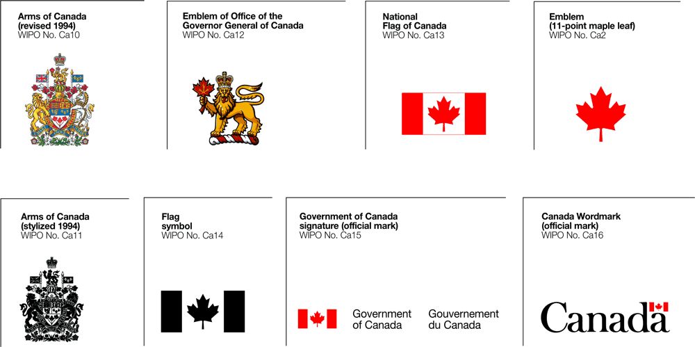
The logo appears 'new' in at least two senses. First, graphical representations used by the Government of Canada are relatively limited, closely guarded and are well-known by the Canadian public from communications materials, federal buildings and government correspondence. Best known among these are the 'Canada Wordmark' and the graphic representations of Canada's government departments whose uses are governed by the Federal Identity Program. The 'Canada 150' logo is a clear visual departure from these very familiar symbols and graphical representations.

The Canada Wordmark

The Canada Wordmark

A second reason that the 'Canada 150' appears new is that it has been designed with a contemporary aesthetic. Although government communications are rarely known for their daring, this logo is not out of place with other current corporate logos and images.

Are there any direct lines of influence from other contemporary artefacts – or historical ones?

There is indeed an obvious point of comparison or line of influence from an historical artefact: the official logo of Canada's Centennial year in 1967, as seen below:

Canada's Centennial logo, designed by Stuart Ash

Canada's Centennial logo, designed by Stuart Ash

Although not identical, the two logos clearly share a heritage in that their respective creators have chosen to represent Canada's provinces in territories through the elements of a stylized maple leaf.

What factors may lead to your example becoming ‘last year’s thing’? What aspect of the design will age first? What do you think will replace it?

The 'Canada 150' design will become 'last year's thing' very quickly, because it has built-in obsolescence. The logo is explicitly tied to the sesquicentennial year—2017—and will be out of date by 2018. It will live on in some of the promotional items that people will buy to commemorate the anniversary and will eventually become a nostalgia piece for those who are young now, just as the Centennial logo stirs up memories for those who were schoolchildren in 1967.

The 'Canada 150' text will age first. Without it, the graphic could probably have had a longer shelf-life even though it is so clearly tied to the sesquicentennial. And because these events by definition only happen every fifty years or on other significant anniversaries, nothing will be created to replace it. The logo is a one-off and will fade as quickly as the t-shirts on which it is printed.

Project 3, Exercise 2: Join the Navy

Denotation: Richard Babcock's wartime recruitment poster features a male sailor riding a moving torpedo. Aside from the splashing of the torpedo's wake, there is very little other detail in the image. The legend under the image appears to be hand-painted in bold capitals, in red and blue lettering. There are two wavy lines under the word "the" and the text is underlined by a solid gold or yellow line, roughly the same colour as the torpedo. 

Richard Fayerweather Babcock, Join the Navy, c. 1917

Richard Fayerweather Babcock, Join the Navy, c. 1917

Blue, gold and watery green are the most common colours in the painting, so the red text reading "Join the Navy" stands out. The simple graphic and bold capitals of the message mean that the poster would likely be easily read and from some distance.

Connotation: The sailor's position and the placement of his hands and legs suggest that he is riding a bucking horse in a rodeo, a scene that would be played out many years later by a character in the movie Dr. Strangelove.

Actor Slim Pickens in a still from Dr. Strangelove. Columbia Pictures, 1964.

Actor Slim Pickens in a still from Dr. Strangelove. Columbia Pictures, 1964.

The message of the poster seems to be that life in the navy is a great adventure for "fighting men." Unlike some other recruitment posters, there is no mention of duty to king, country or family—the only motivation appealed to is a desire for action. There is no reference to the flag, although the red and blue primary colours might help to recall the Stars and Stripes. Overall, the poster played to ideals of masculinity and the sporting life at the time.

It's possible that the torpedo served as a phallic symbol, but other examples of Babcock's posters that I have been able to find do not seem to draw on sexual overtones. At the same time, sexual symbolism and innuendo are not recent arrivals in the visual arts and there is no way to know what connotations the artist may have had in his mind.

What is more striking to me is that the poster represents a naive—and blatantly misleading—American outlook. By 1917, European armies had been in the trenches of WWI for three years and would no longer see enlistment as a call to action and adventure. While British posters insisted on duty, a cowboy riding live ordnance was designed for young men who did not know what was waiting for them.

Another example: The Big Whopper

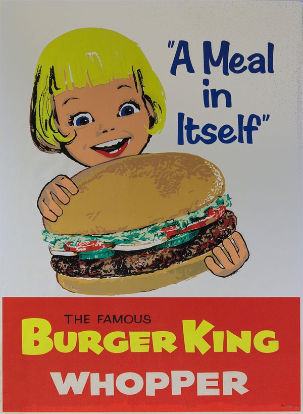
Burger King advertisement, 1960s.

Burger King advertisement, 1960s.

I chose this second example because of the simplicity of its design. 

Denotation: The poster is a painting with a relatively limited colour palette, bearing the image on a white background of a young girl holding a hamburger and looking at it with excitement (mouth open and eyes wide). The image contains the legend "A Meal in Itself" and the lower quarter of the poster is a red rectangle with the words "The Famous Burger King Whopper" in all-caps. The painting looks as though it has been executed quickly (the fingers on the hamburger bun look somewhat clumsy) and there is more attention to detail in the hamburger ingredients than there is in the girl's face.

Connotation: The style of the poster might have been meant to appear unsophisticated and winsome. Although it evokes the excitement of a child, the image's tagline "A Meal in Itself" was probably aimed at parents and perhaps, more specifically, mothers. Children don't normally think of fast food in those terms, and the attention given to the hamburger ingredients (a fresh bun, well-cooked meat, tomatoes, lettuce and cucumbers) is designed to show that the little girl is indeed about to eat a complete and nutritious meal. The poster is presented in a deceptively simple style (reduced palette, unsophisticated art and limited text), but it is communicating visual messages that show the food both as desirable or exciting for children and reassuring for parents.

As a parent and now grandparent, I understand wanting to make sure that one's family has nutritious meals and I also understand that busy families sometimes opt for fast food. It is natural to want to be reassured that a "fast" option doesn't mean that I am feeding children something unhealthy. The poster might have been effective in its day, but its artwork is now dated, the figure of the little girl unappealing and we know much more about what goes into the meals prepared in fast food restaurants. The hamburger might be "a meal in itself," but I would be less confident that it is a good meal. To suggest that this was a nutritious choice for a child might have been the biggest "whopper" in the poster.

Another person I showed this image to remarked immediately on the size of the hamburger relative to the girl's head: she is dominated by the product in front of her. The portrayal of the product is more important than that of the child; the hamburger is truly the subject of the art. The same individual also mentioned that the apparent era of the poster reminded her of a particular episode of Mad Men (a television series centred on the advertising industry of the 1960s) when fast food was taking on a larger role in the lives of families. The fast food restaurant was supplanting the family table and began to market itself in this way to draw customers by easing their guilt over not cooking at home.

Project 3, Exercise 1: What does this apple mean?

The story of the fall in the Garden of Eden as told in the Book of Genesis has been painted by many artists. Although the biblical text speaks only of Eve eating and subsequently offering Adam "fruit," Hendrick Goltzius—like every other artist—has represented the fruit in question as an apple. Because of this portrayal, the apple has come to represent a pleasing temptation that leads to sin and dire consequences.

Hendrick Goltzius, The Fall of Man. Oil on canvas, 1616.

Hendrick Goltzius, The Fall of Man. Oil on canvas, 1616.

Centuries later, Disney Studios used the offer of an apple again as a signifier of a tempting threat with terrible consequences, as the evil Queen in disguise holds up shining, red fruit that Snow White is unable to resist.

Still from Snow White. Disney Studios, 1937.

Still from Snow White. Disney Studios, 1937.

For all the association of the apple as a signifier of temptation and evil since biblical times, it has also been used in the Christian tradition to different effect. Lucas Cranach the Elder, for example, uses the apple theologically to make the point that Christ has overcome the effects of the Fall. Seen this way, the apple signifies new life and fruitfulness through salvation rather than death and despair through disobedience.

Lucas Cranach the Elder, The Virgin and Child under an Apple Tree. 1525–1530.

Lucas Cranach the Elder, The Virgin and Child under an Apple Tree. 1525–1530.

The Belgian surrealist painter, René Magritte, takes a different direction altogether with the apple. In his painting, The Son of Man, an unidentified male figure in business attire has his features concealed by a large green apple with leaves still attached. Only the very edges of the man's eyes may be seen. The scene might be mundane except for the fact that one of the man's elbows appears to bend the wrong way and the apple floats in mid-air. The apple is full of life but serves only to conceal. It is one of the smallest visual elements in the picture but it covers exactly what we want to see: the man's face. It is a frustrating painting, then, because it conceals information rather than furnishing it. If the apple is a signifier, it is one that points to less meaning, rather than more. We think we know what we are looking at, but we understand less than we should. (Magritte would take a similar approach with the figure of a dove—another rich symbol—in Man in a Bowler Hat, also painted in 1964.)

René Magritte, The Son of Man. 1964.

René Magritte, The Son of Man. 1964.

More recently, a stylized apple has become instantly recognizable as the corporate logo for Apple Inc. Although it was originally multi-coloured, the apple is now most often seen in monochrome but is just as easily recognized because of its distinctive outline. The outline is said to be missing a bite in order to give the apple scale (relative to the size of a human bite) to ensure that the figure would not be mistaken for a cherry. In this case the signifier points simply to the name of the company—chosen because of Steve Jobs' work in an apple orchard—rather than having symbolic weight.

First official Apple corporate logo, used from 1977 until 1998

First official Apple corporate logo, used from 1977 until 1998

Even in this small collection of examples, the range of things signified by the figure of an apple is wide. Most of the potential meanings depend on relationship to other systems of signs (myth and story; other artistic works; knowledge of corporate names) and the apple can be used to designate the extremes of risk or health. A thread running through a number of the uses point to the apple's ability to conceal: what it appears to be may not be what it contains. Or the figure of the apple itself may conceal the face that lies behind it. Or the outline of a natural fruit may give a friendlier face to the reality of the high-tech corporation that lies behind it.

Project 2, Exercise 3: Film posters

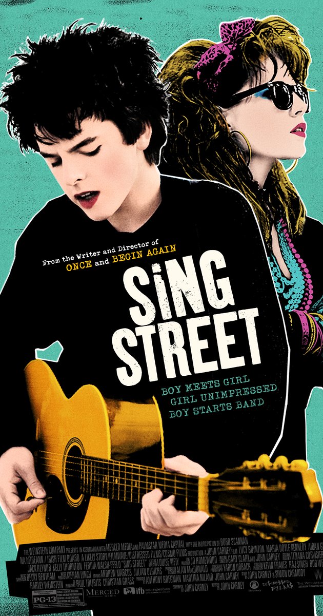
Sing Street poster, 2016.

I have chosen to discuss the poster for the 2016 film Sing Street because it is a relatively recent movie and because of the stylized artwork.

The film is a coming-of-age story set in Dublin of the 1980s. The protagonist has a crush on a young woman and decides that being in a band is the best way to get her attention. As a result, a lot of the movie is taken up with those two themes: the development of the relationship and the influence of the popular music of the time.

The poster captures both themes well. The two main characters dominate the artwork and their fashion sense and hairstyles recall the 1980s. They are clearly young—both from the way they are dressed and the pinkness of their skin and lips. The lead is playing a guitar and singing, although the young woman is looking off somewhere else—the future? perhaps she has ambitions—and is dressed much like Madonna in the 1985 film, Desperately Seeking Susan.

Madonna in a production still image from Desperately Seeking Susan, 1985. Orion Pictures.

Madonna in a production still image from Desperately Seeking Susan, 1985. Orion Pictures.

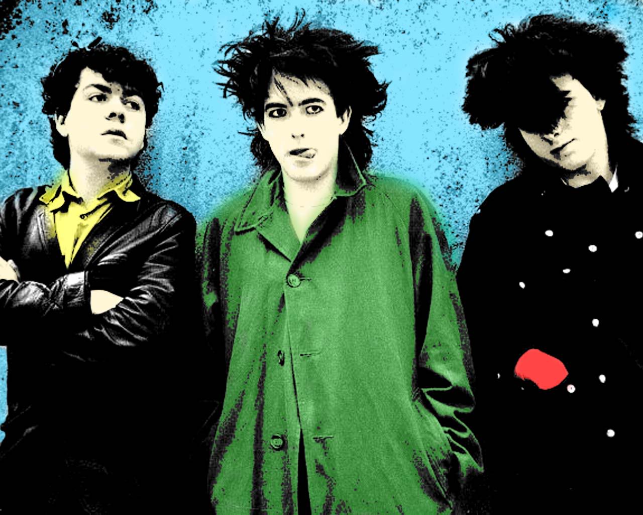
The image is not straight photography but has been posterized, with reduced tones, heightened contrast and saturated colours. In this way it references the look, colour palette and blocks of colour of the music imagery of the same period, as can be seen in the picture of The Cure, below. The type and typefaces are simple and bold, and are also in keeping with poster art from the 1980s.

The Cure

The Cure

Taken as a whole, the different elements of this poster for Sing Street combine to make an effective visual communication. They telegraph the major themes of the movie while evoking the spirit of the period in which it is set.


Project 2, Exercise 2: Re-contextualising images

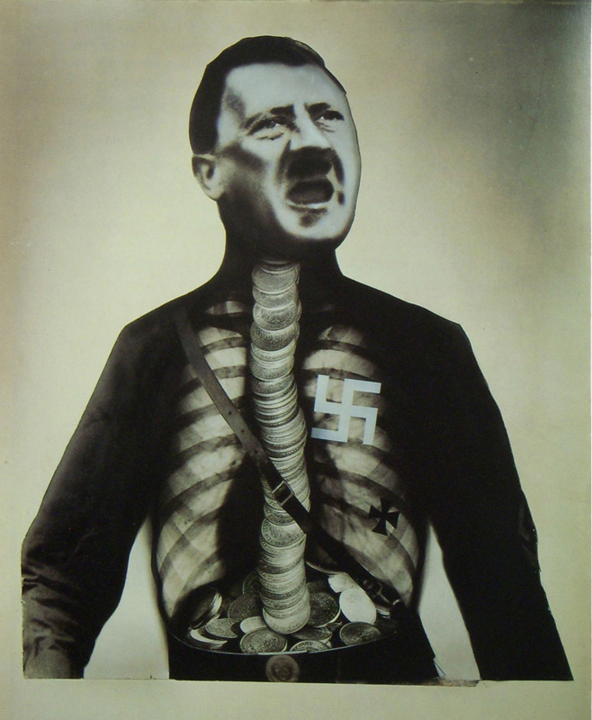
John Heartfield

  • http://www.johnheartfield.com/John-Heartfield-Exhibition/
  • Born Berlin 1891 as Helmut Herzfeld but anglicized his name during WWI in response to anti-British sentiment in Germany.
  • Politically active, a proponent of Dada and an originator of photomontage as a means of artistic and political expression. Also built theatre sets for Bertolt Brecht.
  • Fled Berlin for Prague in 1933 to avoid arrest by the SS after sustained criticism of the Nazi movement. Fled Czechoslovakia in 1938 when the country was invaded by Germany.
  • Lived during WWII in Britain and returned to Berlin in 1950 where he was viewed with suspicion by the East German government. Died 1968.
© 2016 Heartfield Community of Heirs. All Rights Reserved.

© 2016 Heartfield Community of Heirs. All Rights Reserved.

Peter Kennard

  • http://www.peterkennard.com/
  • Born London 1949 and based there. Artist and academic at the Royal College of Art.
  • Politically-active in left-leaning causes, turned to photomontage as a means of expression. Produced work in support of the Committee for Nuclear Disarmament.
  • Uses more modern photomontage tools (Photoshop) than were available to Heartfield (scissors and glue). As a result, some of his pieces are mistaken for "real" images and the potential for the image to affect perception of a mass audience can be heightened. A more deliberate effort to affect not only public discourse but perceptions: "We were trying to portray Iraq as it happened and not wait until afterwards and make a history painting" [The Guardian].
"Photo Op" by kennardphillipps/Reuters. 2005.

"Photo Op" by kennardphillipps/Reuters. 2005.

Hannah Höch

  • http://www.theartstory.org/artist-hoch-hannah.htm
  • Born 1889 Gotha, Germany. Died 1978 Berlin.
  • Became friends with Raoul Hausmann, a fellow-participant in the Berlin Dada group and with him became a pioneer of photomontage.
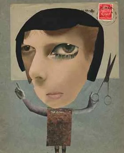
  • A strong advocate for contemporary women artists, she seems to have been undervalued by many of her male colleagues in the artistic community. Her photomontages often criticized the fashion and beauty industries, as well as the ideal of the Weimar New Woman, and frequently challenged gender roles by fusing images of male and female bodies.
  • Her work appears to be just as political as Heartfield's, although small "p" political rather than partisan. Her technique is also rougher, in that the components of her images are often torn from papers or magazines rather than being neatly cut with scissors. Her images are very abstract and distinct from Heartfield's—often bizarre—"realism".
  • Höch's works were seen as "degenerate" during the Nazi period and seldom shown. Although she was freer to exhibit after the war it seems that she never achieved the same degree of attention.
Hannah Höch, Self portrait.

Hannah Höch, Self portrait.

Martha Rosler

  • http://www.martharosler.net/
  • Born Brooklyn, 1943.
  • Works in video, photo-text, installation, and performance, as well as writing about art and culture. Rosler’s work is centered on everyday life and the public sphere, often with an eye to women's experience. Recurrent concerns are the media and war, as well as architecture and the built environment, from housing and homelessness to systems of transport. [Wikipedia].
  • Influential artist, lecturer, professor and writer.
  • “My art is a communicative act,” Martha Rosler says, “a form of an utterance, a way to open a conversation.” [www.artsy.net]
  • Her work is reminiscent of Kennard's and the two share an interest in protesting warfare. Whether it is coincidence or whether Kennard's 2005 image was influenced by Rosler's piece from the year before, each has produced a photomontage named "Photo Op" (above and below) depicting an individual taking a cellphone selfie, oblivious to the scene of fiery destruction behind them. Kennard indicts Tony Blair for the UK's role in Iraq, while Rosler broadens the critique to include a non-politician too caught up in her comfortable surroundings to notice the bodies behind her and the armoured tank outside in the garden.
Martha Rosler. Photo Op, 2004

Martha Rosler. Photo Op, 2004

II. A recontextualised image of my own: Discover unspoiled Iceland!

I'm happy with the results of this collage because I was able to create what I had in mind and I believe it expresses my idea well. I have created meaning through the use of exaggeration of a real situation, which is the impact of ballooning tourism on Iceland's small and fragile ecosystem. Although the text in the collage may not be strictly necessary, I wanted to be sure that the ironic line made the point difficult to miss. Iceland—and especially its international airlines—are marketing the country heavily as an unspoiled place of wild beauty. The more successful these efforts are, although they are crucial to the country's economy at the moment, the less likely Iceland will be to remain beautiful.

Although all of this is a bit heavy-handed, I think it is in keeping with the approach of artists who work in collage or photomontage. What seems to vary, however, is the extent to which the artist attempts to create work that is "realistic." Kennard's Photo Op comes close to photorealism—close enough that some viewers were inclined to believe it was a real photograph (although this may have happened because they were predisposed to think the worst of Tony Blair). Rosler's Photo Op, on the other hand, is unlikely to be mistaken for a real image for a number of reasons: the repetition of the female figure, the positions of the bodies behind her, and the strange mixed lighting throughout the scene. It looks artificial and this is clearly Rosler's intent—perhaps the artificiality of the image underlines the artificiality of a lifestyle that encourages preoccupation with appearance and self, while ignoring the damage around us.

Collage is a powerful tool for creating images and lends itself to communicating a political message ("political" in the broadest sense of the term). It takes existing graphic elements and rearranges them in a way which can be deceptive or plainly incongruous—almost as if holding up fragments of the given world and showing their brokenness or contradiction. They can take what is "real" and show it to us in all its reality or unreality. It is a tool that was born in modernity, with the photograph and high-speed printing, and perhaps for this reason it is ideally suited for protest and criticism in the era of mass communication. The Dadaists were onto something.

Project 2, Exercise 1: Mixed messages

Messages communicated by the writing

  • Enjoy your stay: the message of the words is inviting, but the formal (Gothic?) script seems to work against the message. Perhaps, though, this is meant to be an appeal to a sense of the traditional or old-fashioned. If that is the case the message and typeface might work together. Context and audience would play important parts in how such a message would be read.
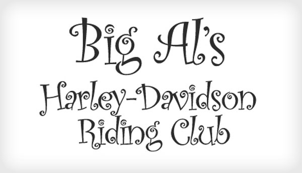
  • DO NOT FEED THE ANIMALS / THEY ARE DANGEROUS: the use of all capital letters communicates a sense of the urgency of the message, which is an important one for anyone concerned about their safety. The typeface, however, might be seen as less than serious. Why not choose a simple, sans serif typeface that communicates less ambiguously?
  • We are professionals: the typewriter script is something we no longer see very often, except perhaps in advertising or on book covers. Perhaps the use of such an "old school" typeface is meant to be ironic, to evoke a particular kind of office work, or to give the reader confidence that the writer has older (and reliable?) values.
  • LUXURY: the typeface aims to be exotic and might be successful in advertising a luxury good (perfume, perhaps?). At the same time, the type is probably a little less legible than it could be—although this could have the beneficial effect of encouraging a potential buyer to slow down and read more carefully.
  • hand made: the text in lowercase, sans serif type is very legible and gives a sense of lack of pretension. It could be an effective way of presenting a hand made product with an air of honesty. In that way, text and type would work together very well.

In each of these examples, context and audience would be important factors in judging the effectiveness of the visual communication. Any one of the examples could be effective or ineffective, depending up the use to which it is put.

Additional examples where text and typeface do not complement each other:

font-choices-op4.jpg

Additional examples where text and typeface do complement each other:

bnd-trebuchet-ms.png

Research point—visual communications

[Note: the Oxford Art Online website has not been accessible to OCA students for some weeks while the contract is being renegotiated. The notes below were made before access to the website was closed.]

Whitney Davis, ‘Communication theory’

http://www.oxfordartonline.com/subscriber/article/grove/art/T018901

Davis provides a broad outline of communication theory’s major concepts and elements. Important distinction to be made between “information” (understanding that can be derived from perception) and “communication” (the intentional delivery of a message). It is interesting to see how authorial intent can pop in and out of discussions in the art world, depending upon which theorist happens to be invoked.

Communication, according to Roman Jakobson’s scheme, has six major factors: ‘addresser’, ‘addressee’, ‘message’, ‘code’, ‘context’ and ‘contact’. Code and context are particularly important, for they describe the interpretive framework within which communication can occur. Too great a gap in code or context between addresser and addressee, and communication will be ineffective or impossible.

Stephen Bann, ‘Semiotics’

http://www.oxfordartonline.com/subscriber/article/grove/art/T077528

Term referring to the analysis of signs and their use. Major theorists are Charles Sanders Peirce (1839–1914), Ferdinand de Saussure (1857–1913) and Roland Barthes.

“Saussure has been called ‘the father of modern linguistics’. He drew a crucial distinction between the linguistic system and its actual manifestations in speech (between ‘langue’ and ‘parole’). He further distinguished between the referential dimension of language, the ‘signified’ (‘signifié’), and the phonic substance of speech, or visible traces on the page, the ‘signifier’ (‘signifiant’).”

Jan Mukarovsky later translated Saussure’s linguistic insights into the esthetic realm to distinguish the ‘sensuously perceivable “work-thing”’ and the ‘aesthetic object’ existing ‘in the consciousness of the whole collectivity’.

Peirce developed a taxonomy of signs to all things and began to classify them by a tripartite division: icon, symbol and index: “the icon relates to its referent by resemblance, the symbol by convention and the index by existential connection.”

Penny Sparke, ‘Design’

http://www.oxfordartonline.com/subscriber/article/grove/art/T022395

Current sense of “design” originated with expansion of industrial revolution and the related separation of of conception from manufacture. Early on, design was largely embellishment or decoration of objects produced by mass processes, so schools of design were primarily interested in developing the drawing skills of students. The emphasis on style and decoration helped to fuel consumerism and sparked a reaction among people like John Ruskin, William Morris and what came to be known as the “Arts and Crafts” movement, “epitomized by such tenets as ‘fitness to purpose’ and ‘truth to materials’.” The movement helped give greater place to ethics and esthetics in design.

Another impact of the Arts and Crafts movement in the early 20th century was the “democratization of design” and the rise of schools and guilds dedicated to it and related principles. Significant figures and groups in this modernist period include Josef Hoffmann, Koloman Moser, the Wiener Werkstätte, C. R. Ashbee and his Guild of Handicrafts, Peter Behrens, Richard Riemerschmid, Henry Van de Velde, and the Deutscher Werkbund.

In the Americas, as industrial production expanded into assembly line mass creation of consumer goods, standardization was the rule. This was not satisfying to consumers for long, so there was a move to greater esthetic detail on the one hand (consumer demand) and the explosion of advertising on the other (consumer awareness). Although some of the same trends could be seen in other parts of the world, “designers in Europe during the inter-war years continued to be more interested in the metaphorical and aesthetic implications of contemporary life and in evolving objects that were appropriate to it” (Le Corbusier, Bauhaus).

Modern movement and later the “International Movement”: “applied to the architecture of simple geometrical forms and plain undecorated surfaces, free of historical styles, that developed mainly in Europe in the late 19th century and the early 20th prior to World War II” (Modern Movement).

Margaret M. Smith and John Newel Lewis, ‘Book illustration’

Originally, all illustration was created by hand. Later techniques included woodcuts (before 1600;  allowed both text and illustration on a single page), copper engraving (second half of 16th century) and other “intaglio” techniques (17th century; printmaking techniques in which the image is incised into a surface and the incised line or sunken area holds the ink). It was difficult to employ both intaglio and movable type on a single page, so text and image were usually on separate pages. Wood engraving was popular in the 18th century, while colour printing and lithography appeared in the 19th century.