Project 3, Research point 1: Christian Boltanski

Christian Boltanski's Personnes; image from Traffic Magazine

Christian Boltanski's Personnes; image from Traffic Magazine

Analysis by terms / categories:

  • Art: this is an installation that is meant to be visited in an exhibition space.
  • Temporary: the installation was in place in Paris for just over a month. 
  • Large scale: the piece is large enough to dominate and overwhelm visitors, which is likely part of the desired effect.
  • Form: Personnes formed its own shapes, in regular rectangular deposits of clothing.
  • Immersive and Distant: the installation is large enough to walk around in, but also draws some of its power from the ability to stand back and take in its scale.
  • Repetition and Shape: the work is laid out as a series of regular rectangles of clothing lying on a concrete floor.

The media release for Personnes described it as "social, religious and humanistic exploration of life, memory and the irreductible individuality of each and every human existence – together with the presence of death, the dehumanisation of the body, chance and destiny. Conceived as a work in sound and vision, Personnes takes up a new theme in Boltanski’s work, building on his earlier explorations of the limits of human existence and the vital dimension of memory : the question of fate, and the ineluctability of death. Personnes transforms the entire Nave of the Grand Palais through the creation of a coherent, intensely moving installation conceived as a gigantic animated tableau. Personnes is a one-off, ephemeral work. In accordance with the artist’s wishes, the components of the piece will all be recycled at the end of the exhibition."

Without knowing anything about the installation, my first glances at pictures of it reminded me of the large piles of sorted clothes, shoes and eyeglasses confiscated from Jewish victims of the Nazi death camps. The empty (de-personalised) clothes cannot help but speak to us of the absence of the people who once wore them. And the rectangular piles on the floor suggested to me both that the missing people were less important than their clothes and that a rational mind had created the arrangement with deliberate purpose. The use of a crane to move the clothes makes the arrangements even more mechanistic and dehumanised.

The name of the installation—Personnes—is a play on words that reflects the dehumanisation described above: the French word suggests at once the people who would have worn the clothes and their absence ("no ones").


http://vernissage.tv/2010/01/14/christian-boltanski-personnes-monumenta-2010-at-grand-palais-paris-interview-part-1/

http://www.clg-exupery-ermont.ac-versailles.fr/IMG/pdf/fiche_prof_personnes_boltanski.pdf

http://www.domusweb.it/en/art/2010/02/01/monumenta-2010-christian-boltanski.html

Project 3, Exercise 1

Thinking back to Part 3 - Visual Communications, it seems to me that the function of Marianne Straub's textiles is to communicate a number of desirable values and attitudes:

  • The pattern of the materials, particularly when viewed down the length of a bus or a train carriage, creates or supports an identity for the transportation company. Once seen and recognized, the fabric is a constant reminder of a consistent 'brand.'
  • The quality of the materials used speak to the care that the transportation company is trying to show to its patrons. Public transport featured molded plastic seating without fabric for a while, no doubt because the seats were more durable and easier to clean. At the same time, the plastic seats were slippery, uncomfortable in summer (too hot) and winter (too cold) and could be read as a message to patrons that they were dirty and not deserving of better things.
  • The patterns chosen, although they seem outdated or even 'retro' now, would have been meant to convey a sense of modernity. Once again, this is a tacit message about the transportation company: we are a modern, forward-thinking company and we expect our patrons to recognize this and value the service they are paying for.
  • Depending upon the type of pattern chosen, there may also have been a desire to make the connection with the home environment. In this sense, patrons are visually encouraged to see their seat as an extension of their living room, a place to be comfortable and relax (rather than a train or bus crammed with other commuters). The association of the home may also encourage patrons to take better care of their surroundings because they have a personal / emotional connection with them.

Project 3, Research point 4: Wrapped Trees, Kusama, Bouroullec and Straub

Wrapped Trees

Copyright: Wolfgang Volz, ©Christo 1998

Copyright: Wolfgang Volz, ©Christo 1998

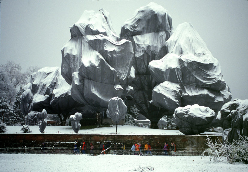
  • Starting on Friday, November 13, 1998, 178 trees were wrapped with 592,015 square feet (55,000 square meters) of woven polyester fabric (used every winter in Japan to protect trees from frost and heavy snow) and 14.3 miles (23 kilometers) of rope. The wrapping was completed on November 22. The trees are located in the park around the Fondation Beyeler and in the adjacent meadow as well as along the creek of Berower Park, northeast of Basel, at the German border. The height of the trees varied between 82 feet (25 meters) and 6.5 feet (2 meters) with a diameter from 47.5 feet (14.5 meters) to 3.3 feet (1 meter). [http://christojeanneclaude.net/projects/wrapped-trees?view=info — consulted 7 August 2017]
     
  • The wrapping was removed after a month and the materials recycled. The artists also approached the cities of St. Louis, MO and Paris concerning additional wrapping projects but were denied permission.
  • After reading the quote again in its proper context on the website (that is, it applies to all of Christo and Jeanne-Claude's projects, not just the Wrapped Trees), I can appreciate the focus on the use and properties of textiles rather than on a particular technique. The two use their materials to create and enhance temporarily, large-scale structural forms, some of which exist already and others that are revealed by the application of the textile and its particular properties.

Yayoi Kusama

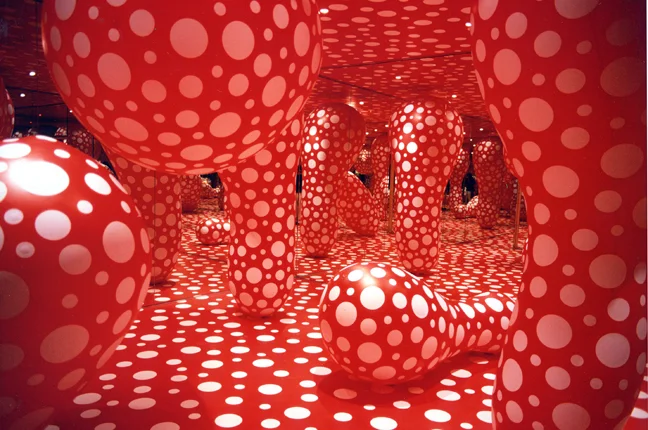
Yayoi Kusama, Dots Obsession, Infinity mirrored Room, 1998. Installation. Les Abattoirs, Tolosa

Yayoi Kusama, Dots Obsession, Infinity mirrored Room, 1998. Installation. Les Abattoirs, Tolosa

  • Art
  • Temporary
  • Large scale
  • Defining and Forming
  • Immersive
  • Pattern, Colour and Repetition

Ronan and Erwan Bouroullec

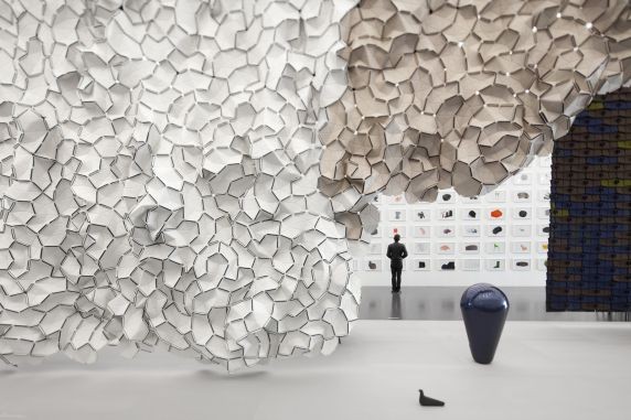
Installation view, Bivouac, Centre Pompidou-Metz, FranceOctober 7, 2011 - July 30, 2012Photo © studio Bouroullec

Installation view, Bivouac, Centre Pompidou-Metz, France
October 7, 2011 - July 30, 2012
Photo © studio Bouroullec

  • Art
  • Permanent
  • Large-scale
  • Transforming
  • Immersive and Distant
  • Pattern, Colour and Shape

Marianne Straub

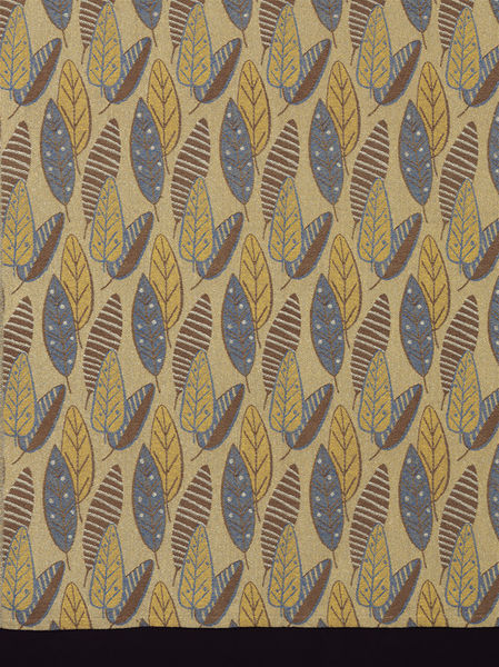
Woven, 1949, British; Straub, Marianne for Helios Ltd. "Brisbane"

Woven, 1949, British; Straub, Marianne for Helios Ltd. "Brisbane"

Marianne Straub OBE (23 September 1909 – 8 November 1994) was one of the leading commercial designers of textiles in Britain in the period from the 1940s to 1960s. She said her overriding aim was: "to design things which people could afford. ... To remain a handweaver did not seem satisfactory in this age of mass-production." [Wikipedia, consulted 7 August 2017]

  • Design
  • Permanent
  • Small-scale
  • Defining
  • Immersive
  • Pattern, Colour and Repetition

Project 3, Research point 2: architectural uses of textiles

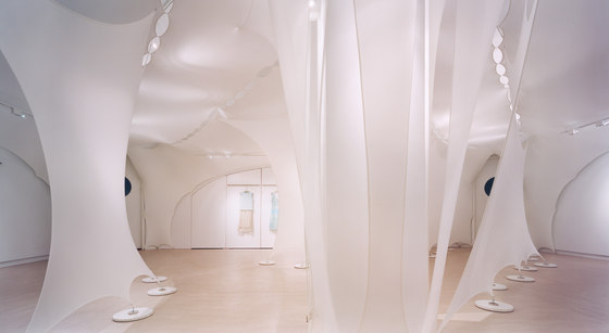
Elie Tahari Showroom, NYC — Photographer: © Michael Moran

Elie Tahari Showroom, NYC — Photographer: © Michael Moran

DAR LUZ installation by Lars Meeß-Olsohn and Ali Heshmati in Eindhoven — Photo © Johan Creemers

DAR LUZ installation by Lars Meeß-Olsohn and Ali Heshmati in Eindhoven — Photo © Johan Creemers

'Tubaloon' by Snohetta Architects for the Kongsberg jazz festival in Norway — Photo © Snohetta

'Tubaloon' by Snohetta Architects for the Kongsberg jazz festival in Norway — Photo © Snohetta

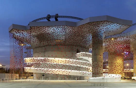
Swiss pavilion at EXPO Shanghai 2010 with X-TEND steel net by Carl Stahl — Photo © iart interactive ag, photographer: Mark Niederman

Swiss pavilion at EXPO Shanghai 2010 with X-TEND steel net by Carl Stahl — Photo © iart interactive ag, photographer: Mark Niederman

Hyparform vertical sails on a Vienna building by Planex

Hyparform vertical sails on a Vienna building by Planex

Project 3, Research point 1: prep for Assignment 5

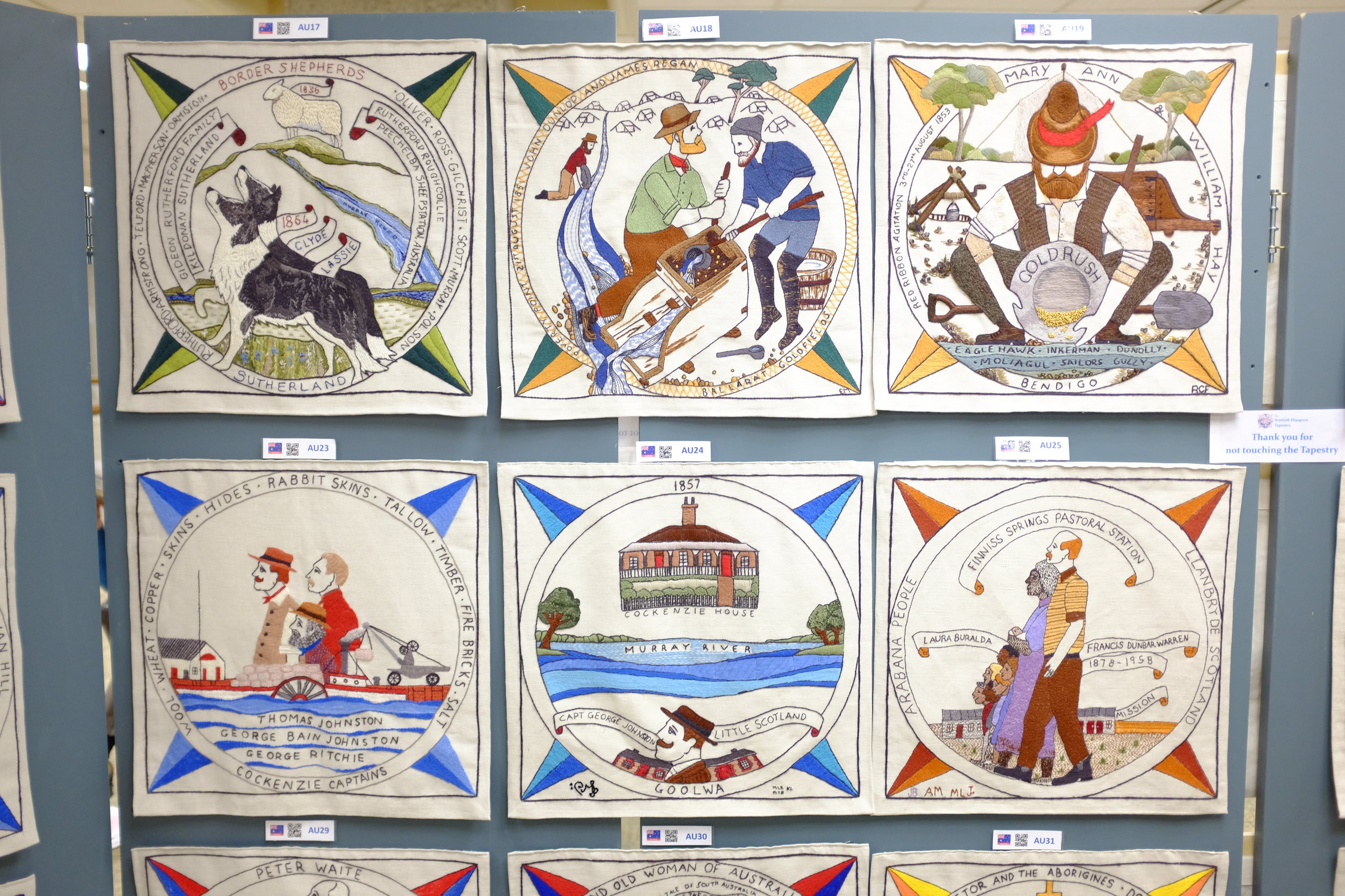
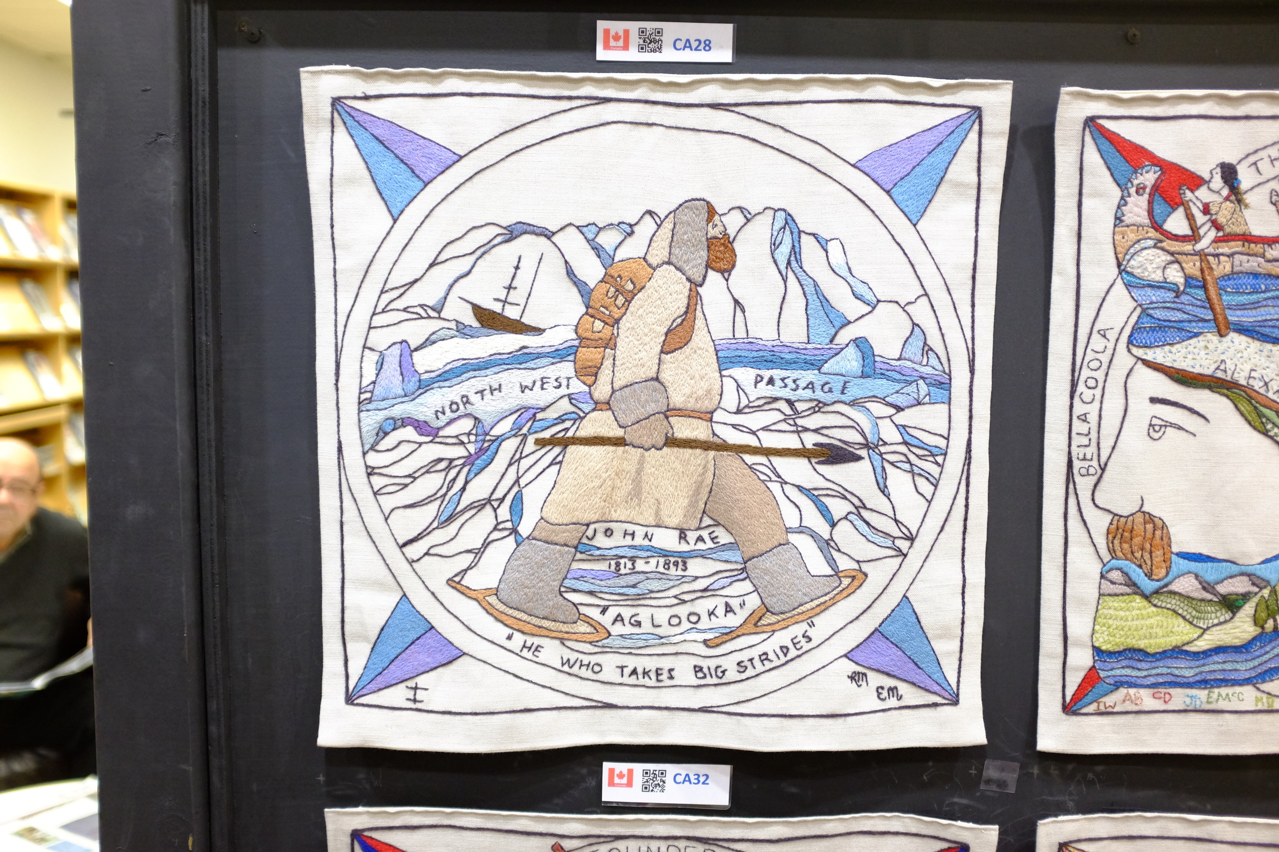
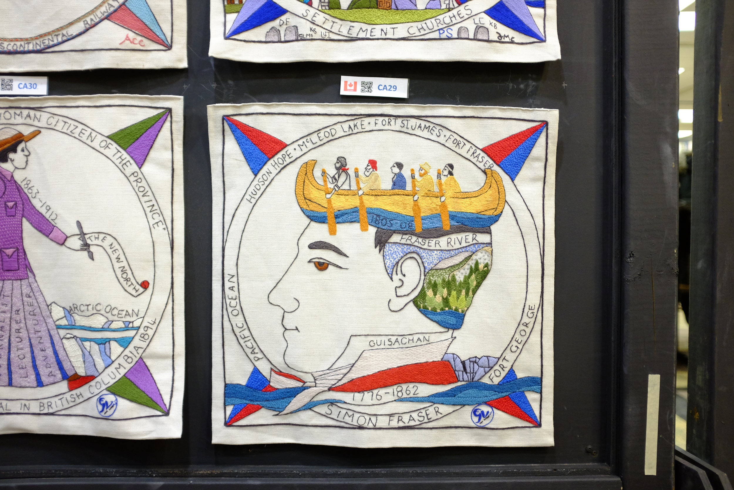
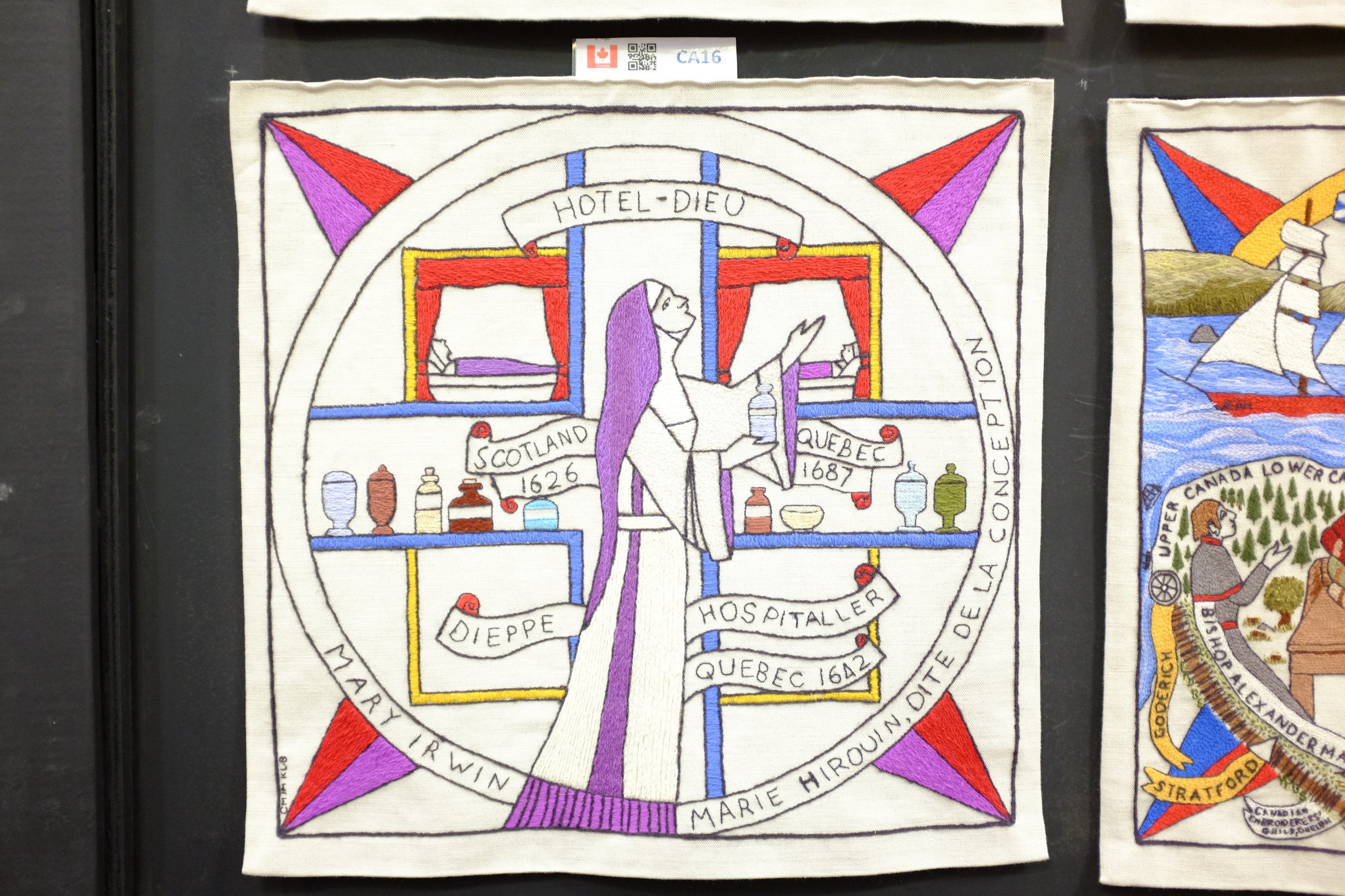
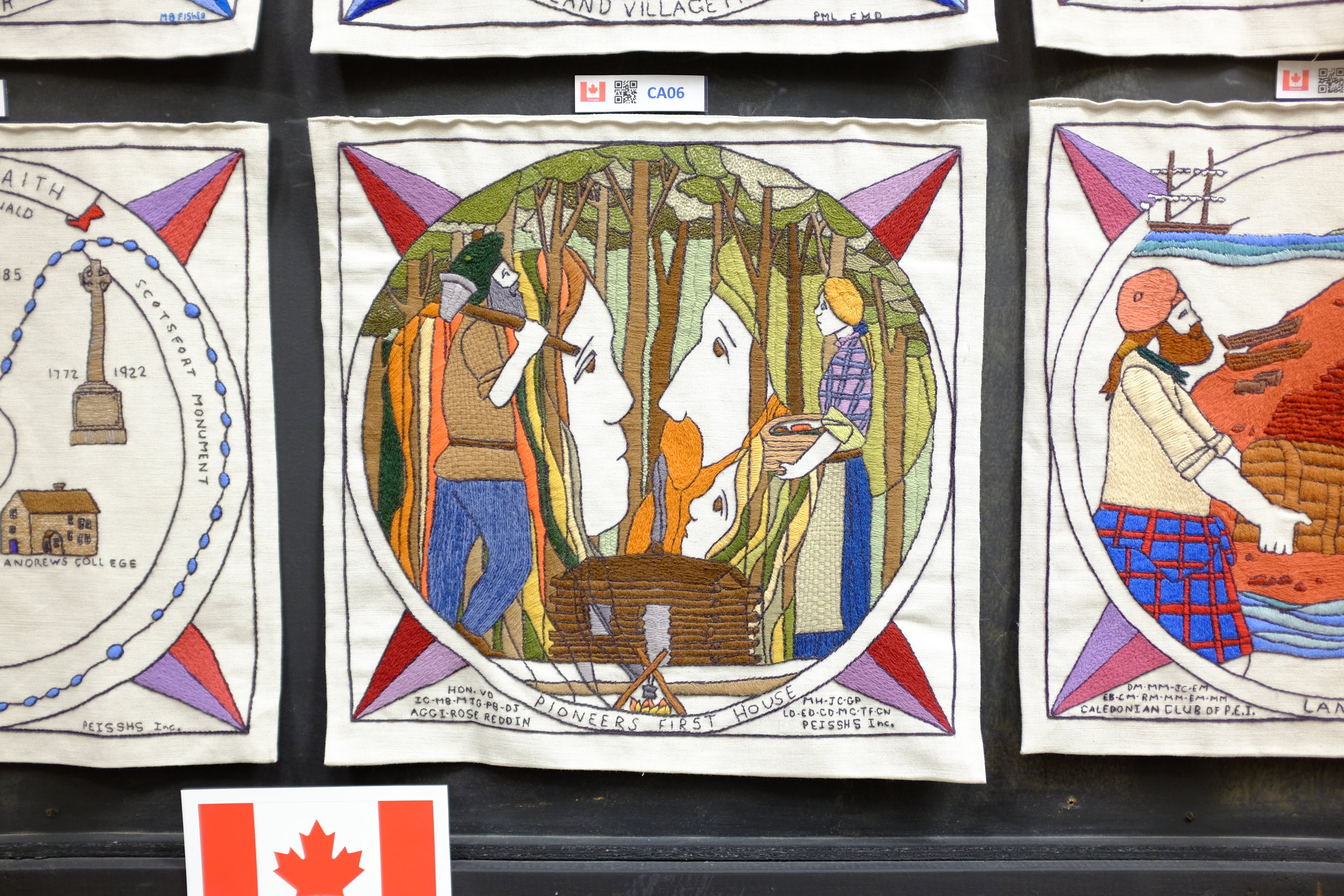
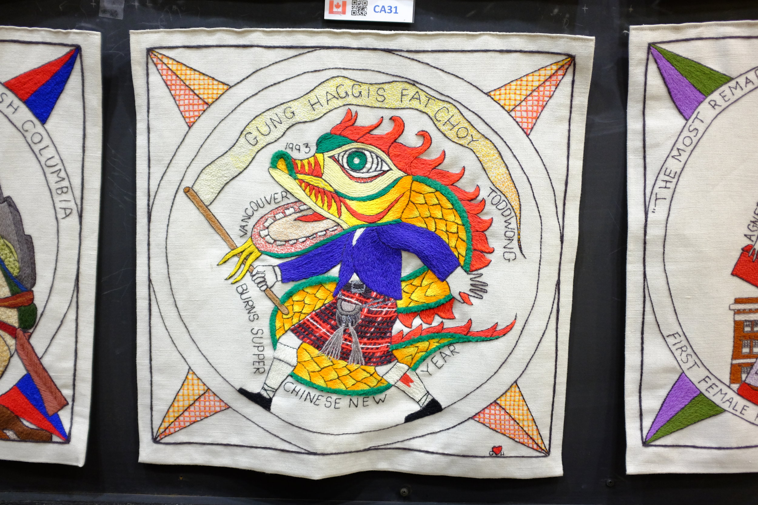
In preparation for Assignment 5 on Textiles, I've decided that I'd like to do work on the the Scottish Diaspora Tapestry. The tapestry was completed in Scotland between 2012 and 2014 and then toured the world via installations in countries with a significant population claiming Scottish heritage. The tapestry will be permanently installed in Prestonpans, Scotland. I had the opportunity to see the tapestry and photograph portions of it in Ottawa during the Canadian leg of its tour in January 2017. Assignment 5 will give me the opportunity to dig more deeply into the textile aspect of the work, rather than just the depictions of Scottish emigration and accomplishments.

A few quick shots I took of tapestry panels. These will be edited and cropped for Assignment 5.

Project 3, Exercise 3: Viewpoint

Image 1: ©Derek Trillo, The Cheshire Plain from Beeston Castle, 2008

  • The high, oblique perspective gives a sense of the spatial relationship of objects on the ground to one another.
  • We also get a sense of the relative size of the objects and we are able to guess at scale, using the trees as a guide.
  • The slanting light gives some idea of texture, from the rough trees and gullies to the relative smoothness of the mowed fields and plowed earth. The shadows also give a relative indication of the time of day—we know the picture was taken during the day (bright) but not at noon when the sun would be directly overhead (smaller or no shadows).
  • We can also surmise that the image was made in early spring: the fields have been plowed for sowing and the grass is very green, but the leaves on the trees are not very advanced.
  • If we were at ground level our view would be blocked by trees, hedges and walls. This high perspective allows us to see over and beyond these obstacles.
  • We cannot see the horizon, however, so it is hard to relate this viewpoint to anything beyond the tight frame of the image.
  • A map would give us a representation of the area from directly above, but we would not have as much information about the ground features or about their texture.
  • Many of the same comments could be made about earlier versions of Google Maps, but more recent iterations give us a richer range of options for viewing.

Image 2 by OCA student, Peter Mansell

  • This picture allows us to see the horizon and shows us a developed urban area that stretches on for some miles.
  • The image shows us a region that appears to contain both commercial / industrial facilities as well as residential areas (the apartments and lower buildings in the middle and longer distance).
  • Although a black and white picture, the trees are covered in foliage and suggest summer.
  • Other than a partial sign on a roof ('P.A. FINLA'), there are few identifying features in the image (the canal?) and little indication where this town might be.

Image 3: © John Davies, Agecroft Power Station, Salford, 1983

  • The black and white photograph is taken from a high angle and shows four cooling stacks from a power station set in a broader landscape. Metal pylons hold the high tension wires that carry electricity away from the station.
  • Behind the cooling stacks it is possible to make out a large building with a high chimney. In the foreground sit some cars in the middle of what looks like scrub land and rubbish at the end of a canal. In the middle distance a game is underway on a football pitch.
  • The foreground is made up of lines of trees, broken up by the lane that the cars have used for access. There appears to be a split-rail fence just behind the trees.
  • The sky is dark and overcast, and it is not possible to tell if the clouds are natural or if they are the smoke/steam produced by the cooling towers. Perhaps the clouds are a mix of both.
  • All told, it is a bleak scene even though the towers are impressive in the way they dominate the landscape and stand against the sky. The bleakness comes from the brute figure of the power station squatting in the middle of what was likely agricultural land.
  • Taking the shot from a relatively high angle allows the photographer to show more of the surrounding area, thereby providing greater local context for the image. Moving to a lower angle or moving closer to the power station would have made the cooling towers even more dominant, but would have blocked much of the view and reduced the amount of visual information for the viewer.
  • Being able to see the players on the football pitch gives the viewer an immediate sense of scale. The figures are dwarfed by the landscape and by the massive size of the cooling towers. It does not take much imagination to see how the humans are dominated in what should be a natural setting by the industrial installation beside and above them.

Image 4: © Bernd & Hilla Becher, Water Towers, 1980

  • Although not technically part of the exercise, the series of images by Bernd and Hilla Becher are very interesting to me because I first saw them in a show at the Rencontres Arles Photographie 2014.
  • The show was called 'The Walther Collection: Typology, Taxonomy and Seriality' and dealt specifically with the issue of how series of similar images invite comparison. Just as the course materials suggest, I found that I did indeed "look far more closely when looking for differences than [I] would do at a single image."
  • Along with work by the Bechers, there were series of images by Karl Blossfeldt (plants), J.D. 'Okhai Ojeikere (hairstyles of African women), Richard Avedon (portraits of Washington elites), Martina Bacigalupo (trimmed remnants from a portrait studio), Ai Weiwei (the dropping of an urn), and Zhang Huan (a face being progressively covered in Chinese characters), Eadweard Muybridge (successive frames of a woman walking) and others.
  • I spent much longer looking at this exhibit than I thought I would, absorbed in examining the clues suggested by the smallest of differences from one frame to the next.

Project 3, Research point: New Topographics

New Topographics: "a term coined by William Jenkins in 1975 to describe a group of American photographers (such as Robert Adams and Lewis Baltz) whose pictures had a similar banal aesthetic, in that they were formal, mostly black and white prints of the urban landscape."

Also the title of the exhibition curated by Jenkins at the International Museum of Photography at the George Eastman House, Rochester, NY (October 1975 to February 1976).

Mitch Epstein, American Power

  • Many of these colour images have a formal structure. They have not been taken haphazardly but show attention to composition.
  • The scenery would normally be considered particularly photogenic in terms of classic landscapes, but there is nonetheless a beauty to many of the shots in the series.
  • Several of the images seem to have been shot from a viewpoint above regular line of sight—ladder? scaffold? pole? The extra height marks a difference from the usual snapshot at eye-level—does it suggest a different way to view the landscape philosophically, as well?
  • Most images contain a lot of detail and show considerable depth of field—the viewer is invited to take in a broad field of view rather than to concentrate on small points of focus.
  • The images explore very broadly the theme of 'power' generation and transmission associated with the energy industry in the U.S.
  • At the same time, the title 'American Power' could be an ironic questioning of the vulnerabilities of the country's political 'power' because of its dependence on fossil fuels and foreign sources, and because of the environmental degradation associated with the energy industry.
  • Some of the images are interesting as standalone documents, but together they form a narrative with a clear point of view.

Fay GodwinOur Forbidden Land

"Her love of walking eventually inspired her to pursue landscape photography, often photographing isolated and remote areas of the British landscape and producing many beautiful pastoral scenes as well as contrasting urban landscapes. President of the Ramblers' Association from 1987 to 1990, she was also renowned for her work as an environmentalist, her interest reflected in many of her best-known images that examine the complex relationships and tensions between man and nature." (Fay Godwin Archive)
  • Much like Epstein's pictures, Godwin's work in this series has been produced with great care.
  • All of the images have been produced in black and white—was this an aesthetic decision (documentary approach? emphasis on form and texture rather than colour?), was it due to necessity, or was it even a consideration at all?
  • The black and white approach suggests something more timeless to me than literal colour, but that may be my own bias.
  • Godwin draws attention to the separation of people in the U.K. from the land around them and to the degradation of the land. The theme is somewhat broader than Epstein's but the two probably share political sympathies.

It's possible that the work of these two photographers and some of the other New Topographers may have an influence on how I look at and photograph landscapes from now on. They point to something real that is happening to the land we share. If all we photograph is carefully framed to be pretty and shown to its best advantage, are our images 'true'? Are they a reflection of reality or do they conceal it? Or both at the same time?

Perhaps that is a good question to chew on: what do I choose not to photograph? And why not?

Project 3, Exercise 2: Holiday photos and motivation

My motivations for taking holiday pictures vary:

  • This is a famous place or view—I want to record it, too.
  • There is a detail or sign that I want to remember, so I will take a picture as a kind of visual diary.
  • I want to remember this view because of how it made me feel.
  • This is something that is new to me or not common where I live.
  • I want to have a record of family members on this trip. We will enjoy looking at these later. My children may appreciate that I captured a portion of their childhood, particularly once they are older and have children of their own.
  • I had some time to concentrate on photography, so I have taken more care with this image than I have with the others from this trip.

When I take pictures on holiday that are meant to be a simple record of a scene or happening, I do pay some attention to composition and lighting. When I am travelling with other people, though, I am always conscious that photography doesn't hold the same interest for them and try to get the shot quickly. When I am by myself I tend to 'work' the shot and will spend time considering how I frame it and use the light. If something is visually interesting I will spend time with it and make a number of exposures until I am happy with the results. A postcard usually offers an image of a scene under optimum conditions, but it is not drawn from my experience—and I suppose that must be important to me (I don't remember buying any postcards).

The images that give me 'more than just a record of place' have a visual quality that I would be happy to share with a broader audience. There is something in the image in terms of simplicity or geometry of line, the quality of the light, some humour or a human element that lifts it a notch above a snapshot. I regularly share these images online with people who weren't there and they frequently appreciate the same qualities that I enjoyed, sometimes spotting lines, patterns or expressions that I did not see. 

The debate about the value of snaps from phones and iPads rages on and I have to admit that I can see something on both sides of the issue. There are indeed a lot of mediocre photos being produced, but that has always been the case (the difference now is the volume, I suppose). At the same time, I think the democratization of photography has been a good thing and the value of an image should be related to its own qualities, rather than to the effort required to produce it. I know that I am generally happier with what I produce photographically when some thought and effort have gone into an image, but I don't know that I am always fit to judge another's thought or effort—let the results speak for themselves. I am more concerned with improving my own abilities than I am with the efforts of others (not that I don't have views on other people's images!).

Project 3, Exercise 1: Comparing telephoto and wide angle views

I'll make my comments based on the two images printed in the course manual.

Image A: wide angle

  • A large, white gate dominates the foreground and portions of a brown fence are visible on either side of the gate.
  • There is rubbish scattered on the dirt in front of the gate. Behind it is a large, grassy field with nothing in it.
  • Beyond the field, and below it, we can see the buildings (some high-rise, most low) of a city stretching far into the distance.
  • At a rough guess, the horizon is many miles away and the sky is partially cloudy.
  • The gate appears to be level in the foreground, but the horizon seems to slope slightly toward the right side of the frame.

Image B: telephoto

  • There is no sign of the gate and the foreground is now occupied by the buildings of the city that appeared to be some distance away.
  • The sky takes up less of the frame and very few clouds are visible in it. The horizon line seems closer and we can see buildings on it that were not perceptible in the previous frame.
  • We can see the distant objects in the frame with much greater detail.
  • Compared the wide-angle shot, the angle of view is much narrower and the perspective in the frame (front to back) is compressed quite a bit.

Project 3: A sense of place

In the case of Ian Berry’s images of Whitby, removing the people from the frames would take away a number of things:

  • a natural human interest in the subject matter;
  • a sense of the era in which the pictures were taken (based on clothing, glasses, hairstyles, etc.);
  • some identifiers about the place (people playing cricket and men in flat caps suggest a UK location);
  • an idea of the time of year (warm enough for sitting in the grass, wearing short sleeves and paddling in the sea); 
  • a sense of scale in the landscape, based on human proportions in it; and
  • a hint at why the photographer may have taken these images (to document people enjoying their leisure time together).

Without these indicators the pictures would be much less interesting and tell a very different story about Whitby: it would look quite lifeless and bleak.

When familiar figures are missing (pp.168–169) we are lacking crucial information that helps us to establish scale, depth, proportion and perspective. What would otherwise 'read' as three-dimensional appears flat and of uncertain size.

Project 3, Exercise 2: Join the Navy

Denotation: Richard Babcock's wartime recruitment poster features a male sailor riding a moving torpedo. Aside from the splashing of the torpedo's wake, there is very little other detail in the image. The legend under the image appears to be hand-painted in bold capitals, in red and blue lettering. There are two wavy lines under the word "the" and the text is underlined by a solid gold or yellow line, roughly the same colour as the torpedo. 

Richard Fayerweather Babcock, Join the Navy, c. 1917

Richard Fayerweather Babcock, Join the Navy, c. 1917

Blue, gold and watery green are the most common colours in the painting, so the red text reading "Join the Navy" stands out. The simple graphic and bold capitals of the message mean that the poster would likely be easily read and from some distance.

Connotation: The sailor's position and the placement of his hands and legs suggest that he is riding a bucking horse in a rodeo, a scene that would be played out many years later by a character in the movie Dr. Strangelove.

Actor Slim Pickens in a still from Dr. Strangelove. Columbia Pictures, 1964.

Actor Slim Pickens in a still from Dr. Strangelove. Columbia Pictures, 1964.

The message of the poster seems to be that life in the navy is a great adventure for "fighting men." Unlike some other recruitment posters, there is no mention of duty to king, country or family—the only motivation appealed to is a desire for action. There is no reference to the flag, although the red and blue primary colours might help to recall the Stars and Stripes. Overall, the poster played to ideals of masculinity and the sporting life at the time.

It's possible that the torpedo served as a phallic symbol, but other examples of Babcock's posters that I have been able to find do not seem to draw on sexual overtones. At the same time, sexual symbolism and innuendo are not recent arrivals in the visual arts and there is no way to know what connotations the artist may have had in his mind.

What is more striking to me is that the poster represents a naive—and blatantly misleading—American outlook. By 1917, European armies had been in the trenches of WWI for three years and would no longer see enlistment as a call to action and adventure. While British posters insisted on duty, a cowboy riding live ordnance was designed for young men who did not know what was waiting for them.

Another example: The Big Whopper

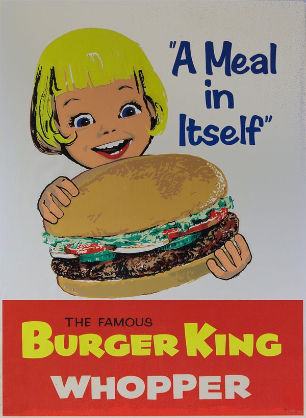
Burger King advertisement, 1960s.

Burger King advertisement, 1960s.

I chose this second example because of the simplicity of its design. 

Denotation: The poster is a painting with a relatively limited colour palette, bearing the image on a white background of a young girl holding a hamburger and looking at it with excitement (mouth open and eyes wide). The image contains the legend "A Meal in Itself" and the lower quarter of the poster is a red rectangle with the words "The Famous Burger King Whopper" in all-caps. The painting looks as though it has been executed quickly (the fingers on the hamburger bun look somewhat clumsy) and there is more attention to detail in the hamburger ingredients than there is in the girl's face.

Connotation: The style of the poster might have been meant to appear unsophisticated and winsome. Although it evokes the excitement of a child, the image's tagline "A Meal in Itself" was probably aimed at parents and perhaps, more specifically, mothers. Children don't normally think of fast food in those terms, and the attention given to the hamburger ingredients (a fresh bun, well-cooked meat, tomatoes, lettuce and cucumbers) is designed to show that the little girl is indeed about to eat a complete and nutritious meal. The poster is presented in a deceptively simple style (reduced palette, unsophisticated art and limited text), but it is communicating visual messages that show the food both as desirable or exciting for children and reassuring for parents.

As a parent and now grandparent, I understand wanting to make sure that one's family has nutritious meals and I also understand that busy families sometimes opt for fast food. It is natural to want to be reassured that a "fast" option doesn't mean that I am feeding children something unhealthy. The poster might have been effective in its day, but its artwork is now dated, the figure of the little girl unappealing and we know much more about what goes into the meals prepared in fast food restaurants. The hamburger might be "a meal in itself," but I would be less confident that it is a good meal. To suggest that this was a nutritious choice for a child might have been the biggest "whopper" in the poster.

Another person I showed this image to remarked immediately on the size of the hamburger relative to the girl's head: she is dominated by the product in front of her. The portrayal of the product is more important than that of the child; the hamburger is truly the subject of the art. The same individual also mentioned that the apparent era of the poster reminded her of a particular episode of Mad Men (a television series centred on the advertising industry of the 1960s) when fast food was taking on a larger role in the lives of families. The fast food restaurant was supplanting the family table and began to market itself in this way to draw customers by easing their guilt over not cooking at home.

Project 3, Exercise 1: What does this apple mean?

The story of the fall in the Garden of Eden as told in the Book of Genesis has been painted by many artists. Although the biblical text speaks only of Eve eating and subsequently offering Adam "fruit," Hendrick Goltzius—like every other artist—has represented the fruit in question as an apple. Because of this portrayal, the apple has come to represent a pleasing temptation that leads to sin and dire consequences.

Hendrick Goltzius, The Fall of Man. Oil on canvas, 1616.

Hendrick Goltzius, The Fall of Man. Oil on canvas, 1616.

Centuries later, Disney Studios used the offer of an apple again as a signifier of a tempting threat with terrible consequences, as the evil Queen in disguise holds up shining, red fruit that Snow White is unable to resist.

Still from Snow White. Disney Studios, 1937.

Still from Snow White. Disney Studios, 1937.

For all the association of the apple as a signifier of temptation and evil since biblical times, it has also been used in the Christian tradition to different effect. Lucas Cranach the Elder, for example, uses the apple theologically to make the point that Christ has overcome the effects of the Fall. Seen this way, the apple signifies new life and fruitfulness through salvation rather than death and despair through disobedience.

Lucas Cranach the Elder, The Virgin and Child under an Apple Tree. 1525–1530.

Lucas Cranach the Elder, The Virgin and Child under an Apple Tree. 1525–1530.

The Belgian surrealist painter, René Magritte, takes a different direction altogether with the apple. In his painting, The Son of Man, an unidentified male figure in business attire has his features concealed by a large green apple with leaves still attached. Only the very edges of the man's eyes may be seen. The scene might be mundane except for the fact that one of the man's elbows appears to bend the wrong way and the apple floats in mid-air. The apple is full of life but serves only to conceal. It is one of the smallest visual elements in the picture but it covers exactly what we want to see: the man's face. It is a frustrating painting, then, because it conceals information rather than furnishing it. If the apple is a signifier, it is one that points to less meaning, rather than more. We think we know what we are looking at, but we understand less than we should. (Magritte would take a similar approach with the figure of a dove—another rich symbol—in Man in a Bowler Hat, also painted in 1964.)

René Magritte, The Son of Man. 1964.

René Magritte, The Son of Man. 1964.

More recently, a stylized apple has become instantly recognizable as the corporate logo for Apple Inc. Although it was originally multi-coloured, the apple is now most often seen in monochrome but is just as easily recognized because of its distinctive outline. The outline is said to be missing a bite in order to give the apple scale (relative to the size of a human bite) to ensure that the figure would not be mistaken for a cherry. In this case the signifier points simply to the name of the company—chosen because of Steve Jobs' work in an apple orchard—rather than having symbolic weight.

First official Apple corporate logo, used from 1977 until 1998

First official Apple corporate logo, used from 1977 until 1998

Even in this small collection of examples, the range of things signified by the figure of an apple is wide. Most of the potential meanings depend on relationship to other systems of signs (myth and story; other artistic works; knowledge of corporate names) and the apple can be used to designate the extremes of risk or health. A thread running through a number of the uses point to the apple's ability to conceal: what it appears to be may not be what it contains. Or the figure of the apple itself may conceal the face that lies behind it. Or the outline of a natural fruit may give a friendlier face to the reality of the high-tech corporation that lies behind it.

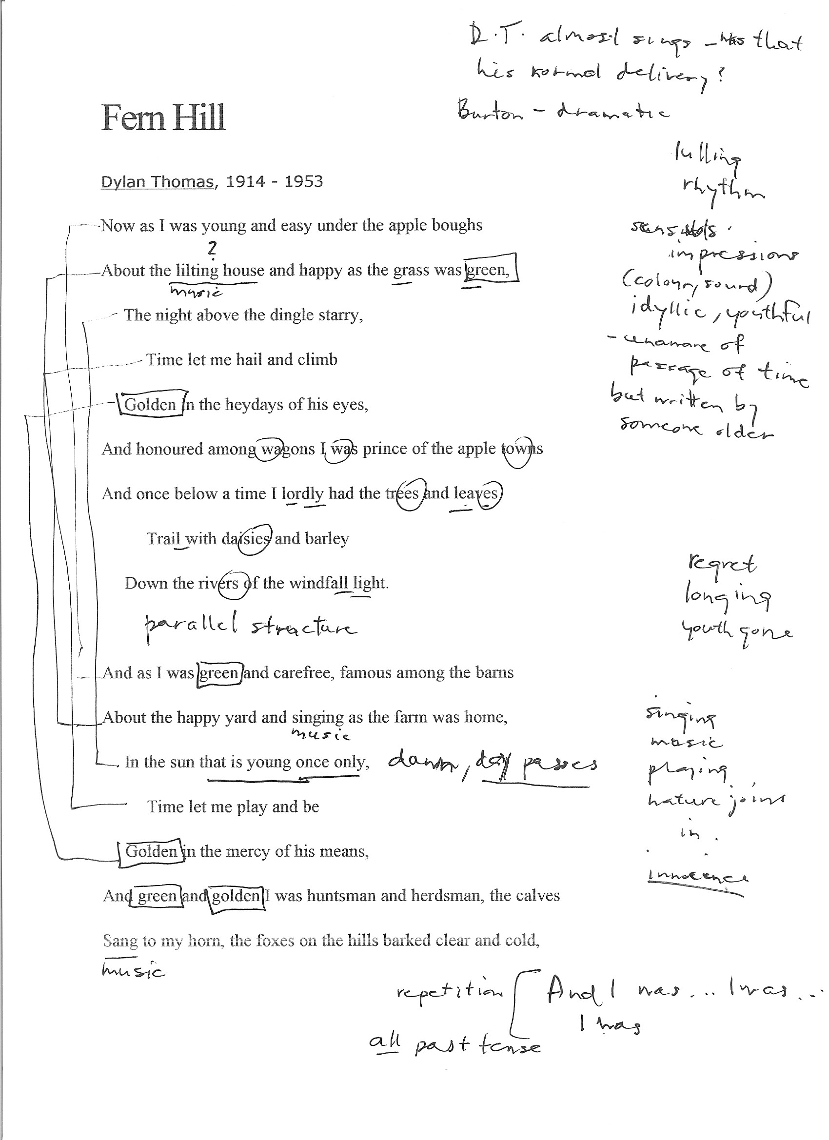
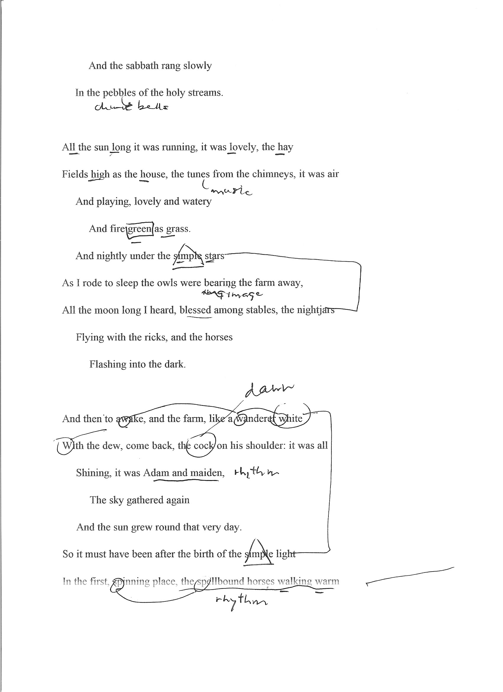
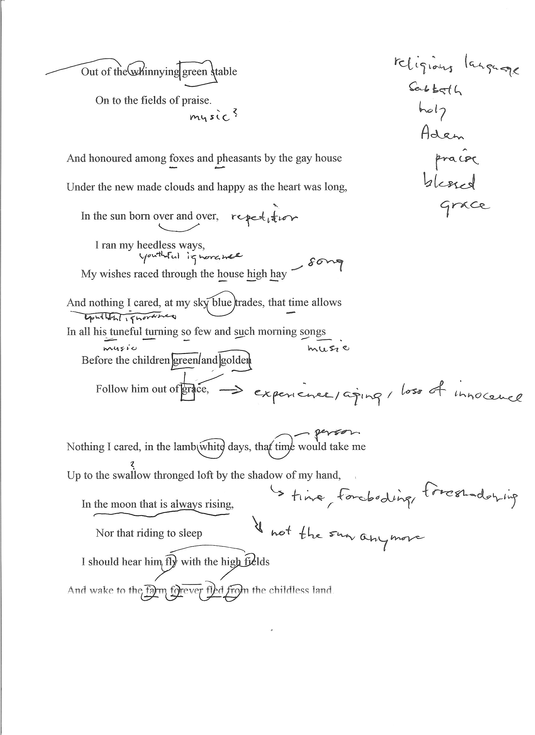
Project 3, Exercise 3: a close reading of Fern Hill

Fern Hill (1945) is a poem by Dylan Thomas, first published in the October, 1945, Horizon magazine, with its first book publication as the last poem in Deaths and Entrances. [source: Wikipedia, accessed 24 October 2016]

  • What’s the mood of the poem? How does it make you feel?

The mood of the poem seems wistful to me. Although the bulk of the text conjures up beautiful images of a blessed childhood, the way it is written in the past tense—"And I was... And as I was...I was...I was..."—leaves the clear sense that the time of youth is now gone. The piling up of sensory images, the use of colour and sound, made me feel a certain rose-coloured nostalgia. At the same time, there was a creeping awareness that although the subject has all summer to play, the poem was written by someone older who understands that childhood does not last forever ("In the sun that is young once only").

  • What poetic devices does Thomas use and what effect do they have on the poem?

Thomas makes little or no use of rhyme in this poem, but he makes powerful use of several other devices:

Rhythm — "the spellbound horses walking warm" — For much of the poem, the gentle rhythm carries the reader along like the boy enjoying the summer. The sharp break in rhythm in the last line is a rude awakening to the demands of time.

Repetition—"green," "golden," "And I was...I was..." — The use of repetition serves to heighten the effect of memory: particularly sharp impressions from the past that linger with us and trigger other memories.

Alliteration — "And wake to the farm forever fled from the childless land," "My wishes raced through the house high hay" — The alliteration briefly speeds up the rhythm of the poem and help to make us think of play or breathless speed.

Assonance — "Trail with daisies and barley" — This line may have two examples of assonance: the long "a" linking "trail" with "daisies," and the long "e" sound shared by "daisies" and "barley." They act like a kind of internal rhyme in a single line and help to move the rhythm along.

Consonance — "Shining, it was Adam and maiden" — The repetition of the "m" and "d" sounds is pleasing and helps to make the text flow by, just as time is flowing by in a carefree way.

Onomatopoeia — "Out of the whinnying green stable" — This device helps us to hear the sound in a way that goes beyond mere description: it helps us to share the experience of the boy in the poem.

Personification — "Time let me play and be / Golden in the mercy of his means" and other examples — I think that this particular use of personification helps us to feel the poet's bitterness more fully: it can be hard enough to accept aging and death as an inevitable part of life, but it seems even worse to think that there might be an intelligent figure behind it.

Simile — "and the farm, like a wanderer white / With the dew..." — The simile compels us to use our imagination to make meaning. We are not reading a news report: we have to engage with the text in a more deliberate way, with a different kind of thinking and appropriation.

Metaphor — "I was prince of the apple towns" — The boy was not a prince, but we can remember what it is like to be a child and think that we might be for a moment.

  • How do the poetic devices help evoke the themes of time and place? Can you identify any other theme running through this poem?

Thomas evokes time (references to age, time of day, movement of the sun, seasons and other natural references, and use of verb tense) and place (descriptions of the farm and its natural surroundings) in fairly direct ways. Perhaps more important is the way he uses poetic devices to move beyond mundane descriptions and invite the reader to experience the time and place through the senses—the sights (frequent repetition of "green" and "golden"), sounds ("About the happy yard and singing as the farm was home"), and emotions ("About the lilting house and happy as the grass was green") of a blissful childhood.

Time and place are the backdrop where Thomas explores the universal themes of youth, its inevitable loss and mortality. At the beginning of the poem he can write that "Time let me hail and climb / Golden in the heydays of his eyes," but by its end he knows that "Time held me green and dying". The personification of Time and its possession of youth is powerful.

  • What is the poem is saying about time and place (and any other theme you’ve identified)?

The poem is saying that time and place are... for a time and place. The sun and moon, the seasons of nature continue their courses but the individual human does not. We may experience them for a spell and naively believe that we are like them, but we are not: Time masters us. Youth, though enjoyable, passes for us all.

  • What lines or images stay with you? What do they remind you of or how do they make you feel?

The repetition of "apples" coupled with "green" and "golden" have stayed with me—they do an excellent job of conjuring up the sense of mid- or late summer. It's not hard to imagine being a boy again, playing in the warm sun on a holiday that goes on forever. It's very appealing.

  • What’s the rhythm like? Is it choppy or is it flowing and smooth? How does the rhythm impact on the poem?

The poem has a lulling rhythm, peaceful and unhurried. At times, it seems almost playful as in the line "My wishes raced through the house high hay," which sounds like it could be a child's song or the kind of wordplay that a child would enjoy. The rhythmic pattern supports well the idyllic imagery that the poet builds into a portrait of a carefree youth. The very last line of the poem shatters the reverie with a new rhythm that falls like a series of blows: "Though I sang in my chains like the sea." Childhood is over.

  • Is the ‘speaker’ important? What are his views? Are they apparent or inferred?

By inference, the speaker is a young boy ("I was prince of the apple towns") raised in the countryside. We never learn his identity, but this is ultimately not very important: the poem addresses universal themes of innocence and its loss, life and death. His views become quite apparent but the reader learns them through accumulated inferences. Thomas could have said plainly, "I had no idea that childhood and its pleasures come to an end, but they did and it is a shock to face mortality." Instead, he draws the reader through an experience of youth that seems never-ending and makes them feel the loss of its passing away.

  • Are there any lines you don’t get? Can you hazard a guess as to what they mean or allude to?

No, there were not. I had to read some of the lines out loud more than once to make sure I had the right rhythm, and found that helped me to understand the phrasing. I had to check the meanings of a couple of words ("dingle," "nightjars") but I did not find the poem difficult.

Project 3, Exercise 2: poetic devices

Rhyme — Words that sound alike, usually at line endings

The Day is done and the darkness
Falls from the wings of Night
As a feather is wafted downward
From an eagle in his flight.
"The Day is Done," Henry Wadsworth Longfellow

Rhythm — A metered structure of syllables, consonants, breathing, or pauses

'Twas the night before Christmas, when all through the house
Not a creature was stirring, not even a mouse;
"A Visit from St. Nicholas," by Clement Clarke Moore

Repetition — Intentional repetition for reinforcement and effect

Because I do not hope to turn again
Because I do not hope
Because I do not hope to turn
"Ash Wednesday," by T.S. Eliot

Alliteration — Two or more words in a line of poetry that begin with the same initial sound

The fair breeze blew, the white foam flew,
The furrow followed free;
We were the first that ever burst
Into that silent sea.
"The Rime of the Ancient Mariner," by Samuel Taylor Coleridge

Assonance — Repeating vowel sounds without repeating consonants. In poetry, often used as an alternative to rhyme

He gives his harness bells a shake
To ask if there is some mistake.
The only other sound’s the sweep
Of easy wind and downy flake.   
The woods are lovely, dark and deep,
But I have promises to keep,
And miles to go before I sleep,
And miles to go before I sleep.
"Stopping by Woods on a Snowy Evening," by Robert Frost

Consonance — Repeating consonants without repeating vowels. Consonance gives melody to verse

’Twas later when the summer went
Than when the Cricket came—
And yet we knew that gentle Clock
Meant nought but Going Home—
’Twas sooner when the Cricket went
Than when the Winter came
Yet that pathetic Pendulum
Keeps esoteric Time.
"'Twas Later When the Summer Went," by Emily Dickinson

Onomatopoeia — A word that imitates the sound made by the thing being described

It’s a jazz affair, drum crashes and cornet razzes.
The trombone pony neighs and the tuba jackass snorts.
The banjo tickles and titters too awful.
The chippies talk about the funnies in the papers.
"Honky Tonk in Cleveland, Ohio," by Carl Sandburg

Personification — Ascribing human qualities to an object

Loveliest of trees, the cherry now
Is hung with bloom along the bough,
And stands about the woodland ride
Wearing white for Eastertide.
"Loveliest of Trees," by A.H. Houseman

Simile — A figure of speech in which an image is evoked by likening one thing to another

What happens to a dream deferred?

Does it dry up
like a raisin in the sun?
Or fester like a sore—
And then run?
Does it stink like rotten meat?
Or crust and sugar over—
like a syrupy sweet?
"What Happens to a Dream Deferred?" by Langston Hughes

Metaphor — To describe something by giving it the identity of something else

I walk into a room
Just as cool as you please,
And to a man,
The fellows stand or
Fall down on their knees.
Then they swarm around me,
A hive of honey bees.

"Phenomenal Woman," by Maya Angelou

Imagery — Use of devices such as simile and metaphor to create images in the reader’s mind

His body was tubular
And tapered
And smoke-blue,
And as he passed the wharf
He turned,
And snapped at a flat-fish
That was dead and floating.
And I saw the flash of a white throat,
And a double row of white teeth,
And eyes of metallic grey,
Hard and narrow and slit.
Then out of the harbour,
With that three-cornered fin
Shearing without a bubble the water
Lithely,
Leisurely,
He swam—That strange fish,
Tubular, tapered, smoke-blue,
Part vulture, part wolf,
Part neither—for his blood was cold.
"The Shark," by Edwin John Pratt