Project 4, Research point: Print and pattern

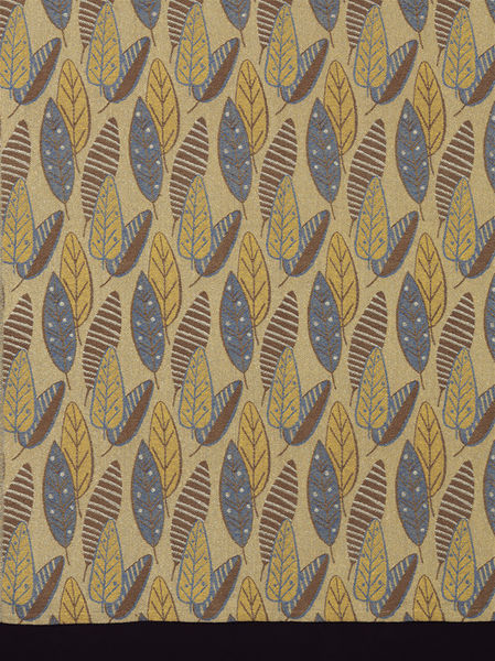
Two examples of the use of print and pattern come to mind immediately, one on either side of the Atlantic: Burberry's trademark scarf (below left, UK) and the Hudson Bay Company's signature blanket (below right, Canada).

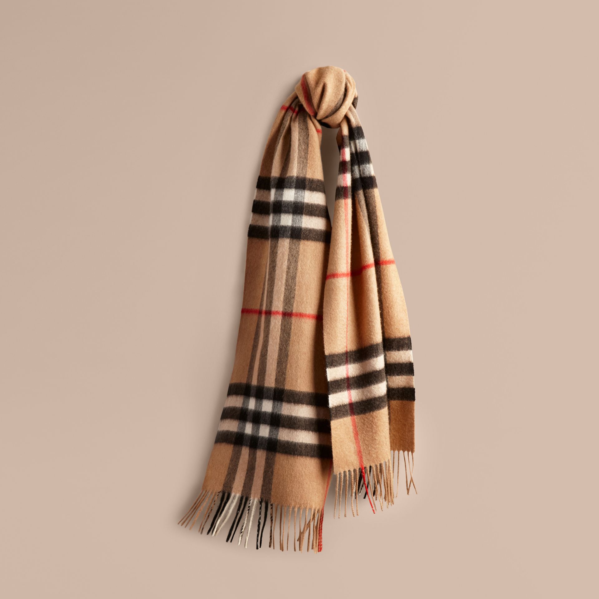
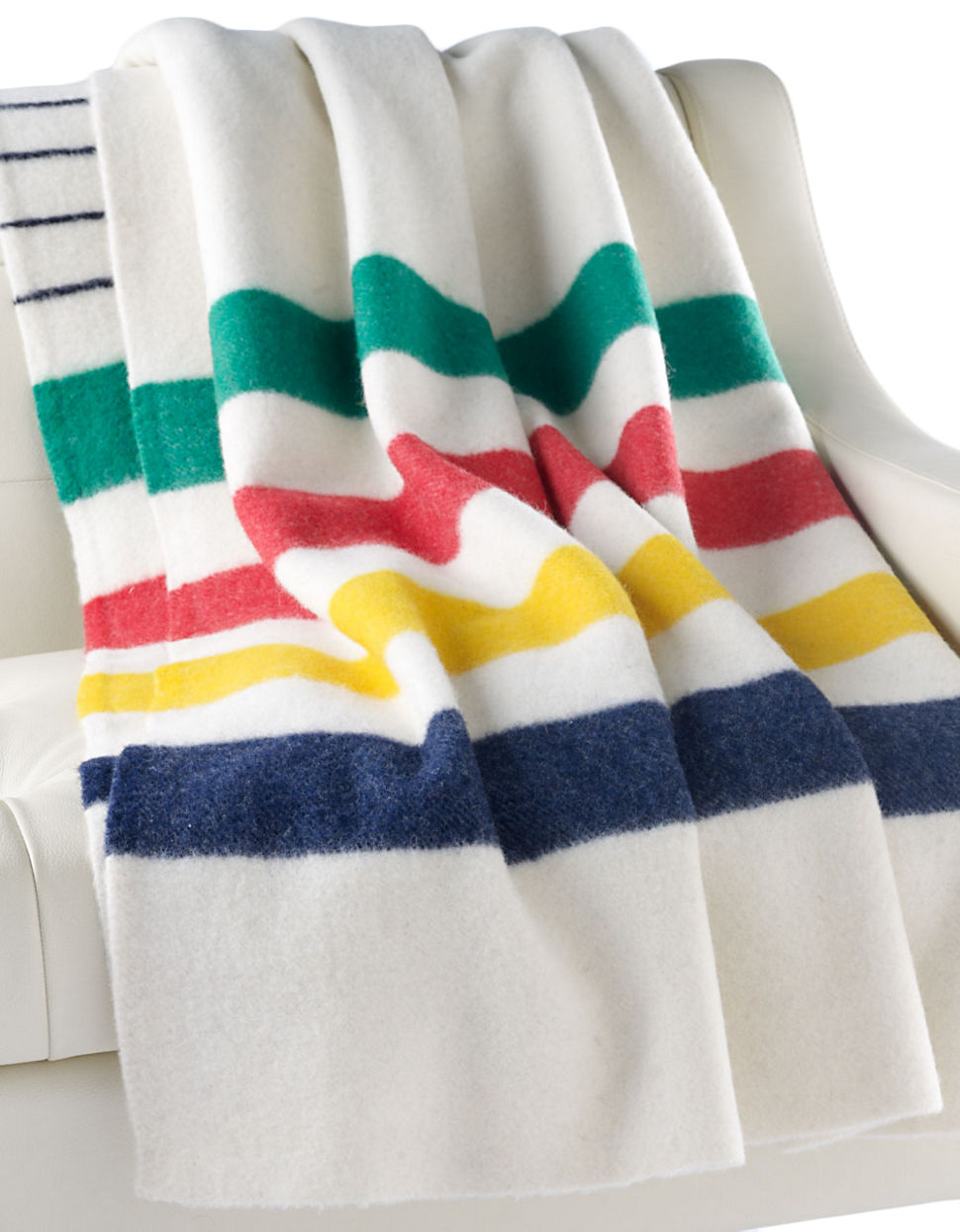
Both patterns are immediately recognizable and both have been imitated. The two companies have worked hard to use the pattern to identify a unique product line that denotes tradition and high-quality, although sometimes with unintended effects. Burberry had to endure years of its pattern being associated with anti-social behaviour ("Burberry versus The Chavs") and Hudson's Bay has been accused of appropriating Indigenous culture ("HBC’s ‘Colonial Barbie’ comes with some baggage"). Both companies have extended the use of their pattern to other items.
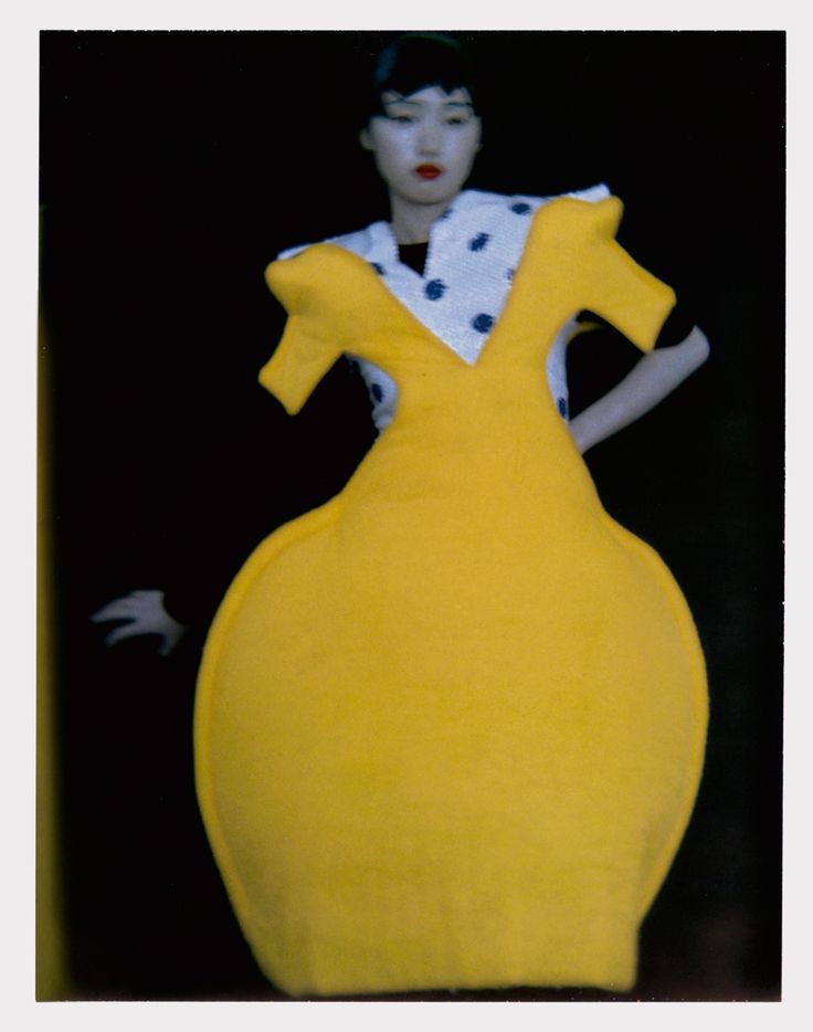
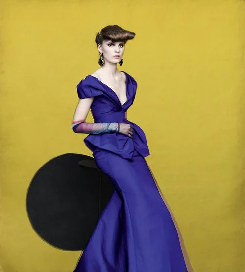
Mary Katrantzou

The article cited on Greek fashion designer in the course materials does not seem to be available anymore. There is, however, a useful review of her 2011 Spring Ready-to-Wear show in the online edition of Vogue (accessed 22 August 2017).

As Katrantzou works on her creations she "designs in 3-D"—that is, she plans the form, volume and drape of the garment at the same time that she develops the pattern / illustration that will be screen-printed onto the fabric.

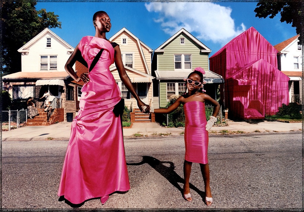
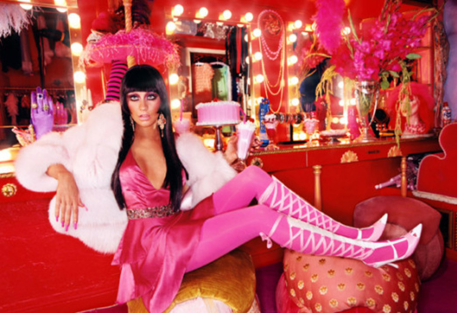
"I thought I was going to do a collection about the seventies photographs of Guy Bourdin and Helmut Newtonall those women in incredible rooms. But then I started to look at the rooms more, and suddenly, I was putting the rooms on the women instead!"

By this, I think Katrantzou meant that rather than have women serve almost as visual accessories within exotic locations, the locations could serve the women by drawing attention to their own appearance. She achieved this through the design process described above that allowed her to digitally print striking architectural images on to the clothes she created. The clothed woman is the centre of attention, not the backdrop in which she is placed (slideshow of garments in the 2011 collection, accessed 22 August 2017).

Examples from Mary Katrantzou's Spring 2011 collection

Examples from Mary Katrantzou's Spring 2011 collection

Project 4, Research point 1: Fashion images

Irving Penn


Mario Testino


Richard Avedon


Terry Richardson


Sarah Moon


David Lachapelle

Project 3, Research point 1: Christian Boltanski

Christian Boltanski's Personnes; image from Traffic Magazine

Christian Boltanski's Personnes; image from Traffic Magazine

Analysis by terms / categories:

  • Art: this is an installation that is meant to be visited in an exhibition space.
  • Temporary: the installation was in place in Paris for just over a month. 
  • Large scale: the piece is large enough to dominate and overwhelm visitors, which is likely part of the desired effect.
  • Form: Personnes formed its own shapes, in regular rectangular deposits of clothing.
  • Immersive and Distant: the installation is large enough to walk around in, but also draws some of its power from the ability to stand back and take in its scale.
  • Repetition and Shape: the work is laid out as a series of regular rectangles of clothing lying on a concrete floor.

The media release for Personnes described it as "social, religious and humanistic exploration of life, memory and the irreductible individuality of each and every human existence – together with the presence of death, the dehumanisation of the body, chance and destiny. Conceived as a work in sound and vision, Personnes takes up a new theme in Boltanski’s work, building on his earlier explorations of the limits of human existence and the vital dimension of memory : the question of fate, and the ineluctability of death. Personnes transforms the entire Nave of the Grand Palais through the creation of a coherent, intensely moving installation conceived as a gigantic animated tableau. Personnes is a one-off, ephemeral work. In accordance with the artist’s wishes, the components of the piece will all be recycled at the end of the exhibition."

Without knowing anything about the installation, my first glances at pictures of it reminded me of the large piles of sorted clothes, shoes and eyeglasses confiscated from Jewish victims of the Nazi death camps. The empty (de-personalised) clothes cannot help but speak to us of the absence of the people who once wore them. And the rectangular piles on the floor suggested to me both that the missing people were less important than their clothes and that a rational mind had created the arrangement with deliberate purpose. The use of a crane to move the clothes makes the arrangements even more mechanistic and dehumanised.

The name of the installation—Personnes—is a play on words that reflects the dehumanisation described above: the French word suggests at once the people who would have worn the clothes and their absence ("no ones").


http://vernissage.tv/2010/01/14/christian-boltanski-personnes-monumenta-2010-at-grand-palais-paris-interview-part-1/

http://www.clg-exupery-ermont.ac-versailles.fr/IMG/pdf/fiche_prof_personnes_boltanski.pdf

http://www.domusweb.it/en/art/2010/02/01/monumenta-2010-christian-boltanski.html

Project 3, Research point 4: Wrapped Trees, Kusama, Bouroullec and Straub

Wrapped Trees

Copyright: Wolfgang Volz, ©Christo 1998

Copyright: Wolfgang Volz, ©Christo 1998

  • Starting on Friday, November 13, 1998, 178 trees were wrapped with 592,015 square feet (55,000 square meters) of woven polyester fabric (used every winter in Japan to protect trees from frost and heavy snow) and 14.3 miles (23 kilometers) of rope. The wrapping was completed on November 22. The trees are located in the park around the Fondation Beyeler and in the adjacent meadow as well as along the creek of Berower Park, northeast of Basel, at the German border. The height of the trees varied between 82 feet (25 meters) and 6.5 feet (2 meters) with a diameter from 47.5 feet (14.5 meters) to 3.3 feet (1 meter). [http://christojeanneclaude.net/projects/wrapped-trees?view=info — consulted 7 August 2017]
     
  • The wrapping was removed after a month and the materials recycled. The artists also approached the cities of St. Louis, MO and Paris concerning additional wrapping projects but were denied permission.
  • After reading the quote again in its proper context on the website (that is, it applies to all of Christo and Jeanne-Claude's projects, not just the Wrapped Trees), I can appreciate the focus on the use and properties of textiles rather than on a particular technique. The two use their materials to create and enhance temporarily, large-scale structural forms, some of which exist already and others that are revealed by the application of the textile and its particular properties.

Yayoi Kusama

Yayoi Kusama, Dots Obsession, Infinity mirrored Room, 1998. Installation. Les Abattoirs, Tolosa

Yayoi Kusama, Dots Obsession, Infinity mirrored Room, 1998. Installation. Les Abattoirs, Tolosa

  • Art
  • Temporary
  • Large scale
  • Defining and Forming
  • Immersive
  • Pattern, Colour and Repetition

Ronan and Erwan Bouroullec

Installation view, Bivouac, Centre Pompidou-Metz, FranceOctober 7, 2011 - July 30, 2012Photo © studio Bouroullec

Installation view, Bivouac, Centre Pompidou-Metz, France
October 7, 2011 - July 30, 2012
Photo © studio Bouroullec

  • Art
  • Permanent
  • Large-scale
  • Transforming
  • Immersive and Distant
  • Pattern, Colour and Shape

Marianne Straub

Woven, 1949, British; Straub, Marianne for Helios Ltd. "Brisbane"

Woven, 1949, British; Straub, Marianne for Helios Ltd. "Brisbane"

Marianne Straub OBE (23 September 1909 – 8 November 1994) was one of the leading commercial designers of textiles in Britain in the period from the 1940s to 1960s. She said her overriding aim was: "to design things which people could afford. ... To remain a handweaver did not seem satisfactory in this age of mass-production." [Wikipedia, consulted 7 August 2017]

  • Design
  • Permanent
  • Small-scale
  • Defining
  • Immersive
  • Pattern, Colour and Repetition

Project 3, Research point 2: architectural uses of textiles

Elie Tahari Showroom, NYC — Photographer: © Michael Moran

Elie Tahari Showroom, NYC — Photographer: © Michael Moran

DAR LUZ installation by Lars Meeß-Olsohn and Ali Heshmati in Eindhoven — Photo © Johan Creemers

DAR LUZ installation by Lars Meeß-Olsohn and Ali Heshmati in Eindhoven — Photo © Johan Creemers

'Tubaloon' by Snohetta Architects for the Kongsberg jazz festival in Norway — Photo © Snohetta

'Tubaloon' by Snohetta Architects for the Kongsberg jazz festival in Norway — Photo © Snohetta

Swiss pavilion at EXPO Shanghai 2010 with X-TEND steel net by Carl Stahl — Photo © iart interactive ag, photographer: Mark Niederman

Swiss pavilion at EXPO Shanghai 2010 with X-TEND steel net by Carl Stahl — Photo © iart interactive ag, photographer: Mark Niederman

Hyparform vertical sails on a Vienna building by Planex

Hyparform vertical sails on a Vienna building by Planex

Project 3, Research point 1: prep for Assignment 5

In preparation for Assignment 5 on Textiles, I've decided that I'd like to do work on the the Scottish Diaspora Tapestry. The tapestry was completed in Scotland between 2012 and 2014 and then toured the world via installations in countries with a significant population claiming Scottish heritage. The tapestry will be permanently installed in Prestonpans, Scotland. I had the opportunity to see the tapestry and photograph portions of it in Ottawa during the Canadian leg of its tour in January 2017. Assignment 5 will give me the opportunity to dig more deeply into the textile aspect of the work, rather than just the depictions of Scottish emigration and accomplishments.

A few quick shots I took of tapestry panels. These will be edited and cropped for Assignment 5.

Project 2, Research point 2

  • What is their craft and how do they approach it in their work?

I have decided to look at the work of Marcela Rosemberg, a glass-fusion artist who lives in Cobourg, Ontario. My family and I met Marcela and had the chance to tour her studio a number of years ago when she lived on Prince Edward Island.

  • Do they adhere to the ideas of Slow Design? To what extent does this allow them to take risks, experiment and innovate?

I have not been able to find any explicit reference by Marcela to Slow Design, but some of the things she says about her own artistic practice are reminiscent of the movement's commitments and principles. The following passage from the "About" page on her website is a good example: 

Beauty, simplicity, elegance and functionality are essential components in Marcela Rosemberg’s designs. At her studio, she’s always looking for that special blend of colour and texture that leads her to each piece of art she carefully designs. She treats glass as if it were a human being, by respecting it and not pushing it. This allows her to understand its flow, displacement, behavior, and action up to its most intricate inner part… Its core. That is why Marcela always says: “Each time a piece leaves my studio I feel a little bit of my soul is going with it”.  

I remember very clearly from the studio tour that Marcela is constantly experimenting with combinations of colours and pigments to be used in her fused glass creations, as well as with new forms and purposes for the finished products. She was good enough to show us some of the less successful efforts that she still had on-hand, so it was clear that she was indeed trying new things and taking risks.  

  • Is their story or the story of their work important? Why?

Marcela's story is clearly very important to her and to the artistic identity she has established over the years. As her website explains, "[t]he ocean and her Jewish faith are the main sources of inspiration in her sculptural and functional current work."

Her website goes on to explain how when Marcela left her native Argentina she relocated in Atlantic Canada and that "her colours and designs are still standing strong on the East coast where she created a brand for herself."

Marcela Rosemberg, Dancing Vessel

Marcela Rosemberg, Dancing Vessel


The importance of her Jewish heritage can be seen in the beautiful pieces that are clearly designed for the Jewish community

Marcela Rosemberg, Miracle Menorah

Marcela Rosemberg, Miracle Menorah

Marcela's emphasis on her considered and hand-made approach to her work, as well as the emotional attachment that she has to her pieces will no doubt be a part of her story that is significant to her clientele, both those who are already clients and those who would like to feel that they are buying a unique creation directly from the designer-maker.

  • Do you value ‘craft’ and craftsmanship? Why or why not?

 Certainly. I get a great deal of pleasure from seeing the work of someone who has perfected their art or craft to a high degree -- I appreciate both the amount of work that has gone into making difficult things look effortless, as well as the finished product itself (whether that is an object or a performance). And this is not a recent thing for me: I remember being fascinated at the age of 12 by the skill of a backhoe operator who was excavating the hole for the pool that was being installed in our backyard. He operated a piece of heavy machinery like it was a surgeon's scalpel, working quickly to remove earth by following a spray-painted line on the grass, never once making a false cut. I thought of that craftsman years later when I read Aristotle's view that virtue is the practised skill of living well.

  • Is there room for craft in modern society?

 No question. Dedication to 'craft' is needed in so many areas of our society, not only in the arts, but also in the world of work more broadly. All work has value if it is approached with an attention to perfection of a craft and the pursuit of excellence. This extends from ensuring that ancient and traditional kinds of 'know-how' are not lost, to reminding us that the mass-produced may have brought us economies of scale but that there is still great value in considered, skillful and sustainable design and making. And this is true both for the maker and for the one who receives the made good. We cannot all be craftspeople in every field and inexpensive consumer goods have their place, but we are all richer when each of us has something in our life that we pursue as a craft, for our benefit and for the benefit of others.

Project 2, Research point: Slow design

  • What are the guiding principles of this movement?

'Slow Design' is an offshoot of the broader 'slow' movement which began with the interest in Slow Food. One description of Slow Food runs as follows:

Slow Food envisions a world in which all people can access and enjoy food that is good for them, good for those who grow it and good for the planet.

Our approach is based on a concept of food that is defined by three interconnected principles: good, clean and fair.

GOOD: quality, flavorsome and healthy food
CLEAN: production that does not harm the environment
FAIR: accessible prices for consumers and fair conditions and pay for producers
— 'Our philosophy' at slowfood.com (https://www.slowfood.com/about-us/our-philosophy/ accessed 15 July 2017)

A similar approach can be seen on the website of Slow Swiss-made Watches, where the company describes the philosophy behind its single-hand, 24-hour timepieces:

slow watches were created to shift the way people read time. So rather than focusing on the second or the minute we have produced an instrument that measures the moment.

slow does not describe a speed…. It’s a mindset that most of us somehow lost. As a result of our busy lifestyles, we often forget that we actually have a choice of how to live. The slow watch (we named it slow Jo) is a subtle reminder that time is the most precious thing we have so we should enjoy everything we do and stop chasing every minute.
— slow-watches.com (accessed 15 July 2017)

Since the advent of Slow Food, the 'slow' label has been applied to wide range of cultural practices and phenomena such as aging, religion, education, fashion, media, science, photography and travel, to name just a few.

Slow Design has many practitioners and descriptions, but it shares commitments with the broader Slow movement around simple living, work-life balance, concern for time-poverty, and sustainability of materials and process. The ever-growing manifesto of just one Slow Design company, Deep Craft, is a useful illustration of how 'Slow' can be applied in design and fabrication. The first 11 principles (out of a list of 67 on 15 July 2017) from the manifesto are:

  1. Market = Material Provenance
  2. Maintenance = Improvement
  3. The functional lifespan of a constructed thing should mimic the lifecycle of its principle material.
  4. Entropy adds value: The functionality of a thing by definition incorporates/embodies its decomposition.
  5. Handwork may be the bedrock of innovation, but nostalgia for handwork is quicksand.
  6. Prepare for unintended consequences.
  7. Optimize beneficial end use.
  8. All vessels originate with an imagined voyage.
  9. Perfection is impossible to maintain.
  10. The tool shapes us as much as we shape the tool.
  11. Craft practices and products simultaneously preserve knowledge and resources.
  • Do you believe this approach to design and making could have a positive impact on our consumption of products?

Yes, I do believe this, but I expect that the impact will be relatively limited. From what I have observed, the Slow approach is most often promoted by people who are fairly well-heeled. It might be nice to know exactly where the wood for a new piece of furniture was sourced, that the piece itself was hand-carved and that a new tree was planted to replace the one that was felled, but this is production by the few, for the few. The Slow movement may wear humble clothing, but it is currently an indulgence for the wealthy, largely because hand-crafted items are usually much more expensive than those mass-produced. For Slow to have a real impact on the consumption of products, it would need to touch all sectors of society, be affordable to a broader range of people, and transfer more of its profits back down the production chain to the source.

  • Would you place more value on a product that has been created with this principle in mind? Why or why not?

I might, but it would depend on a calculation of 'value' to me and to my family. I would love to be able to buy beautiful, practical hand-crafted goods (although hand-crafting is not an immediate guarantee of superior quality), but sometimes we just need something 'good enough' that we can afford within our overall household budget.

I am sympathetic to the commitments of the Slow movement, but there are numerous factors to take into account.

Project 3, Research point: New Topographics

New Topographics: "a term coined by William Jenkins in 1975 to describe a group of American photographers (such as Robert Adams and Lewis Baltz) whose pictures had a similar banal aesthetic, in that they were formal, mostly black and white prints of the urban landscape."

Also the title of the exhibition curated by Jenkins at the International Museum of Photography at the George Eastman House, Rochester, NY (October 1975 to February 1976).

Mitch Epstein, American Power

  • Many of these colour images have a formal structure. They have not been taken haphazardly but show attention to composition.
  • The scenery would normally be considered particularly photogenic in terms of classic landscapes, but there is nonetheless a beauty to many of the shots in the series.
  • Several of the images seem to have been shot from a viewpoint above regular line of sight—ladder? scaffold? pole? The extra height marks a difference from the usual snapshot at eye-level—does it suggest a different way to view the landscape philosophically, as well?
  • Most images contain a lot of detail and show considerable depth of field—the viewer is invited to take in a broad field of view rather than to concentrate on small points of focus.
  • The images explore very broadly the theme of 'power' generation and transmission associated with the energy industry in the U.S.
  • At the same time, the title 'American Power' could be an ironic questioning of the vulnerabilities of the country's political 'power' because of its dependence on fossil fuels and foreign sources, and because of the environmental degradation associated with the energy industry.
  • Some of the images are interesting as standalone documents, but together they form a narrative with a clear point of view.

Fay GodwinOur Forbidden Land

"Her love of walking eventually inspired her to pursue landscape photography, often photographing isolated and remote areas of the British landscape and producing many beautiful pastoral scenes as well as contrasting urban landscapes. President of the Ramblers' Association from 1987 to 1990, she was also renowned for her work as an environmentalist, her interest reflected in many of her best-known images that examine the complex relationships and tensions between man and nature." (Fay Godwin Archive)
  • Much like Epstein's pictures, Godwin's work in this series has been produced with great care.
  • All of the images have been produced in black and white—was this an aesthetic decision (documentary approach? emphasis on form and texture rather than colour?), was it due to necessity, or was it even a consideration at all?
  • The black and white approach suggests something more timeless to me than literal colour, but that may be my own bias.
  • Godwin draws attention to the separation of people in the U.K. from the land around them and to the degradation of the land. The theme is somewhat broader than Epstein's but the two probably share political sympathies.

It's possible that the work of these two photographers and some of the other New Topographers may have an influence on how I look at and photograph landscapes from now on. They point to something real that is happening to the land we share. If all we photograph is carefully framed to be pretty and shown to its best advantage, are our images 'true'? Are they a reflection of reality or do they conceal it? Or both at the same time?

Perhaps that is a good question to chew on: what do I choose not to photograph? And why not?

Research Point: Dealing with the flood

For me, photography has been a hobby and not something I have used in the context of my work life. I have had pictures published in magazines and sold a few prints, but I use social media daily and regularly post images on several different platforms: Flickr (I've had an account for 12 years), Instagram, Twitter, Facebook and this website. I post pictures to share with friends and family (some publicly, some privately), to document my travels, to illustrate some of the things I write, to learn with other photographers, to keep a record of my own progress and, frankly, because I feel the need to share the things I see.

Some of my pictures are 'social' in nature (friends, family, events), but most have been for my own interest. In that sense, I suppose many of them could be viewed as leaning toward the artistic side, although I have never used that term myself. (A friend did once tell me, however, that she didn't 'get' my pictures but understood that they were 'meant to be artsy-fartsy.' I wasn't sure what she meant at first but gradually realized that, for her, a good photograph usually has family members in it.)

Social media have contributed to the democratization of photography, along with other technologies, particularly the availability of digital cameras and the vastly-improved quality of sensors in mobile phones. I have heard photographers and critics complain about the sheer volume of trivial and poor pictures and am sometimes sympathetic to their concerns (I get tired of seeing pictures of cats, selfies, garish sunsets and cups of coffee), but I don't think that they devalue photography. The cream rises to the top and a remarkable image still stands apart from the pack without the help of photo snobbery.

I suppose this means that I am contributing to the flood and it occasionally occurs to me that the world doesn't really need another mediocre picture. Nevertheless, I get pleasure out of taking, editing and sharing pictures and enjoy seeing the work of others, too. None of us will improve our photographic and artistic skills without practice, so I will continue to make photographs—they may not be the best, but I can see my progress.

Project 1, Research Point

William Henry Fox Talbot, The Pencil of Nature, 1844-1846

Fox Talbot's cameras, collection of the National Museum of Photography, Film and Television 

Fox Talbot's cameras, collection of the National Museum of Photography, Film and Television 

Fox Talbot (1800-1877) was originally inspired in his experiments by his difficulties in assisted-drawing with a Camera Lucida. Not being able to master the technique involved, he began to consider how he might permanently fix the images on paper produced by a Camera Obscura. Fox Talbot sees both techniques as aids to drawing but hints at how fixed images derived from photographic techniques might have potential beyond 'naturally' recording images. Although he is interested as a scientist in achieving consistent results, he allows room for esthetic concerns:

These tints, however, might undoubtedly be brought nearer to uniformity, if any great advantage appeared likely to result: but, several persons of taste having been consulted on the point, viz. which tint on the whole deserved a preference, it was found that their opinions offered nothing approaching to unanimity, and therefore, as the process presents us spontaneously with a variety of shades of colour, it was thought best to admit whichever appeared pleasing to the eye, without aiming at an uniformity which is hardly attainable.
— William Henry Fox Talbot, The Pencil of Nature, Section ii.

It seems clear to me that photography is both mechanical and creative and I don't see any inherent contradiction in that. Any art—and perhaps any human product—involves the use of tools, materials and processes, some of which may be mechanical and some not. Photography is far from being the objective 'pencil of nature' and some of Fox Talbot's early work already shows an awareness of the role the human operator plays in creating the camera, preparing the paper, mixing the chemicals, timing the exposure and positioning the camera. The camera and its related processes may be more complex than those employed in some arts, but the roles of imagination and human action are no less important.

Research point: postmodernism

I bought and read Christopher Butler's Postmodernism: A very short introduction (Oxford: Oxford Paperbacks, 2002) and found it a very helpful overview of the shape and impact of postmodernist thought. I was familiar with much of the content from earlier studies in theology and literature, but the material on the arts was newer to me. I appreciated the fact that Butler didn't content himself with just describing the contours of postmodernism but also offered some reflection and criticism.

It seems to me that postmodernist thought has been of real benefit in identifying power relationships in various discourses and in questioning totalizing metanarratives. But then it runs into difficulty. As Butler points out a number of times, postmodernism's hermeneutic of suspicion is an effective tool of deconstruction but it makes any constructive effort difficult, if not impossible.

Where do we go as a society after postmodernism? Do we simply opt for power politics? Do we shut our eyes and fall back on an uncritical romanticism? Both? Neither?

And where does this leave the arts? Do they have anything new and constructive to say or should artists content themselves with exposing and questioning? How long can irony and detachment be satisfying?

51tI+JrlbML._SX315_BO1,204,203,200_.jpg

Reflection on tutor's feedback to Assignment 1

I'm late getting back to the coursework after some recent changes at my job and a month's holiday in Scotland. Things are back to "normal" now, so it's time to get cracking on Creative Arts Today. 

I probably put off submitting Assignment longer than I should have because I wasn't completely confident with my work or the requirements of the course. I'm not suggesting that there is anything wrong with the OCA course materials: it's more a case of getting used to distance education rather than more customary on-site education. Assignment 1 broke the ice, though, so I'm fairly sure I'll move through the remaining assignments at a better pace.

As it turns out, I was pleased with my tutor's feedback. Garry had clearly read very carefully what I had written and I found his comments both helpful and fair. The one sticking point was that he had not received the URL for my learning blog, so he had to rely solely on the Word document that I submitted for the assignment. I did indeed include it via the OCA submission interface, but I'll make a point of including the blog's link in the Word document itself next time. 

Garry's overall comments about my writing style and content were positive and he identified a couple  of areas that I could strengthen: 

  1. some research gaps; and
  2. the need to be more specific in some of the statements I made. 

The research gaps were largely related to drawing on thinkers and critics in the arts whose work could illuminate, bolster or challenge some of the points in my paper. As a new student in the visual arts I think this is normal and I will look to broaden my knowledge of theory, criticism and performance as I progress through this course and others. I appreciate the additional references and links Garry provided and will follow up on them. I will likely blog on the pieces that I find most useful or provocative. I expect that my understanding will increase through this reflection and that my critical vocabulary will grow and allow me to express myself on the arts with greater accuracy. Expanding my understanding and "toolkit" will also help me to situate my comments within a larger conversation around art criticism and appreciation. Given the negotiated meaning (negotiated among artist, viewer, critic, etc.) and social dimensions of contemporary art, it will be important to have this degree of awareness about one's own thought and expression, and those of other people. The issue of context has multiple dimensions and it is crucial to know where one stands in relation to time, place and discourse.

I accept without reservation Garry's comment on my need to be more specific in parts of my text. As I read through what I had written I could see exactly what he meant. I don't think I need to spend a lot of time reflecting on this: it's something I need to watch for in future writing.

As I mentioned earlier, I will follow up on the additional readings and references Garry has provided. They will supplement my learning and I look forward to reading them.

Garry also mentioned that he had a grid that outlines modernist/postmodernist definitions and strategies. I have some familiarity with these in the fields of literature and philosophy, but I am sure I would benefit from seeing how they are applied in the visual arts. 

All told, I breathed a sigh of relief as I worked my way through the comments from my tutor. He spent time on what I wrote, made some encouraging remarks about my writing and thinking, and directed me to some additional sources to help deepen my work. I couldn't ask for much better than that and -- importantly for me -- the exercise provided me with a baseline for expectations. (So that's what they're looking for!) 

I've learned some things, I'm encouraged and I'm ready to work toward Assignment 2.

No complaints here. 

Exercise 2: Developing your research skills

Katie Paterson Vatnajökull (the sound of) 

This piece is a site-specific installation in Iceland. It makes available a continuous feed of amplified sound from the Vatnajökull glacier via telephone. An audio loop is available as a sample on the artist's website and appears to consist mainly of ice cracking and the running of meltwater.

Unlike Longplayer, another audio installation, there is a greater sense of distance between the source of the sound and the listener. This is not just because of the physical distancye between Iceland and wherever the listener might be in the world, but because the source of the sound does not seem as obvious. In the case of Longplayer the video gives the listener something to look at and a sense of being "present" at something recognizable as a performance, even if the musical notes may someday be sounded by computer rather than musicians. With Vatnajökull, on the other hand, we do not have the same sense of immediacy or agency: what does the installation look like and how was it done? Is there really a continuous feed of sound from the glacier 24/7, or are we listening to a very long audio loop that repeats? Is there really an installation at all? Put another way, is there really a "there" there or are we being tricked?

Nevertheless, we can be fairly confident that Katie Paterson is playing fair with her audience because she has shown such great care in researching and producing her other pieces. Whether it is Future Library or Fossil Necklace, Paterson has painstakingly worked to create objects and happenings that are rooted in specific places and times. If anything, her work is often preoccupied with an interest in very long stretches of time and cosmic dimensions, such as can be seen in Ancient Darkness TV and All the Dead Stars.

On the face of it, Vatnajökull is largely about place, being named for a large, well-known ice cap. It is the source for Iceland's famous glacier lagoon visited by many thousands of tourists each year and, even without having visited the site, most people could conjure up something like it in their imaginations supported by the sound of moving ice and water droplets alone.

On reflection, however, Vatnajökull is also very much about the passage of time. Even though Katie Paterson's use of text in the piece is very limited and provides few interpretive clues, glaciers are all about time. The formation of an ice sheet takes many hundreds of years and I remember the tour guide at Jökulsárlón telling me that the pure glacial ice she handed me to taste was over 1,000 years old. While it was still in my mouth, it dawned on me that Vikings were roaming Iceland when the snow fell that created the icy diamond! But the constant dripping and cracking we hear in Paterson's piece reminds us that the ancient ice sheet is melting at an ever-increasing pace because of global warming. And, as we look forward, we can imagine a time when there may be no Vatnajökull at all -- along with the related climactic, economic and social impacts that we really don't understand yet.

In this way, there is both a strong, ancient character to the work blended with a warning about the fragility of all natural things that are subject to the passing of time and the effects of human activity.  

Jökulsárlón at the foot of Vatnajökull (taken Septermber 23, 2015)

Jökulsárlón at the foot of Vatnajökull (taken Septermber 23, 2015)

Research point: artists whose work incorporates text

  • Ian Hamilton Finlay (1925-2006; sculpture, writing, graphic art, poetry)—Many of Finlay's works incorporate text and he had a fondness for inscribing words and entire poems on stone although he worked in many media. Perhaps his most famous work, Little Sparta, is the garden he created southwest of Edinburgh. Little Sparta brings together sculpture, poetry and gardening to create an environment that both fits into, and stands apart from, the local landscape. As one of Finlay's own lines asserts, "It is the case with some gardens as with societies; some things require to be fixed so that others can be placed."
     
  • Alec Finlay (1966-; poetry, sculpture, collage, technology, publishing)—An interesting work, The Road North, consists of poems written on a blog during a year-long trip around Scotland with a friend. It is described as a "collaborative audio and visual word-map" and is loosely inspired by a journey taken by the Japanese poet Basho. The blog entries contain photographs, snatches of conversation, reflections on places visited and poetry, along with pictures of sights along the way.
     
  • Doug Aitken (1968-; photography, video, sculpture, illustration, installation)—A series of creations consisting of a single word in large type that provides the outline of an image or images: examples include "Star," "Party," "Free," "Riot," "One," "Sunset." The images contained within the words sometimes work against the word ("Party" contains an image of many discarded tin cans) and sometimes appear to support it ("Sex" suggests a lush garden and fruitful nature and "Vulnerable" contains an image of a lone aircraft sitting on a tarmac apron).
     
  • Graham Gussin (1960-; neon, video, installation, sound)—"Someplace Sometime" is a blue neon sign that undermines the typical use of a large, bright, coloured sign: to signal something or somewhere worth noticing. Instead, the work catches the user's attention to underline no particular place or time. Is this humour, something deeper or a bit of both? Possibly a regular theme of Gussin's, given that we see it present in other of his works, such as "Untitled" and "Zone Out Plinth" where words again signify less than they promise.
     
  • Marine Hugonnier (1969-; film, photography, sculpture)—Series "Art for Modern Architecture" systematically replaces pictures from newspaper front pages with colourful geometric shapes. Replacing the images detracts from the stories by removing helpful visual references, but it also has the effect of relativizing the text as well: the columns and paragraphs of words now take their place as graphic elements alongside the brightly coloured blocks. It's a strange effect: if there had only been text on the page we might not miss the images but, once the image content is present only as pure colour and form, the words carrying meaning are also lessened in impact.

Many of the pieces produced by these artists are relevant to theme of "place," albeit in significantly different ways. Ian Hamilton Finlay has shaped the landscape around himself and incorporated his work directly into it. Alec Finlay's work is not so much tied to one place but involves travel, reflection and response to a series of places around Scotland. Dou Aitken's installations constitute one-word comments involving places, but it is not always clear whether the place comments on the text or the text is a comment on the place. Graham Gussin's neon sign seems to invoke place through its absence by telling the viewer that there is nothing particularly special about the location of his installation. Even Marine Hugonnier's graphic constructions with newspaper might be seen—at a stretch?—as a comment on place: how do we understand the architecture of a place or the use of space when what we think we need to create meaning is replaced by something completely different?