Project 4, Research point: Print and pattern

Two examples of the use of print and pattern come to mind immediately, one on either side of the Atlantic: Burberry's trademark scarf (below left, UK) and the Hudson Bay Company's signature blanket (below right, Canada).

Both patterns are immediately recognizable and both have been imitated. The two companies have worked hard to use the pattern to identify a unique product line that denotes tradition and high-quality, although sometimes with unintended effects. Burberry had to endure years of its pattern being associated with anti-social behaviour ("Burberry versus The Chavs") and Hudson's Bay has been accused of appropriating Indigenous culture ("HBC’s ‘Colonial Barbie’ comes with some baggage"). Both companies have extended the use of their pattern to other items.

Mary Katrantzou

The article cited on Greek fashion designer in the course materials does not seem to be available anymore. There is, however, a useful review of her 2011 Spring Ready-to-Wear show in the online edition of Vogue (accessed 22 August 2017).

As Katrantzou works on her creations she "designs in 3-D"—that is, she plans the form, volume and drape of the garment at the same time that she develops the pattern / illustration that will be screen-printed onto the fabric.

"I thought I was going to do a collection about the seventies photographs of Guy Bourdin and Helmut Newtonall those women in incredible rooms. But then I started to look at the rooms more, and suddenly, I was putting the rooms on the women instead!"

By this, I think Katrantzou meant that rather than have women serve almost as visual accessories within exotic locations, the locations could serve the women by drawing attention to their own appearance. She achieved this through the design process described above that allowed her to digitally print striking architectural images on to the clothes she created. The clothed woman is the centre of attention, not the backdrop in which she is placed (slideshow of garments in the 2011 collection, accessed 22 August 2017).

Examples from Mary Katrantzou's Spring 2011 collection

Examples from Mary Katrantzou's Spring 2011 collection

Project 4, Research point 1: Fashion images

Irving Penn


Mario Testino


Richard Avedon


Terry Richardson


Sarah Moon


David Lachapelle

Project 3, Research point 1: Christian Boltanski

Christian Boltanski's Personnes; image from Traffic Magazine

Christian Boltanski's Personnes; image from Traffic Magazine

Analysis by terms / categories:

  • Art: this is an installation that is meant to be visited in an exhibition space.
  • Temporary: the installation was in place in Paris for just over a month. 
  • Large scale: the piece is large enough to dominate and overwhelm visitors, which is likely part of the desired effect.
  • Form: Personnes formed its own shapes, in regular rectangular deposits of clothing.
  • Immersive and Distant: the installation is large enough to walk around in, but also draws some of its power from the ability to stand back and take in its scale.
  • Repetition and Shape: the work is laid out as a series of regular rectangles of clothing lying on a concrete floor.

The media release for Personnes described it as "social, religious and humanistic exploration of life, memory and the irreductible individuality of each and every human existence – together with the presence of death, the dehumanisation of the body, chance and destiny. Conceived as a work in sound and vision, Personnes takes up a new theme in Boltanski’s work, building on his earlier explorations of the limits of human existence and the vital dimension of memory : the question of fate, and the ineluctability of death. Personnes transforms the entire Nave of the Grand Palais through the creation of a coherent, intensely moving installation conceived as a gigantic animated tableau. Personnes is a one-off, ephemeral work. In accordance with the artist’s wishes, the components of the piece will all be recycled at the end of the exhibition."

Without knowing anything about the installation, my first glances at pictures of it reminded me of the large piles of sorted clothes, shoes and eyeglasses confiscated from Jewish victims of the Nazi death camps. The empty (de-personalised) clothes cannot help but speak to us of the absence of the people who once wore them. And the rectangular piles on the floor suggested to me both that the missing people were less important than their clothes and that a rational mind had created the arrangement with deliberate purpose. The use of a crane to move the clothes makes the arrangements even more mechanistic and dehumanised.

The name of the installation—Personnes—is a play on words that reflects the dehumanisation described above: the French word suggests at once the people who would have worn the clothes and their absence ("no ones").


http://vernissage.tv/2010/01/14/christian-boltanski-personnes-monumenta-2010-at-grand-palais-paris-interview-part-1/

http://www.clg-exupery-ermont.ac-versailles.fr/IMG/pdf/fiche_prof_personnes_boltanski.pdf

http://www.domusweb.it/en/art/2010/02/01/monumenta-2010-christian-boltanski.html

Project 3, Exercise 1

Thinking back to Part 3 - Visual Communications, it seems to me that the function of Marianne Straub's textiles is to communicate a number of desirable values and attitudes:

  • The pattern of the materials, particularly when viewed down the length of a bus or a train carriage, creates or supports an identity for the transportation company. Once seen and recognized, the fabric is a constant reminder of a consistent 'brand.'
  • The quality of the materials used speak to the care that the transportation company is trying to show to its patrons. Public transport featured molded plastic seating without fabric for a while, no doubt because the seats were more durable and easier to clean. At the same time, the plastic seats were slippery, uncomfortable in summer (too hot) and winter (too cold) and could be read as a message to patrons that they were dirty and not deserving of better things.
  • The patterns chosen, although they seem outdated or even 'retro' now, would have been meant to convey a sense of modernity. Once again, this is a tacit message about the transportation company: we are a modern, forward-thinking company and we expect our patrons to recognize this and value the service they are paying for.
  • Depending upon the type of pattern chosen, there may also have been a desire to make the connection with the home environment. In this sense, patrons are visually encouraged to see their seat as an extension of their living room, a place to be comfortable and relax (rather than a train or bus crammed with other commuters). The association of the home may also encourage patrons to take better care of their surroundings because they have a personal / emotional connection with them.

Project 3, Research point 4: Wrapped Trees, Kusama, Bouroullec and Straub

Wrapped Trees

Copyright: Wolfgang Volz, ©Christo 1998

Copyright: Wolfgang Volz, ©Christo 1998

  • Starting on Friday, November 13, 1998, 178 trees were wrapped with 592,015 square feet (55,000 square meters) of woven polyester fabric (used every winter in Japan to protect trees from frost and heavy snow) and 14.3 miles (23 kilometers) of rope. The wrapping was completed on November 22. The trees are located in the park around the Fondation Beyeler and in the adjacent meadow as well as along the creek of Berower Park, northeast of Basel, at the German border. The height of the trees varied between 82 feet (25 meters) and 6.5 feet (2 meters) with a diameter from 47.5 feet (14.5 meters) to 3.3 feet (1 meter). [http://christojeanneclaude.net/projects/wrapped-trees?view=info — consulted 7 August 2017]
     
  • The wrapping was removed after a month and the materials recycled. The artists also approached the cities of St. Louis, MO and Paris concerning additional wrapping projects but were denied permission.
  • After reading the quote again in its proper context on the website (that is, it applies to all of Christo and Jeanne-Claude's projects, not just the Wrapped Trees), I can appreciate the focus on the use and properties of textiles rather than on a particular technique. The two use their materials to create and enhance temporarily, large-scale structural forms, some of which exist already and others that are revealed by the application of the textile and its particular properties.

Yayoi Kusama

Yayoi Kusama, Dots Obsession, Infinity mirrored Room, 1998. Installation. Les Abattoirs, Tolosa

Yayoi Kusama, Dots Obsession, Infinity mirrored Room, 1998. Installation. Les Abattoirs, Tolosa

  • Art
  • Temporary
  • Large scale
  • Defining and Forming
  • Immersive
  • Pattern, Colour and Repetition

Ronan and Erwan Bouroullec

Installation view, Bivouac, Centre Pompidou-Metz, FranceOctober 7, 2011 - July 30, 2012Photo © studio Bouroullec

Installation view, Bivouac, Centre Pompidou-Metz, France
October 7, 2011 - July 30, 2012
Photo © studio Bouroullec

  • Art
  • Permanent
  • Large-scale
  • Transforming
  • Immersive and Distant
  • Pattern, Colour and Shape

Marianne Straub

Woven, 1949, British; Straub, Marianne for Helios Ltd. "Brisbane"

Woven, 1949, British; Straub, Marianne for Helios Ltd. "Brisbane"

Marianne Straub OBE (23 September 1909 – 8 November 1994) was one of the leading commercial designers of textiles in Britain in the period from the 1940s to 1960s. She said her overriding aim was: "to design things which people could afford. ... To remain a handweaver did not seem satisfactory in this age of mass-production." [Wikipedia, consulted 7 August 2017]

  • Design
  • Permanent
  • Small-scale
  • Defining
  • Immersive
  • Pattern, Colour and Repetition

Project 3, Research point 3: Christo and Jeanne-Claude

  • The scale of the Surrounded Islands project is impressive. And although the work appears to be simple in concept (surround 11 islands with "floating pink woven polypropylene fabric") it is clear that an enormous amount of imagination, planning, logistical support and money went into the project.
  • "The luminous pink color of the shiny fabric was in harmony with the tropical vegetation of the uninhabited verdant islands, the light of the Miami sky and the colors of the shallow waters of Biscayne Bay." This is all true, but the shade of pink also reminded me of the art deco-revival pink that was often associated with Miami in the 1980s. As just one example, the visual design of the TV show Miami Vice (1984–1990) frequently drew on the same palette:
  • The other item that caught my attention when reading about this installation had to do with the issue of impact on the environment. I wondered about the impact on the bay's wildlife, but did not expect to learn that the local flora and fauna were probably in better shape after the installation than before it. Not only did the artists exercise due diligence with a marine biologist, ornithologists and a mammal expert, but they also removed "some forty tons of varied garbage that included refrigerator doors, tires, kitchen sinks, mattresses and an abandoned boat." My expectations were entirely wrong.
  • I agree with the assessment of the Surrounded Islands project: it is a temporary, large-scale art installation that defines a series of islands by shape (although the role of striking colour should not be undervalued) and meant to be viewed at a distance.

Project 3, Research point 2: architectural uses of textiles

Elie Tahari Showroom, NYC — Photographer: © Michael Moran

Elie Tahari Showroom, NYC — Photographer: © Michael Moran

DAR LUZ installation by Lars Meeß-Olsohn and Ali Heshmati in Eindhoven — Photo © Johan Creemers

DAR LUZ installation by Lars Meeß-Olsohn and Ali Heshmati in Eindhoven — Photo © Johan Creemers

'Tubaloon' by Snohetta Architects for the Kongsberg jazz festival in Norway — Photo © Snohetta

'Tubaloon' by Snohetta Architects for the Kongsberg jazz festival in Norway — Photo © Snohetta

Swiss pavilion at EXPO Shanghai 2010 with X-TEND steel net by Carl Stahl — Photo © iart interactive ag, photographer: Mark Niederman

Swiss pavilion at EXPO Shanghai 2010 with X-TEND steel net by Carl Stahl — Photo © iart interactive ag, photographer: Mark Niederman

Hyparform vertical sails on a Vienna building by Planex

Hyparform vertical sails on a Vienna building by Planex

Project 3, Research point 1: prep for Assignment 5

In preparation for Assignment 5 on Textiles, I've decided that I'd like to do work on the the Scottish Diaspora Tapestry. The tapestry was completed in Scotland between 2012 and 2014 and then toured the world via installations in countries with a significant population claiming Scottish heritage. The tapestry will be permanently installed in Prestonpans, Scotland. I had the opportunity to see the tapestry and photograph portions of it in Ottawa during the Canadian leg of its tour in January 2017. Assignment 5 will give me the opportunity to dig more deeply into the textile aspect of the work, rather than just the depictions of Scottish emigration and accomplishments.

A few quick shots I took of tapestry panels. These will be edited and cropped for Assignment 5.

Project 2, Research point 2

  • What is their craft and how do they approach it in their work?

I have decided to look at the work of Marcela Rosemberg, a glass-fusion artist who lives in Cobourg, Ontario. My family and I met Marcela and had the chance to tour her studio a number of years ago when she lived on Prince Edward Island.

  • Do they adhere to the ideas of Slow Design? To what extent does this allow them to take risks, experiment and innovate?

I have not been able to find any explicit reference by Marcela to Slow Design, but some of the things she says about her own artistic practice are reminiscent of the movement's commitments and principles. The following passage from the "About" page on her website is a good example: 

Beauty, simplicity, elegance and functionality are essential components in Marcela Rosemberg’s designs. At her studio, she’s always looking for that special blend of colour and texture that leads her to each piece of art she carefully designs. She treats glass as if it were a human being, by respecting it and not pushing it. This allows her to understand its flow, displacement, behavior, and action up to its most intricate inner part… Its core. That is why Marcela always says: “Each time a piece leaves my studio I feel a little bit of my soul is going with it”.  

I remember very clearly from the studio tour that Marcela is constantly experimenting with combinations of colours and pigments to be used in her fused glass creations, as well as with new forms and purposes for the finished products. She was good enough to show us some of the less successful efforts that she still had on-hand, so it was clear that she was indeed trying new things and taking risks.  

  • Is their story or the story of their work important? Why?

Marcela's story is clearly very important to her and to the artistic identity she has established over the years. As her website explains, "[t]he ocean and her Jewish faith are the main sources of inspiration in her sculptural and functional current work."

Her website goes on to explain how when Marcela left her native Argentina she relocated in Atlantic Canada and that "her colours and designs are still standing strong on the East coast where she created a brand for herself."

Marcela Rosemberg, Dancing Vessel

Marcela Rosemberg, Dancing Vessel


The importance of her Jewish heritage can be seen in the beautiful pieces that are clearly designed for the Jewish community

Marcela Rosemberg, Miracle Menorah

Marcela Rosemberg, Miracle Menorah

Marcela's emphasis on her considered and hand-made approach to her work, as well as the emotional attachment that she has to her pieces will no doubt be a part of her story that is significant to her clientele, both those who are already clients and those who would like to feel that they are buying a unique creation directly from the designer-maker.

  • Do you value ‘craft’ and craftsmanship? Why or why not?

 Certainly. I get a great deal of pleasure from seeing the work of someone who has perfected their art or craft to a high degree -- I appreciate both the amount of work that has gone into making difficult things look effortless, as well as the finished product itself (whether that is an object or a performance). And this is not a recent thing for me: I remember being fascinated at the age of 12 by the skill of a backhoe operator who was excavating the hole for the pool that was being installed in our backyard. He operated a piece of heavy machinery like it was a surgeon's scalpel, working quickly to remove earth by following a spray-painted line on the grass, never once making a false cut. I thought of that craftsman years later when I read Aristotle's view that virtue is the practised skill of living well.

  • Is there room for craft in modern society?

 No question. Dedication to 'craft' is needed in so many areas of our society, not only in the arts, but also in the world of work more broadly. All work has value if it is approached with an attention to perfection of a craft and the pursuit of excellence. This extends from ensuring that ancient and traditional kinds of 'know-how' are not lost, to reminding us that the mass-produced may have brought us economies of scale but that there is still great value in considered, skillful and sustainable design and making. And this is true both for the maker and for the one who receives the made good. We cannot all be craftspeople in every field and inexpensive consumer goods have their place, but we are all richer when each of us has something in our life that we pursue as a craft, for our benefit and for the benefit of others.

Project 2, Exercise 1

  • Do you believe there is a demand for hand-made objects and work? Why do you think that some consumers seek out these qualities in the objects they buy?

Yes, there is certainly a demand for the hand-made. Some consumers are looking for a perceived improvement in quality; others would like to support craftspeople; and others again have a philosophical or ethical commitment to hand-made goods.

  • Do you think the desire for hand-made products is based on a romantic perception of the hand-made and a sense of ‘post-industrial nostalgia for the pre-industrial’? Why or why not?

I think this is probably the case for at least some of the interest in hand-made goods. I consider that it is a similar type of attraction that some people have for music on vinyl or analogue/film photography—there is a romantic attachment to a physical artifact that is not entirely dependent on hi-tech to make it accessible or to be enjoyed. Some of the attraction may also be based on aesthetics: some people believe vinyl has a 'warmth' that digital audio does not; some believe that there is superior quality to photographic film or that it too has a warmth not available in a digital image.

  • Do you feel that hand-made products are viewed as luxury or value-added products? How do hand-made items compare with mass-produced items, in terms of their value, life cycle, cost and ethics?

Hand-made products do not necessarily have to be more expensive than mass-produced items, but they often are because of the limited scale of production and how labour-intensive the production is. So, yes, hand-made items are often viewed as luxury items—it is often less expensive to buy the mass-produced item (which is generally better marketed, too). It is hard to compare the value, life cycle, cost and ethics of hand-made goods versus the mass-produced—I think it depends largely on the item in question. I don't believe hand-made is inherently superior, but I believe it has a cachet that mass-produced items do not.

  • Reflect on any hand-made item you own (not necessarily textiles). Can you remember why you were drawn to it? Did the fact that it was hand-made make it feel ‘special’ or did you just buy it because you liked the design? How did its price compare with the industrially-produced equivalent?

When I travel with my family we often buy one or two items to bring home with us. These are not strictly 'souvenirs' but they do remind us of the place we have visited and we lean toward hand-made goods. We—rightly or wrongly—have the feeling that the hand-made item has a greater connection to the place and the people we have seen. And the hand-made item often has a uniqueness or a particularity about it that does not come through in a mass-produced piece. The price of the hand-made item may be more expensive than a factory-made 'souvenir' (usually made overseas), but this is not a factor in our choice—we always opt for the local item.

For example, when we visited Belgium for a month a number of years ago, we could have bought tourist souvenirs in any number of shops. Instead, we chose to buy a small figure made by sculptor Lut Brackx. The figure sits in our living room and reminds us of our time in Belgium and the side street in Antwerp where we came upon Ms. Brackx's shop by accident and chatted with her husband for a while. A mass-produced item would not elicit quite the same feeling for us.

Project 2, Research point: Slow design

  • What are the guiding principles of this movement?

'Slow Design' is an offshoot of the broader 'slow' movement which began with the interest in Slow Food. One description of Slow Food runs as follows:

Slow Food envisions a world in which all people can access and enjoy food that is good for them, good for those who grow it and good for the planet.

Our approach is based on a concept of food that is defined by three interconnected principles: good, clean and fair.

GOOD: quality, flavorsome and healthy food
CLEAN: production that does not harm the environment
FAIR: accessible prices for consumers and fair conditions and pay for producers
— 'Our philosophy' at slowfood.com (https://www.slowfood.com/about-us/our-philosophy/ accessed 15 July 2017)

A similar approach can be seen on the website of Slow Swiss-made Watches, where the company describes the philosophy behind its single-hand, 24-hour timepieces:

slow watches were created to shift the way people read time. So rather than focusing on the second or the minute we have produced an instrument that measures the moment.

slow does not describe a speed…. It’s a mindset that most of us somehow lost. As a result of our busy lifestyles, we often forget that we actually have a choice of how to live. The slow watch (we named it slow Jo) is a subtle reminder that time is the most precious thing we have so we should enjoy everything we do and stop chasing every minute.
— slow-watches.com (accessed 15 July 2017)

Since the advent of Slow Food, the 'slow' label has been applied to wide range of cultural practices and phenomena such as aging, religion, education, fashion, media, science, photography and travel, to name just a few.

Slow Design has many practitioners and descriptions, but it shares commitments with the broader Slow movement around simple living, work-life balance, concern for time-poverty, and sustainability of materials and process. The ever-growing manifesto of just one Slow Design company, Deep Craft, is a useful illustration of how 'Slow' can be applied in design and fabrication. The first 11 principles (out of a list of 67 on 15 July 2017) from the manifesto are:

  1. Market = Material Provenance
  2. Maintenance = Improvement
  3. The functional lifespan of a constructed thing should mimic the lifecycle of its principle material.
  4. Entropy adds value: The functionality of a thing by definition incorporates/embodies its decomposition.
  5. Handwork may be the bedrock of innovation, but nostalgia for handwork is quicksand.
  6. Prepare for unintended consequences.
  7. Optimize beneficial end use.
  8. All vessels originate with an imagined voyage.
  9. Perfection is impossible to maintain.
  10. The tool shapes us as much as we shape the tool.
  11. Craft practices and products simultaneously preserve knowledge and resources.
  • Do you believe this approach to design and making could have a positive impact on our consumption of products?

Yes, I do believe this, but I expect that the impact will be relatively limited. From what I have observed, the Slow approach is most often promoted by people who are fairly well-heeled. It might be nice to know exactly where the wood for a new piece of furniture was sourced, that the piece itself was hand-carved and that a new tree was planted to replace the one that was felled, but this is production by the few, for the few. The Slow movement may wear humble clothing, but it is currently an indulgence for the wealthy, largely because hand-crafted items are usually much more expensive than those mass-produced. For Slow to have a real impact on the consumption of products, it would need to touch all sectors of society, be affordable to a broader range of people, and transfer more of its profits back down the production chain to the source.

  • Would you place more value on a product that has been created with this principle in mind? Why or why not?

I might, but it would depend on a calculation of 'value' to me and to my family. I would love to be able to buy beautiful, practical hand-crafted goods (although hand-crafting is not an immediate guarantee of superior quality), but sometimes we just need something 'good enough' that we can afford within our overall household budget.

I am sympathetic to the commitments of the Slow movement, but there are numerous factors to take into account.

Project 1, Exercise 2: Sustainable products

I live in a semi-rural area in Western Quebec. We are not connected to the municipal water or sewer systems, so our drinking water comes from a well on our property and our waste water is treated in a septic system buried in our yard. All of this means that we have tried to pay attention to the kinds of products that we use in our house and what we put in our waste water, to avoid polluting our immediate environment.

The dishwashing liquid that we currently use is called "Bio-Vert," whose name and packaging suggest that it is good for the environment.

The label on the front of the squeeze bottle make a number of explicit "green" claims:

  • Gentle on Hands
  • Biodegradable
  • Carcinogen free
  • Hypoallergenic
  • Green Leader since 1984
  • Ecologo from Underwriters Laboratories
  • Produit certifié à impact environnemental réduit

And there are more claims on the back of the bottle:

  • Biodegradable as per the OECD test series 301
  • Safe for septic tanks
  • No animal testing
  • Environmental facts: contains 0% of Formaldehyde, EDTA, Dye, SLES, DEO, APEOs, or Petroleum Solvants
  • Recyclable Container and Labels: 100%
  • Product certified for reduced environmental impact. View specific attributes evaluated: UL.com/EL; UL 2759

That all sounds very impressive, although I don't know what most of it means. And there is still a warning in all caps: "PLEASE KEEP ALL CLEANING PRODUCTS OUT OF REACH OF CHILDREN. IN CASE OF EYE CONTACT, RINSE THOROUGHLY WITH WATER. IF SWALLOWED, DRINK PLENTY OF WATER AND CALL A POISON CENTRE OR A DOCTOR IMMEDIATELY."

As far as I can tell from the company's website, its FAQ page and the accreditation from UL's environmental group, it would seem that the claims made by Bio-Vert are legitimate. To test the claims, however, I would need to spend a considerable amount of time researching the impacts of the chemicals named (what is EDTA?), the standards and tests employed by the various research groups (UL) and quasi-governmental agencies (OECD), the company's practices, its use of the accreditation symbols, and its track record in the marketplace. Even if I had the time to do all of these things, I do not have the necessary technical knowledge and competencies to evaluate all the evidence myself. Like most people, I am obliged to trust the recommendations of specialists and to hope that the company is representing the findings of those specialists fairly and accurately.

Following up—suggested readings after Assignment 3

Postmodernism

In art, postmodernism was specifically a reaction against modernism. (Actually, I believe this holds true across the board. The hint is in the name.) The end of confidence in overarching meta-narratives or universal truths and the recognition of the importance of context and many small narratives, no one of which had claim to be “the truth.” Suspicion of the sufficiency of reason (it can’t be a complete suspicion of reason or there would be little point in pursuing postmodernist thought at all).

 “Postmodern art drew on philosophy of the mid to late twentieth century, and advocated that individual experience and interpretation of our experience was more concrete than abstract principles. While the modernists championed clarity and simplicity; postmodernism embraced complex and often contradictory layers of meaning.”

 With the end of ‘authority’ came an assertion of complete freedom that had expression in rule-breaking, self-awareness, parody, appropriation and ironic commentary.

  • Pop art: no separation between fine art and popular culture
  • Conceptual art: concept more important than the created performance or artefact (personal interpretation and experience)

  • Feminist theory and art: lived experience of women (article only mentions feminist theory, but there is a range of localized theories/experiences: queer theory, post-colonial, etc.)

  • Neo-expressionism: re-birth of myth, symbol and history (rich in interpretive possibilities?)

  • Appropriation and other borrowings: drawing on other cultural products as nothing is normative

  • Performance art: accessible and often transgressive of established norms and narratives

Representation

Hall, S., Evans, J. & Nixon, S. 2013, Representation, Second ed, The Open University, Milton Keynes. (particularly Chapter One: ‘The Work of Representation’).

  • “Representation connects meaning and language to culture. [...] ‘Representation means using language to say something meaningful about, or to represent, the world meaningfully to other people.’” (p.15)

  • Three theories of representation—reflective (language reflects reality), intentional (language expresses the intent of the communicator) and and constructionist (language is a social construct using agreed-upon and arbitrary systems of codes to express and interpret meaning)—and within the the constructionist approach there are a further two: semiotic and discursive.

  • Representation as "standing in place of" (describe or depict) or "standing for" (symbolize). Words stand for or represent concepts. (p.16)

  • "Representation" is the production of the meaning of the concepts in our minds through language and consists of a system of concepts of things in our heads that we perceive or of more abstract concepts. (p.17)

  • A system of representation “consists, not of individual concepts, but of different ways of organizing, clustering, arranging and classifying concepts, and of establishing complex relationships between them.” (p.17)

  • We are able to communicate “because we share broadly the same conceptual maps… [and] ‘belong to the same culture’.” (p.18) We must also share a common language.

  • Signs are “words, sounds or images which carry meaning”. Signs are, in turn, organized into languages, of which there are many varieties.

  • Signs have to be interpreted. (p.19)

  • “Codes fix the relationships between concepts and signs. They stabilize meaning within different languages and cultures.” (p.21)

  • Reflective approach to representation: meaning lies “in the object, person, idea or event in the real world, and language functions like a mirror, to reflect the true meaning as it already exists in the world.” (p.24)

  • Intentional approach to representation: “words mean what the author intends they should mean.” A difficulty with this approach is that no author is the sole arbiter of meanings, since language is shared.

  • Instead, meaning is constructed through representational systems of concepts and signs.

  • “Meaning is produced within language, in and through various representational systems which, for convenience, we call ‘languages’, (p.28)

  • Saussure distinguished between a form, which he called the signifier, and the corresponding concept that it brings to our imaginations: the signified. Together and arbitrarily, they are a sign. (p.31)

  • “Signs [...] ‘are members of a system and are defined in relations to the other members of that system.’” (p.31)

  • Much of meaning is derived from difference. Difference can have ranges and degrees, and need not be strictly binary.

  • “It is the differences between signifiers which signify.” And the relations between signifier and signified vary with time, as products of history and culture. These changes lead to new meanings and point out the importance of interpretation. (p.32)

  • Saussure further distinguished langue (a language system) and parole (any specific communication. (p.33)

  • Saussure concentrated primarily on the relation of signifier and signified, paying relatively little attention to reference, those things in the real world to which language refers. (p.34)

  • Saussure’s work also concentrated on how language works internally (its formal aspects) rather than on its actual use. His thinking was discounted as a ‘scientific’ system but found continued usefulness as a means to examine meaning and culture. The limits of his system also pointed out the degree to which languages, although rule-bound, evolve. The systems of rules are not static. (p.35)

  • Saussure’s work was developed further in cultural studies by Roland Barthes and in anthropology by Claude Lévi-Strauss. (pp.36-37) Each field of meaning can be said to have its own langue and parole, with its own set of meanings created by constructed relationships between signifiers and signifieds. The work of identifying these systems and interpreting them is ongoing.

  • Foucault continued to develop such structuralism into discursive analysis: the study of “the production of knowledge through language.” (p.44) Any discourse is “true [...] only within a specific historical context.” (p.46)

Interpretation

Terry Barrett , Art Education, Vol. 47, No. 5, Interpretation. (Sep., 1994), pp. 8-13.

In this article Barrett offers a series of principles related to the interpretation of art. He describes three specific steps in viewing a work: description, interpretation and judgement. The first two lead to ‘understanding,’ which may make judgement ‘superfluous.’

 Barrett’s principles are as follows:

  • Artworks have ‘aboutness’ and demand interpretation. Barrett asserts several things here that he doesn’t develop or explain (although the responses are no doubt in the extensive references that he provides). For example, he dismisses the idea of some that art just ‘is’ and cannot be discussed. Instead, he moves beyond a work’s ‘is-ness,’ saying that ‘a work of art is an expressive object made by a person… it is always about something”. I think this is probably a fair point, because even if an artist created a work that was about ‘nothing,’ an idea of creating a pointless object (pure freedom? a statement about the ultimate meaninglessness of reality or our inability to communicate ‘reality’?) would still lie behind the creation of the work. I have a feeling that a geologist, an earth scientist or a biologist (or theologian!) might dispute the idea that trees and rocks do not call for interpretations, but he is making a point about the intent of the artist. Barrett claims that if something is created by a person, another person not only has the opportunity to interpret it, but the work itself asks to be interpreted. (This shows a confidence in the sufficiency of human reason, something that can’t be taken for granted among all commentators.)
     
  • Responsible interpretations present the artwork in its best rather than in its weakest light. I’m not sure why this automatically makes an interpretation more ‘responsible,’ but I agree that interpreters are well-advised to show generosity and humility in their work. Why bother with the work of interpreting if there is nothing to be learned from something another human made?

  • Interpretations are arguments. This statement leads to the helpful warning that we should be alert to the premises of a critic’s interpretation before accepting his or her conclusions.

  • Interpretations are persuasive. I expect that this is true most of the time, but I can imagine that a critic might review a work without necessarily trying to win the reader to a particular point of view: the critic’s goals could be educational (did you see this aspect? did you notice this possibility?) without trying to arrive at a particular fixed interpretation.

  • Some interpretations are better than others. Yes. A well-formed, experienced and reliable guide of good will deserves more of a hearing. And the ‘that’s just your opinion’ school of thought does indeed show up in the humanities and social sciences.

  • No single interpretation is exhaustive of the meaning of an artwork and there can be different, competing, and contradictory interpretations of the same artwork. Certainly—variety of context and viewpoint make a final interpretation of an artwork impossible. And this does not undermine the previous point about some interpretations being better than others.

  • Interpretations imply a world view. No argument here: this is the source of the context and viewpoint referred to in the previous point.

  • Good interpretations of art tell more about the artwork than they tell about the interpreter. Barrett sums up his point well in this line: “All interpretations reveal the critic, but the critic’s primary challenge is to direct the reader to perceive and understand the art object in question.” I accept this, but I’m not sure that a hardcore postmodernist would.

  • Interpretations are not so much absolutely right, but more or less reasonable, convincing, enlightening, and informative. From everything Barrett has said to this point in the article, this is a logical position to take.

  • Good interpretations have coherence, correspondence, and inclusiveness. In other words, they should hold together, relate to the work appropriately and deal with it as a whole.

  • Feelings are guides to interpretations. Yes—we make things with our whole selves, so it is appropriate to read them that way, too.

  • It is interpretively risky to arrive at a confident interpretation of one piece of art without knowledge of any others by the artist. (It seems to me that Barrett is presenting a new principle here but that it is has not been set in bold type in the article—a mistake?) I think this could be argued. Is the artist’s intent what is important? Are we to assume that the artist could not strike out on a new path or make a complete break with what has gone before?

  • An interpretation of an artwork need not match the artist’s intent for the artwork. No argument here: artists are not necessarily the best or most articulate interpreters of their own work and, like the rest of us, are probably not fully aware of all the influences to which they are subject.

  • The objects of interpretations are artworks, not artists. A valid principle, but could it conflict with Barrett’s principle about the need to take into account an artist’s broad output?

  • All art is in part about the world in which it emerged. Yes, but what are the limits on this? When should we start to worry that the interpreter’s knowledge of ‘culture’ might be projecting ideas and influences that simply aren’t there? And in today’s highly-mobile societies with multiple cultural influences, what is ‘the world’ in which a piece emerges? Is this ‘world’ unique to every artist, and at different times of her life?

  • All art is in part about other art. Some of these statements are quite sweeping and categorical. It is a valid point that “art does not emerge within an aesthetic vacuum,” but do the aesthetics in question only have to arise from the art world? It sounds strange to say that “[a]rt can be about life, about art, or both.” Where is the dividing line?

  • Interpretation is ultimately a communal endeavor and the community is eventually self-corrective. Barrett is right to call this “an optimistic view of the art world and scholarship”—it sounds like an article of faith to me. If the art world does not self-correct, how would we know? What would be different? How would we test the degree of correction? From what standard?

  • Good interpretations invite us to see for ourselves and to continue on our own. The implication here is that art and interpretation are part of an ongoing process of dialogue and perhaps education/refinement of opinion and understanding.

‘Visual Stance’ - Gaze and Glance and ‘Direct Address’

The Gaze in Portraiture

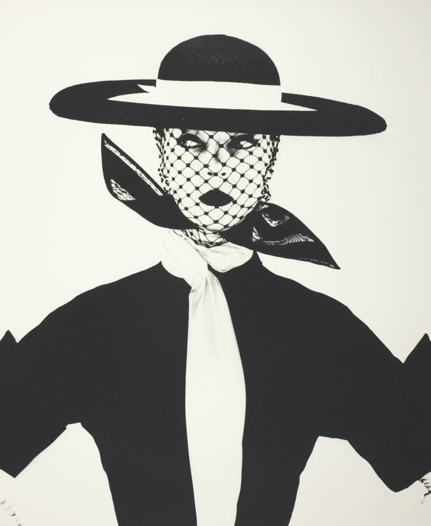
Online article by John Frederick Anderson, heavily drawn from a portion of a book by Norman Bryson (“The Gaze and the Glance” in Vision and Painting: The Logic of the Gaze, (1982) Macmillan). The importance of different levels of looking in art, from the glance (short-lived, furtive, stolen) to the gaze (longer, open, admiring?). Cultural differences in where the gaze lands; the direct gaze as a sign of aggression in the animal kingdom. A direct gaze between humans can also be a sign of aggression, or at least confidence. Does this also mark the line between portraiture (gaze) and street photography (glance)?

Nicolas Mirzoeff (1998) Visual-Culture-Reader, Routledge, 2009 (“Introduction to Part Five,” pp.391–397).

  • Feminist and queer theory have placed importance on the gaze in terms of power relationship (asserting the right to look on another), to the point of proposing that “the gaze is in itself male, objectifying and subordinating women.” (391)
  • Recognition that sex is not merely present in genitalia but throughout a human being.

  • Growth in medical/anatomical knowledge is rationalist (and somewhat mechanical)—viewed as enacting “a man’s claim to rational authority over (feminine) nature.” (392)

  • Life drawing not open to women; Freudian psychoanalytic view of difference between the sexes rooted in presence and absence (castration) of a penis.

  • Role playing of the ‘heterosexual binary’ in presenting stereotypes of masculinity and femininity, which may or may not be related to gender. (393)

  • What happens to the ‘heterosexual binary’ if the subject or the object of the gaze is not heterosexual? (394) → expanded set of identities and meanings

  • These expanded identities and meanings can be subversive of gender norms or supportive of them (what is the impact of drag? in what context? for what purpose?) (395)

  • Importance of viewpoint: images can pose questions of the one looking on them, just as easily as the one looking may exercise the gaze.

  • Interesting differences in comfort with images and gaze, depending on the viewer’s expectations and personal norms: ‘some lesbian and gay readers demand unambiguously “safe” images in the gay press whereas they revel in transgressive, contradictory and subversive pleasures in the mainstream’ (Reina Lewis, quoted on 396).

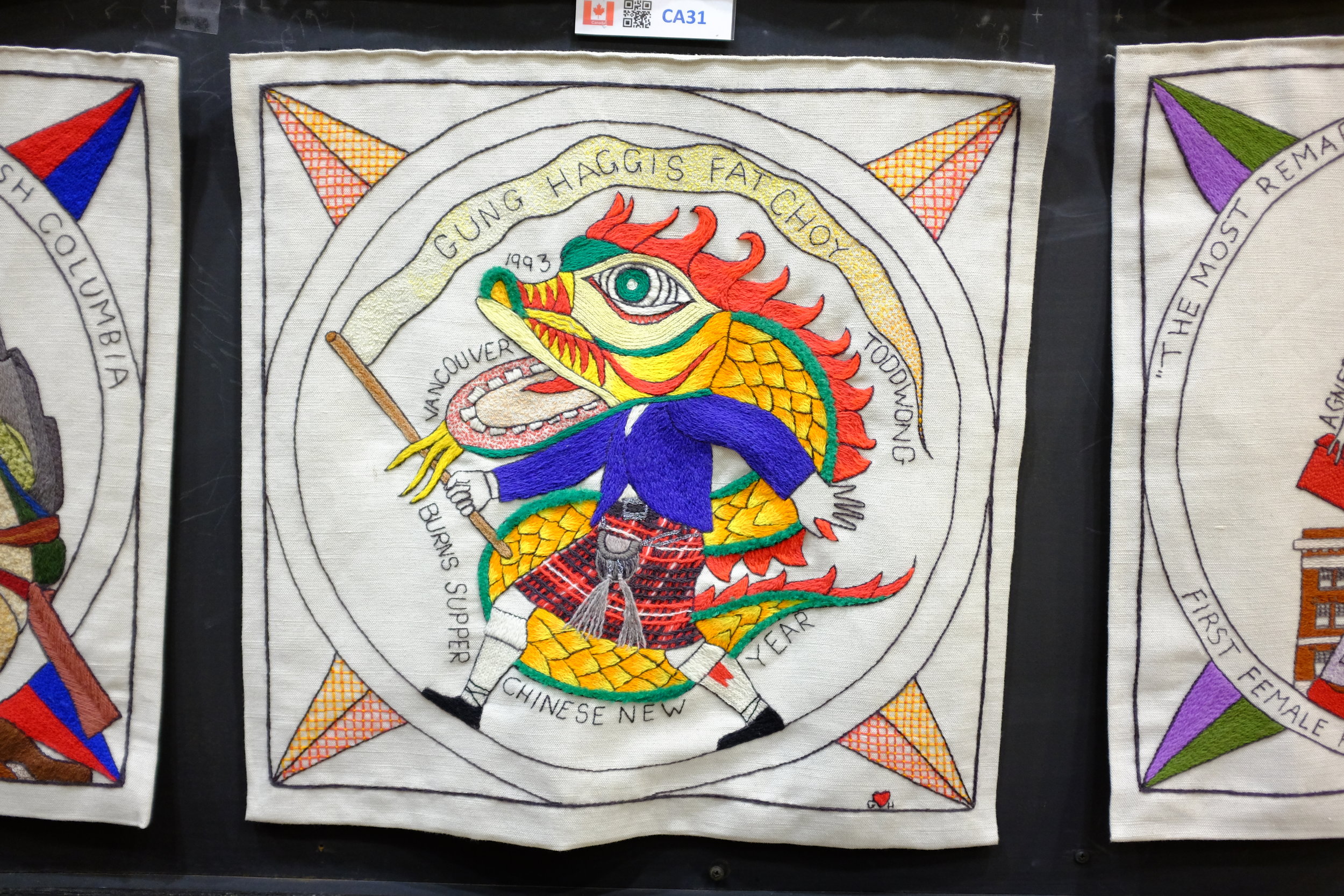
Tate Debate: When is appropriation homage and when is it plagiarism?

Appropriation has a long history in art: Pablo Picasso; Georges Braque; Kurt Schwitters; Andy Warhol. Some image appropriation is a necessity (e.g., orthodox iconography) while other uses are meant to comment or subvert the original piece. Advent of digital media has made appropriation much easier and more common. When is this a problem?

Project 3, Exercise 3: Viewpoint

Image 1: ©Derek Trillo, The Cheshire Plain from Beeston Castle, 2008

  • The high, oblique perspective gives a sense of the spatial relationship of objects on the ground to one another.
  • We also get a sense of the relative size of the objects and we are able to guess at scale, using the trees as a guide.
  • The slanting light gives some idea of texture, from the rough trees and gullies to the relative smoothness of the mowed fields and plowed earth. The shadows also give a relative indication of the time of day—we know the picture was taken during the day (bright) but not at noon when the sun would be directly overhead (smaller or no shadows).
  • We can also surmise that the image was made in early spring: the fields have been plowed for sowing and the grass is very green, but the leaves on the trees are not very advanced.
  • If we were at ground level our view would be blocked by trees, hedges and walls. This high perspective allows us to see over and beyond these obstacles.
  • We cannot see the horizon, however, so it is hard to relate this viewpoint to anything beyond the tight frame of the image.
  • A map would give us a representation of the area from directly above, but we would not have as much information about the ground features or about their texture.
  • Many of the same comments could be made about earlier versions of Google Maps, but more recent iterations give us a richer range of options for viewing.

Image 2 by OCA student, Peter Mansell

  • This picture allows us to see the horizon and shows us a developed urban area that stretches on for some miles.
  • The image shows us a region that appears to contain both commercial / industrial facilities as well as residential areas (the apartments and lower buildings in the middle and longer distance).
  • Although a black and white picture, the trees are covered in foliage and suggest summer.
  • Other than a partial sign on a roof ('P.A. FINLA'), there are few identifying features in the image (the canal?) and little indication where this town might be.

Image 3: © John Davies, Agecroft Power Station, Salford, 1983

  • The black and white photograph is taken from a high angle and shows four cooling stacks from a power station set in a broader landscape. Metal pylons hold the high tension wires that carry electricity away from the station.
  • Behind the cooling stacks it is possible to make out a large building with a high chimney. In the foreground sit some cars in the middle of what looks like scrub land and rubbish at the end of a canal. In the middle distance a game is underway on a football pitch.
  • The foreground is made up of lines of trees, broken up by the lane that the cars have used for access. There appears to be a split-rail fence just behind the trees.
  • The sky is dark and overcast, and it is not possible to tell if the clouds are natural or if they are the smoke/steam produced by the cooling towers. Perhaps the clouds are a mix of both.
  • All told, it is a bleak scene even though the towers are impressive in the way they dominate the landscape and stand against the sky. The bleakness comes from the brute figure of the power station squatting in the middle of what was likely agricultural land.
  • Taking the shot from a relatively high angle allows the photographer to show more of the surrounding area, thereby providing greater local context for the image. Moving to a lower angle or moving closer to the power station would have made the cooling towers even more dominant, but would have blocked much of the view and reduced the amount of visual information for the viewer.
  • Being able to see the players on the football pitch gives the viewer an immediate sense of scale. The figures are dwarfed by the landscape and by the massive size of the cooling towers. It does not take much imagination to see how the humans are dominated in what should be a natural setting by the industrial installation beside and above them.

Image 4: © Bernd & Hilla Becher, Water Towers, 1980

  • Although not technically part of the exercise, the series of images by Bernd and Hilla Becher are very interesting to me because I first saw them in a show at the Rencontres Arles Photographie 2014.
  • The show was called 'The Walther Collection: Typology, Taxonomy and Seriality' and dealt specifically with the issue of how series of similar images invite comparison. Just as the course materials suggest, I found that I did indeed "look far more closely when looking for differences than [I] would do at a single image."
  • Along with work by the Bechers, there were series of images by Karl Blossfeldt (plants), J.D. 'Okhai Ojeikere (hairstyles of African women), Richard Avedon (portraits of Washington elites), Martina Bacigalupo (trimmed remnants from a portrait studio), Ai Weiwei (the dropping of an urn), and Zhang Huan (a face being progressively covered in Chinese characters), Eadweard Muybridge (successive frames of a woman walking) and others.
  • I spent much longer looking at this exhibit than I thought I would, absorbed in examining the clues suggested by the smallest of differences from one frame to the next.

Project 3, Research point: New Topographics

New Topographics: "a term coined by William Jenkins in 1975 to describe a group of American photographers (such as Robert Adams and Lewis Baltz) whose pictures had a similar banal aesthetic, in that they were formal, mostly black and white prints of the urban landscape."

Also the title of the exhibition curated by Jenkins at the International Museum of Photography at the George Eastman House, Rochester, NY (October 1975 to February 1976).

Mitch Epstein, American Power

  • Many of these colour images have a formal structure. They have not been taken haphazardly but show attention to composition.
  • The scenery would normally be considered particularly photogenic in terms of classic landscapes, but there is nonetheless a beauty to many of the shots in the series.
  • Several of the images seem to have been shot from a viewpoint above regular line of sight—ladder? scaffold? pole? The extra height marks a difference from the usual snapshot at eye-level—does it suggest a different way to view the landscape philosophically, as well?
  • Most images contain a lot of detail and show considerable depth of field—the viewer is invited to take in a broad field of view rather than to concentrate on small points of focus.
  • The images explore very broadly the theme of 'power' generation and transmission associated with the energy industry in the U.S.
  • At the same time, the title 'American Power' could be an ironic questioning of the vulnerabilities of the country's political 'power' because of its dependence on fossil fuels and foreign sources, and because of the environmental degradation associated with the energy industry.
  • Some of the images are interesting as standalone documents, but together they form a narrative with a clear point of view.

Fay GodwinOur Forbidden Land

"Her love of walking eventually inspired her to pursue landscape photography, often photographing isolated and remote areas of the British landscape and producing many beautiful pastoral scenes as well as contrasting urban landscapes. President of the Ramblers' Association from 1987 to 1990, she was also renowned for her work as an environmentalist, her interest reflected in many of her best-known images that examine the complex relationships and tensions between man and nature." (Fay Godwin Archive)
  • Much like Epstein's pictures, Godwin's work in this series has been produced with great care.
  • All of the images have been produced in black and white—was this an aesthetic decision (documentary approach? emphasis on form and texture rather than colour?), was it due to necessity, or was it even a consideration at all?
  • The black and white approach suggests something more timeless to me than literal colour, but that may be my own bias.
  • Godwin draws attention to the separation of people in the U.K. from the land around them and to the degradation of the land. The theme is somewhat broader than Epstein's but the two probably share political sympathies.

It's possible that the work of these two photographers and some of the other New Topographers may have an influence on how I look at and photograph landscapes from now on. They point to something real that is happening to the land we share. If all we photograph is carefully framed to be pretty and shown to its best advantage, are our images 'true'? Are they a reflection of reality or do they conceal it? Or both at the same time?

Perhaps that is a good question to chew on: what do I choose not to photograph? And why not?

Project 3, Exercise 2: Holiday photos and motivation

My motivations for taking holiday pictures vary:

  • This is a famous place or view—I want to record it, too.
  • There is a detail or sign that I want to remember, so I will take a picture as a kind of visual diary.
  • I want to remember this view because of how it made me feel.
  • This is something that is new to me or not common where I live.
  • I want to have a record of family members on this trip. We will enjoy looking at these later. My children may appreciate that I captured a portion of their childhood, particularly once they are older and have children of their own.
  • I had some time to concentrate on photography, so I have taken more care with this image than I have with the others from this trip.

When I take pictures on holiday that are meant to be a simple record of a scene or happening, I do pay some attention to composition and lighting. When I am travelling with other people, though, I am always conscious that photography doesn't hold the same interest for them and try to get the shot quickly. When I am by myself I tend to 'work' the shot and will spend time considering how I frame it and use the light. If something is visually interesting I will spend time with it and make a number of exposures until I am happy with the results. A postcard usually offers an image of a scene under optimum conditions, but it is not drawn from my experience—and I suppose that must be important to me (I don't remember buying any postcards).

The images that give me 'more than just a record of place' have a visual quality that I would be happy to share with a broader audience. There is something in the image in terms of simplicity or geometry of line, the quality of the light, some humour or a human element that lifts it a notch above a snapshot. I regularly share these images online with people who weren't there and they frequently appreciate the same qualities that I enjoyed, sometimes spotting lines, patterns or expressions that I did not see. 

The debate about the value of snaps from phones and iPads rages on and I have to admit that I can see something on both sides of the issue. There are indeed a lot of mediocre photos being produced, but that has always been the case (the difference now is the volume, I suppose). At the same time, I think the democratization of photography has been a good thing and the value of an image should be related to its own qualities, rather than to the effort required to produce it. I know that I am generally happier with what I produce photographically when some thought and effort have gone into an image, but I don't know that I am always fit to judge another's thought or effort—let the results speak for themselves. I am more concerned with improving my own abilities than I am with the efforts of others (not that I don't have views on other people's images!).

Project 2, Exercise 3: The image as document

Why do you think that photographs are such a significant part of our lives? Write down how you feel about photos – or videos – from your family’s past.

  • Photographs are tangible artifacts that promise to preserve memories intact and changeless across time. Faces and places are of particular importance to us, so anything that can channel their likenesses to us is meaningful. We can preserve other kinds of keepsakes like letters or personal possessions, but they don't seem to have quite the same power. Perhaps this is because relate to people is more important than relating to inanimate objects, and to relate to a person most often means reading his or her face where we look for recognition, what is familiar and loved, and characteristic expressions and signs of mood.
  • I look at pictures and videos of my family's past to remember how people and things were. Sometimes they help me to recall a particular, mood or feeling, but it is hard to view them without adding on a layer of everything that has happened since the time the picture was taken. I also find that I feel differently about pictures taken of family members that I know than those that I have never known. Pictures of family members from generations that went before me are interesting in a curious (are those eyes like mine?) or historical (so that's where and how our family lived) way, but they do not have the same personal appeal—they both are and are not part of my story.

Will this archiving be affected by the digital revolution?

  • Digital photography has many advantages over film-based photography, but one of its downsides is the fact that I print so few images now. I realize that none of my children has probably had the experience of poring over a family album because there isn't one. There are now thousands more images in the house but they are not as easily available and we are not likely to sit looking at them together. (Although we did happen to do this recently and it occurred to me how much I missed looking at family pictures together, even those taken just a few years ago.)
  • Looking at screen-based imagery is not the same as looking at a photographic print: we are used to digital images being transitory and are more likely to browse rather than contemplate them. If we need to research or consume images, digital is much faster. If we want to take time over a picture there is no substitute for a print you can hold in your hand. I wouldn't call one approach better than the other—it is more a question of being appropriate to the task.

Project 2, Exercise 1: It's about time

Derek Trillo, Passing Place, Manchester, 2006

  • Conveys movement by using a slow shutter speed to capture two figures walking toward one another on a staircase. The resulting blur is effective, particularly because it works well with the silhouetted figures and the background colours—I think I can see some multicoloured fringing that gives the impression of speed.

Harold Edgerton, Bullet and Apple, c.1964

  • A high-speed flash has been used to freeze a bullet as it exits an apple stuck on a shell casing. This is also effective not because it allows movement to blur, but because it freezes an event that the eye cannot possibly see (the previous image also used a camera to portray an event in a way that the eye cannot naturally perceive). The entry and exit 'wounds' to the apple have only just been made and show the bullet's explosive speed and power.

Harold Edgerton, Multiflash tennis serve, 1949

  • Edgerton used a stroboscopic effect to slice up a moment that would have been visible to the eye (a tennis serve). Again, the technical properties of photography are effective in allowing us to 'see' an event in a way that would otherwise be impossible: this time a single, fluid movement portrayed as a series of discrete steps.

Jacques-Henri Lartigue, Ma cousine Bichonnade, 1905

  • Lartigue's picture of his cousin is also effective in showing movement through a relatively short exposure, although it gives the impression that the subject is flying. In that sense, though, it is no more unnatural than any of the other images—each one of them portrays movement in a way that is foreign to us, but that tells us something interesting about movement and the passage of time.


Research point: Context and meaning

Notes on John A. Walker, "Context as a Determinant of Photographic Meaning"

  • Walker distinguishes between 'immanent structure' (immediate, local context) and the broader context outside the frame of an artwork. The frame itself is a form of self-containment or bracketing of meaning and can lead us to ignore the wider context within which a work appears and is understood.
  • A given work can have multiple contexts. These have different impacts on the connotations of a work but are less likely to affect denotation.
  • When context changes there is potential for a 'third-effect' meaning created by relationships with items in the surrounding context.
  • Change of context became particularly important as artworks were less often attached to a specific place. (John Berger makes the same point in "Ways of Seeing," noting that it used to be common for works to be created for, and installed in, specific settings. Often, these were places of worship.) Now, media context is more important than 'architectural setting.'
  • Walker uses the terms 'circulation' and 'currency' to describe the ebbs and flows in the life of a work as it changes contexts.
  • The different locations in which Jo Spence's project—Beyond the Family Album, Private Images, Public Conventionshas been seen demonstrate the impact that context has for setting an interpretive frame.
  • Walker states that if we are going to talk about the "efficacy" of the exhibit we would need to know about the viewers. But which viewers? Spence's 'ideal viewer' or someone else? I don't know how useful this would be as a line of inquiry. If we can't always be sure about the intent of the artist (as though there were just one and the artist herself could articulate it perfectly), and context has an important role in the creation of meaning, why do we think that knowing about the 'viewer' (as though there were just one) is helpful?
  • Just as context can shape interpretation of a work, so the work can shape interpretation of its context. This is a good point and Walker's example is worth copying here:

If display context can influence the meaning of a photograph, the photograph
can influence the meaning of the context. This reasoning lay behind John X.
Bcrger's comment at a Hayward Gallery evening discussion that the socialist and
feminist photography 'had radicalised the gallery space'. But the influence is twoway:
it could also be argued that the gallery—a High Art cultural institution
serving the interests of the bourgeoisie—had de-radicalised radical photography!

  • Walker then describes the 'mental context' of the viewer. Much of this seems like basic communications or rhetorical theory: how is the viewer/listener disposed to the work/message? He then spends a few paragraphs pointing out that we are not all just individuals but share common opinions, values and viewpoints. In other words, there must be sufficient commonality between communicator and audience to allow communication to happen. 
  • This seems like a fairly obvious point to me, but it may still need to be made explicit. People regularly claim that advertising has no effect, but it must: commercial enterprises and governments wouldn't pay what they do if advertising had no impact. Perhaps this is a more insidious side of imagery if we are not even aware of its effects.
  • Walker closes his article with a brief discussion of the frustration that some artists have of losing control of the meaning of their work, given that they cannot always choose the context within which it will be viewed. (Sounds to me to be a bit like having children. We bring them into the world and do our best to raise them well, but we don't own them and we cannot control them. You must accept it.)

Prep work for Assignment 3: Re-appropriating images

  • Look at the original image and do a semiotic analysis. Describe its contents (denotation) and possible meanings (connotation) as you did in Part Three. Extend your enquiry by researching the original context of the image. Why was it produced, where and when was it originally located, and how might audiences have interpreted it?
Publicity still for The Seven Year Itch, by Sam Shaw.

Publicity still for The Seven Year Itch, by Sam Shaw.

The image is a picture of a woman who appears to be trying to push her dress down as it is being blown up. The background is very dark and it would appear that it is nighttime. Nevertheless, she is very well lit and stands out from the background, both because she is dressed in white and because of artificial lighting that is directed upon her. Although she is holding her dress down, she is smiling, has her eyes closed and does not appear to be concerned. Although it is dark she is dressed for warm weather in a light halter dress and high-heeled sandals with no stockings. She is also carefully made up and wearing earrings that complement her clothes. It looks as though she may be dressed for an evening out.

In terms of connotation, this is a young, attractive woman who appears to be confident and enjoying herself on a warm evening. She is relaxed and well-dressed and is standing over a grate or grille. Her clothing suggests that she may be comfortably wealthy, but this could be misleading. She is dressed all in white—shoes, dress, underwear and earrings; even her hair is blonde—a colour that in the West has long connoted purity or innocence. Her legs are being exposed and she is both aware of it and not overly perturbed. And she is being watched: in the mid-left portion of the frame there is the reflection of a camera, so the woman is not only being lit and photographed from the front but her image is being recorded from behind. This is a performance with an audience that wishes to capture her and she is participating.

It doesn’t take much research at all to know that this is a picture of Marilyn Monroe, still one of the most recognizable people in the world. And anyone who has a passing interest in movies will know that this image is taken from an (in)famous scene in The Seven-Year Itch. The picture may have been taken while the scene was being filmed or may have been a recreation of the moment of filming. It exists in multiple versions that were shot from different angles: the director, Billy Wilder, attempted to film the scene on a New York sidewalk but it had to be shot on a soundstage because the filming attracted too much attention. The still images shot by Sam Shaw reveal more of Ms. Monroe than those that appear in the film.

Although the word “iconic” is overused to describe many images and other phenomena, this image has earned that title since the movie was released. Images of this scene were used to promote the movie when it was released in June 1955 and the dress itself sold for some US$5.6M when it came up for auction in 2011.

At this point in the movie Ms. Monroe’s character is out for a walk on a hot summer evening in New York City accompanied by her neighbour, a man whose wife and children have already escape the heat of the city for a summer at the ocean. Along the way she stops to enjoy a blast of (relatively) cool air from a grate in the street as a subway train passes below. The updraft lifts her skirt up and exposes her legs, but there is an innocence in the moment because Monroe’s character appears blissfully unaware of the effect that she has on those around her. She seems both knowing and unknowing. As with Venus—a comparison made by a number of commentators—Monroe is naked but not nude in the way expressed by John Berger: “To be naked is to be oneself; to be nude is to be seen naked by others and yet not recognised for oneself. A nude has to be seen as an object in order to be a nude. Nakedness reveals itself, Nudity is placed on display.”

I referred to the image as “infamous” because of the reaction of both Joe DiMaggio, Marilyn Monroe’s husband at the time, and of some American organizations and newspapers. The film was approved for wide release, however, and a 52-foot cutout of the famous scene decorated the facade of the cinema in Times Square where the movie opened. Many would have found the image titillating and some would have disapproved—the whole movie was banned in Ireland as indecent.

  • Also reflect on where the original is currently located. Where did you access it? Did you see the original or have you seen a reproduction in print, online or elsewhere? What does this tell you about our modern relationship to the example you’ve chosen? Does it highlight any change in attitudes or approaches to visual communication more broadly?

It is difficult to say where the original is located because, in a sense, there is no “original.” There are multiple versions of the image that have been taken from the film and from the many still image recreations afterward. I have seen the image so many times that I cannot remember which I saw first, the movie or the still (most likely).

This suggests several things to me:

  1. That iconic images such as this one are, by definition, ubiquitous and it becomes impossible for us to know when or where we first saw them or how we reacted to them. I am certain that if anyone saw any one of these images they would insist that they knew “it” and had seen it before, whether they had or not. In that sense, it is the presence of Marilyn Monroe, her pose and the dress that are famous, rather than any specific instance of the image.

  2. That there are multiple layers of meaning and context that come to be laid on famous images. It becomes almost impossible to view the image as a thing in itself independent of the stories that we associate with it. Do we even see the image anymore?

  3. That memory is unreliable and we are very suggestible. The things we think we know or remember can be false and influenced by images and the layers of meaning we have subsequently built upon them. (I have seen family members “remember” events in a photograph, only to be told that they were not alive when the image was taken. It is the photograph that they remember and they have written a false narrative around it that includes themselves.)

  • Now reflect on your chosen re-appropriated image. Why was it produced, how has it been shown to audiences and what do you think their interpretations are?
The 500-Year Itch, 1992, by Shelley Niro.

The 500-Year Itch, 1992, by Shelley Niro.

The 500-Year Itch is a photograph created by artist Shelley Niro. Both the title of the work and its visual elements indicate that it was designed to reference the famous pictures of Marilyn Monroe from The Seven-Year Itch. It has been shown to audiences as a photographic print in galleries and was in a private collection for some years before being donated to the National Gallery of Canada. I saw a print of it recently as part of a Gallery exhibit entitled Photography in Canada: 1960–2000 and then again in the printed catalogue for the exhibit. I imagine that most viewers will encounter the image the way that I did: as part of the National Gallery’s retrospective on Canadian photography in the second half of the twentieth century. In this context, think that people will recognize the reference to Marilyn Monroe and find it a humorous take on images of female beauty. They may also think of the image as somewhat outdated, given that The Seven-Year Itch was filmed in the mid-1950s and that the current show is a retrospective that shows the work of Canadian artists, many of whom are now old or dead. The ongoing fascination with anything to do with Marilyn Monroe may help to give the image continued currency for viewers, however.

  • Make a comparison between the two images. You may want to place the two versions side by side and annotate the visual similarities, differences and other comparisons you make. How does the new work make reference to the old? Does it maintain, subvert or alter the original message in any way and, if so, how does this take place visually? Think about the visual elements of the two items. How is image, composition, typography, visual narrative or any other element used to construct Meaning?

Visually, the two images are similar only in very broad strokes: the curly blonde, the dress, a smiling woman and a source of air from below. The photograph by Shelley Niro references the Monroe images but her pose does not copy any of them exactly. The garment in Niro’s image is a white, sleeveless halter dress but it is not pleated and the material looks heavier. Niro’s shoes are not white sandals, but dark with a different heel, Niro is wearing glasses, a beaded necklace and a bracelet. If she is wearing earrings, they cannot be seen. Niro is also wearing a wig. Instead of Monroe’s subway grate, she stands astride an electric fan with a trailing cord. She also holds a remote control in her hand that we assume is used to trigger the camera taking the shot. Finally, the shots of Monroe have been produced as contrasty black and white images that nevertheless have a wide tonal range in the dress and skin. Niro’s photograph is either in colour or is a hand-tinted black and white. Her makeup has been accentuated on the print and items coloured yellow (wig, necklace and bracelet) especially so.

Niro’s image subverts Monroe’s in a number of ways. Although both photographs have been carefully created (one on a soundstage, the other most likely in a studio), Niro goes out of her way to highlight the artificiality of the moment: her hair is obviously a wig and its colour has been heightened like a poster or cartoon; she stands over an electric fan turned clumsily on its back; and she holds a remote control while looking directly at the viewer. Monroe participates with viewers (likely men) who capture her image; Niro fabricates her own patently false image and is in control of all its elements, from conception to the tripping of the shutter. In this sense, Monroe is an object while Nero is a subject.

  • Try and make connections between how the original and the re-appropriated image relate to one another both in terms of their visual construction and their context. This might lead to thoughts about wider cultural and social change, as well as differences in the use of visual communication and media at different times.

If we paid attention only to the visual content of the two images, Shelley Niro’s image could be read as a feminist critique of gender roles and sexism in image-making. It could also be seen as a comment on the mores of an earlier time and how some attitudes have changed while others have not.

The title of Niro’s work, however—The 500-Year Itch—points to another layer of intent and interpretation. The photograph was produced in 1992, so the ‘500 years’ in question would be 1492: the year of Columbus’ arrival in the Americas. For Indigenous North Americans, such as Shelley Niro, that event is a kind of shorthand for the arrival of Europeans and their impact upon the cultures that lived here. The combined effect of the work and its title, then, is a response not only to stereotypical views of women in general, but more specifically to historical and more contemporary views on Indigenous women in North America.

I have also learned that the The 500-Year Itch has been displayed both as a standalone image and also as part of a triptych. The triptych makes the point much more clearly about stereotypical portrayals involving Indigenous women than does the standalone “Marilyn” shot, showing a picture of Niro’s mother in a fashionable dress and heels from the 1940s, bracketed by a picture of Niro as Marilyn and another of Niro barefoot in a shirt and jeans.

The 500-Year Itch, 1992, triptych by Shelley Niro.

The 500-Year Itch, 1992, triptych by Shelley Niro.