The third dimension
Many, if not all, of the examples of what is "cutting edge" in visual communications are directly linked to the digital revolution. In one sense, this has been somewhat limiting because it implied that the "edge" was largely limited to those forms of visual communication that could be digitized for two-dimensional printing and/or viewing on a monitor. With the advent of 3D printing, however, more digitized visual communications will have the added benefit of depth as well as shape.
More and more artists are now working in the area of 3D printing of their art, making it possible to transmit exact copies of their work anywhere in the world and to scale the work to a client's desired dimensions. Examples of 3D sculpture and wearables (with the potential to create scripted or spontaneous visual 'communications') can be seen on many sites across the Web. Here are just a few examples:
- Marco Mahler Mobiles
- 3-D printed clothes with data representation as part of the "Internet of Things"
- 3-D maps that can be exchanged digitally and printed locally to show terrain relief and other features
Intelligent typefaces
One of the more interesting items I found during my search was the self-adjusting typeface called Futuracha. Inspired by art deco design, its intelligent properties can be seen in a video for a fund-raising campaign. Each letter in the typeface automatically adjusts to the preceding and following letters to create beautiful ligatures and typographic designs.

A sample of text in the Futuracha typeface showing self-adjusting ligatures and letter combinations.
Could it be that typefaces will self-adjust not only to graphical form within words, but to the content of the words themselves? In other words, intelligent text would not only enhance the appearance of words visually but perhaps help to communicating the meaning of a passage?
Visual representation of data
Now that virtually every phenomenon can be recorded and digitized directly or indirectly, we are swimming in rapidly-expanding seas of data. Many of these datasets are so large that is impossible to find meaning within them quickly or effectively. And the democratization of data—in the sense that data are created by and about a much wider section of the population and affect our lives—means that more of us need help to understand what all this information means. New techniques of visual representation are being developed to make sense of data and to tease out the "stories" they can tell.
"Data visualization" is becoming a specialized field of trained individuals who can interpret the work of quantitative analysts and make it accessible to a broader audience in a way that is both accurate and aesthetically appealing. "Infographics" tell a static and relatively simple data story in graphic form, while more detailed visualizations are often dynamic and designed to allow the end user to monitor evolving data and make decisions.
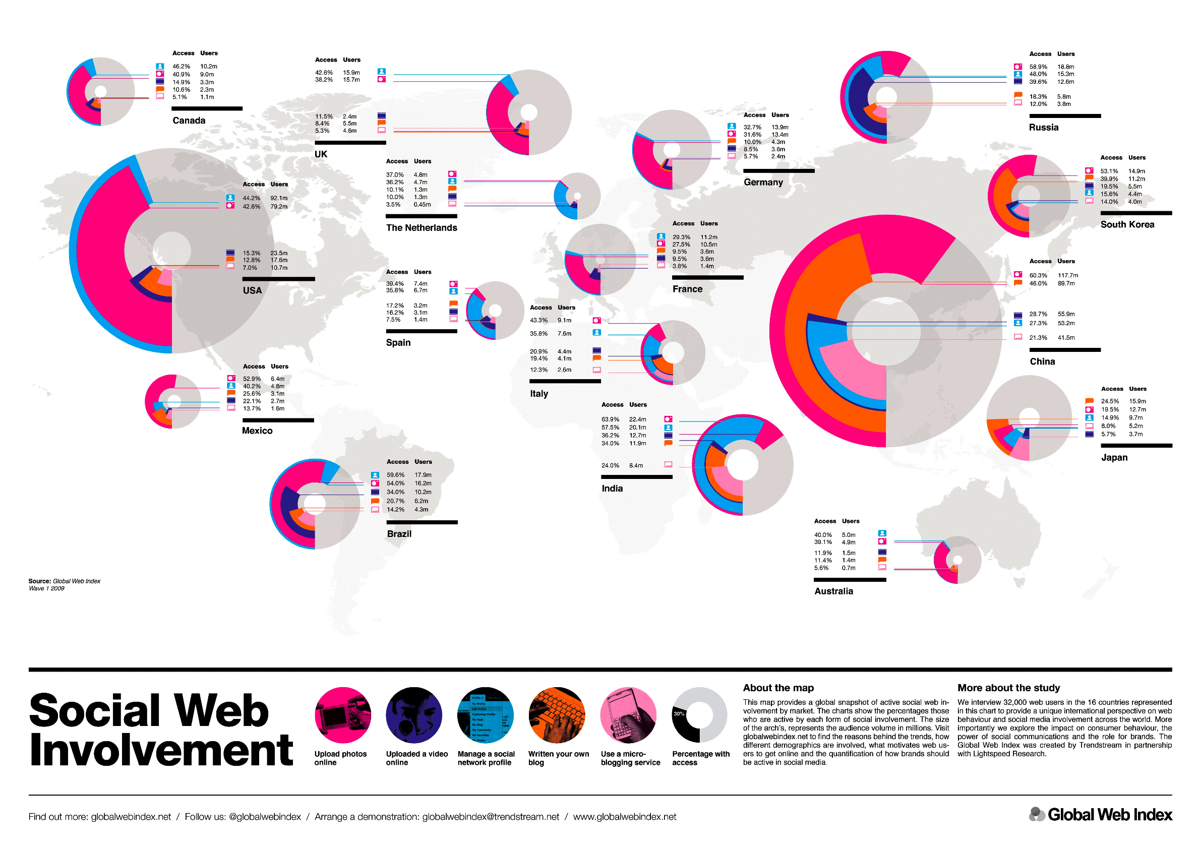
An infographic describing social web involvement. www.globalwebindex.net
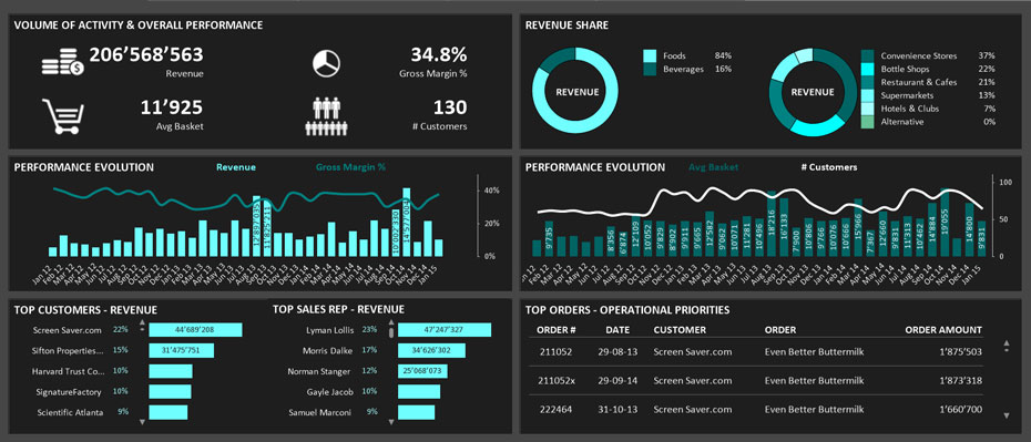
A dynamic visualization providing sales information. www.lintao-dashboards.com
The Histography website is a particularly powerful example of visualization of a huge dataset, showing the span of human history as a timeline drawn from every entry on Wikipedia.
The next step beyond data visualization allows viewers not only to view data representations passively, but to actively manipulate data in graphical form. A visual interface makes it possible for non-specialists to conduct complex mathematical and statistical computations while exploring large datasets and creating models with them as images.

Data exploration and modelling example. SAS Visual Analytics.
Virtual reality
Virtual reality (VR)—an immersive, computer-generated 3D environment—is not new in itself, having been around since the middle of the 20th century. What is cutting-edge, however, is how the necessary equipment to create and experience VR is now within the reach of people outside of laboratories and production studios. It is possible to buy purpose-built VR headsets for hundreds of dollars, but it is also possible to adapt an iPhone or similar device to experience VR. Most VR content has been designed for gaming, but there is nothing to prevent developers from opening up a broader world of travel and art at relatively low cost and easy distribution.
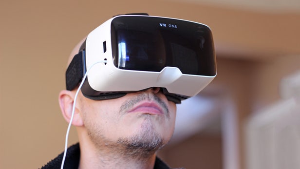
The Zeiss VR One, a virtual reality headset with a slide-out tray for the iPhone 6 (Photo: Will Shanklin/Gizmag.com).
Reflection
Looking at this collection of new forms of visual communication, some are admittedly more cutting-edge than others. What makes them of interest to me, however, is the way that they open up new possibilities and often to a broader range of people. Whether it is making it possible for ordinary people to understand and ask questions of enormous amounts of data, allowing us to have the sensation of travelling beyond our own time and place, or helping us to communicate more powerfully, each of these innovations can extend our reach as individuals and as a society. They give us new tools to persuade, to inform, to develop and expand identity, to interact and, where necessary, to call into question facts or narratives.